

Recommandé
Contenu connexe
Similaire à Compaq cp qlogov1
Similaire à Compaq cp qlogov1 (20)
Plus de ELF MACHINE
Plus de ELF MACHINE (20)
Dernier
Dernier (20)
Compaq cp qlogov1
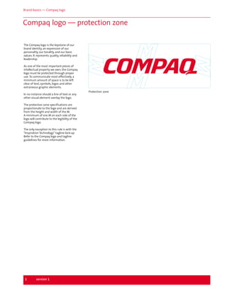
- 1. Brand basics — Compaq logo Compaq logo — protection zone The Compaq logo is the keystone of our brand identity, an expression of our personality, our tonality, and our basic values. It represents quality, reliability and leadership. As one of the most important pieces of intellectual property we own, the Compaq logo must be protected through proper use. To communicate most effectively, a minimum amount of space is to be left clear of text, symbols, logos and other extraneous graphic elements. In no instance should a line of text or any other visual element overlay the logo. The protection zone specifications are proportionate to the logo and are derived from the height and width of the M. A minimum of one M on each side of the logo will contribute to the legibility of the Compaq logo. The only exception to this rule is with the "Inspiration Technology" tagline lock-up. Refer to the Compaq logo and tagline guidelines for more information. 1 version 1 Protection zone
- 2. Brand basics — Compaq logo Compaq logo — color versions A consistent image is vital to building brand identity. For this reason, Compaq Red (100% Pantone 186) is the color of choice for the presentation of our logo. In certain instances, where it is not possible to present the logo in the corporate red, it may appear in 100% black. The logo should never appear as a tint. To ensure the unified look that is so vital to a strong brand identity, it is important to reproduce the colors in the Compaq palette as accurately as possible in all print and electronic applications. All the relevant color-matching formulas are provided here. Process c - 5% m - 100% y - 70% k - 0% RGB r - 224 g - 000 b - 036 Web RGB r - 225 g - 000 b - 000 Web Hex FF0000 2 version 1
- 3. Brand basics — Compaq logo Compaq logo — dos and don'ts The Compaq logo is the cornerstone of our brand identity. Whenever and wherever it appears, it should always be clear and visible. Care should therefore be taken in controlling the background on which it is presented in order to optimize legibility. The correct and incorrect examples illustrated here will serve as a useful guide when you are developing a layout or choosing an environment or a medium in which the Compaq logo will be displayed. Don't To maximize readability, it is strongly recommended that the Compaq logo only appear on solid backgrounds such as white, black or red. Avoid using busy backgrounds such as photos, illustrations or patterns. The Computers For the Compaq logo, always adhere to the protection zone quidelines. Please do not use colors outside of the approved color palette. Do not add bounding boxes or other graphic elements to the lock-up. Avoid using blends, drop shadows, filters or effects. 3 version 1 Please do not use the Compaq logo as a read-through.