Top Rated Bangalore Call Girls Mg Road ⟟ 9332606886 ⟟ Call Me For Genuine S...
An Artistic Journey-Amy Duffy
1. DRAWING
WITH
SHAPES
BY: AMY DUFFY
Part Two
The second half of this project we decided to
get creative with our pieces and see what wild things
we could do. This was probably my favorite project we have done this semester. It
The composition for the piece was already was fun to have control over picking which picture to do and how I wanted to a
chosen because of the use of an actual picture. When pproach the project. Learning how to use the Adobe Illustrator made this challeng-
given the freedom to change the look of the lines and ing and exciting. the challenging part for me was shaping out all of the details in
the colors, I played with many options. My favorite the picture. The ref lections in the windshield of the streetcar were very challeng-
was the line i used on the images to the right and ing. in the first weeks of the project I almost completely ingnored them but as he
above. The streetcar is a huge part of New Orleans weeks went on I added more and more to it and now I love the way it turned out.
culture and since that is where I took the picture I
decided this line would be appropriate because it
reminded me of the fleur-de-lis, which has become
a symbol that represents New Orleans. I want the
viewer to notice the interesting lines in all of these
picture yet still understand what it is. I also want the
viewer to enjoy the fun and life that these lines bring
to the piece.
This artwork is about taking a conventional
photograph and revamping it in multiple ways to
make it even more appealing to the eye. I just want
the viewer to see the serious detail work yet also
enjoy the fun twist that some of the pieces have.
“I also want the viewer to enjoy the fun and life that these lines
bring to the piece.”
THREE FOUR
2. Part Two
The second half of this project we decided to
get creative with our pieces and see what wild things
we could do.
Part
This was probably my favorite project we have done this semester. It
One
The composition for the piece was already was fun to have control over picking which picture to do and how I wanted to a
chosen because of the use of an actual picture. When pproach the project. Learning how to use the Adobe Illustrator made this challeng-
given the freedom to change the look of the lines and ing and exciting. the challenging part for me was shaping out all of the details in
the colors, I played with many options. My favorite the picture. The ref lections in the windshield of the streetcar were very challeng-
was the line i used on the images to the right and ing. in the first weeks of the project I almost completely ingnored them but as he
above. The streetcar is a huge part of New Orleans weeks went on I added more and more to it and now I love the way it turned out.
culture and since that is where I took the picture I
decided this line would be appropriate because it
reminded me of the fleur-de-lis, which has become
a symbol that represents New Orleans. I want the
viewer to notice the interesting lines in all of these
picture yet still understand what it is. I also want the
For
viewer to enjoy the fun and life that these lines bring
to the piece.
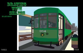
my object project I have chosen a picture of a streetcar. I took this photo-
graph while visiting New Orleans and was fascinated by the vintage look of the streetcar
This artwork is about taking a conventional In the first step of this project we took a photograph of anything we wanted and
against the modern city scape.
photograph and revamping it in multiple ways to placed large shapes of color over the picture to create an Illustartor image of it. The
Craft: For this project I will be using Adobe Illustrator and the ink tool. To fully capture
make it even more appealing to the eye. I just want first draft of this was fun and challenging. I had to learn to work fro large portions
this image I will be using large blocks of color and outlining each shape and filling it in.
the viewer to see the serious detail work yet also and shapes in the background and adjust to overlapping all of the layers.
Composition: I want the viewer to be able to tell what the object is and how each part of
enjoy the fun twist that some of the pieces have. After the first draft and critique I realized that i needed to add much
it was made up. I want the viewer to notice the steps I took, working from the back to the
more detail into the picture. I added shadows into the windshield and then more
front, and the layering that eventually helped compose this piece.
minor details throughout. After doing so I thought that the piece looked much
Concept: I want the viewer to easily understand what is going on in the picture and to
“I also want the viewer to enjoy the fun and life that these lines
better and more realistic. I was much happier with the final product after my revi-
notice all of the layering and overlapping that is taking place. sions.
bring to the piece.”
FIVE SIX
3. Part Two
The second half ofof this project we
The second half this project we decided to
decided to withcreative with our pieces and see
get creative get our pieces and see what wild things This was probably my favorite project we have done this semester.
what wild things we could do.
we could do. It was This to have control over picking which picture to dosemester. ItI wanted
fun was probably my favorite project we have done this and how
The composition for the piece was already
The composition for the piece was was fun to have the project. picking which picture to doAdobe Illustrator made this
to approach control over Learning how to use the and how I wanted to a
alreadybecause ofbecause of the usepicture.actual
chosen chosen the use of an actual of an When pproach the project. exciting. the challenging part Illustrator made this challeng-of
challenging and Learning how to use the Adobe for me was shaping out all
picture. When given the freedom to change the
given the freedom to change the look of the lines and ing and exciting. the challenging part for me was shaping out all ofof the streetcar
the details in the picture. The reflections in the windshield the details in
look of theI lines and the colors, I played with
the colors, played with many options. My favorite the picture. The ref lectionsIn the first weeksof the streetcar were very completely in-
were very challenging. in the windshield of the project I almost challeng-
many options. My favorite wasto the rightused on
was the line i used on the images the line i and ing. in the them but as the weeks I almost completely ingnored more butit and now I
gnored first weeks of he project went on I added more and them to as he
the images to the righthuge part of New Orleans
above. The streetcar is a and above. The streetcar weeks went way added more and more to it and now I love the way it turned out.
love the on I it turned out.
is a huge part ofthat is Orleans culturepicture I
culture and since New where I took the and since
that is where I took the picture I decided this line
decided this line would be appropriate because it
would be me of the fleur-de-lis, which has become of
reminded appropriate because it reminded me
the fleur-de-lis, which has become a want the that
a symbol that represents New Orleans. I symbol
represents New Orleans. I want the all of these
viewer to notice the interesting lines in viewer to
notice the still understand whatall is. Ithese picture
picture yet interesting lines in it of also want the
yet stillto enjoy the fun and it is.that these lines bring
viewer understand what life I also want the
viewer to enjoy the fun and life that these lines
to the piece.
bring to the piece. is about taking a conventional
This artwork
This artwork is about taking a conven-
photograph and revamping it in multiple ways to
tional it even more appealing to the eye.in just want
make photograph and revamping it I multiple
ways to make it the serious detail work yet also eye.
the viewer to see even more appealing to the
I just want the viewer some ofthe serious detail
enjoy the fun twist that to see the pieces have.
work yet also enjoy the fun twist that some of
the pieces have.
“I““I also want the viewerenjoy the fun and life that thesethese
also want the viewer to to enjoy the fun and life that lines
lines bring to the piece.””
bring to the piece.”
SEVEN EIGHT
4. Hue and Value
In this hue and value In the foreground, I first My final step was to
study we started off by creat- started by creating rough line pull out all of the different
ing various sizes of “5” in sketches of the vases. I used shades both dark and light.
the background. We repeat- a middle tone of orange. By doing this I added depth
edly overlapped and layered The orange has both a huge and dimension to my 2D proj-
them. For the background I dark to light scale, perfect ect. The darkest shades of
tried to use the full scale of for this project, and is a nice orange were away from the
the color green from lightest compliment to the green in light with the brightest and
to darkest. I really like the the background. I used the whitest shades of orange
way the lighter colored fives middle orange to fill in the closer to the light.
sit on top of the darker col- shapes of the vases com-
ored ones. It creates a lot of pletely. Because of the light-
depth in the background and ing on the still life I started
makes it equally as interest- to notice the darker shades
ing as the foreground. within and the bright light
Part Two
“It createsof a project we decided to
The second half this lot of depth in the background and makes
highlights on the objects.
get creative with our pieces and see what wild things
it equally as interesting as the foreground.”
we could do.
The composition for the piece was already
This was probably my favorite project we have done this semester. It
was fun to have control over picking which picture to do and how I wanted to a
chosen because of the use of an actual picture. When pproach the project. Learning how to use the Adobe Illustrator made this challeng-
given the freedom to change the look of the lines and ing and exciting. the challenging part for me was shaping out all of the details in
the colors, I played with many options. My favorite the picture. The ref lections in the windshield of the streetcar were very challeng-
was the line i used on the images to the right and ing. in the first weeks of the project I almost completely ingnored them but as he
above. The streetcar is a huge part of New Orleans weeks went on I added more and more to it and now I love the way it turned out.
culture and since that is where I took the picture I
decided this line would be appropriate because it
reminded me of the fleur-de-lis, which has become
a symbol that represents New Orleans. I want the
viewer to notice the interesting lines in all of these
picture yet still understand what it is. I also want the
viewer to enjoy the fun and life that these lines bring
to the piece.
This artwork is about taking a conventional
photograph and revamping it in multiple ways to
make it even more appealing to the eye. I just want
the viewer to see the serious detail work yet also
enjoy the fun twist that some of the pieces have.
“I also want the viewer to enjoy the fun and life that these lines
bring to the piece.”
NINE TEN
5. Craft: I used long brushstrokes to build up the shape of each bottle. After building a general shape I went in
and added cross hatching lines to give the shape more definition and more structure. I layered line after line. I started
layering with darker and lighter hues to give the objects real shape and three dimensionality.
Composition: The darker hues help define the shadows on each object. By creating this value
contrast between the medium tones and the darker and lighter ones the objects begin to stand out and take real shape.
Concept: The concept for this piece was to take two complimentary colors and set them against each
other in an effort to show the different hues and values and how they work together and can help each other stand out.
Part Two
The second half of this project we decided to
get creative with our pieces and see what wild things
we could do. This was probably my favorite project we have done this semester. It
The composition for the piece was already was fun to have control over picking which picture to do and how I wanted to a
chosen because of the use of an actual picture. When pproach the project. Learning how to use the Adobe Illustrator made this challeng-
given the freedom to change the look of the lines and ing and exciting. the challenging part for me was shaping out all of the details in
the colors, I played with many options. My favorite the picture. The ref lections in the windshield of the streetcar were very challeng-
was the line i used on the images to the right and ing. in the first weeks of the project I almost completely ingnored them but as he
above. The streetcar is a huge part of New Orleans weeks went on I added more and more to it and now I love the way it turned out.
culture and since that is where I took the picture I
decided this line would be appropriate because it
reminded me of the fleur-de-lis, which has become
a symbol that represents New Orleans. I want the
viewer to notice the interesting lines in all of these
picture yet still understand what it is. I also want the
viewer to enjoy the fun and life that these lines bring
to the piece.
This artwork is about taking a conventional
photograph and revamping it in multiple ways to
make it even more appealing to the eye. I just want
the viewer to see the serious detail work yet also
enjoy the fun twist that some of the pieces have.
“I also want the viewer to enjoy the fun and life that these lines
bring to the piece.”
ELEVEN Twelve
6. A Spot of Tea... The Art of the Number “5”
Part Two
Teapots seemed to be
a very common theme this After the shape was
semester. We used teapots
The second half of this project we decided to clear I went in and added
of many different shapes and
get creative with our pieces and see what wild things bigger and darker “5’s” to
we could do. sizes. Each teapot project build dimension and depth.
The darker and larger fives This was probably my favorite project we have done this semester. It
came with a new technique.
The composition for the piece was already was fun to have control over picking which picture to do and how I wanted to a
chosen because of the use of an actual picture. Whenright, we
In the project to the made a huge difference in
the picture. It makes the pproach the project. Learning how to use the Adobe Illustrator made this challeng-
given the freedom to change the look of the lines and as a
used the number five ing and exciting. the challenging part for me was shaping out all of the details in
the colors, I played with manystarting point for our teapots.
options. My favorite teapots stand out and stand
up on their own. the picture. The ref lections in the windshield of the streetcar were very challeng-
was the line i used on the imagesstartedrightwith smaller
It to the off and ing. in the first weeks of the project I almost completely ingnored them but as he
above. The streetcar is a huge part ofthat helped build up the
fives New Orleans weeks went on I added more and more to it and now I love the way it turned out.
culture and since that is whereshape thethe object.
I took of picture I
decided this line would be appropriate because it
reminded me of the fleur-de-lis, which has become
a symbol that represents New Orleans. I want the
viewer to notice the interesting lines in all of these
picture yet still understand what it is. I also want the
viewer to enjoy the fun and life that these lines bring
to the piece.
This artwork is about taking a conventional
photograph and revamping it in multiple ways to
make it even more appealing to the eye. I just want
the viewer to see the serious detail work yet also
enjoy the fun twist that some of the pieces have.
“I also want the viewer to enjoy the fun and life that these lines
bring to the piece.”
THIRTEEN FOURTEEN
7. Craft: These teapots were created in Adobe illustrator. I used the pen and Composition: When seen, I want the viewer to take the time to see all the differ-
tablet tools, which made this, seem just like writing with an ink pen on pa-
per. I think that I found this project fairly easy because of how similar this is ent sizes and thickness of each “5” that went into this. I believe it is easy to
to writing or drawing. I enjoyed the way this piece turned out and I enjoyed see just how much work went into this. I took the time to make many very
small, thin fives and then carefully made large thick fives to give the teapots
learning how to use the pen ad tablet.
depth.
Part Two
The second half of this project we decided to
get creative with our pieces and see what wild things
we could do. This was probably my favorite project we have done this semester. It
The composition for the piece was already was fun to have control over picking which picture to do and how I wanted to a
chosen because of the use of an actual picture. When pproach the project. Learning how to use the Adobe Illustrator made this challeng-
given the freedom to change the look of the lines and ing and exciting. the challenging part for me was shaping out all of the details in
the colors, I played with many options. My favorite the picture. The ref lections in the windshield of the streetcar were very challeng-
was the line i used on the images to the right and ing. in the first weeks of the project I almost completely ingnored them but as he
above. The streetcar is a huge part of New Orleans weeks went on I added more and more to it and now I love the way it turned out.
culture and since that is where I took the picture I
decided this line would be appropriate because it
reminded me of the fleur-de-lis, which has become
a symbol that represents New Orleans. I want the
viewer to notice the interesting lines in all of these
picture yet still understand what it is. I also want the
viewer to enjoy the fun and life that these lines bring
to the piece.
This artwork is about taking a conventional
photograph and revamping it in multiple ways to
make it even more appealing to the eye. I just want
the viewer to see the serious detail work yet also
enjoy the fun twist that some of the pieces have.
“I also want the viewer to enjoy the fun and life that these lines
FIFTEENthe piece.”
bring to
SIXTEEN
8. Concept:
This artwork is about taking something as simple
as the number 5 and transforming it into some-
thing that is unconventional. Before this project
I would never have thought to create a picture
out of a number instead of lines. I hope that this
piece gives the viewer some creative ideas and
helps them think outside the box. I want them to
see what I did with the number five and hope it
gives them the drive to be equally as creative.
I created each teapot using both simple and
complex lines. Through this project I learned the
difference between a line made in Adobe Illustra-
tor and a line made w ith pencil.
Part Two
The second half of this project we decided to
get creative with our pieces and see what wild things
we could do. This was probably my favorite project we have done this semester. It
The composition for the piece was already was fun to have control over picking which picture to do and how I wanted to a
chosen because of the use of an actual picture. When pproach the project. Learning how to use the Adobe Illustrator made this challeng-
given the freedom to change the look of the lines and ing and exciting. the challenging part for me was shaping out all of the details in
the colors, I played with many options. My favorite the picture. The ref lections in the windshield of the streetcar were very challeng-
was the line i used on the images to the right and For these artworks I used rapid move-the first weeks of the project I almost completely ingnored them but as he
ing. in
above. The streetcar is a huge part of New Orleans ments of my hand. I created each teapot by went on I added more and more to it and now I love the way it turned out.
weeks
culture and since that is where I took the picture I using different lines and applied different
decided this line would be appropriate because it amounts of pressure changing the value of the
reminded me of the fleur-de-lis, which has become line in each picture. the use of the dark ink on
a symbol that represents New Orleans. I want the the light paper already sets the teapot off from
viewer to notice the interesting lines in all of these the background and the medium I used was
picture yet still understand what it is. I also want the ebony pencil which helped make darker harder
viewer to enjoy the fun and life that these lines bring lines and give the illusion of depth. I wanted
to the piece. the viewer to understand that these pictures
This artwork is about taking a conventional were teapots. I also wanted the viewer to see
photograph and revamping it in multiple ways to the different values that give the teapot depth
make it even more appealing to the eye. I just want and give it the illusion of three dimensional-
the viewer to see the serious detail work yet also ity. the artwork is about creating a piece using
enjoy the fun twist that some of the pieces have. minimal lines. the challenge is to make the little
amount of lines you have to work with count so
that you can get your point across.
“I also want the viewer to enjoy the fun and life that these lines
bring to the piece.”
SEVENTEEN EIGHTEEN
9. The Evolution of Pandora
The legend The bottom shows a lump of
clay and as the eyes travel
of Pandora’s Box is well
known throughout the up you can tell that it is turn-
mythology world. The story ing into a woman, Pandora.
is about how Pandora’s The woman’s arms are
foolishness and nosiness spread open wide and the
caused the unleashing of box is floating above. The
evil into the world. The part black lines emerging from
of the story that sometimes the box represent the evil.
gets overlooked is that not The lines of evil are also
only did Pandora unleash binding Pandora’s arms.
Part Two
evil into the world; she
also released hope in the That shows how
process. This story is both this forever ties her down
The second half of this project we decided to
chilling and beautiful. to the evil; she will forever
get creative with our pieces and see what wild things
we could do. For my printmaking class probablypartfavorite project she
This was
be a of it because
we were given the challenge released it. Finally the we have done this semester. It
my but-
The composition for the piece was already was fun to have control over picking which picture to do and how I wanted to a
to explore mythology and terfly at the top represents
chosen because of the use of an actual picture. When pproach the project. Learning how to use the Adobe Illustrator made this challeng-
given the freedom to change the look of the lines and find a story that and could in-the challenging partcame into the
ing we exciting.
the hope that
for me was shaping out all of the details in
the colors, I played with many options. My favorite terpret through a silkscreen. lections with the evil.
the picture. The ref
world
inIthe windshield of the streetcar were very challeng-
tried to turn this
I chose Pandora’s the first weeks of the project I almost completely ingnored them but as he
was the line i used on the images to the right and ing. in Box but story of something unfortu-
above. The streetcar is a huge part of New Orleans decided to take a different I added more and more to it and now I love the way it turned out.
weeks went on
approach to it. nate into almost a resurrec-
culture and since that is where I took the picture I
In the beginning tion story. Evil is the death
decided this line would be appropriate because it
of Pandora’s story she is and hope is the resurrec-
reminded me of the fleur-de-lis, which has become
created from the clay and tion. The story also is beau-
a symbol that represents New Orleans. I want the
forms into a woman and like tiful because even though
viewer to notice the interesting lines in all of these
I stated earlier, she releases there is so much evil in the
picture yet still understand what it is. I also want the
evil and hope into the world. world we always know that
viewer to enjoy the fun and life that these lines bring
In my piece, I wanted to there is hope out there too.
to the piece.
This artwork is about taking a conventional capture the evolution of
photograph and revamping it in multiple ways to Pandora. When looking at
make it even more appealing to the eye. I just want the piece I want the viewers
the viewer to see the serious detail work yet also eyes to start at the bottom,
enjoy the fun twist that some of the pieces have. the beginning of the story
and travel up to the top, the
resolution of the story.
“I also want the viewer to enjoy the fun and life that these lines “I tried to turn this story of
something unfortunate into
almost a resurrection story.”
NINETEEN piece.”
bring to the TWENTY
10. Ebony Pencil
By: Amy Duffy
Part Two
The second half of this project we decided to
get creative with our pieces and see what wild things
we could do. This was probably my favorite project we have done this semester. It
The composition for the piece was already was fun to have control over picking which picture to do and how I wanted to a
chosen because of the use of an actual picture. When pproach the project. Learning how to use the Adobe Illustrator made this challeng-
given the freedom to change the look of the lines and ing and exciting. the challenging part for me was shaping out all of the details in
the colors, I played with many options. My favorite the picture. The ref lections in the windshield of the streetcar were very challeng-
was the line i used on the images to the right and ing. in the first weeks of the project I almost completely ingnored them but as he
above. The streetcar is a huge part of New Orleans weeks went on I added more and more to it and now I love the way it turned out.
culture and since that is where I took the picture I
decided this line would be appropriate because it
reminded me of the fleur-de-lis, which has become
a symbol that represents New Orleans. I want the
viewer to notice the interesting lines in all of these
picture yet still understand what it is. I also want the
viewer to enjoy the fun and life that these lines bring
to the piece.
This artwork is about taking a conventional
photograph and revamping it in multiple ways to
make it even more appealing to the eye. I just want
the viewer to see the serious detail work yet also
enjoy the fun twist that some of the pieces have.
“I also want the viewer to enjoy the fun and life that these lines
TWENTYONE piece.”
bring to the
TWENTYTWO
11. As you can see form
Of all of the dif- both of these pieces I en-
joy drawing textures with
ferent mediums and ma-
terials I have learned and ebony pencil. The still life
worked with Ebony pencil is on the bottom is full of
still my favorite to use. The many textures; the feath-
many different weighted ers of the bird, the grainy
lines and shading that can wood of the birdhouse,
be done with an ebony still and the straw hat. All of
amazes me when I use it. these textures are differ-
Senior year of high ent but all work together
school I did this ebony in this still life. When the
drawing. It is one of my viewer looks at both of
favorite pieces I have ever these pieces I hope that
done. The different re- they see the detail and
flections in the doorknob appreciate the craft it took
compliment the grain in the to make them.
Part Two
wood of the door. I thought
that I really captured the po-
sition and lighting perfectly. project we decided to
The second half of this
get creative with our pieces and see what wild things
“ One of
we could do. This was probably my favorite project we have done this semester. It
The composition for the piece was already
my favorite
chosen because of the use of an actual picture. When
was fun to have control over picking which picture to do and how I wanted to a
pproach the project. Learning how to use the Adobe Illustrator made this challeng-
things to draw
given the freedom to change the look of the lines and ing and exciting. the challenging part for me was shaping out all of the details in
the colors, I played with many options. My favorite the picture. The ref lections in the windshield of the streetcar were very challeng-
is hands.”
was the line i used on the images to the right and
above. The streetcar is a huge part of New Orleans
ing. in the first weeks of the project I almost completely ingnored them but as he
weeks went on I added more and more to it and now I love the way it turned out.
culture of my favoriteis where I took the picture I
One and since that things
to draw is hands.I find be appropriate because it
decided this line would them
to be very me of the fleur-de-lis, which has become
reminded challenging and
beautiful. thatof the different Orleans. I want the
a symbol All represents New
lines and wrinkles create
viewer to notice the interesting lines in all of these
interesting still understand what it is. I also want the
picture yet shadows. Hands
are unique. They all look life that these lines bring
viewer to enjoy the fun and
the the piece. very different.
to same yet
Their simplicity and com-
This artwork is about taking a conventional
plexity fascinaterevamping it in multiple ways to
photograph and me and I
truly enjoy drawing them. to the eye. I just want
make it even more appealing
Although I to see enjoyed detail work yet also
the viewer have the serious
taking the fun twist that some of the pieces have.
enjoy computer graph-
ics I still love to just get a
pen and paper and draw
from life. There is a certain
“I also want the viewer to enjoy the fun and life that these lines
thrill to it that can never be
replaced.
bring to the piece.”
TWENTYTHREE TWENTYFOUR
12. Still Lifes
I think it is safe to
say that one of my favorite
things to do is to eat. When
it came time to create a
concentration for a portfolio
I had to submit it was easy
to decide that I would incor-
porate food. I did a series
of still lives that involved
cooking. I took many of
my favorite meals and
Part Two broke them down into and
interesting composition.
The second half of this project we decided to
get creative with our pieces and see what wild things done with
The first piece is
we could do. acrylic paint on canvas.
This was probably my favorite project we have done this semester. It
“I took many of the contents that go into
The composition for the piece was already
chosen because of the use of an actual picture. When
was fun to have control over picking which picture to do and how I wanted to a
pproach the project. Learning how to use the Adobe Illustrator made this challeng-
making banana bread and arranged them
given the freedom to change the look of the lines and ing and exciting. the challenging part for me was shaping out all of the details in
the colors, I played with many options. My favorite the picture. The ref lections in the windshield of the streetcar were very challeng-
was the line i used on the images to the right and
like so.”
ing. in the first weeks of the project I almost completely ingnored them but as he
above. The streetcar is a huge part of New Orleans weeks went on I added more and more to it and now I love the way it turned out.
culture and since that is where I took the picture I
decided this line would be appropriate because it my favorite
One of
reminded me of the fleur-de-lis, which has bake is
things tobecome banana
bread. I took many of the
a symbol that represents New Orleans. I want the
viewer to notice the interesting lines in all ofthat go into mak-
contents these
picture yet still understand what it is. I also want the and ar-
ing banana bread
viewer to enjoy the fun and life that these lines bring so. I think
ranged them like
to the piece. that my favorite part of this
piece is the bananas. The
This artwork is about taking a conventional
photograph and revamping it in multiple ways to of the picture
color scheme
make it even more appealing to the eye. I just want a lot of
is warm but uses
reds and browns so the
the viewer to see the serious detail work yet also
enjoy the fun twist that some of the pieces have. bananas re-
yellow of the
ally pops against that.
“I also want the viewer to enjoy the fun and life that these lines
bring to the piece.”
TWENTYFIVE TWENTYSIX
13. This second still
life is one of my favorite
pieces. It was done in
colored pencil on drawing
paper. I love the vibrant
colors of the vegetables
and their reflection against
the metal bowl.
This drawing took me
a great deal of time and I
tried to use a lot of detail
and express the lighting
used. When a viewer looks
at this I hope that they ap-
preciate the work and the
amount of time that went
into it.
Part Two
The second half of this project we decided to
To date this is one
of my favorites and I hope
that others can appreciate
get creative with our pieces and see what wild things it as much as I do.
we could do. This was probably my favorite project we have done this semester. It
The composition for the piece was already was fun to have control over picking which picture to do and how I wanted to a
chosen because of the use of an actual picture. When pproach the project. Learning how to use the Adobe Illustrator made this challeng-
given the freedom to change the look of the lines and ing and exciting. the challenging part for me was shaping out all of the details in
the colors, I played with many options. My favorite the picture. The ref lections in the windshield of the streetcar were very challeng-
was the line i used on the images to the right and ing. in the first weeks of the project I almost completely ingnored them but as he
above. The streetcar is a huge part of New Orleans weeks went on I added more and more to it and now I love the way it turned out.
culture and since that is where I took the picture I
decided this line would be appropriate because it
reminded me of the fleur-de-lis, which has become
a symbol that represents New Orleans. I want the
viewer to notice the interesting lines in all of these
picture yet still understand what it is. I also want the
viewer to enjoy the fun and life that these lines bring
to the piece.
This artwork is about taking a conventional
photograph and revamping it in multiple ways to
make it even more appealing to the eye. I just want
the viewer to see the serious detail work yet also
enjoy the fun twist that some of the pieces have.
“I also want the viewer to enjoy the fun and life that these lines
bring to the piece.”
TWENTYSEVEN TWENTYEIGHT
14. Acrylic Paintings
I love working with This being my earliest acryl-
ics painting I think that I have
The second painting is one
I did of my niece. Drawing
acrylic paint and I always have. people is not my strong point
These two pieces were just done improved greatly over the past
so it was an experimental
in spare time. One is a copy of a 6 years. It is always good to
painting of sorts. Although it
master painting. I did it when I was look back at old artwork and
looks nothing like her, I still
fifteen and at the time was quite im- appreciate your development.
think that it is a cute painting
pressed with my work. I like to keep and makes for a conversa-
it around because it helps me show tion piece.
my progression over the years.
Part Two
The second half of this project we decided to
get creative with our pieces and see what wild things
we could do. This was probably my favorite project we have done this semester. It
The composition for the piece was already was fun to have control over picking which picture to do and how I wanted to a
chosen because of the use of an actual picture. When pproach the project. Learning how to use the Adobe Illustrator made this challeng-
given the freedom to change the look of the lines and ing and exciting. the challenging part for me was shaping out all of the details in
the colors, I played with many options. My favorite the picture. The ref lections in the windshield of the streetcar were very challeng-
was the line i used on the images to the right and ing. in the first weeks of the project I almost completely ingnored them but as he
above. The streetcar is a huge part of New Orleans weeks went on I added more and more to it and now I love the way it turned out.
culture and since that is where I took the picture I
decided this line would be appropriate because it
reminded me of the fleur-de-lis, which has become
a symbol that represents New Orleans. I want the
viewer to notice the interesting lines in all of these
picture yet still understand what it is. I also want the
viewer to enjoy the fun and life that these lines bring
to the piece.
This artwork is about taking a conventional
photograph and revamping it in multiple ways to
make it even more appealing to the eye. I just want
the viewer to see the serious detail work yet also
enjoy the fun twist that some of the pieces have.
“Drawing people is not my strong
“I also want the viewer to enjoy the fun and life that these lines point so it was an experimental
painting of sorts.”
bring to the piece.”
TWENTYNINE THIRTY
15. Figure Drawing
Part Two
The second half of this project we decided to
get creative with our pieces and see what wild things
we could do. This was probably my favorite project we have done this semester. It
The composition for the piece was already was fun to have control over picking which picture to do and how I wanted to a
chosen because of the use of an actual picture. When pproach the project. Learning how to use the Adobe Illustrator made this challeng-
given the freedom to change the look of the lines and ing and exciting. the challenging part for me was shaping out all of the details in
the colors, I played with many options. My favorite the picture. The ref lections in the windshield of the streetcar were very challeng-
was the line i used on the images to the right and ing. in the first weeks of the project I almost completely ingnored them but as he
above. The streetcar is a huge part of New Orleans weeks went on I added more and more to it and now I love the way it turned out.
culture and since that is where I took the picture I
decided this line would be appropriate because it
reminded me of the fleur-de-lis, which has become
a symbol that represents New Orleans. I want the
viewer to notice the interesting lines in all of these
picture yet still understand what it is. I also want the
viewer to enjoy the fun and life that these lines bring
to the piece.
This artwork is about taking a conventional
photograph and revamping it in multiple ways to
make it even more appealing to the eye. I just want
the viewer to see the serious detail work yet also
enjoy the fun twist that some of the pieces have.
“I also want the viewer to enjoy the fun and life that these lines
bring to the piece.”
THIRTYONE THIRTYTWO
16. A s I stated
earlier, drawing people
For these pieces
I used ebony pencil and
Throughout the
course I got more used to
just plain lead pencil. the human form and it be-
has never been my strong I like learning how to came much easier to draw.
suit. In order to improve my shade all of the different I hope that by looking at
skills I took a figure draw- parts of the body to make these the viewer gets a full
ing class. After getting over it look life-like. While understanding of the hu-
the initial shock of drawing I was drawing these man form.
people who were nude, I I thought about each
began to develop a liking shadow and how I could
for it. We were required to make it look just right so
Part Two
learn many of the muscles that the figure did not
in the body, along with the look flat.
The second half of this project we decided to bones.
get creative with our pieces and see what wild things
we could do. This was probably my favorite project we have done this semester. It
The composition for the piece was already was fun to have control over picking which picture to do and how I wanted to a
“While I was drawing
chosen because of the use of an actual picture. When pproach the project. Learning how to use the Adobe Illustrator made this challeng-
given the freedom to change the look of the lines and ing and exciting. the challenging part for me was shaping out all of the details in
the colors, I played with many options. My favorite the picture. The ref lections in the windshield of the streetcar were very challeng-
was the line i used on the images to the right and ing. in the first weeks of the project I almost completely ingnored them but as he
these I thought about each
above. The streetcar is a huge part of New Orleans weeks went on I added more and more to it and now I love the way it turned out.
culture and since that is where I took the picture I
decided this line would be appropriate because it
reminded me of the fleur-de-lis, which has become
a symbol that represents New Orleans. I want the
viewer to notice the interesting lines in all of these
picture yet still understand what it is. I also want the
shadow and how I could
make it look just right so
viewer to enjoy the fun and life that these lines bring
to the piece.
This artwork is about taking a conventional
photograph and revamping it in multiple ways to
make it even more appealing to the eye. I just want
the viewer to see the serious detail work yet also
enjoy the fun twist that some of the pieces have.
that the figure did not
look flat.”
“I also want the viewer to enjoy the fun and life that these lines
bring to the piece.”
THIRTYTHREE THIRTYFOUR
17. Master Paintings Part Two
The second half of this project we decided to
get creative with our pieces and see what wild things
we could do.
The composition for the piece was already
chosen because of the use of an actual picture. When
This was probably my favorite project we have done this semester. It
was fun to have control over picking which picture to do and how I wanted to a
pproach the project. Learning how to use the Adobe Illustrator made this challeng-
given the freedom to change the look of the lines and ing and exciting. the challenging part for me was shaping out all of the details in
the colors, I played with many options. My favorite the picture. The ref lections in the windshield of the streetcar were very challeng-
was the line i used on the images to the right and ing. in the first weeks of the project I almost completely ingnored them but as he
above. The streetcar is a huge part of New Orleans weeks went on I added more and more to it and now I love the way it turned out.
culture and since that is where I took the picture I
decided this line would be appropriate because it
reminded me of the fleur-de-lis, which has become
a symbol that represents New Orleans. I want the
viewer to notice the interesting lines in all of these
picture yet still understand what it is. I also want the
viewer to enjoy the fun and life that these lines bring
to the piece.
This artwork is about taking a conventional
photograph and revamping it in multiple ways to
make it even more appealing to the eye. I just want
the viewer to see the serious detail work yet also
enjoy the fun twist that some of the pieces have.
“I also want the viewer to enjoy the fun and life that these lines
bring to the piece.” Cezanne
THIRTYFIVE THIRTYSIX
18. “In my recreation I bumped
up the vibrancy of each hue.” Degas
I love to paint.
I take inspiration from many
of my favorite artists such
as Degas, Van Gogh, and
Monet. These two featured
pieces were master cop-
ies. I took a painting from
Degas, Dance School, and
recreated it in my own style.
Although I went for
likeness to the original, it
does not look exactly like
Part Two
it, which is what makes it
my own. I loved painting
The second half of thisitproject we decided to
this because presented
get creative with a challenge and an op-
our pieces and see what wild things
we could do. portunity. The challenge
This was probably my favorite project we have done this semester. It
was painting human figures
The composition for the piece was already was fun to have control over picking which picture to do and how I wanted to a
which I am not comfortable
chosen because of the use of an actual picture. When pproach the project. Learning how to use the Adobe Illustrator made this challeng-
with. The opportunity was
given the freedom to change the look of the lines and ing and exciting. the challenging part for me was shaping out all of the details in
the colors, I played learnmany options. My favorite
to with from Degas’ style
the picture. The ref lections in the windshield of the streetcar were very challeng-
was the line i used onto see howto the right and
and the images he painted
ing. in the first weeks of the project I almost completely ingnored them but as he
above. The streetcar is a hugeand maybe help
the figures part of New Orleans
weeks went on I added more and more to it and now I love the way it turned out.
myself improve.
culture and since that is where I took the picture I
The second artist
decided this line would be appropriate because it
reminded me of the thatfleur-de-lis,and recre- become
I studied which has
ated was Paul Cezanne.
a symbol that represents New Orleans. I want the
viewer to notice His interesting lines in all of these
the use of the rich colors
picture yet still understand what it my eye.
of fruits attractedis. I also want the
The original of this painting
viewer to enjoy the fun and life that these lines bring
to the piece. is slightly more muted. In
my recreation I bumped up
This artwork is about taking a conventional
photograph and the vibrancyin multiple ways to
revamping it of each hue. I
wanted all of the colors to want
make it even more appealing to the eye. I just
the viewer to seebe rich anddetail work yet also
the serious to stand out.
enjoy the fun twist that some of the pieces are
The background colors have.
a very cool color scheme
whereas the colors of the
“I also want the viewer to enjoy the fun and life that these lines
actual fruits are warmer. My
favorite part of the whole
piece is the reflection of the
peaches and cherries in the
metal cup. I feel like it gives
bring to the piece.”
it a real sense of realism.
THIRTYSEVEN THIRTYEIGHT
19. Gouache Paint
G ouache paint is simi-
lar to water color but ap-
pears brighter when used.
All of these pieces were
done in gouache. My favor-
ite is the picture to the right.
The warm color scheme
gives it a playful and
comfortable feel, almost
like the little girl is baking.
When I created all of the
pieces I was very new to
working with this paint but I
ended up enjoying it. When
Part Two
The second half of this project we decided to
these are observed I want
the viewer to enjoy the fun
get creative with our pieces and see what wild things colors and simple brush
we could do. strokes that work together
in the pieces. This was probably my favorite project we have done this semester. It
The composition for the piece was already was fun to have control over picking which picture to do and how I wanted to a
chosen because of the use of an actual picture. When pproach the project. Learning how to use the Adobe Illustrator made this challeng-
given the freedom to change the look of the lines and ing and exciting. the challenging part for me was shaping out all of the details in
the colors, I played with many options. My favorite the picture. The ref lections in the windshield of the streetcar were very challeng-
was the line i used on the images to the right and ing. in the first weeks of the project I almost completely ingnored them but as he
above. The streetcar is a huge part of New Orleans weeks went on I added more and more to it and now I love the way it turned out.
culture and since that is where I took the picture I
decided this line would be appropriate because it
reminded me of the fleur-de-lis, which has become
a symbol that represents New Orleans. I want the
viewer to notice the interesting lines in all of these
picture yet still understand what it is. I also want the
viewer to enjoy the fun and life that these lines bring
to the piece.
This artwork is about taking a conventional
photograph and revamping it in multiple ways to
make it even more appealing to the eye. I just want
the viewer to see the serious detail work yet also
enjoy the fun twist that some of the pieces have.
“I also want the viewer to enjoy the fun and life that these lines
bring to the piece.”
THIRTYNINE
FORTY
20. About The Artist
My name is Amy Duffy. I am enter-
ing my junior year here at Saint Xavier.
My major is Secondary Education/Art. I
would like to get my masters degree in
Special Education and eventually do Art
Therapy and work with Autistic teenag-
ers. My favorite mediums to use are pen-
cil and paint. I enjoy This was probably my favorite project we have done this semester. It
working on larger
scale pieces. I am not totoo Learning how towhich picture toIllustrator made this challeng-
computer Adobe do and how I wanted to a
was fun have control over picking savvy
so I am very intimidated the challenging part class but all of the details in
ing and exciting. by this for me was shaping out
pproach the project. use the
hopefully I will learnthea lotof and Imaybe ingnored them but as he
the picture. The ref lections in the windshield of the streetcar were very challeng-
ing. in first weeks the project almost completely
even obtain a new favorite medium by the
weeks went on I added more and more to it and now I love the way it turned out.
end!
See my process
Magazine Product
FORTYONE FORTYTWO