
Recommandé
Contenu connexe
Tendances
Tendances (20)
Similaire à Joomla!Day 2013 Nürnberg; Vortrag von Johannes Hock
Similaire à Joomla!Day 2013 Nürnberg; Vortrag von Johannes Hock (20)
Dernier
Dernier (20)
Joomla!Day 2013 Nürnberg; Vortrag von Johannes Hock
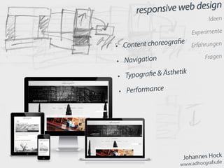
- 1. responsive web design Johannes Hock www.adhocgrafx.de responsive web design Ideen Experimente Erfahrungen Fragen • Content choreografie • Navigation • Typografie & Ästhetik • Performance
- 2. responsive web design 1961 geboren in München-Pasing Akademie der Bildenden Künste München Prof. Sir Eduardo Paolozzi Prof. Heribert Sturm about seit 1990 Kunstlehrer am Gymnasium 1996–2003 Deutsche Schule Lima / Peru
- 3. responsive web design seit 2009 > Joomla! e-learning Plattform für den Kunstunterricht www.kunstimunterricht.de seit 2013 powered by tec-promotions.de seit 2011 > responsive web design JoomSkeleton, JoomFluid und JoomFlex https://github.com/adhocgraFX
- 4. responsive web design Content choreografie
- 5. responsive web design Content choreografie content first > push & pull > css // Nathan Smith: http://unsemantic.com/ <section class=“grid-100“ > sidebar grid-33 width: 33.33333%; main grid-66 width: 66.66667%; sidebar width: 100%; main width: 100%; <!-- 2 columns: main | sidebar --> <section class="grid-100" > <section class="grid-66" id="main" role="main" > <jdoc:include type="component" /> </section> <aside class="grid-33" id="sidebar" role="complementary" > <jdoc:include type="modules" name="sidebar" style="…" /> </aside> </section>
- 6. responsive web design Content choreografie content first > push & pull > css <section class=“grid-100“ > sidebar grid-33 pull-66 width: 33.33333%; left: -66.66667%; main grid-66 push-33 width: 66.66667%; left: 33.33333%; sidebar width: 100%; main width: 100%; <!-- 2 columns: sidebar | main --> <section class="grid-100" > <section class="grid-66 push-33" id="main" role="main" > <jdoc:include type="component" /> </section> <aside class="grid-33 pull-66" id="sidebar" role="complementary" > <jdoc:include type="modules" name="sidebar" style="…" /> </aside> </section>
- 7. responsive web design Content choreografie
- 8. responsive web design main footer head row // Mobile_Detect.php // Serban Ghita: https://github.com/serbanghita/Mobile-Detect // mobile detect usage von Rene Kreijveld include_once ('js/Mobile_Detect.php'); $detect = new Mobile_Detect(); $layout = ($detect->isMobile() ? ($detect->isTablet() ? 'tablet' : 'mobile') : 'desktop'); main footer head row content first > top to bottom > php Content choreografie
- 9. responsive web design <?php if ($layout == 'mobile'):?> <?php if ($this->countModules('head_row')): ?> <section class="grid-100" role"complementary" > <jdoc:include type="modules" name="head_row" style="…" /> </section> <?php endif; ?> <?php endif; ?> main footer head_row <?php if ($layout == ‚mobile‘):?> head_row <?php if ($layout != ‚mobile‘):?> main footer head_row <?php if ($layout != ‚mobile‘):?> head_row <?php if ($layout == ‚mobile‘):?> Content choreografie
- 10. responsive web design <?php if ($layout != 'mobile'):?> <?php if ($this->countModules('slideshow')): ?> <section class="grid-100" role"complementary" > <jdoc:include type="modules" name="slideshow" /> </section> <?php endif; ?> <?php endif; ?> main SLIDESHOW <?php if ($layout != ‚mobile‘):?> main SLIDESHOW <?php if ($layout != ‚mobile‘):?> hide <> mobile version > php Content choreografie
- 11. responsive web design Content choreografie flexbox > css <nav id=“nav“ role=“navigation“ > </nav> <div class="flex-container"> <header role="banner"> <div class="search" role="search"> </div> </header> <div class="head_row"> </div> <section class="content" role="main" > </section> <aside class="primary" role="complementary" > </aside> <aside class="secondary" role="complementary" > </aside> <div class="bottom_row"> </div> <footer role="contentinfo"> </footer> </div>
- 12. responsive web design Content choreografie flexbox > css .flex-container { display: -webkit-flex; /* NEW - Chrome */ display: flex; /* NEW, Spec - Opera 12.1, Firefox 20+ */ -webkit-flex-flow: row wrap; flex-flow: row wrap; } .content { -webkit-order: 2; order: 2; } @media screen and (min-width: 50em) { .content { -webkit-order: 4; order: 4; width: 50%; } }
- 13. responsive web design Navigation JoomSkeleton & JoomFluid Jake Rocheleau: http://www.hongkiat.com/blog/ building-mobile-app-navigation-with-jquery/
- 14. responsive web design Navigation <nav id=“navmenu“> <!-- off canvas navi --> <jdoc:include type=“modules“ name=“nav“ /> </nav> <div id=“wrapper“> <!-- äußerer Hauptrahmen --> <div id=“main“> <!-- innerer Rahmen --> <!-- content --> <nav id=“nav“> <jdoc:include type=“modules“ name=“nav“ /> </nav> <!-- mobil --> <button class=“reorder“ id=“menu-btn“> <a href=“#navmenu“></a> </button>
- 15. responsive web design Navigation <div id=“wrapper“> <!-- äußerer Hauptrahmen --> <nav id=“navmenu“> <!-- off canvas navi --> <jdoc:include type=“modules“ name=“nav“ /> </nav> <div id=“main“> <!-- innerer Rahmen --> <!-- content --> <nav id=“nav“> <jdoc:include type=“modules“ name=“nav“ /> </nav> <!-- mobil --> <button class=“reorder“ id=“menu-btn“> <a href=“#navmenu“></a> </button>
- 16. responsive web design Navigation <div id=“wrapper“> <!-- äußerer Hauptrahmen --> <nav id=“navmenu“> <!-- off canvas navi --> <jdoc:include type=“modules“ name=“nav“ /> </nav> <div id=“main“> <!-- innerer Rahmen --> <!-- content --> <nav id=“nav“> <jdoc:include type=“modules“ name=“nav“ /> </nav> <!-- mobil --> <button class=“reorder“ id=“menu-btn“> <a href=“#navmenu“></a> </button>
- 17. responsive web design Navigation <div id=“wrapper“> <!-- äußerer Hauptrahmen --> <?php if ($layout == ‚mobile‘):?> <nav id=“navmenu“> <!-- off canvas navi --> <jdoc:include type=“modules“ name=“nav“ /> </nav> <?php endif; ?> <div id=“main“> <!-- innerer Rahmen --> <!-- navi + z.B. Suche, Flaggen --> <?php if ($layout != ‚mobile‘):?> <nav id=“nav“> <jdoc:include type=“modules“ name=“nav“ /> </nav> <?php endif; ?> ... <?php if ($layout == ‚mobile‘):?> <button class=“reorder“ id=“menu-btn“> <a href=“#navmenu“></a> </button> <?php endif; ?> <!-- content --> </div> </div>
- 18. responsive web design Navigation David Bushell: http://coding.smashingmagazine.com/2013/01/15/ off-canvas-navigation-for-responsive-website/ <div id=“wrapper“> <!-- äußerer Hauptrahmen --> <div id=“main“> <!-- innerer Rahmen --> <!-- content --> </div> <header id=“top“ role=“banner“ > … (buttons) … <jdoc:include type=“modules“ name=“nav“ /> <jdoc:include type=“modules“ name=“nav_module“ style=“…“ /> … </header> JoomFlex
- 19. responsive web design Navigation <div id=“wrapper“> <header id=“top“ role=“banner“ > <nav-open-btn> <nav-close-btn> <jdoc:include type=“modules“ name=“nav“ /> <jdoc:include type=“modules“ name=“nav_module“ style=“…“ /> … </header> <div id=“wrapper“> <div id=“main“> <!-- innerer Rahmen --> <!-- content --> </div> <header id=“top“ role=“banner“ > <nav-open-btn> <nav-close-btn> <jdoc:include type=“modules“ name=“nav“ /> <jdoc:include type=“modules“ name=“nav_module“ style=“…“ /> … </header> <div id=“main“> <!-- innerer Rahmen --> <!-- content --> </div>
- 20. responsive web design<div id="wrapper"> <!-- äußerer Hauptrahmen --> <header id="top" role="banner" > <!-- header --> <?php if ($layout == 'mobile'):?> <div role="navigation" > <button id="nav-open-btn" > <a href="#nav"><?php echo JText::_('TPL_JF3_NAVOPEN'); ?></a> </button> </div> <?php endif;?> <nav id="nav" role="navigation" > <div class="nav-close" > <jdoc:include type="modules" name="nav" /> <button id="nav-close-btn" > <a href="#top"><?php echo JText::_('TPL_JF3_NAVCLOSE'); ?></a> </button> </div> <?php if ($this->countModules('nav_module')): ?> <!-- module pos im nav; z.B. search --> <div class="nav-module" role="search" > <jdoc:include type="modules" name="nav_module" style="…" /> </div> <?php endif;?> </nav> </header> <div id=“main“> <!-- innerer Rahmen --> <!-- content --> </div> </div>
- 21. responsive web design Navigation <a href=“#simple-nav“>Simple Navigation</a> … … <nav id=“simple-nav“ role=“navigation“> <jdoc:include type=“modules“ name=“nav“ /> </nav> einfache navi / noscript
- 22. responsive web design Navigation Manoela Ilic http://tympanus.net/codrops/2013/08/13/ multi-level-push-menu/ Viljami Salminen http://responsive-nav.com/ Jason Weaver http://jasonweaver.name/ lab/flexiblenavigation/ weitere interessante Beispiele
- 23. responsive web design Typografie & Ästhetik https://www.rijksmuseum.nl/
- 24. responsive web design Typografie & Ästhetik Skalierung mit % und em body { font-size: 112.5%; /* 112,5% ~ 18px */ line-height: 1.5; /* nur noch bei Abweichungen verändern | Web > Print */ } h1, h2, h3, h4, h5, h6 { line-height: 1.2; /* headline < paragraph */ } @media screen and (max-width: 767px / 30em) { body { font-size: 100%; /* 100% ~ 16px */ } } @media screen and (min-width: 1280px/ 70em) { body { font-size: 125%; /* 125% ~ 20px */ } }
- 25. responsive web design Typografie & Ästhetik Typographische Tonleiter /* base font size = 112.5% ~ 18px */ h1 { font-size: 3em; } /* 54px */ h2 { font-size: 2.25em; } /* 41px */ h3 { font-size: 1.5em; } /* 27px */ h4 { font-size: 1.3125em; } /* 24px */ h5 { font-size: 1.125em; } /* 20px */ h6 { font-size: 1em; } /* 18px */ Typo Typo Typo Typo Typo Typo http://lamb.cc/typograph/ von Iain Lamb
- 26. responsive web design Typografie & Ästhetik MODULOR von LeCorbusier /* base font size = 112.5% ~ 18px */ h1 { font-size: 3.4231em; } /* 62px */ h2 { font-size: 2.6154em; } /* 47px */ h3 { font-size: 2.1154em; } /* 38px */ h4 { font-size: 1.6154em; } /* 29px */ h5 { font-size: 1.3077em; } /* 24px */ h6 { font-size: 1em; } /* 18px */ Typo Typo Typo Typo Typo Typo
- 27. responsive web design Typografie & Ästhetik Skalierung für mobile Ansicht /* bei body = 100% ~ 16px */ /* sehr flache Schrift-Skalierung - für mobile Ansicht */ @media screen and (max-width: 767px) { h1 { font-size: 2em; } /* 32px */ h2 { font-size: 1.6666em; } /* 28px */ h3 { font-size: 1.5em; } /* 24px */ h4 { font-size: 1.3333em; } /* 21px */ h5 { font-size: 1.1667em; } /* 19px */ h6 { font-size: 1em; } /* 16px */ } Typo Typo Typo Typo Typo Typo
- 28. responsive web design article { p { // margin-bottom: @paragraph-val; & + p { // Erstzeileneinzug text-indent: @indent-val; margin-top: -@paragraph-val; // text-align: justify; } &.bild + p, &.lead + p, &.bildlegende + p, &.img_caption + p, &.autor + p { text-indent: 0 !important; } } }
- 29. responsive web design Typografie & Ästhetik http://opendyslexic.org/ siehe auch: Matilda von Ann Bessemans Joomla! Testing Thanks for helping us to test Joomla! We're getting ready for the release of Joomla 3.0 and we appreciate you helping us find and fix problems as we work. If you haven't done testing before here are some tips. • Don't delete the installation folder when you finish in- stalling! While we're working we turn … Joomla! Testing Thanks for helping us to test Joomla! We're getting ready for the release of Joomla 3.0 and we appreciate you helping us find and fix problems as we work. If you haven't done testing before here are some tips. • Don't delete the installation folder when you finish installing! While we're working we turn …
- 30. responsive web design Typografie & Ästhetik Joomla! Testing Thanks for helping us to test Joomla! We're getting ready for the release of Joomla 3.0 and we appreciate you helping us find and fix problems as we work. If you haven't done testing before here are some tips. • Don't delete the installation folder when you fin- ish installing! While we're working we turn … Joomla! Testing Thanks for helping us to test Joomla! We're getting ready for the release of Joomla 3.0 and we appreciate you helping us find and fix problems as we work. If you haven't done testing before here are some tips. • Don't delete the installation folder when you fin- ish installing! While we're working we turn … Alegreya (serif) Andada (slab) Bitter (slab) Droid Sans Droid Serif Gentium (serif) Yanone Kaffeesatz (sans) Lato (sans) Open Sans Condensed Open Sans PT Sans Narrow PT Sans PT Serif Source Code Pro (slab mono) Source Sans Pro Ubuntu Condensed (sans) Ubuntu (sans) Vollkorn (serif)
- 31. responsive web design Performance Mobile_Detect.php Idee von Rene Kreijveld + js > template.js.php Idee von Alexander Schmidt / blank template <?php if ($layout == 'desktop'):?> <script type="text/javascript" src="<?php echo $tpath.'/js/template.desktop.js.php'; ?>"></script> <?php endif; ?> … <?php if ($layout != ‚desktop‘):?> <script type="text/javascript" src="<?php echo $tpath.'/js/template.mobile.js.php'; ?>"></script> <?php endif; ?> Bilddateien Adaptive Images by Matt Willcox Doc: http://adaptive-images.com Github: https://github.com/MattWilcox/Adaptive-Images Responsive Img jQuery Plugin by Drew Thomas Doc: http://responsiveimg.com Github: https://github.com/drewbrolik/Responsive-Img ???…
- 32. responsive web design Credits David Bushell Achim Fischer JUG Fulda Dave Gamache Dirk Jesse Rene Kreijveld Philip Locke JUG Nürnberg Angie Radtke Viljami Salminen Alexander Schmidt Roberto Segura Nathan Smith Stefan Wendhausen … und viele mehr … herzlichen Dank für Hilfe Tips Tricks …