SlideShare une entreprise Scribd logo
1  sur  31
In what ways does your media product
 use, develop or challenge forms and
 conventions of real media products?

                             By Natasha
                              Stapleton
Large masthead that
                                      Front Cover
 stretches across the top
 of the page. The font is                             The sell lines are on the
 unique and the colours                               side of the page which is
  make it stand out. The                              normally the place to put
     font looks like it’s                                 them in real music
dripping, leaving it looking                            magazines. They are
  original and rebellious.                            short and only take up a
                                                       bit of the room but they
                                                        still stand out with the
The main image is complete band                                  stroke.
taking up the majority of the front
 cover, all with eye contact giving                   The main sell line stretches
  direct address to the audience.                   across the front cover as well
  The lead singer is standing on                    but in the centre. It stands out
   something to make him seem                        with the black font and white
 taller, therefore more dominant.                   stroke and it has the effect of
They all have serious expressions                   cuts through the font, giving it
     which is normal for a rock                      that extra bit of attitude. The
  magazine as it shows attitude.                          sell line underneath
                                                     describes what the article is
                                                     about which is similar to real
 The flasher doesn’t take up too                               magazines.
    much room on the cover                              The barcode, issue
 however it makes it look more                        number, date and price
   interesting and the colours                      are all at the bottom of the
  match the rest of the colour                        page, showing that they
             scheme.                                are important but not that
                                                      important that they take
                                                      up a lot of space on the
   The footer of the magazine                                     page.
   includes bands that are all
     shown in the contents
  page, they are all of different
   genres of rock, attracting a
    wider range in audience.
FRONT COVER; SIMILARITIES

           Large masthead
          spread across the
           top of the page


            Image of a five
           piece band. One
             member looks
             slightly more
          dominant than the
         others (the vocalist)


         Barcodes both in
         bottom right hand
         corner along with
         date and price etc
FRONT COVER; DIFFERENCES
           The sell lines on my
         cover are at the top and
          are more noticeable, I
            did this because I
         wanted my magazine to
          look more interesting.
         The sell lines on the AP
         cover are in the header
         and at the bottom of the
           cover in small writing

                My main sell line is
               spread out across the
                page and therefore
             stands out a lot more. I
           did this because I wanted
              the band’s name to be
           seen and to be clear from
          afar. The AP cover’s main
           sell line isn’t in large font
             and is just in the bottom
              left hand corner of the
             page, perhaps to make
                the image the main
                      attraction
          My footer is different to AP’s
         header as it just names bands
            inside that week this is so I
         could fit more bands onto the
          front cover and make it more
         attractive to a wider audience.
           AP’s contains information in
             more detail about what is
                 inside the magazine
Contents Page
The image at the top of the
  page is very unique. I’ve
made it look like an advert                          The masthead from my
 for an album but it is also                       front cover is used again
  related to my magazine                             as it is the magazine’s
   because this album is                              trademark. Instead of
  being reviewed. Both of                           ‘contents’ I’ve used ‘this
   the girl’s eye lines are                           week’ to make it a bit
   direct address and the                                 more original.
  image is extremely eye-
          catching.


                                               I have used headings for my
                                                  list of pages to show the
I have kept the same                                regular sections of my
  sell lines from the                          magazine. I also haven’t put
cover and added in a                           a lot of detail in my contents
few more bands and                               page and just written band
artists. I have used a                           names, this is because as
  variety of different                           soon as someone see’s a
   genres of rock to                           band they like they’ll want to
                                                 buy the magazine to read
    attract a wider
                                                           the article.
       audience.
Contents Page;
Similarities
        There is an image at
         the top of the page
           that looks like a
               banner.


          The masthead and
          the ‘This Week’ is
           further down the
          page, around half
                 way
         There are images of
         the bands inside the
         magazine to appeal
           to the audience


          There are headings
              to cut up the
           different pages. If
          you like a particular
           section then you
            can find it easily
Contents Page; Differences
       The word ‘Contents’ is at the
       top of the Kerrang! Contents
         page, however I decided I
          didn’t want to put both
        ‘Contents’ and ‘This Week’
            as I believed it was
           unnecessary. This is
        because I thought it took up
       too much room and I wanted
         more room to put as much
           information about my
           magazine on there as
                  possible.
        There is an introduction
         from the editor on the
      Kerrang! Magazine which
       is something I also didn’t
          think was necessary
        because I could use the
      space for more sections of
              the magazine.

        The list of articles in Kerrang!
          Is more cramped and filled
             with images and some
           articles names have more
               detail. There is also
        subscription information. I felt
           like I wanted my contents
           page to have more space
         and I wanted it to be easy to
        read. I didn’t want it to be too
         packed with information as I
          still wanted it to be clear to
                       read.
I wanted my heading
                                                                                                for my double page
                                                                                                     spread to be
                                  Double Page Spread                                               extremely eye-
                                                                                                   catching. Most
                                                                                                headings in double
                                                                                              page spreads take up
                                                                                                a lot of the room on
I wanted to use the idea                                                                      the page and I wanted
   of a collage because                                                                           to do this but still
    the article is about a                                                                       leave room for my
   ‘journey to fame’ so I                                                                        article. Having ‘We
  wanted to put across                                                                          are the Loveless’ as
 that these images were                                                                           the heading puts
 taken at different times                                                                      across that this band
                                                                                                   are strong and
         of the year.
                                                                                                  united, therefore
                                                                                               attracting rock music
                                                                                                         fans.

                                                                                                    I wanted a pull
                                                                                                 quote to break up
                                                                                               the article and make
    A lot of rock                                                                                it look less like an
  magazines have                                                                               essay and more like
  images of bands                                                                               an article. I wanted
   playing live so                                                                                to make sure the
therefore I put some                                                                               reader was still
 images of them on                                                                                 engaged in the
       stage.                                                                                       magazine so I
                                                                                                chose a pull quote
                                                                                                that would interest
                                                                                                     the audience.
                             I have put a date, the magazine name and page number on the
                                bottom of the page to make it look more professional as all
                             magazines have this feature on every page so that the audience
                                                 can identify the magazine.
Double Page Spread;
  Similarities
           Collage; Different images from different
                            times


                                  Pull quote          Drop caps

Captions
Double Page Spread; Differences
               The images on my magazine are all set out neatly, all fitting well
            however on the Kerrang! Magazine they overlap each other and there
            is a dominating image at the top. I wanted to make sure I had a lot of
            space at the top of one page for my heading so it would stand out on
                                          the page.


                                                                   The article isn’t broken up with
                                                                   pull quotes in the middle of the
                                                                       text as the pull quote is
 Layout is different. On one page is the article and the           overlapping the images. I didn’t
    other are the pictures however on the Kerrang!                 want my pull quotes to overlap
Magazine the article is spread over onto the first page
                                                                    my photos because I want to
aswell as on the second. I wanted mine to be seperate
                                                                    ensure that you could see the
            so that they were clearer to see.
                                                                                photos.
HARD ROCK, ALTERNATIVE ROCK
                  Originally, the term ‘rocker’ was used for bikers predominantly men who were
                      normally seen wearing leather jackets with studs who listen to rock ‘n’ roll
                  music. The stereotype has developed dramatically over the years into several
                                                                                    subgenres.
A Stereotypical ‘Hard Rocker’                        A Stereotypical ‘Alternative Rocker/
Gender: Predominantly male.                          Scene’
Clothing: Leather Jackets, black clothing, leather   Gender: Both male and female.
trousers, denim jackets with patches and             Clothing: Converse, piercings, tattoos, multi
pins, combat boots, studded jewellery, long          coloured hair, skinny jeans, coloured jeans, eye
hair, tattoos, piercings.                            liner, ear stretchers, doc martens,
Activities: Creating music, consuming                Activities: Anything music based, skating.
alcohol, taking drugs.
IMAGES, COLOURS, GENDER
                    The main image relates to the particular
                    social group I have chosen because they are
                    all wearing leather. One band member has a
                    bandana and is wearing leather trousers and
                    the others are wearing band t-shirts apart
                    from one who is wearing a t-shirt with an
                    alcoholic drink on it. All of the men on the
                    cover have a serious expression, connoting
                    attitude and rebellion.

                    The colours are mostly dark, the black is
                    there within the image but also in the text and
                    the masthead to stand out. The colour purple
                    I have used is a dark shade which matches
                    the colour of the bandana. This colour
                    scheme looks dramatic and almost gothic,
                    attracting people interested in rock music and
                    fashion.
                    There are only men on the front cover
                    however advertised in the sell line are the
                    ‘Rocker Sisters’ confirming that there are
                    females inside, therefore attracting both
IPC MEDIA
IPC Media is a magazine and digital publisher from the
   UK that sells over 350 million copies of their
   magazine’s a year. They publish many different
   genres of magazines;
   womens, music, homes, soaps, sports and
   business.


I would get IPC Media to distribute my music
    magazine. This is because the magazine that my
    magazine is similar to (Kerrang!) is distributed by
    another publisher (Bauer). The only other music
    magazine that IPC Media distributes is NME which
    is a different genre to my music magazine.
    Therefore, my music magazine would be
    distributed widely, increasing the chance of beating
    the rival magazines (Kerrang!, Q).


My magazine would be distributed in
   shops, supermarkets, festivals, gigs and specific
   music shops like HMV.
TAZMIN PYE
Age: 17

Occupation: Student

Favourite Colour: Red

Interests: Music, Film, Writing.

Favourite Bands: Metallica, The
Strokes, Paramore, Arctic
Monkeys, Slipknot, Guns N’
Roses, Pink Floyd, Green Day,
The Beatles, The Ramones.

Wears a lot of dark colours,
band t-shirts, skinny jeans,
shorts. Likes to cut up her t-
shirts and experiment with her
hair colours.
CHRIS DOCKER
Age: 17

Occupation: Student
Works part-time at a
butchers

Favourite Colour:

Interests: Music, Writing

Favourite Bands: Fall Out
Boy, The Kooks, Jimmy Eat
World, Kings of Leon

Wears a lot of skinny
jeans, band t-
shirts, checked shirts. Has
long hair.
I attracted my target audience by using dark colours like black and purple. I
used these colours as they would be appropriate for both genders and the
clothing that the stereotypical ‘rocker’ would wear is dark, mostly black.
Purple (dark purple not light) isn’t really seen as a specific gender’s type of
colour and I chose to use this because of the colour of the band member’s
bandana.
The band are dressed in leather and dark clothing which is the hard rock style
and therefore would attract someone who likes that particular music. They are
wearing band t-shirts showing that they are also passionate music fans
relating to the reader. Every member has a serious expression on their face
looking almost intimidating and one of the members have no shirt on
underneath their leather jacket, conveying the attitude and rebellious
behaviour of rock stars, again attracting the target audience.
Using the word ‘ROCK’ on the cover in big bold capital letters with a drop
shadow would attract a reader because straight away they would know what
genre of music this magazine includes and in the footer there are 3 bands who
are different styles of rock, creating a wider range of readers who like different
types of rock.
A hobby of the stereotypical ‘rocker’ is to listen to new music so therefore the
use of the flasher claiming that this band was ‘voted best new band of 2012’
would appeal to the reader and make them want to buy the magazine and read
about them.
I also chose to advertise ‘Early Bird Tickets for Festivals’ with would attract
the reader because another hobby of the ‘rocker’ is to go to gigs and festivals. I
also advertised another band and their debut album called ‘the Rocker Sisters’
stating that this magazine isn’t just for males as it has female bands included
as well.
My contents page also has dark colours but it is a lot brighter than the
front cover. The masthead is exactly the same as on the front cover
because I wanted it to become the logo of the magazine so when it is
written anywhere it would be in that font, colour and style. I also
added another colour into the colour scheme here; gray. I wanted to use
this colour because it’s not another primary or secondary colour so the
colours wouldn’t clash so it’s a safe coloured background to place
images on.
The images I have used in my contents page show that the magazine
isn’t just for males but it isn’t girly because the girls still have a straight
face and attitude. The other girl (the solo artist) is smiling however she
is wearing a leather jacket, showing the style of rock again. The image
of the band featured on the cover is at a different angle and shows the
band looking dominant and strong, which would attract a rock music
fan as they like bands that are fierce and have attitude.
For the actual list of the contents I haven’t added any detail to the list
and only written the names of the band included as I believe that any
rock music fan only cares about the music and the band and doesn’t
need to see gossip like ‘Look who he is dating’ and just seeing the
band’s name that they like would make them want to buy the magazine
and read the article. I have used the names of different bands from
different subgenres within the genre of rock to attract a wider range of
readers of all ages (for example a Metallica fan would usually be older
than a Paramore or You Me at Six fan.
I attracted my audience by using images from
gigs. This would appeal to an audience of rock
music fans because they are usually very
passionate about gigs and an image would
make them want to go to one if the band looks
good live. The other images have fairly normal
backgrounds (of greenery) showing that they are
just men really and that anyone from anywhere
could be part of a band. The captions used are
catchy and short. Using the terms ‘rock’n’ roll’ and
‘rockin’’ again show the reader what kind of
magazine it is and who it attracts. ‘Best mates to
band mates’ show that they are friends as well as
band mates, attracting the audience as they would
know that there is little chance of the band
breaking up. The colours in the live pictures are
dark and connote a certain mood and
attitude, showing the dark element to rock gigs.
The colours of the article page are a different colour
scheme to the front cover and the contents page
however still has gray, black and white, still
showing it’s a rock magazine with attitude. Using
the colour red makes the name stand out and be
seen from afar and that is the intention of the
magazine; to promote this band. The use of the
colour red in the pull quote stands out next to the
white writing and would draw the readers
attention and give them a brief outline to what this
article is about, making them want to read it.
AUDIENCE FEEDBACK
                              Overall Rating of
                     6
                                 Magazine
                     4

                     2

                     0
                         Excellent   Very Good    Good

                    Best Things about my Magazine:
                    Colour Scheme
                    Double Page Spread
                    Images

                    Things needing improvements
                    within my Magazine:
                    Contents Page
                    Less Clutter
I used Photoshop to
     manipulate my                        I used InDesign
     images before putting                to create my
     them onto my                         contents page
     magazine. I also used                and double
     this program to                      page spread.
     create my whole front
     cover.


                             I used a digital
                             camera to
                             capture my
                             images.


I used Kerrang.com
to research into
magazine covers.
Front Cover


Using Photoshop:
I have changed the levels on this main image to make it look darker and more ‘rock’ like. This
makes the bands faces and therefore their facial expressions stand out a lot more as the rest of
the image is darkened. I also used Photoshop to add text onto my front cover. I added a
dafont.com font and edited it on Photoshop by taking away the white background, adding a
drop shadow and changing the colour to purple to match the colour scheme. I also added a
flasher by adding a shape onto the page and changing the colour.
Contents Page


Using InDesign:
I edited the images in
Photoshop by deleting the
background and feather
around the girl’s heads
however I used InDesign to
desgin the layout of my
contents page. I also added
a shadow around all the
images to make them look
blended in more. I also
used InDesign to add
columns for my list of
pages, I used boxes to
place my photographs into
InDesign and used also
used text.
Front Cover
                                                                           Use of
                                                                           drop
                                                                           shadow
                                                                           on font


                                                                           Use of
                                                                           levels to
                                                                           make it
                                                                           more like
                                                                           a specific
                                                                           genre


                                                                           Adding a
                                                                           footer to
                                                                           make it
                                                                           look more
                                                                           like a real
                                                                           magazine
 I learned how to manipulate font from dafont.com on Photoshop to
 create a certain style relating to the type of magazine. I also learned
how to manipulate my images a lot better in my main task for example
changing the levels of an image to create a mood relating to the genre.
Contents Page


                                                                             Using more
                                                                             professional
                                                                             font


                                                                             Adding a
                                                                             shadow
                                                                             around the
                                                                             edges of the
                                                                             images to
                                                                             make them
                                                                             look darker
                                                                             and more
                                                                             rock related


                                                                                 Adding a
                                                                                 black shape
                                                                                 at the
                                                                                 bottom to
                                                                                 show the
   I have learned how to edit a picture by taking out the background on          list section
Photoshop. I also learnt how to feather round somebody’s face in an image to
make it look more natural and less obviously edited. I’ve also used fonts from
     InDesign and colours to make it look more sophisticated and more
                                professional.
Double Page Spread


   I have learnt how to add images from Photoshop onto InDesign. I have
 learned to edit font in Photoshop and added a stroke. I have learnt how to
 add columns in the article on InDesign and also how to add drops caps and
change the colour. I also learnt how to add shapes for my backgrounds of my
                                   captions.

Contenu connexe

Tendances

Evaluation Question 1
Evaluation Question 1Evaluation Question 1
Evaluation Question 1
asmediaf12
 
Front cover, contents page & double page spread
Front cover, contents page & double page spreadFront cover, contents page & double page spread
Front cover, contents page & double page spread
ChloeDrury
 
Evaluation for contents and front cover page
Evaluation for contents and front cover pageEvaluation for contents and front cover page
Evaluation for contents and front cover page
Pariswood
 
Analysing Contents Pages
Analysing Contents PagesAnalysing Contents Pages
Analysing Contents Pages
asmediag12
 
Evaluation 1- In what ways does your media product use, develop or challenge ...
Evaluation 1- In what ways does your media product use, develop or challenge ...Evaluation 1- In what ways does your media product use, develop or challenge ...
Evaluation 1- In what ways does your media product use, develop or challenge ...
Daisy Birchall
 
NME front cover analysis
NME front cover analysisNME front cover analysis
NME front cover analysis
LaraMedia
 
Technologies from the process of constructing the product
Technologies from the process of constructing the productTechnologies from the process of constructing the product
Technologies from the process of constructing the product
lilyfaulkner
 
Contentspage pres...11111
Contentspage pres...11111Contentspage pres...11111
Contentspage pres...11111
chiquitahx
 
Technologies from the process of constructing the product
Technologies from the process of constructing the productTechnologies from the process of constructing the product
Technologies from the process of constructing the product
lilyfaulkner
 
Contents page analysis
Contents page analysisContents page analysis
Contents page analysis
shaniajay
 

Tendances (19)

Evaluation Question 1
Evaluation Question 1Evaluation Question 1
Evaluation Question 1
 
Media as fdhdfhdf
Media as fdhdfhdfMedia as fdhdfhdf
Media as fdhdfhdf
 
Evaluation
EvaluationEvaluation
Evaluation
 
Front cover, contents page & double page spread
Front cover, contents page & double page spreadFront cover, contents page & double page spread
Front cover, contents page & double page spread
 
My contents page analyss
My contents page analyssMy contents page analyss
My contents page analyss
 
Analysing contents pages prep for blog ppt
Analysing  contents pages prep for blog pptAnalysing  contents pages prep for blog ppt
Analysing contents pages prep for blog ppt
 
Creating my cover page
Creating my cover pageCreating my cover page
Creating my cover page
 
Evaluation for contents and front cover page
Evaluation for contents and front cover pageEvaluation for contents and front cover page
Evaluation for contents and front cover page
 
My contents page analyss
My contents page analyssMy contents page analyss
My contents page analyss
 
Analysing Contents Pages
Analysing Contents PagesAnalysing Contents Pages
Analysing Contents Pages
 
Creating my cover page
Creating my cover pageCreating my cover page
Creating my cover page
 
Evaluation 1- In what ways does your media product use, develop or challenge ...
Evaluation 1- In what ways does your media product use, develop or challenge ...Evaluation 1- In what ways does your media product use, develop or challenge ...
Evaluation 1- In what ways does your media product use, develop or challenge ...
 
NME front cover analysis
NME front cover analysisNME front cover analysis
NME front cover analysis
 
Question 7
Question 7Question 7
Question 7
 
Technologies from the process of constructing the product
Technologies from the process of constructing the productTechnologies from the process of constructing the product
Technologies from the process of constructing the product
 
Analysis of examples
Analysis of examplesAnalysis of examples
Analysis of examples
 
Contentspage pres...11111
Contentspage pres...11111Contentspage pres...11111
Contentspage pres...11111
 
Technologies from the process of constructing the product
Technologies from the process of constructing the productTechnologies from the process of constructing the product
Technologies from the process of constructing the product
 
Contents page analysis
Contents page analysisContents page analysis
Contents page analysis
 

En vedette (7)

Curso de comunicación
Curso de comunicaciónCurso de comunicación
Curso de comunicación
 
Capacitacion supervisores 10.13 (1)
Capacitacion supervisores 10.13 (1)Capacitacion supervisores 10.13 (1)
Capacitacion supervisores 10.13 (1)
 
sldo amagua hector
sldo amagua hectorsldo amagua hector
sldo amagua hector
 
Plan estratégico para mejorar el desempeño docente en
Plan estratégico para mejorar el desempeño docente enPlan estratégico para mejorar el desempeño docente en
Plan estratégico para mejorar el desempeño docente en
 
PROBLEMAS DE COMUNICACION EN EL AMBITO SOCIOLABORAL
PROBLEMAS DE COMUNICACION EN EL AMBITO SOCIOLABORALPROBLEMAS DE COMUNICACION EN EL AMBITO SOCIOLABORAL
PROBLEMAS DE COMUNICACION EN EL AMBITO SOCIOLABORAL
 
GRUPO 1 UNY Proyecto Estrategias Gerenciales para la Optimización del Desempe...
GRUPO 1 UNY Proyecto Estrategias Gerenciales para la Optimización del Desempe...GRUPO 1 UNY Proyecto Estrategias Gerenciales para la Optimización del Desempe...
GRUPO 1 UNY Proyecto Estrategias Gerenciales para la Optimización del Desempe...
 
Las relaciones interpersonales
Las relaciones interpersonalesLas relaciones interpersonales
Las relaciones interpersonales
 

Similaire à Evaluation

Analysis of nme
Analysis of nmeAnalysis of nme
Analysis of nme
asmediaf12
 
Analysis of nme
Analysis of nmeAnalysis of nme
Analysis of nme
asmediaf12
 
Analysis of nme
Analysis of nmeAnalysis of nme
Analysis of nme
asmediaf12
 
Analysis of Front covers, contents pages and double page spreads.
Analysis of Front covers, contents pages and double page spreads.Analysis of Front covers, contents pages and double page spreads.
Analysis of Front covers, contents pages and double page spreads.
lozfenwick9
 
Research and designs for my mag
Research and designs for my magResearch and designs for my mag
Research and designs for my mag
rhaines07
 
Contents Page Analysis
Contents Page AnalysisContents Page Analysis
Contents Page Analysis
Charis Creber
 
Analysingmusicmagazines 120219122142-phpapp02
Analysingmusicmagazines 120219122142-phpapp02Analysingmusicmagazines 120219122142-phpapp02
Analysingmusicmagazines 120219122142-phpapp02
karamediastudies
 
Media evaluation question 1
Media evaluation question 1Media evaluation question 1
Media evaluation question 1
floam123
 
Analysingmusicmagazines 120219122142-phpapp02
Analysingmusicmagazines 120219122142-phpapp02Analysingmusicmagazines 120219122142-phpapp02
Analysingmusicmagazines 120219122142-phpapp02
karamediastudies
 
Magazine analysis3 totp
Magazine analysis3 totpMagazine analysis3 totp
Magazine analysis3 totp
ramondeholmes
 
Question seven1
Question seven1Question seven1
Question seven1
Aaliyah195
 

Similaire à Evaluation (20)

Evaluation rock mag
Evaluation   rock magEvaluation   rock mag
Evaluation rock mag
 
Analysis of nme
Analysis of nmeAnalysis of nme
Analysis of nme
 
Analysis of nme
Analysis of nmeAnalysis of nme
Analysis of nme
 
Analysis of nme
Analysis of nmeAnalysis of nme
Analysis of nme
 
Task 2
Task 2Task 2
Task 2
 
Analysis of Front covers, contents pages and double page spreads.
Analysis of Front covers, contents pages and double page spreads.Analysis of Front covers, contents pages and double page spreads.
Analysis of Front covers, contents pages and double page spreads.
 
Research and designs for my mag
Research and designs for my magResearch and designs for my mag
Research and designs for my mag
 
Contents Page Analysis
Contents Page AnalysisContents Page Analysis
Contents Page Analysis
 
Nme magazine powerpoint
Nme magazine powerpointNme magazine powerpoint
Nme magazine powerpoint
 
Analysingmusicmagazines 120219122142-phpapp02
Analysingmusicmagazines 120219122142-phpapp02Analysingmusicmagazines 120219122142-phpapp02
Analysingmusicmagazines 120219122142-phpapp02
 
Media evaluation question 1
Media evaluation question 1Media evaluation question 1
Media evaluation question 1
 
Analysing music magazines
Analysing music magazinesAnalysing music magazines
Analysing music magazines
 
Analysingmusicmagazines 120219122142-phpapp02
Analysingmusicmagazines 120219122142-phpapp02Analysingmusicmagazines 120219122142-phpapp02
Analysingmusicmagazines 120219122142-phpapp02
 
Evaluation
EvaluationEvaluation
Evaluation
 
Evaluation 1
Evaluation 1Evaluation 1
Evaluation 1
 
Magazine analysis3 totp
Magazine analysis3 totpMagazine analysis3 totp
Magazine analysis3 totp
 
Evaluation
EvaluationEvaluation
Evaluation
 
Evaluation
EvaluationEvaluation
Evaluation
 
Evaluation
EvaluationEvaluation
Evaluation
 
Question seven1
Question seven1Question seven1
Question seven1
 

Plus de ahsatanstapes

Plus de ahsatanstapes (8)

Task 10 formal proposal
Task 10   formal proposalTask 10   formal proposal
Task 10 formal proposal
 
Task 9 research 4 people
Task 9   research 4 peopleTask 9   research 4 people
Task 9 research 4 people
 
Questionnaire Results
Questionnaire ResultsQuestionnaire Results
Questionnaire Results
 
Questionnaire
QuestionnaireQuestionnaire
Questionnaire
 
Target Audiences in NME and Kerrang!
Target Audiences in NME and Kerrang!Target Audiences in NME and Kerrang!
Target Audiences in NME and Kerrang!
 
List of Rock Bands
List of Rock BandsList of Rock Bands
List of Rock Bands
 
Analyzing Contents Pages
Analyzing Contents PagesAnalyzing Contents Pages
Analyzing Contents Pages
 
Analysing Magazine Covers
Analysing Magazine CoversAnalysing Magazine Covers
Analysing Magazine Covers
 

Dernier

Navsari Escorts Service ☎️ 6378878445 ( Sakshi Sinha ) High Profile Call Girl...
Navsari Escorts Service ☎️ 6378878445 ( Sakshi Sinha ) High Profile Call Girl...Navsari Escorts Service ☎️ 6378878445 ( Sakshi Sinha ) High Profile Call Girl...
Navsari Escorts Service ☎️ 6378878445 ( Sakshi Sinha ) High Profile Call Girl...
mriyagarg453
 
Call Girls Bellandur ☎ 7737669865☎ Book Your One night Stand (Bangalore)
Call Girls Bellandur ☎ 7737669865☎ Book Your One night Stand (Bangalore)Call Girls Bellandur ☎ 7737669865☎ Book Your One night Stand (Bangalore)
Call Girls Bellandur ☎ 7737669865☎ Book Your One night Stand (Bangalore)
amitlee9823
 

Dernier (20)

❤Personal Whatsapp Number Keylong Call Girls 8617697112 💦✅.
❤Personal Whatsapp Number Keylong Call Girls 8617697112 💦✅.❤Personal Whatsapp Number Keylong Call Girls 8617697112 💦✅.
❤Personal Whatsapp Number Keylong Call Girls 8617697112 💦✅.
 
VIP Model Call Girls Koregaon Park ( Pune ) Call ON 8005736733 Starting From ...
VIP Model Call Girls Koregaon Park ( Pune ) Call ON 8005736733 Starting From ...VIP Model Call Girls Koregaon Park ( Pune ) Call ON 8005736733 Starting From ...
VIP Model Call Girls Koregaon Park ( Pune ) Call ON 8005736733 Starting From ...
 
Verified Trusted Call Girls Tambaram Chennai ✔✔7427069034 Independent Chenna...
Verified Trusted Call Girls Tambaram Chennai ✔✔7427069034  Independent Chenna...Verified Trusted Call Girls Tambaram Chennai ✔✔7427069034  Independent Chenna...
Verified Trusted Call Girls Tambaram Chennai ✔✔7427069034 Independent Chenna...
 
Top Rated Kolkata Call Girls Khardah ⟟ 6297143586 ⟟ Call Me For Genuine Sex S...
Top Rated Kolkata Call Girls Khardah ⟟ 6297143586 ⟟ Call Me For Genuine Sex S...Top Rated Kolkata Call Girls Khardah ⟟ 6297143586 ⟟ Call Me For Genuine Sex S...
Top Rated Kolkata Call Girls Khardah ⟟ 6297143586 ⟟ Call Me For Genuine Sex S...
 
Hotel And Home Service Available Kolkata Call Girls Sonagachi ✔ 6297143586 ✔C...
Hotel And Home Service Available Kolkata Call Girls Sonagachi ✔ 6297143586 ✔C...Hotel And Home Service Available Kolkata Call Girls Sonagachi ✔ 6297143586 ✔C...
Hotel And Home Service Available Kolkata Call Girls Sonagachi ✔ 6297143586 ✔C...
 
College Call Girls Pune 8617697112 Short 1500 Night 6000 Best call girls Service
College Call Girls Pune 8617697112 Short 1500 Night 6000 Best call girls ServiceCollege Call Girls Pune 8617697112 Short 1500 Night 6000 Best call girls Service
College Call Girls Pune 8617697112 Short 1500 Night 6000 Best call girls Service
 
Jodhpur Park ( Call Girls ) Kolkata ✔ 6297143586 ✔ Hot Model With Sexy Bhabi ...
Jodhpur Park ( Call Girls ) Kolkata ✔ 6297143586 ✔ Hot Model With Sexy Bhabi ...Jodhpur Park ( Call Girls ) Kolkata ✔ 6297143586 ✔ Hot Model With Sexy Bhabi ...
Jodhpur Park ( Call Girls ) Kolkata ✔ 6297143586 ✔ Hot Model With Sexy Bhabi ...
 
Model Call Girls In Ariyalur WhatsApp Booking 7427069034 call girl service 24...
Model Call Girls In Ariyalur WhatsApp Booking 7427069034 call girl service 24...Model Call Girls In Ariyalur WhatsApp Booking 7427069034 call girl service 24...
Model Call Girls In Ariyalur WhatsApp Booking 7427069034 call girl service 24...
 
Dum Dum ( Call Girls ) Kolkata ✔ 6297143586 ✔ Hot Model With Sexy Bhabi Ready...
Dum Dum ( Call Girls ) Kolkata ✔ 6297143586 ✔ Hot Model With Sexy Bhabi Ready...Dum Dum ( Call Girls ) Kolkata ✔ 6297143586 ✔ Hot Model With Sexy Bhabi Ready...
Dum Dum ( Call Girls ) Kolkata ✔ 6297143586 ✔ Hot Model With Sexy Bhabi Ready...
 
Hotel And Home Service Available Kolkata Call Girls Howrah ✔ 6297143586 ✔Call...
Hotel And Home Service Available Kolkata Call Girls Howrah ✔ 6297143586 ✔Call...Hotel And Home Service Available Kolkata Call Girls Howrah ✔ 6297143586 ✔Call...
Hotel And Home Service Available Kolkata Call Girls Howrah ✔ 6297143586 ✔Call...
 
𓀤Call On 6297143586 𓀤 Sonagachi Call Girls In All Kolkata 24/7 Provide Call W...
𓀤Call On 6297143586 𓀤 Sonagachi Call Girls In All Kolkata 24/7 Provide Call W...𓀤Call On 6297143586 𓀤 Sonagachi Call Girls In All Kolkata 24/7 Provide Call W...
𓀤Call On 6297143586 𓀤 Sonagachi Call Girls In All Kolkata 24/7 Provide Call W...
 
Navsari Escorts Service ☎️ 6378878445 ( Sakshi Sinha ) High Profile Call Girl...
Navsari Escorts Service ☎️ 6378878445 ( Sakshi Sinha ) High Profile Call Girl...Navsari Escorts Service ☎️ 6378878445 ( Sakshi Sinha ) High Profile Call Girl...
Navsari Escorts Service ☎️ 6378878445 ( Sakshi Sinha ) High Profile Call Girl...
 
Top Rated Pune Call Girls Pimpri Chinchwad ⟟ 6297143586 ⟟ Call Me For Genuin...
Top Rated  Pune Call Girls Pimpri Chinchwad ⟟ 6297143586 ⟟ Call Me For Genuin...Top Rated  Pune Call Girls Pimpri Chinchwad ⟟ 6297143586 ⟟ Call Me For Genuin...
Top Rated Pune Call Girls Pimpri Chinchwad ⟟ 6297143586 ⟟ Call Me For Genuin...
 
Call Girls Bellandur ☎ 7737669865☎ Book Your One night Stand (Bangalore)
Call Girls Bellandur ☎ 7737669865☎ Book Your One night Stand (Bangalore)Call Girls Bellandur ☎ 7737669865☎ Book Your One night Stand (Bangalore)
Call Girls Bellandur ☎ 7737669865☎ Book Your One night Stand (Bangalore)
 
VIP Model Call Girls Vijayawada ( Pune ) Call ON 8005736733 Starting From 5K ...
VIP Model Call Girls Vijayawada ( Pune ) Call ON 8005736733 Starting From 5K ...VIP Model Call Girls Vijayawada ( Pune ) Call ON 8005736733 Starting From 5K ...
VIP Model Call Girls Vijayawada ( Pune ) Call ON 8005736733 Starting From 5K ...
 
Hotel And Home Service Available Kolkata Call Girls South End Park ✔ 62971435...
Hotel And Home Service Available Kolkata Call Girls South End Park ✔ 62971435...Hotel And Home Service Available Kolkata Call Girls South End Park ✔ 62971435...
Hotel And Home Service Available Kolkata Call Girls South End Park ✔ 62971435...
 
Kanpur call girls 📞 8617697112 At Low Cost Cash Payment Booking
Kanpur call girls 📞 8617697112 At Low Cost Cash Payment BookingKanpur call girls 📞 8617697112 At Low Cost Cash Payment Booking
Kanpur call girls 📞 8617697112 At Low Cost Cash Payment Booking
 
📞 Contact Number 8617697112 VIP East Sikkim Call Girls
📞 Contact Number 8617697112 VIP East Sikkim Call Girls📞 Contact Number 8617697112 VIP East Sikkim Call Girls
📞 Contact Number 8617697112 VIP East Sikkim Call Girls
 
VIP Model Call Girls Budhwar Peth ( Pune ) Call ON 8005736733 Starting From 5...
VIP Model Call Girls Budhwar Peth ( Pune ) Call ON 8005736733 Starting From 5...VIP Model Call Girls Budhwar Peth ( Pune ) Call ON 8005736733 Starting From 5...
VIP Model Call Girls Budhwar Peth ( Pune ) Call ON 8005736733 Starting From 5...
 
Call Girls Bhandara Just Call 8617697112 Top Class Call Girl Service Available
Call Girls Bhandara Just Call 8617697112 Top Class Call Girl Service AvailableCall Girls Bhandara Just Call 8617697112 Top Class Call Girl Service Available
Call Girls Bhandara Just Call 8617697112 Top Class Call Girl Service Available
 

Evaluation

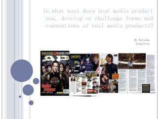
  • 1. In what ways does your media product use, develop or challenge forms and conventions of real media products? By Natasha Stapleton
  • 2. Large masthead that Front Cover stretches across the top of the page. The font is The sell lines are on the unique and the colours side of the page which is make it stand out. The normally the place to put font looks like it’s them in real music dripping, leaving it looking magazines. They are original and rebellious. short and only take up a bit of the room but they still stand out with the The main image is complete band stroke. taking up the majority of the front cover, all with eye contact giving The main sell line stretches direct address to the audience. across the front cover as well The lead singer is standing on but in the centre. It stands out something to make him seem with the black font and white taller, therefore more dominant. stroke and it has the effect of They all have serious expressions cuts through the font, giving it which is normal for a rock that extra bit of attitude. The magazine as it shows attitude. sell line underneath describes what the article is about which is similar to real The flasher doesn’t take up too magazines. much room on the cover The barcode, issue however it makes it look more number, date and price interesting and the colours are all at the bottom of the match the rest of the colour page, showing that they scheme. are important but not that important that they take up a lot of space on the The footer of the magazine page. includes bands that are all shown in the contents page, they are all of different genres of rock, attracting a wider range in audience.
  • 3. FRONT COVER; SIMILARITIES Large masthead spread across the top of the page Image of a five piece band. One member looks slightly more dominant than the others (the vocalist) Barcodes both in bottom right hand corner along with date and price etc
  • 4. FRONT COVER; DIFFERENCES The sell lines on my cover are at the top and are more noticeable, I did this because I wanted my magazine to look more interesting. The sell lines on the AP cover are in the header and at the bottom of the cover in small writing My main sell line is spread out across the page and therefore stands out a lot more. I did this because I wanted the band’s name to be seen and to be clear from afar. The AP cover’s main sell line isn’t in large font and is just in the bottom left hand corner of the page, perhaps to make the image the main attraction My footer is different to AP’s header as it just names bands inside that week this is so I could fit more bands onto the front cover and make it more attractive to a wider audience. AP’s contains information in more detail about what is inside the magazine
  • 5. Contents Page The image at the top of the page is very unique. I’ve made it look like an advert The masthead from my for an album but it is also front cover is used again related to my magazine as it is the magazine’s because this album is trademark. Instead of being reviewed. Both of ‘contents’ I’ve used ‘this the girl’s eye lines are week’ to make it a bit direct address and the more original. image is extremely eye- catching. I have used headings for my list of pages to show the I have kept the same regular sections of my sell lines from the magazine. I also haven’t put cover and added in a a lot of detail in my contents few more bands and page and just written band artists. I have used a names, this is because as variety of different soon as someone see’s a genres of rock to band they like they’ll want to buy the magazine to read attract a wider the article. audience.
  • 6. Contents Page; Similarities There is an image at the top of the page that looks like a banner. The masthead and the ‘This Week’ is further down the page, around half way There are images of the bands inside the magazine to appeal to the audience There are headings to cut up the different pages. If you like a particular section then you can find it easily
  • 7. Contents Page; Differences The word ‘Contents’ is at the top of the Kerrang! Contents page, however I decided I didn’t want to put both ‘Contents’ and ‘This Week’ as I believed it was unnecessary. This is because I thought it took up too much room and I wanted more room to put as much information about my magazine on there as possible. There is an introduction from the editor on the Kerrang! Magazine which is something I also didn’t think was necessary because I could use the space for more sections of the magazine. The list of articles in Kerrang! Is more cramped and filled with images and some articles names have more detail. There is also subscription information. I felt like I wanted my contents page to have more space and I wanted it to be easy to read. I didn’t want it to be too packed with information as I still wanted it to be clear to read.
  • 8. I wanted my heading for my double page spread to be Double Page Spread extremely eye- catching. Most headings in double page spreads take up a lot of the room on I wanted to use the idea the page and I wanted of a collage because to do this but still the article is about a leave room for my ‘journey to fame’ so I article. Having ‘We wanted to put across are the Loveless’ as that these images were the heading puts taken at different times across that this band are strong and of the year. united, therefore attracting rock music fans. I wanted a pull quote to break up the article and make A lot of rock it look less like an magazines have essay and more like images of bands an article. I wanted playing live so to make sure the therefore I put some reader was still images of them on engaged in the stage. magazine so I chose a pull quote that would interest the audience. I have put a date, the magazine name and page number on the bottom of the page to make it look more professional as all magazines have this feature on every page so that the audience can identify the magazine.
  • 9. Double Page Spread; Similarities Collage; Different images from different times Pull quote Drop caps Captions
  • 10. Double Page Spread; Differences The images on my magazine are all set out neatly, all fitting well however on the Kerrang! Magazine they overlap each other and there is a dominating image at the top. I wanted to make sure I had a lot of space at the top of one page for my heading so it would stand out on the page. The article isn’t broken up with pull quotes in the middle of the text as the pull quote is Layout is different. On one page is the article and the overlapping the images. I didn’t other are the pictures however on the Kerrang! want my pull quotes to overlap Magazine the article is spread over onto the first page my photos because I want to aswell as on the second. I wanted mine to be seperate ensure that you could see the so that they were clearer to see. photos.
  • 11.
  • 12. HARD ROCK, ALTERNATIVE ROCK Originally, the term ‘rocker’ was used for bikers predominantly men who were normally seen wearing leather jackets with studs who listen to rock ‘n’ roll music. The stereotype has developed dramatically over the years into several subgenres. A Stereotypical ‘Hard Rocker’ A Stereotypical ‘Alternative Rocker/ Gender: Predominantly male. Scene’ Clothing: Leather Jackets, black clothing, leather Gender: Both male and female. trousers, denim jackets with patches and Clothing: Converse, piercings, tattoos, multi pins, combat boots, studded jewellery, long coloured hair, skinny jeans, coloured jeans, eye hair, tattoos, piercings. liner, ear stretchers, doc martens, Activities: Creating music, consuming Activities: Anything music based, skating. alcohol, taking drugs.
  • 13. IMAGES, COLOURS, GENDER The main image relates to the particular social group I have chosen because they are all wearing leather. One band member has a bandana and is wearing leather trousers and the others are wearing band t-shirts apart from one who is wearing a t-shirt with an alcoholic drink on it. All of the men on the cover have a serious expression, connoting attitude and rebellion. The colours are mostly dark, the black is there within the image but also in the text and the masthead to stand out. The colour purple I have used is a dark shade which matches the colour of the bandana. This colour scheme looks dramatic and almost gothic, attracting people interested in rock music and fashion. There are only men on the front cover however advertised in the sell line are the ‘Rocker Sisters’ confirming that there are females inside, therefore attracting both
  • 14.
  • 15. IPC MEDIA IPC Media is a magazine and digital publisher from the UK that sells over 350 million copies of their magazine’s a year. They publish many different genres of magazines; womens, music, homes, soaps, sports and business. I would get IPC Media to distribute my music magazine. This is because the magazine that my magazine is similar to (Kerrang!) is distributed by another publisher (Bauer). The only other music magazine that IPC Media distributes is NME which is a different genre to my music magazine. Therefore, my music magazine would be distributed widely, increasing the chance of beating the rival magazines (Kerrang!, Q). My magazine would be distributed in shops, supermarkets, festivals, gigs and specific music shops like HMV.
  • 16.
  • 17. TAZMIN PYE Age: 17 Occupation: Student Favourite Colour: Red Interests: Music, Film, Writing. Favourite Bands: Metallica, The Strokes, Paramore, Arctic Monkeys, Slipknot, Guns N’ Roses, Pink Floyd, Green Day, The Beatles, The Ramones. Wears a lot of dark colours, band t-shirts, skinny jeans, shorts. Likes to cut up her t- shirts and experiment with her hair colours.
  • 18. CHRIS DOCKER Age: 17 Occupation: Student Works part-time at a butchers Favourite Colour: Interests: Music, Writing Favourite Bands: Fall Out Boy, The Kooks, Jimmy Eat World, Kings of Leon Wears a lot of skinny jeans, band t- shirts, checked shirts. Has long hair.
  • 19.
  • 20. I attracted my target audience by using dark colours like black and purple. I used these colours as they would be appropriate for both genders and the clothing that the stereotypical ‘rocker’ would wear is dark, mostly black. Purple (dark purple not light) isn’t really seen as a specific gender’s type of colour and I chose to use this because of the colour of the band member’s bandana. The band are dressed in leather and dark clothing which is the hard rock style and therefore would attract someone who likes that particular music. They are wearing band t-shirts showing that they are also passionate music fans relating to the reader. Every member has a serious expression on their face looking almost intimidating and one of the members have no shirt on underneath their leather jacket, conveying the attitude and rebellious behaviour of rock stars, again attracting the target audience. Using the word ‘ROCK’ on the cover in big bold capital letters with a drop shadow would attract a reader because straight away they would know what genre of music this magazine includes and in the footer there are 3 bands who are different styles of rock, creating a wider range of readers who like different types of rock. A hobby of the stereotypical ‘rocker’ is to listen to new music so therefore the use of the flasher claiming that this band was ‘voted best new band of 2012’ would appeal to the reader and make them want to buy the magazine and read about them. I also chose to advertise ‘Early Bird Tickets for Festivals’ with would attract the reader because another hobby of the ‘rocker’ is to go to gigs and festivals. I also advertised another band and their debut album called ‘the Rocker Sisters’ stating that this magazine isn’t just for males as it has female bands included as well.
  • 21. My contents page also has dark colours but it is a lot brighter than the front cover. The masthead is exactly the same as on the front cover because I wanted it to become the logo of the magazine so when it is written anywhere it would be in that font, colour and style. I also added another colour into the colour scheme here; gray. I wanted to use this colour because it’s not another primary or secondary colour so the colours wouldn’t clash so it’s a safe coloured background to place images on. The images I have used in my contents page show that the magazine isn’t just for males but it isn’t girly because the girls still have a straight face and attitude. The other girl (the solo artist) is smiling however she is wearing a leather jacket, showing the style of rock again. The image of the band featured on the cover is at a different angle and shows the band looking dominant and strong, which would attract a rock music fan as they like bands that are fierce and have attitude. For the actual list of the contents I haven’t added any detail to the list and only written the names of the band included as I believe that any rock music fan only cares about the music and the band and doesn’t need to see gossip like ‘Look who he is dating’ and just seeing the band’s name that they like would make them want to buy the magazine and read the article. I have used the names of different bands from different subgenres within the genre of rock to attract a wider range of readers of all ages (for example a Metallica fan would usually be older than a Paramore or You Me at Six fan.
  • 22. I attracted my audience by using images from gigs. This would appeal to an audience of rock music fans because they are usually very passionate about gigs and an image would make them want to go to one if the band looks good live. The other images have fairly normal backgrounds (of greenery) showing that they are just men really and that anyone from anywhere could be part of a band. The captions used are catchy and short. Using the terms ‘rock’n’ roll’ and ‘rockin’’ again show the reader what kind of magazine it is and who it attracts. ‘Best mates to band mates’ show that they are friends as well as band mates, attracting the audience as they would know that there is little chance of the band breaking up. The colours in the live pictures are dark and connote a certain mood and attitude, showing the dark element to rock gigs. The colours of the article page are a different colour scheme to the front cover and the contents page however still has gray, black and white, still showing it’s a rock magazine with attitude. Using the colour red makes the name stand out and be seen from afar and that is the intention of the magazine; to promote this band. The use of the colour red in the pull quote stands out next to the white writing and would draw the readers attention and give them a brief outline to what this article is about, making them want to read it.
  • 23. AUDIENCE FEEDBACK Overall Rating of 6 Magazine 4 2 0 Excellent Very Good Good Best Things about my Magazine: Colour Scheme Double Page Spread Images Things needing improvements within my Magazine: Contents Page Less Clutter
  • 24.
  • 25. I used Photoshop to manipulate my I used InDesign images before putting to create my them onto my contents page magazine. I also used and double this program to page spread. create my whole front cover. I used a digital camera to capture my images. I used Kerrang.com to research into magazine covers.
  • 26. Front Cover Using Photoshop: I have changed the levels on this main image to make it look darker and more ‘rock’ like. This makes the bands faces and therefore their facial expressions stand out a lot more as the rest of the image is darkened. I also used Photoshop to add text onto my front cover. I added a dafont.com font and edited it on Photoshop by taking away the white background, adding a drop shadow and changing the colour to purple to match the colour scheme. I also added a flasher by adding a shape onto the page and changing the colour.
  • 27. Contents Page Using InDesign: I edited the images in Photoshop by deleting the background and feather around the girl’s heads however I used InDesign to desgin the layout of my contents page. I also added a shadow around all the images to make them look blended in more. I also used InDesign to add columns for my list of pages, I used boxes to place my photographs into InDesign and used also used text.
  • 28.
  • 29. Front Cover Use of drop shadow on font Use of levels to make it more like a specific genre Adding a footer to make it look more like a real magazine I learned how to manipulate font from dafont.com on Photoshop to create a certain style relating to the type of magazine. I also learned how to manipulate my images a lot better in my main task for example changing the levels of an image to create a mood relating to the genre.
  • 30. Contents Page Using more professional font Adding a shadow around the edges of the images to make them look darker and more rock related Adding a black shape at the bottom to show the I have learned how to edit a picture by taking out the background on list section Photoshop. I also learnt how to feather round somebody’s face in an image to make it look more natural and less obviously edited. I’ve also used fonts from InDesign and colours to make it look more sophisticated and more professional.
  • 31. Double Page Spread I have learnt how to add images from Photoshop onto InDesign. I have learned to edit font in Photoshop and added a stroke. I have learnt how to add columns in the article on InDesign and also how to add drops caps and change the colour. I also learnt how to add shapes for my backgrounds of my captions.