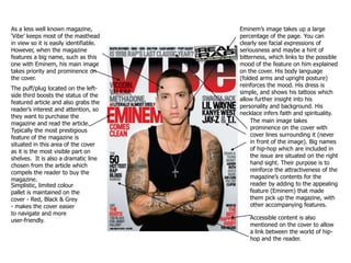
1. As a less well known magazine, ‘Vibe’ keeps most of the masthead in view so it is easily identifiable. However, when the magazine features a big name, such as this one with Eminem, his main image takes priority and prominence on the cover. Eminem’s image takes up a large percentage of the page. You can clearly see facial expressions of seriousness and maybe a hint of bitterness, which links to the possible mood of the feature on him explained on the cover. His body language (folded arms and upright posture) reinforces the mood. His dress is simple, and shows his tattoos which allow further insight into his personality and background. His necklace infers faith and spirituality. The puff/plug located on the left-side third boosts the status of the featured article and also grabs the reader’s interest and attention, so they want to purchase the magazine and read the article. Typically the most prestigious feature of the magazine is situated in this area of the cover as it is the most visible part on shelves. It is also a dramatic line chosen from the article which compels the reader to buy the magazine. The main image takes prominence on the cover with cover lines surrounding it (never in front of the image). Big names of hip-hop which are included in the issue are situated on the right hand sight. Their purpose is to reinforce the attractiveness of the magazine’s contents for the reader by adding to the appealing feature (Eminem) that made them pick up the magazine, with other accompanying features. Simplistic, limited colour pallet is maintained on the cover - Red, Black & Grey - makes the cover easier to navigate and more user-friendly. Accessible content is also mentioned on the cover to allow a link between the world of hip-hop and the reader.
2. Rolling Stone, unlike Vibe, is a well-known magazine, and therefore the masthead needn’t be placed in front of the image. The simplicity of the cover is effective because of the striking image and easy-to-navigate layout. The image is striking because, unlike most magazine cover images, you cannot see the model’s eyes on this one, due to the shadow of his simple hood. Whilst eyes are normally the easiest way of conveying emotion, this image still invokes emotion in the reader without using eye contact. Eminem’s facial expressions - which are visible - look vengeful and it gives the image an evil feel. In conjunction with the puff (‘The Road Back From Hell’) the reader gets an idea about the possible nature of the article inside - dark and bitter. Another notable thing is that this image probably would’ve have been plausible with a less famous celebrity: everyone knows what Eminem is about, and therefore this image is effective because it balances what the audience does know, with what they don’t (which they hope to find out after reading the article). The colours used on the cover are dull and not eye-catching, so that the focus of the reader is on the image as it is a striking one. Puffs are present to give a brief overview of the contents of the magazine. There are varied puffs so that the reader sees the magazine has a wide range of features, as well as big names. The main article puff of the magazine stands out because it is in larger font than the other puffs.
3. Their respective hairstyles seem to find common ground in their clean cut style (clear, even lines), whilst still maintaining individuality. On XXL, a slogan is used as a way of attracting the reader (‘Hip-Hop on a higher level’). This is done to enhance the credibility of the magazine. NickiMinaj’s facial expressions use aspects of the ‘male gaze’ technique to attract readers through ‘seduction’. The masthead is eye-catching and recognisable due to its consistent colourful style. It catches the readers eye which is always important. Like the other magazine covers, XXL uses space on the cover to show what else is in the magazine, again, with the use of big names and thought-provoking article names (ie, ‘The struggle of female MC’s’) Whilst the costumes are chosen for their commercial effectiveness, some qualities appear more personal to the pictured artists. These include NickiMinaj’s item in her hand and her tattoo, and Drake’s dog tags. The headline ‘DOMINATION’ is eye-catching and thought-provoking, making the reader want to read on. This is reinforced by the alliterative subtitle underneath, hopefully making the reader want to buy the magazine and read the article. The barcode is neatly in the corner where it takes up less meaningful space.