
Recommandé
Contenu connexe
Tendances
Tendances (19)
En vedette
En vedette (20)
Similaire à Digipak analysis re-up
Similaire à Digipak analysis re-up (20)
Plus de Alex Wilson
Dernier
Dernier (20)
Digipak analysis re-up
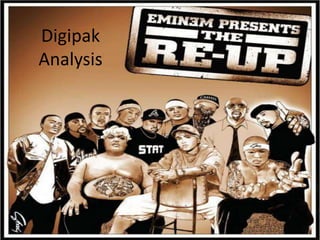
- 2. Front. The cover of the digipak looks as though it has been drawn, and has a sepia effect. These are for a unique edge – to make the album more recognisable for the audience going to buy it. It also gives the album a more classic hip-hop appearance, as though this album is an attempt to make a classic rap record. The image is of members of the Shady Records label. They are all stood together, inferring their label is tight and united. Eminem is positioned centrally on the cover, as he is the face of the album, which he is presenting. The title of the album is in the top right corner, and isn’t aligned. It looks as though it is a stamp, thus giving a suggestion of authenticity.
- 3. Back. Like Professor Green’s album, the track list is continuous (not a list), however this is for different reasons. On Professor Green’s, it was for minimising the space taken up by the tracklist. In the case of ‘The Re-Up’, it is merely for originality – the track list still occupies most of the space on the back. There are also some intertextual references, such as the small image of 50 Cent in the bottom right corner (drawn/sepia, just like the front cover for uniformity and continuity), from 50 Cent’s album ‘Get Rich or Die Tryin’’. This provides further gratification for the audience.
- 4. Booklet & CD tray. The booklet contains credits for the songs on the album, as well as a similar image as on the front cover – only this time in full colour and not ‘drawn’. There are also sections of an image on each page, with the full image on the back of the booklet. The image is of what looks like a grimey, dirty kitchen. On a surface in the kitchen are copies of ‘The Re-Up’ CD, wads of money, a microphone, beat machine and a turntable. These are all fundamental aspects of the hip-hop genre. The four elements of hip-hop are DJing, MCing, graffiti and breaking – the objects present in the image relate to DJing and MCing. The setting of the kitchen, along with the objects, suggest that the album is homemade, and that the producers of the album are attempting to go back to the classic ‘roots’ of rap music. This would be appealing to an audience interested in classic hip-hop, and also gives the album further authenticity.
- 5. CD. The CD is designed to look like a tape reel, thus reinforcing the authentic hip-hop feel that the entire digipak maintains. To add to the authenticity, a ‘sticker’ with the release date is on the CD.
- 6. I HAVE LEARNT... If a message is to be conveyed through the digipak (such as the ‘classic’ hip-hop feel of ‘The Re-Up’), it must be maintained throughout. Objects, not just people, can be used to convey themes.