
Recommandé
Contenu connexe
Tendances
Tendances (20)
En vedette
En vedette (20)
Similaire à Rock's New Royalty
Similaire à Rock's New Royalty (20)
Plus de alicesoph96
Plus de alicesoph96 (20)
Rock's New Royalty
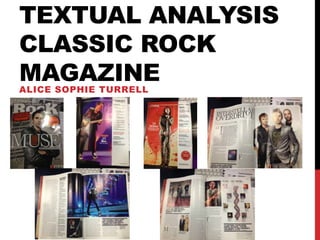
- 1. TEXTUAL ANALYSIS CLASSIC ROCK MAGAZINE ALICE SOPHIE TURRELL
- 2. INFORMATION Total Circulation (December 2009); 71,242 Publishing Company; Future PLC About Future PLC; “Our music-listening brands Classic Rock and Metal Hammer continue to evolve and expand. In 2011 Classic Rock pioneered a series of successful, ground-breaking, collectable fanpacks – matching new studio albums from iconic artists like Blondie and Slash with exclusive bespoke behind-the-scenes magazines, retailing on the newsstand at a premium price. Also Cooper: Welcome 2 My Nightmare was first delivered as an interactive iPad app as well. Classic Rock also produces AOR specials whilst Prog has become a highly respected title in its own right. Metal Hammer has launched its first fanpack, Metal Hammer Presents: Machine Head, and also celebrated its 25th anniversary in 2011 with a special edition of the magazine. Metal Hammer also runs the hugely successful Golden Gods Awards in the UK while the Classic Rock Roll of Honor Awards goes from strength to strength. And, in social media, Metal Hammer now has over 380,000 Facebook fans.” – Future PLC on Classic Rock
- 3. COLOUR The colours used in Classic Rock are mainly quite simple, with a theme of grey white and black and some red running throughout the magazine. These colours are associated with the rock genre, so therefore are fitting to the magazine and will catch the target audiences eye. The use of grey is quite strong throughout the whole magazine – especially on the cover and it makes it seem more elite and slightly classy which would appeal to the target audience. On the cover, certain pieces of information have been done in bold reds and oranges to stand out and catch attention, which relates to the Poynter Institute’s eye tracking research shows that colour draws a reader into a page (Garcia and Stark 1991). These colours fit in with the magazine as they connote more risky and energetic ideas such as danger which make the magazine and the artists seem rebellious which would draw in attention. The idea of using red to highlight certain things is continued onto the contents pages, where the page numbers are in red as well as some artists that are not announced as major features on the front cover. This is not the case with the main feature (Muse) however, which is entirely in black and grey except for images. The main images are also quite grey. This helps reflect the bands attitude and their music. In the main images for this article the band are wearing blacks, and greys mainly. These colours represent the mystery of the band and their music, while the gold and silver which Matt Bellamy (front man) is wearing connotes their wealth and high status in the rock genre – which is what the feature is about.
- 4. LAYOUT AND DESIGN The layout on the cover is quite neat and organized in general, with the cover lines at both sides of the image and not overlapping it – other than the main cover line that goes across the whole page. The only image on the cover is of the Muse front man, and that clearly links to the main cover line, which even if you didn’t know the band you would be able to see as the main cover line that says “MUSE” cuts in front of the image and is quite big, and in a different colour – white – to the other cover lines. The rest of the cover lines vary slightly in style, with some being bold and some being in a slightly more formal font. These different fonts go quite well together, as you are drawn to the bolder font which shows the main information, then you look at the more formal writing and see a bit more about that feature. The only use of bright colour is on the inserts and on the main cover line. The use of colour indicates that they are the main features, and the colour contrasts the darker, more formal colours used. The cover does use rule of thirds as the image is central – which is what you are automatically drawn to, with the main cover line taking up most of the central space horizontally. On the contents pages, the actual contents lists do not take up most of the layout and are almost overpowered by the images. The layout of the list is slightly confusing at first look, with the main features listed on one page and the “regular” features on the next. The image on the first contents page of Muse performing links in with the words as the Muse article being the main feature is listed on that pages contents. The image on the second contents page however, does not link in with that page. Although the matching feature is mentioned above the image, it is actually listed on the previous page. The font is consistent on both pages, with the title of the feature being in a different colour mostly (red or grey) and bolder, with a brief description underneath in a smaller (black) font. These contents pages do not follow the rule of thirds as the information is pushed to the right side, and the image taking up about two thirds of the whole page. The layout for the main feature on Muse is quite formal overall, with the there being more writing that images and the writing going in columns, rather than stretching across the whole page. The font style is consistent, with the first paragraph being bolder and bigger, as well as some quotes to draw in the readers attention. The formal font style and layout of the writing being quite formal suggests that the feature is quite serious rather than fun and humorous. The other indication that the feature is quite serious is the colours, as they it is mainly black and white. The images are all relevant as well, linking into what is being said in the article. For example, when the feature talks about Matt Bellamy’s partner, a image of the two of them is next to it. The rule of thirds does not apply to this feature, as it goes in a columned style, with other statistics, quotes and images inserted around the relevant part in the feature.
- 5. IMAGES On the front cover, only an image of Matt Bellamy from Muse is the only image used. This emphasises that the main article is about Muse, which therefore links to the contents of the magazine. The fact that it is only the front man featured on the cover suggests that the article is more about him than the other two members or the band a whole. On the first contents page, there is only one image used, and again it is of the Muse front man. This links into the actual contents list as it says as a caption “COVER STORY, 38, Muse, Rocks new royalty.” This caption then goes with the front cover story and image, and the contents list that shows the Muse feature as the main one. The fact that yet again the front man is featured as the image shows that he is what most people think of when they think of the band, therefore the article would appeal to more people. On the second contents page, there is again only one image, this time relating the article on The Doors. This image is again of the bands front man, this is because the article is mainly about Jim Morrison. Although this image is used, the article isn’t featured on that pages contents list, but the previous page which shows the main features. There are quite a few images in the main feature. The main one being of the whole band, which indicates that the article is therefore about Muse as a whole. However, other than that main image there is only one other image used of the whole band with the rest of the images being of Matt Bellamy linking back to the fact it is mainly of him, and as he is the member most people think of when the think of Muse. An image of their latest album cover is also included near some text which suggests that particular part of the article is about the album in some way.
- 6. POSE, STYLE, HAIR, MAKE UP The pose Matt Bellamy is in makes him seem powerful and in control, which relates back to the feature – which shows Muse as the most dominating, powerful rock band at the moment – and the band in general which is quite important in the Rock genre.. He is also looking down at the camera which gives the impression that he is looking down on other artists. Although he looks superior in this pose, he also looks quite relaxed, and not false which shows he is happy and comfortable with the fact Muse are one of the leading rock bands right now. The first thing you are drawn to is the metallic silver jacket he is wearing which is quite eccentric and space related, which is reflecting Muse’s style as a band and their music. Both of the images used in the contents pages are natural as they are live shoots of the artists performing on stage. These show you the artists strength and power on stage. With the image of Matt Bellamy he is playing guitar showing how good he is - which links into the article. With the image of Jim Morrison, it looks quite intense, showing his stage presence and perhaps the use of drugs which is talked about in the article. The main image for the Muse article is similar to the one used on the cover, with Matt in the same outfit and the background the same. The difference is all of the band are in it. All the members are standing together, naturally and relaxed with no real pose. The way that Matt Bellamy is in front shows that he is the front man and gives the impression he has more power. They are all standing facing the same way and looking straight at the camera, this shows that they are united and quite powerful – which links back to what the feature talks about. They are all dressed slightly eccentric and wearing mainly black colours hinting to the darker, mysterious more serious style of Muse rather than the brighter more vibrant side.
- 7. COMPOSITION AND FRAMING The image on the cover is central, and is surrounded by the cover lines, except the main one which goes with the image and that goes across the image. The image used is a mid shot and it fits in well with the size of the cover as the image fills it. The image does look slightly Photoshopped, but not dramatically with added effects, but slightly so it looks more perfected and professional. When you first look at the cover, you notice first the image as it what gets your attention as you recognised the cover artist and want to read more about it. The way that the image looks like it is overlapping the other cover lines adds to the fact that image and article are more important than the rest of the features. The background is plain and grey. This is better than having a busy background as it does not make the cover look too full and messy. The plain background also keeps the reader focused on the artist in the image. Both of the images on the contents pages are live shots taken looking up at the artists. They are both full length and looking up at the artists on stage this makes them seem powerful and sow them being the best at what they do. As the images are live photographs, the background is the stage and there are a lot of bright colours in them, contrasting the image on the cover. As on both pages the image takes up most of the space, they are what you see first then you see the contents list, This works well as your eyes naturally go left to right. The main image that goes with the feature on Muse takes up the whole right page, so it is the first thing you see when you turn onto the feature, this clearly indicates that it’s the Muse article. The image is mid long shot and shows clearly the whole band, and looks up at them slightly. Like the cover image, it is slightly Photoshopped to give the image a more perfect finish. It also looks slightly desaturated to go with the darker side of Muse. The background is a really light grey colour which helps show up their darker clothing more.
- 8. WRITTEN CODES The writing on the cover gives a clear indication of who the target audience is and of what the contents is. For example, just from the title of the magazine, “Classic Rock” you can tell that the magazine is aimed at people who are interested in classic rock, so they are most likely to mainly be 30 - 45. It also tells you what is in the magazine - features on classic rock artists and genres. The cover lines do not go into great detail on what to expect inside, just naming the artists. This makes the reader want to know more and not just know instantly from looking at the cover. The writing on the front is mainly bold and stands out well, so if the magazine was on a shelf you would be able to see it clearly. The title, insert and main cover line are bolder than the rest of the text, this is to make it clearer to readers what the magazine is and what the main features are. The writing in the contents pages just expand on what is mentioned on the cover. With the artists being the mentioned next to the page number and a short explanation of what to find in the articles. For example, for the Slash feature the explanation just informs the reader that it is an interview with Slash and a few points it covers. On the second contents page, on the image of Jim Morrison there is a quote next to the page number. This catches the readers attention and they want to know more about who was saying it and what it was relevant to. For the main feature, the title and subheading give away some ideas of what to expect in the magazine. For example, the title “Interstellar Overdrive” link to style of Muse (interstellar) and suggest that they have been working into overdrive and that’s what the article is about. The subheading gives away a bit more information, mentioning 2013 gives the impression that the article is about the band at the current time and the future rather than looking back at their career. “Step into the weird world of Muse” suggests that the feature will be quite in depth and will give the reader a deep insight into what Muse is really about and what’s happening for them at the current time.
- 9. LANGUAGE The language on the cover is quite simple as it basically just tells the reader what artists are in the magazine. Although there is some language used as part of the main feature cover line – “As epic as Zeppelin. As out-there as Floyd. As OTT as Queen.” This is quite dramatic and builds up the article. The relation of Muse to these legendary, influential artists grabs the readers attention. Similarly to the cover, the contents pages do not show overly strong use of specific language as the only writing is giving a very short description of what each feature is. Although, the descriptions are quite exaggerated, making the reader want to read the feature. For example, words such as “mammoth” and “dizzyingly” are used to exaggerate. The language style is quite strong in the feature though. The overall style is formal, with a few descriptive puns linked back to Muse and what their music is about. The feature is partly an interview, and partly documents the how far Muse have come and their status as “the new Queen”. The feature although showing serious language and writing style does use a lot of exaggerated language also, constantly making the band seem like the best thing about rock at the moment, showing clearly that the writer is biased towards liking Muse. When describing certain events, the language used does give the reader a really good idea of what has happened due to the detail the writer goes into. The formal, in-depth language is not just used in this feature but is continued throughout the magazine with all features being quite detailed and formal, while going over the top. The reason for the more formal language is due to the target audience, with the magazine being aimed more at the 30 – 45 year olds who may be more middle class, the language has to suit them and appeal to them.
- 10. THEORIES Cultural Industry, Adorno and Horkheimer (1944) This theory states that media products are all made the same, and sent out to an obedient audience who do not question them. The theory relates in some ways to Classic Rock. A way in which it does relate to this theory is that it it does have similarities to other rock magazines due to the artists and features in the magazine. It also does not relate to the magazine for the same reason, as it covers a broader range of artist both new and old. It does not relate to the point about how it is made due to the design is completely different from other rock magazines as it is more aimed towards 30 – 45 year olds rather than at teens who would prefer a brighter, messier design. Encoding Decoding, Hall (1973) This theory states that ideas are put into the media product by the creator, then it is down to the audience/reader to decode them. This can either be in the way the creator wants, a neutral way or be against it. This relates to the magazine as the writers could possibly put in their own biased views into the features - for example Muse featuring strongly suggests that the writer is biased towards like the band – and these views can either be seen in the way the writer wants or a completely different way. Uses and Gratifications, Blumler and Katz (1974) This theory states there is four reasons why someone decides to look at a media product; personal identification, personal relationships, entertainment, and observation. The magazine matches all of these points as someone may read it either to get inspiration from their icons, relate to others with a similar music preference, just to relax and escape normal routine, and to find out about gigs and bands in other parts of the world.
- 11. THEORIES Hierarchy of Needs Abraham Maslow (1954) There are five points to the Hierarchy of Needs, but only three of them are relevant to the Classic Rock magazine – belonging and affectionate needs, esteem needs and self actualization. The point regarding belonging links into the magazine as it gives readers a group they are part of with people that share their interests. The point of esteem needs links as people reading about their icons could give them more confidence and inspiration. The point of self actualization relates to the magazine as people reading about their favorite artists and other articles could help them develop as a person and become more them self. Stereotypes Branston G and Stafford R (2010) This theory states how stereotypes come about and what categorizes them This links to Classic Rock magazine due to the fact the stereotyping means only a certain group of people would read the magazine, and they work with this. For example, it is important who they put on the cover, the fact that Matt Bellamy is used attracts fans of Muse and similar artists while the image deters others who are interested in pop music. Male Gaze Laura Mulvey (1975) This theory talks about how women are used as visual pleasure to attract men into buying a magazine or other product. This can be reversed as well – “female gaze”. Some magazines put images of celebrities that people find attractive to sell their product. The use of Matt Bellamy could be to attract people who are him or people who aspire to be like him.
- 12. OVERALL IMPRESSION Overall, I think this magazine has quite a lot of strengths, and only a few weaknesses. The main weakness is the contents pages layouts. It would be better if the contents was in linear order, instead of having the one off features and the regular features on different pages. I also think that the page layout could be slightly better, with more images and having the contents list more central and bigger in comparison to the image which takes up most of the page. The formal, serious way in which the magazine is presented and the features written is both a strength and a weakness. It is a strength as it suits the target audience, and gives readers a more in depth, detailed view on rock. But it is also a weakness as it could be a bit more of an easier, informal read while still being as descriptive and informative if it was slightly more humorous. Another strength is the cover layout and colour scheme. The fact that there is only one image, and the cover lines are quite short do not over complicate the cover and make it look messy. The fact that the cover lines are really short – mainly just mentioning the artists name – helps attract the readers attention as well, making them want to read more. I also think the colour scheme works really well with the genre and target audience. The use of the black and grey colours go with the genre, connoting darker and more edgier themes, and also go well with the target audience as it looks professional and sophisticated instead of having a mixture of different colours and looking more like a teen magazine. There are elements that I am going to use and take into consideration when designing my magazine. The main one is the colour scheme. This is because I like how it is simple, yet reflects the target audience and the type of magazine well. I like how the main colours used are black, grey and white, and then there are only certain parts that are in another, bold colour to make them stand out more. I also am going to use ideas from the cover layout generally. I like how the cover lines are on both sides of the image, which is central. I also like how only one member is on the cover, this is as it does not over crowd the cover and make it look cluttered.