
Recommended
More Related Content
What's hot
What's hot (18)
Viewers also liked
Similar to Atomic kitten digipak
Similar to Atomic kitten digipak (20)
More from amyflint5477
More from amyflint5477 (20)
Recently uploaded
Recently uploaded (20)
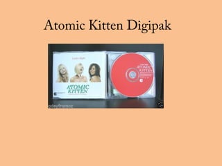
Atomic kitten digipak
- 2. The high key background is typical of the time for a girl band. The light pinks and blues of the clothing are trendy pf the time and link in with the title colouring. Stylish hairstyles and sexy makeup. Every member is looking at the camera making a connection with the audience. The pink title stands out against the background and links in with the girly theme of the band. The title of the album is smaller typical to a girls bands cover and the artists title is in block capital. The lighting in the studio gives the girls skin a glow. Promoting a young vibrant look.
- 3. The pink colour continues into the album. Pink is a feminine colour and reminds the audience of beauty. The white title and writing makes the album look soft and girly, if a black was used it would appear more edgy. The title of the artists is again in block capitals and is the biggest text on the CD making it stand out. The font of the text is curly and adds to the whole girly feel of the album.
- 4. A bar code is typical to all CD’s. kit can be found on the front or back of CD’s. The use of a block colour is typical to a girl band. The white colour is something typical to the time era the band was popular. Information about the record labels etc. The text on the back of the album is simple very typical to a girl band however it is in a light grey colour making it slighting unclear. I would of used a block black colour and made the text slightly bigger.