5 Examples of Bad Facebook Ads from Big Brands (And How You Can Avoid the Same Mistakes)
•
0 j'aime•718 vues

Andrew Macarthy is a social media consultant and author of the #1 Amazon Web Marketing Bestseller, 500 Social Media Marketing Tips. Amazon US: http://www.amazon.com/dp/B007L50HE6 Amazon UK: http://www.amazon.co.uk/dp/B007L50HE6 Follow Me: http://www.facebook.com/500socialmediatips/ http://www.pinterest.com/andrewmacarthy http://www.twitter.com/andrewmacarthy http://www.youtube.com/500socialmediatips 5 Examples of Bad Facebook Ads from Big Brands (And How You Can Avoid the Same Mistakes)

Recommandé
Recommandé
Contenu connexe
Dernier
Dernier (20)
En vedette
En vedette (20)
5 Examples of Bad Facebook Ads from Big Brands (And How You Can Avoid the Same Mistakes)
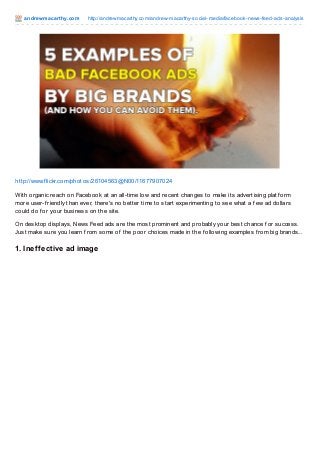
- 1. andrewmacart hy.com http://andrewmacarthy.com/andrew-macarthy-social-media/facebook-news-feed-ads-analysis http://www.f lickr.com/photos/26104563@N00/11677907024 With organic reach on Facebook at an all-time low and recent changes to make its advertising platf orm more user-f riendly than ever, there's no better time to start experimenting to see what a f ew ad dollars could do f or your business on the site. On desktop displays, News Feed ads are the most prominent and probably your best chance f or success. Just make sure you learn f rom some of the poor choices made in the f ollowing examples f rom big brands... 1. Ineffective ad image
- 2. Facebook recommends News Feed ad images be 600 x 225 pixels in order to take advantage of the bigger preview mode. While EE's is that size, there is a ton of wasted white space and the post instantly screams "paid ad." A more natural, lif estyle-f ocussed shot would work much better. 2. Ineffective ad copy
- 3. When you create an ad, Facebook allows you to edit all sorts of copy, f rom the main status to the link headline and description. 02 pretty much f ails on all counts here. Despite a simple and direct message, the ad includes no call to action, a f ail with the broken @prezzybox.com mention, and underused link copy. 3. Poor copy and image
- 4. Here, it appears that the image Udemy has used is not large enough to generate the bigger News Feed preview (as seen in the other examples in this post). That leaves an ad dominated by text. As it's of f ering a discount code, this could have f eatured in an image along with a call-to-action button. 4. No call to action button I really like notonthehighstreet's copy and image, but they missed a trick by not including one of Facebook's
- 5. "Shop Now" call to action buttons. The link copy could also be more appealing, instead of just listing the website address twice. 5. Poor URL copy At f irst glance, this ad doesn't look too bad... a bit corporate f or Facebook, maybe, but passable. However, take a closer look at the website it appears to be linking to: ADFARM.MEDIAPLEX.COM. Apparently this site is used by brands to track where visit are coming f rom, but a quick search also shows many people just assume it is spammy or malicious - not good! Changing the address to something like barclaycard.com/credit would work much better. Conclusion Facebook ads are one of the most powerf ul and cost-ef f ective ways of reaching your audience. By avoiding some of the small mistakes like those above, their ef f ectiveness can be signif icantly increased. Have you seen any poor Facebook ads f rom big brands? Feel f ree to share them over at the 500 Social Media Marketing Tips Facebook page! ,