
Recommandé
Contenu connexe
Tendances
Tendances (19)
Similaire à Question5powerpoint
Similaire à Question5powerpoint (20)
Dernier
Dernier (20)
Question5powerpoint
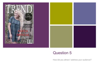
- 1. + Question 5 How did you attract / address your audience?
- 2. + Who is my audience? The music genre of my magazine is ‘country-pop”. I will majorly focus on the pop aspect but include country themes. Pop music is a popular genre of music, including chart music and most upcoming stars. It is very popular with teenage girls in particular, ranging from the age of 11 – 18 years old.
- 3. + Photography My photography is of a teenage girl making it relatable for my target audience. Also where she is in the woods this makes her seem like she’s fitting more into the music genre ‘country pop’. She is also smiling in every photo so she doesn’t seem too serious making her more likeable to the audience.
- 4. + Colour scheme I have chosen the colour scheme throughout of black and white but with bright red placed throughout to break sections up or stand out compared to the page. Red is a statement colour which is really in fashion at the moment as well, attracting my female target audience whilst drawing in their attention. I ensured the red colour was not over used so that when it was used it stood out and made more difference. I kept the photos in colour because they seemed more ‘real’ making her more relatable to the teenage girls reading it.
- 5. + Language choices My choice of language was carefully selected in order to appeal to my target audience, and also suited well in my particular music genre. (Country pop) My masthead ‘TREND’ dennotates to a particular notion that is interested in by the public eye. For example a particular band or artist. Teenage girls often want to fit in and follow the trend and this can be possible if this magazine is bought. On the front cover I used cover lines and puffs and plugs that all appealed stereotypically to my target audience of teenage girls. This included of fashion choices, and the chance to win tickets to see Taylor swift, a musician fanned by majority of girls. I also used very simple language to in order they didn’t have to think to hard. This makes sure they don’t have to think and the magazine can be used as an enjoyment factor.