

Recommandé
Contenu connexe
En vedette
En vedette (20)
Cover magazine Analysis
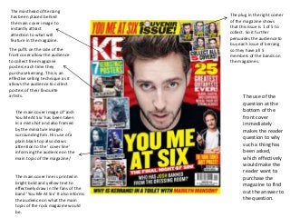
- 1. The masthead of Kerrang has been placed behind the main cover image to instantly attract attention to what will feature in the magazine. The puffs on the side of the front cover allow the audience to collect free magazine posters each time they purchase kerrang. This is an effective selling technique as it allows the audience to collect posters of their favourite artists. The main cover image of ‘Josh You Me At Six’ has been taken in a mid shot and also framed by the miniature images surrounding him. His use of a plain black top also draws attention to the ‘ cover line’ informing the audience on the main topic of the magazine/ The main cover line is printed in bright bold and yellow text to effectively draw in the fans of the band ‘You Me At Six’ It also informs the audience on what the main topic of the rock magazine would be. The plug in the right corner of the magazine shows that this issue is 1 of 5 to collect. So it further persuades the audience to buy each issue of kerrang so they have all 5 members of the bands on the magazines. The use of the question at the bottom of the front cover immediately makes the reader question to why such a thing has been asked, which effectively would make the reader want to purchase the magazine to find out the answer to the question.