SlideShare une entreprise Scribd logo
1  sur  7
The masthead that I created would be attracted to the audience because it is
Masthead- After thinking of different ideas I               bright and bold and stands out in the left third. Having it on the left makes it more
chose to use a bright pink colour with a black              viewable when it is with a variety of other magazines. The target audience I feel
background that was shadowed. I decided to use              will read this magazine would be young teenagers preferably females. I feel this is
this because the colour pink links well the pop genre       the right audience for this magazine. So having the colour pink and blue are
of being bright and bold. The reason I chose the            common colours that teenagers like, so this makes it more appealing for them.
black background was because it would help it stand                                         The main image is off two young males at a high
out and be one of the main points of the magazine.                                          angle shot. They are wearing on trend clothing
The masthead has a black oval ring around it that is                                        which is good for attracting the target audience. I
highlighted with black and light blue colours around                                        chose to dress them in this type of clothing to
the outside. Again I chose to use this because it                                           make them look new and fresh. The positioning of
stands out and the blue links well with the pink                                            the main characters which is in the middle of the
colour. The masthead is positioned in the left third                                        magazine front cover, I decided to use them in this
of the magazine, this is because when people look at                                        position so they were centre of attention. The high
a variety of magazine the masthead stands out to                                            angle shot of the image makes it unique and
them and shows what magazine it is. The ‘POP’                                               different to many other magazine main images. The
inside the oval ring has been warped so the effect of                                       main characters are of a different ethnic race
it being 3D made it stand out more and it also isn’t                                        which subverts the normal music artists. Although
cut off too much from the main images.                                                      many have been around for years. It is new to see
 The are two main cover lines that are on the left                                          this on current magazines which is what I wanted
 third that have no pictures linked to them. The                                            to get across as the magazine being fresh and new.
 cover lines both have headings which is in the                                             It makes the magazine stand out and the image
 font style of marker felt, the reason I chose this                                         looks 3D.
 to be bigger that the text underneath was t            The image that I used as my main image, I used this because it was a good unique angle
 make it stand out and the headings are straight        that would appeal to the target audience. Looking at other magazines around I feel that
 to the point, snappy words that without reading        there wasn’t any angled images like this. I makes the magazine stand out and appeal to
 the smaller text the audience would know what          the audience. Also with the characters making direct address to the audience this makes
 is in the magazine. Having the blue faded              it more appealing. The clothing that they are wearing in on-trend fashion which makes it
 background makes it stand out more against the         more appealing to the target audience, especially as they are teenagers and quite good
 black text. I used this because the colour links       looking which would appeal more to them.
 to the masthead and is the same colour. The
 text in the top cover line is related to a famous    This is the same shade pink as the masthead ‘pop’. I thought this worked well together
 celebrity which could make it more appealing to      because it showed that everything links together and all related. The font is in regular
 the audience. The text that follows from the         Arial, I felt this would be good to use because it was simple, also because it is a cover
 headings is in black again but this time with        line it stood out being simple because the magazine is so loud and ‘in your face’ this
 pink faded background colour.                        breaks away from that.
The anchorage text is the most eye catching part of the magazine front cover. I
   I felt that the cover lines would appeal to my target   decided to break up the colours a little bit so it stood out to the rest of the magazine.
   audience because they stand out and because it is       The name of the duo is ‘Antics’ I chose to use this text style because all the letter links
   positioned on the left third this is the first section  together and it looks really effective. The masthead is white with a blue outline. The
   that magazine readers look at so I felt putting it      colour blue is still the same shade as the other blue in the rest of the front cover. i
   here would make it more appealing to the audience chose to keep the same colours so again the different sections of the magazine still
   instead of having it in the opposite side. Also as                                          linked together and it flowed from one thing to the
   said in previously the top cover line on the left third                                     next. It has a shadowed back ground to make it
   involves a famous musician, this makes it more                                              stand out more from the image. Apart from the
   appealing to the target audience of young                                                   background being white I chose to use the masthead
   teenagers preferably females. I chose to use this                                           as white because all the colours on the magazine
   musician because she is very popular in the music                                           were based around blue and pink, so I felt that
   industry and her style makes her more appealing to                                          having white text it made it stand out more and
   her fans, which is the reason why I put it in my                                            break up the normal pattern. The text below hat
   magazine. The two colours linked together would                                             says ‘the newcomers on the block’. I chose to use
   appeal to my audience because they link together                                            this because I wanted the magazine to look fresh and
   and they stand out because of being bright colours.                                         new and have the main characters as newcomers
   They link well to the ‘pop’ genre because of being                                          and new to the industry, I thought having this said
   bold.                                                                                       would make it more appealing to the target
                                                                                               audience as they would be more keen to read about
                                                                                               new musicians and find out information about them.
                                                                                               Having the text in upper case makes it stand out
                                                                                               more to the audience. I put a block of white behind
For the anchorage text I felt that this would appeal to                                        the text to make it more bold. Also have a sharp
my target audience because it was bold and stood out                                           off white makes it link to the ‘block’ stated in the
from the rest of the magazine. The text underneath I felt                                      text. I alternated the colours within the text from
with what it says makes it appeal to the audience                                              black to pink. I chose to do this so I still linking back
because they are new to the industry. So the audience                                          to my genre of ‘pop’ and I'm keeping the same 4
will be more keen to read in. This makes the target                                            colours flowing throughout the page. Above the
audience social integrate, it gives them something to                                          anchorage text placed a pink faded rectangle with
talk about to their friends. I attracted my audience with                                     ‘EXCLUSIVE’ inside, although I had previously used
the anchorage text because its eye catching and with                                           this on a cover line, I felt it would still work using it
the white block behind the smaller text shows the links                                        above this. I chose to use this word because the two
between the magazine, also when it states ‘newcomers’                                          boys on the double page stated this was their first
this gives the information to the audience that they are                                       interview. So I thought this would link well between
exclusively talking to this magazine first which will make                                     the pages.
them more engaged.
The sell line is placed scrolling along the top of the magazine. It has a pink
The image I used on the left third at the bottom is of       background, so I decide to make the text white. This helps the text stand out. Also
a size size, the image is of a teenage girl that comes       the text says ‘your’ in it, which shows direct address to the audience which can
across as glamorous and a role model to my target            make it more appealing for them, and they engage themselves more. This shows
audience. The image has a rounded square around
                                                             the use of personal identity because it makes the reader gain insight to how they
the outside, this shape has been warped to make it
stand out more. The background inside the image is           feel and their o opinions of the question. Also it informs the target audience
bright green. I chose to keep the green screen in the                                             who their idol maybe, this makes them find out
image still because it breaks up with the formality of                                            who they are similar to in musician and celebrity
the colours within the rest of magazine which allows                                              industry. This can help them will feeling they
it to be more eye catching. The shaded pink area                                                  connect to society as their answer maybe
around the outside of the shape makes the image                                                   someone current and popular with others. Also
look like its popping out. I chose to use this shade to      ``                                   the word ‘pop’ is used within this sell line so it
keep the colours linking together as the green is                                                 show the relation between the genre and
different. Having the pink shaded area allows it to                                               purpose of the magazine.
flow into the text of this cover line. The text beside it
says ‘back in pink’ this integrates well with the colour                                       I feel this would appeal to my target audience because it
scheme I decided to use. This is in upper case letters                                         is directing it purely to them, and its something that no
to make the black stand out and make it clearer for                                            other person can decide for them. This allows them to
the readers to understand. I edited the image to                                               be socially integrated within the magazine and feel it has
make it brighter and keep to the genre of ‘pop’ being                                          be published purposely for them. The word ‘inside’
bold and outstanding.                                                                          makes it more appealing to the audience because they
I feel this section appeals to my target audience                                              will feel they have to buy the magazine to see what else
because the image shows a pretty girl with her hair                                            is inside the magazine and to find out the answer to the
                                                                                               question.
and makeup done. To any teenage girls this is what
                                                                                                                   I feel this appeals to my target audience
they are interested in through their age, so this could   The cover line below the sell line is of a quote from
                                                                                                                   because it is showing direct contact with
help them find their sense of identity and feel they are a small interview with a pop singer who has been
                                                                                                                   the characters. Also personal identity is
part of the magazine as they may want to be like her or going through some problems with the music                 used because the reader may feel similar
feel they have the same interests. So it gains insight to industry. The text is quoted and in black with a pink to what has been happening with her. It
what other girls think of themselves. The text also       faded background. This background I feel was good
                                                                                                                   integrates because they are gaining
gives then a sense of satisfying their general interest   and necessary because it helped with the follow up
                                                                                                                   insight into what has been happening
                                                          picture that comes with it. I was able to place the
because if this musician was their role model they                                                                 with other people, so they want to read
                                                          image so it blends in well. The image is of the girl
would find out new information that they are                                                                       more to give social empathy. It allows the
                                                          looking back over her shoulder this is a good angle
interested in. With this information the target                                                                    to have an emotional release within the
                                                          for the shot as the other images on my magazine
audience would also gain a sense of belonging because they are more forward. This breaks away from the magazine due to their own circumstances
it would give them something to identify and talk                                                                  or similar. I feel this cover line connects
                                                          pattern, but she is making direct address with the
                                                                                                                   really well with any reader of my
about to their friends, so it appeals to my target        reader. I chose to use this shot because it shows
                                                                                                                   magazine which is why I included it.
audience through social integration.                      the character as being innocent but a lot to tell.
On my double page I decided to put the                The main image that I have used for the double page scrolling along the top consist of 3 black
 name of my magazine at the top left corner.           and white images. Two off which are the same person but the character being on different
 The is bold and big the same as on the front          levels and the other being on the lower level but the opposite person. The images are
 cover. The only change to it is that I added an       positioned In a line across the top of the page. I thought this was a unique way of showing
 ‘Exclusive’ in green font, I made it have a           different images of the main characters and breaks away from what normal music magazine
 small black outline so it stood out a bit more        produce. Having the images in black and white shows a big contrast to the bright colours that
 and made it look 3d. I chose to use the               have been used previously on the magazine. I chose to do this because it gives the double
 colour green because on the front cover               page an edginess to the characters and it can also show a meaning how it can feel being in a
 above the anchorage it has this word linked           duo and the different sides of being in the music industry. I decided to position the image of
 to it. I felt the relationship would still flow       the character standing so there is a pattern and it wasn’t too squashed in together. The
 through the magazine if I had it on the               background of this top section is in pink which makes the images stand out more and make
 double page also. Again the positioning of                                                                   them look more defined to the audience. I
 the masthead is on the left third, this is so if                                                             chose the pink background because it
 the readers were to flick through the pages                                                                  keeps in with the routine of having the
 this would stand out to them and they would                                                                  pink shades flowing through the magazine
 know what they would be reading instantly.                                                                    and sticking to the colours of pop.
 The colour green links well with the pinks                                                                      I felt these images would appeal to my
 and blues because they are very bright and                                                                      target audience because they are a
 playful which is what the genre of pop is all                                                                   unique way off showing the characters in
 about.                                                                                                          different positions. It will appeal to my
I felt this the masthead on the double page                                                                      target audience because it socially
appeal to my target audience because they                                                                        integrates between social groups. It gives
link to the front cover. It is bold and loud                                                                     the a basis and something to talk about
which is normally what ‘pop’ music is about         I chose to put the quote from one of the answers in          within the magazine. Also it entertains
so I felt having this on my double page             the middle of the page. This is a white block with the       the readers because they can escape
would give an insight to what the interview         blue writing inside that is in upper case letter. I chose    from reality and be diverted from there
was about.                                          to do it in blue so it links with the blocked colour         problems. It can also appeal to different
 Below the scrolling images along the top I         shape that I have on the left. When the box comes out audiences like males because they can
 decided to put two added blocks of black           of shape it has a faded blue outline this makes it stand feel they may be similar in a way to how
 going to either side of the pages. I wanted        out more to the audience. I chose to make the text in        these boys are and aspire to be like them.
 to use this because it broke up the section        upper case letters to make it bold and emphasis on           So it can be inviting for other particular
 from the images to the information and I           what it is saying. This informs the readers because          social groups.
 felt this would be a good way to capture           they are finding out about events that are coming            I felt the box added on with a quote in it
 the readers attention. Also the colour             up, like their tour. The shaded outlines also highlights     will appeal to my target audience
 black is still sticking to my colour scheme        this sections and makes it a centre piece. I wanted this because it is bold and clear of what it is
 that I wanted flowing through my                   to give the readers and insight to what they would be        saying, and makes the double page look
 magazine.                                          reading and to engage them straight away.                    more professional.
On my double page I used three main                    The images at either side of the double page are off the duo separated. They are doing
colours, I chose the blue colour to be a blue          similar poses and are wearing similar clothes. On the right hand side the image of one of
squared blocked and use the effect of it               the characters is larger that the opposite side. The size of the image is the width of the
falling into the page. I decided to use this           double page so he fits in well. The images are in colour which is a contrast to the 3 images
because I had previously done a similar                along the top of the page. Having these in colour makes the stand out. Their body language
pattern on my contents page. I chose these             shows they are confident and happy, then stood with their hands in their pockets show they
colours because the pink shows a sign of               are relaxed. This gives off what their personalities are like and can make the audience see
feminist which is who my target audience is            they are outgoing characters. The clothing they are wearing is on-trend fashion this can
based on. The blue is to match the gender of           appeal to the audience because they are wearing current clothing that teenagers are into. I
the boys.                                              chose to make Andile bigger on the right hand side because it stands out and changes the
                                                       structure of the page. I felt that this image should be used because the formation at the top
I felt this would appeal to my target audience
                                                                                                           he only had one image so it made it equal
because they are bright and playful colours.
                                                                                                           of having him larger. Both images are
The three colours mixed represents the
                                                                                                           making direct address to the reader.
different genders that relate well to my
magazine.                                                                                                   I felt the two images on either side of
                                                                                                            the page would attract my target
The sub heading off the text is in black                                                                    audience because they are current
writing, I chose to use this colour because                                                                 characters and they can connect well
you could still see what it says and it is bold.                                                            with teenagers in today's society. With
In the sub heading the name of the duo has                                                                  both the images making direct eye
been highlight in white and made bigger into                                                                contact with the reader this can engage
a bigger font compared to the rest off it. I                                                                them more to the information that is
decided to use this because it emphasised on                                                                being said. These image can socially
the name of them like it did on the front                                                                   integrate with the target audience which
                                                   The layout of the double page is in the formation off a makes it more appealing. It enables the
cover., which is also white I chose to put the
                                                   question and answer interview. I feel this was the best readers to connect with friends and give
colour into white All the text is in upper case
                                                   way to show information about the musicians. It is an them something to talk about.
this again it to make it stand out. The ellipse
                                                   easy way to understand for all ages in my target
at the end of the sub heading makes it more                                                                    The layout of the double page will
                                                   audience. The question and answer are in different
intriguing to what is in the interview and                                                                     attract my target audience because it
                                                   colours, I felt this would make it good for teenagers to
makes the reader read on. This appeals to                                                                      is easy to understand, the format is a
                                                   identify who was asking the question and see the
the target audience because it is informing
                                                   replies. On the right side of the page the colours of the popular way that other magazines use
them about what will be included in the rest                                                                   when interviewing musicians. The
                                                   text change, this was so it was easier to read with the
of the page.
                                                   white background. The colours of white, black, pink and colours make it fun and bright which
                                                   blue I chose them to keep them flowing throughout the links back to the genre of pop.
                                                   magazine and sticking to the scheme.
The title of the page which is placed in the top          I feel this would attract make target         Above the title I place a star shape that has
centre . The font is marker felt and in upper case        audience because it stands out and they       text in it saying ‘ for your eyes only’ I felt this
letters. I chose to use this because it makes the         know what the page is about. I felt the       was a good way to attract readers because it
text edgy and unique. The black colour of the text        colour black is a good colour to use to       is showing direct address and it makes them
makes it stand out and be bold, this gives it the         attract readers because it is a colour that   feel they are talking to the reader. Having the
centre of attention. I chose the colour black             suits everyone and all ages.                  shape with jagged edges makes it eye
because the colour white and purples which are in                                                       catching to the reader. Also the bright orange
the background are cool relaxing colours so having                                                      makes it more appealing to the audience, it
the colour black makes it override this.                                                                is bold and links well to the other colours. I
On the left of the page I copied the front cover into                                                   chose to use this because it gives the
the contents. I thought this was a unique way of                                                        audience a sense of personal identity
informing the readers where each cover line is in the                                                   because it identifies to them that they are
magazine and all the important stories. It is a quick                                                   valued customers. It socially integrates to the
way for them to gage where the stories they want to                                                     readers because it makes them feel they are
read are and is really easy to understand. This informs                                                 gaining a sense of belonging and it allows
my target audience because it is telling them about                                                     them to connect with the magazine. This
the information within the magazine, it is satisfying                                                   attracts the audience because it creates a
the general interest of the readers. The numbers                                                        relationship with the reader.
coming out the front cover highlights individually, I
                                                                                                                  The purple block behind the
chose the change the colour of the number coming of
                                                                                                                  white background looks effective
the anchorage text I wanted this be the main part on
                                                                                                                  in the contents page because it
the numbers because it is the main story.
                                                                                                                  looks as if it is falling into the
I felt having the front cover on the contents page                                                                page. The purple is a really good
appeals to my target audience because as it is for                                                                colour because its calm and not
teenagers this was a simple but unique way of showing                                                             too bold but it also stands out
what is included in the magazine. It Informs the readers.                                                         and relates well to the genre of
                                                      Having the website address at the bottom of the page this ‘pop'. It gives the page structure
 Underneath the copied front cover it says ‘this
                                                      shows that the magazine is available on the internet and and unique way off showing
 month’ again this is in marker felt and in upper                                                                 colours. I chose to use this
                                                      has extra information that they can look at.
 case. I decided to use this because it showed the                                                                because it gives the page a burst
                                                      I feel this appeals to the target audience because it
 readers what would be included in this months
                                                      informs then about more relevant information and where of colour.
 issues. In this section the numbers are bold and                                                                 I feel this would appeal to my
                                                      they can find it. It socially integrates because it enables
 in a larger font, they are in columns which makes                                                                target audience because it is
                                                      them to talk to friends and family about the
 it clearer to see. The colours alternate, I chose to                                                             similar to other popular
                                                      information, it finds a basis for different conversations.
 do this because it links with the main colours on                                                                magazines, so I knew this would
                                                      Also it entertains the readers because it allows them to
 the page of purple and orange.                                                                                   appeal to my target audience.
                                                      escape from problems by other sources.
On the contents page I decided the have three images going down the
                                         right side of the page. The images show a range of different emotions
                                         that link well to the captions below them. In all the images it shows
                                         them smiling, this makes the audience feel happy which is what the
                                         meaning of ‘pop’ is about. I felt having the images with them smiling
                                         would attract the audience because it allows them to connect with the
                                         characters, it gives them a sense of happiness. Having this also allows
                                         the to reinforce their personal values.

                                         The images show a range of ethnicities which is good because it shows
                                         acceptance to any reader. The quotes underneath each image is
                                         effective because it gives a short insight to what their interviews will be
                                         like this will engage the audience more.

                                         In the top image I decided to have the character with her hands over
                                         her face, with the caption underneath this can make the reader give
                                         social empathy to their story, and can also show person identity
                                         through sharing the same problems.
                                         This attracts my audience because it allows them to connect with the
                                         character. The middles image shows a forward shot of a young
                                         teenager. It shows him smiling which gives the impression to the
The text next to it also alternate the   audience that he is confident and fun, this links back to the genre of
colours, this is to link with the        ‘pop’ being outgoing and exciting.
numbers beside them.
I felt that having the numbers in        The final image shows a boy and girl with a fun and unique shot that
bold and the text beside it I though
                                         has been taken. The shot shows humour and fun. I chose to use a shot
this would attract my target
audience because they are bright         like this because it is funny and a different way to show an image.
and it informs them what is include      I thought this would attract my target audience because they are young
in the rest of the magazine. The         and fresh. The emotion of the characters can help connect with the
information allows them to relax         audience because they are laughing and look like fun.
and break away from reality.

Contenu connexe

En vedette

2024 State of Marketing Report – by Hubspot
2024 State of Marketing Report – by Hubspot2024 State of Marketing Report – by Hubspot
2024 State of Marketing Report – by HubspotMarius Sescu
 
Everything You Need To Know About ChatGPT
Everything You Need To Know About ChatGPTEverything You Need To Know About ChatGPT
Everything You Need To Know About ChatGPTExpeed Software
 
Product Design Trends in 2024 | Teenage Engineerings
Product Design Trends in 2024 | Teenage EngineeringsProduct Design Trends in 2024 | Teenage Engineerings
Product Design Trends in 2024 | Teenage EngineeringsPixeldarts
 
How Race, Age and Gender Shape Attitudes Towards Mental Health
How Race, Age and Gender Shape Attitudes Towards Mental HealthHow Race, Age and Gender Shape Attitudes Towards Mental Health
How Race, Age and Gender Shape Attitudes Towards Mental HealthThinkNow
 
AI Trends in Creative Operations 2024 by Artwork Flow.pdf
AI Trends in Creative Operations 2024 by Artwork Flow.pdfAI Trends in Creative Operations 2024 by Artwork Flow.pdf
AI Trends in Creative Operations 2024 by Artwork Flow.pdfmarketingartwork
 
PEPSICO Presentation to CAGNY Conference Feb 2024
PEPSICO Presentation to CAGNY Conference Feb 2024PEPSICO Presentation to CAGNY Conference Feb 2024
PEPSICO Presentation to CAGNY Conference Feb 2024Neil Kimberley
 
Content Methodology: A Best Practices Report (Webinar)
Content Methodology: A Best Practices Report (Webinar)Content Methodology: A Best Practices Report (Webinar)
Content Methodology: A Best Practices Report (Webinar)contently
 
How to Prepare For a Successful Job Search for 2024
How to Prepare For a Successful Job Search for 2024How to Prepare For a Successful Job Search for 2024
How to Prepare For a Successful Job Search for 2024Albert Qian
 
Social Media Marketing Trends 2024 // The Global Indie Insights
Social Media Marketing Trends 2024 // The Global Indie InsightsSocial Media Marketing Trends 2024 // The Global Indie Insights
Social Media Marketing Trends 2024 // The Global Indie InsightsKurio // The Social Media Age(ncy)
 
Trends In Paid Search: Navigating The Digital Landscape In 2024
Trends In Paid Search: Navigating The Digital Landscape In 2024Trends In Paid Search: Navigating The Digital Landscape In 2024
Trends In Paid Search: Navigating The Digital Landscape In 2024Search Engine Journal
 
5 Public speaking tips from TED - Visualized summary
5 Public speaking tips from TED - Visualized summary5 Public speaking tips from TED - Visualized summary
5 Public speaking tips from TED - Visualized summarySpeakerHub
 
ChatGPT and the Future of Work - Clark Boyd
ChatGPT and the Future of Work - Clark Boyd ChatGPT and the Future of Work - Clark Boyd
ChatGPT and the Future of Work - Clark Boyd Clark Boyd
 
Getting into the tech field. what next
Getting into the tech field. what next Getting into the tech field. what next
Getting into the tech field. what next Tessa Mero
 
Google's Just Not That Into You: Understanding Core Updates & Search Intent
Google's Just Not That Into You: Understanding Core Updates & Search IntentGoogle's Just Not That Into You: Understanding Core Updates & Search Intent
Google's Just Not That Into You: Understanding Core Updates & Search IntentLily Ray
 
Time Management & Productivity - Best Practices
Time Management & Productivity -  Best PracticesTime Management & Productivity -  Best Practices
Time Management & Productivity - Best PracticesVit Horky
 
The six step guide to practical project management
The six step guide to practical project managementThe six step guide to practical project management
The six step guide to practical project managementMindGenius
 
Beginners Guide to TikTok for Search - Rachel Pearson - We are Tilt __ Bright...
Beginners Guide to TikTok for Search - Rachel Pearson - We are Tilt __ Bright...Beginners Guide to TikTok for Search - Rachel Pearson - We are Tilt __ Bright...
Beginners Guide to TikTok for Search - Rachel Pearson - We are Tilt __ Bright...RachelPearson36
 

En vedette (20)

2024 State of Marketing Report – by Hubspot
2024 State of Marketing Report – by Hubspot2024 State of Marketing Report – by Hubspot
2024 State of Marketing Report – by Hubspot
 
Everything You Need To Know About ChatGPT
Everything You Need To Know About ChatGPTEverything You Need To Know About ChatGPT
Everything You Need To Know About ChatGPT
 
Product Design Trends in 2024 | Teenage Engineerings
Product Design Trends in 2024 | Teenage EngineeringsProduct Design Trends in 2024 | Teenage Engineerings
Product Design Trends in 2024 | Teenage Engineerings
 
How Race, Age and Gender Shape Attitudes Towards Mental Health
How Race, Age and Gender Shape Attitudes Towards Mental HealthHow Race, Age and Gender Shape Attitudes Towards Mental Health
How Race, Age and Gender Shape Attitudes Towards Mental Health
 
AI Trends in Creative Operations 2024 by Artwork Flow.pdf
AI Trends in Creative Operations 2024 by Artwork Flow.pdfAI Trends in Creative Operations 2024 by Artwork Flow.pdf
AI Trends in Creative Operations 2024 by Artwork Flow.pdf
 
Skeleton Culture Code
Skeleton Culture CodeSkeleton Culture Code
Skeleton Culture Code
 
PEPSICO Presentation to CAGNY Conference Feb 2024
PEPSICO Presentation to CAGNY Conference Feb 2024PEPSICO Presentation to CAGNY Conference Feb 2024
PEPSICO Presentation to CAGNY Conference Feb 2024
 
Content Methodology: A Best Practices Report (Webinar)
Content Methodology: A Best Practices Report (Webinar)Content Methodology: A Best Practices Report (Webinar)
Content Methodology: A Best Practices Report (Webinar)
 
How to Prepare For a Successful Job Search for 2024
How to Prepare For a Successful Job Search for 2024How to Prepare For a Successful Job Search for 2024
How to Prepare For a Successful Job Search for 2024
 
Social Media Marketing Trends 2024 // The Global Indie Insights
Social Media Marketing Trends 2024 // The Global Indie InsightsSocial Media Marketing Trends 2024 // The Global Indie Insights
Social Media Marketing Trends 2024 // The Global Indie Insights
 
Trends In Paid Search: Navigating The Digital Landscape In 2024
Trends In Paid Search: Navigating The Digital Landscape In 2024Trends In Paid Search: Navigating The Digital Landscape In 2024
Trends In Paid Search: Navigating The Digital Landscape In 2024
 
5 Public speaking tips from TED - Visualized summary
5 Public speaking tips from TED - Visualized summary5 Public speaking tips from TED - Visualized summary
5 Public speaking tips from TED - Visualized summary
 
ChatGPT and the Future of Work - Clark Boyd
ChatGPT and the Future of Work - Clark Boyd ChatGPT and the Future of Work - Clark Boyd
ChatGPT and the Future of Work - Clark Boyd
 
Getting into the tech field. what next
Getting into the tech field. what next Getting into the tech field. what next
Getting into the tech field. what next
 
Google's Just Not That Into You: Understanding Core Updates & Search Intent
Google's Just Not That Into You: Understanding Core Updates & Search IntentGoogle's Just Not That Into You: Understanding Core Updates & Search Intent
Google's Just Not That Into You: Understanding Core Updates & Search Intent
 
How to have difficult conversations
How to have difficult conversations How to have difficult conversations
How to have difficult conversations
 
Introduction to Data Science
Introduction to Data ScienceIntroduction to Data Science
Introduction to Data Science
 
Time Management & Productivity - Best Practices
Time Management & Productivity -  Best PracticesTime Management & Productivity -  Best Practices
Time Management & Productivity - Best Practices
 
The six step guide to practical project management
The six step guide to practical project managementThe six step guide to practical project management
The six step guide to practical project management
 
Beginners Guide to TikTok for Search - Rachel Pearson - We are Tilt __ Bright...
Beginners Guide to TikTok for Search - Rachel Pearson - We are Tilt __ Bright...Beginners Guide to TikTok for Search - Rachel Pearson - We are Tilt __ Bright...
Beginners Guide to TikTok for Search - Rachel Pearson - We are Tilt __ Bright...
 

Finished media question 45

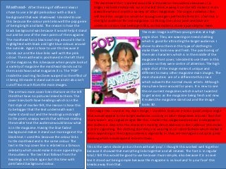
  • 1. The masthead that I created would be attracted to the audience because it is Masthead- After thinking of different ideas I bright and bold and stands out in the left third. Having it on the left makes it more chose to use a bright pink colour with a black viewable when it is with a variety of other magazines. The target audience I feel background that was shadowed. I decided to use will read this magazine would be young teenagers preferably females. I feel this is this because the colour pink links well the pop genre the right audience for this magazine. So having the colour pink and blue are of being bright and bold. The reason I chose the common colours that teenagers like, so this makes it more appealing for them. black background was because it would help it stand The main image is off two young males at a high out and be one of the main points of the magazine. angle shot. They are wearing on trend clothing The masthead has a black oval ring around it that is which is good for attracting the target audience. I highlighted with black and light blue colours around chose to dress them in this type of clothing to the outside. Again I chose to use this because it make them look new and fresh. The positioning of stands out and the blue links well with the pink the main characters which is in the middle of the colour. The masthead is positioned in the left third magazine front cover, I decided to use them in this of the magazine, this is because when people look at position so they were centre of attention. The high a variety of magazine the masthead stands out to angle shot of the image makes it unique and them and shows what magazine it is. The ‘POP’ different to many other magazine main images. The inside the oval ring has been warped so the effect of main characters are of a different ethnic race it being 3D made it stand out more and it also isn’t which subverts the normal music artists. Although cut off too much from the main images. many have been around for years. It is new to see The are two main cover lines that are on the left this on current magazines which is what I wanted third that have no pictures linked to them. The to get across as the magazine being fresh and new. cover lines both have headings which is in the It makes the magazine stand out and the image font style of marker felt, the reason I chose this looks 3D. to be bigger that the text underneath was t The image that I used as my main image, I used this because it was a good unique angle make it stand out and the headings are straight that would appeal to the target audience. Looking at other magazines around I feel that to the point, snappy words that without reading there wasn’t any angled images like this. I makes the magazine stand out and appeal to the smaller text the audience would know what the audience. Also with the characters making direct address to the audience this makes is in the magazine. Having the blue faded it more appealing. The clothing that they are wearing in on-trend fashion which makes it background makes it stand out more against the more appealing to the target audience, especially as they are teenagers and quite good black text. I used this because the colour links looking which would appeal more to them. to the masthead and is the same colour. The text in the top cover line is related to a famous This is the same shade pink as the masthead ‘pop’. I thought this worked well together celebrity which could make it more appealing to because it showed that everything links together and all related. The font is in regular the audience. The text that follows from the Arial, I felt this would be good to use because it was simple, also because it is a cover headings is in black again but this time with line it stood out being simple because the magazine is so loud and ‘in your face’ this pink faded background colour. breaks away from that.
  • 2. The anchorage text is the most eye catching part of the magazine front cover. I I felt that the cover lines would appeal to my target decided to break up the colours a little bit so it stood out to the rest of the magazine. audience because they stand out and because it is The name of the duo is ‘Antics’ I chose to use this text style because all the letter links positioned on the left third this is the first section together and it looks really effective. The masthead is white with a blue outline. The that magazine readers look at so I felt putting it colour blue is still the same shade as the other blue in the rest of the front cover. i here would make it more appealing to the audience chose to keep the same colours so again the different sections of the magazine still instead of having it in the opposite side. Also as linked together and it flowed from one thing to the said in previously the top cover line on the left third next. It has a shadowed back ground to make it involves a famous musician, this makes it more stand out more from the image. Apart from the appealing to the target audience of young background being white I chose to use the masthead teenagers preferably females. I chose to use this as white because all the colours on the magazine musician because she is very popular in the music were based around blue and pink, so I felt that industry and her style makes her more appealing to having white text it made it stand out more and her fans, which is the reason why I put it in my break up the normal pattern. The text below hat magazine. The two colours linked together would says ‘the newcomers on the block’. I chose to use appeal to my audience because they link together this because I wanted the magazine to look fresh and and they stand out because of being bright colours. new and have the main characters as newcomers They link well to the ‘pop’ genre because of being and new to the industry, I thought having this said bold. would make it more appealing to the target audience as they would be more keen to read about new musicians and find out information about them. Having the text in upper case makes it stand out more to the audience. I put a block of white behind For the anchorage text I felt that this would appeal to the text to make it more bold. Also have a sharp my target audience because it was bold and stood out off white makes it link to the ‘block’ stated in the from the rest of the magazine. The text underneath I felt text. I alternated the colours within the text from with what it says makes it appeal to the audience black to pink. I chose to do this so I still linking back because they are new to the industry. So the audience to my genre of ‘pop’ and I'm keeping the same 4 will be more keen to read in. This makes the target colours flowing throughout the page. Above the audience social integrate, it gives them something to anchorage text placed a pink faded rectangle with talk about to their friends. I attracted my audience with ‘EXCLUSIVE’ inside, although I had previously used the anchorage text because its eye catching and with this on a cover line, I felt it would still work using it the white block behind the smaller text shows the links above this. I chose to use this word because the two between the magazine, also when it states ‘newcomers’ boys on the double page stated this was their first this gives the information to the audience that they are interview. So I thought this would link well between exclusively talking to this magazine first which will make the pages. them more engaged.
  • 3. The sell line is placed scrolling along the top of the magazine. It has a pink The image I used on the left third at the bottom is of background, so I decide to make the text white. This helps the text stand out. Also a size size, the image is of a teenage girl that comes the text says ‘your’ in it, which shows direct address to the audience which can across as glamorous and a role model to my target make it more appealing for them, and they engage themselves more. This shows audience. The image has a rounded square around the use of personal identity because it makes the reader gain insight to how they the outside, this shape has been warped to make it stand out more. The background inside the image is feel and their o opinions of the question. Also it informs the target audience bright green. I chose to keep the green screen in the who their idol maybe, this makes them find out image still because it breaks up with the formality of who they are similar to in musician and celebrity the colours within the rest of magazine which allows industry. This can help them will feeling they it to be more eye catching. The shaded pink area connect to society as their answer maybe around the outside of the shape makes the image someone current and popular with others. Also look like its popping out. I chose to use this shade to `` the word ‘pop’ is used within this sell line so it keep the colours linking together as the green is show the relation between the genre and different. Having the pink shaded area allows it to purpose of the magazine. flow into the text of this cover line. The text beside it says ‘back in pink’ this integrates well with the colour I feel this would appeal to my target audience because it scheme I decided to use. This is in upper case letters is directing it purely to them, and its something that no to make the black stand out and make it clearer for other person can decide for them. This allows them to the readers to understand. I edited the image to be socially integrated within the magazine and feel it has make it brighter and keep to the genre of ‘pop’ being be published purposely for them. The word ‘inside’ bold and outstanding. makes it more appealing to the audience because they I feel this section appeals to my target audience will feel they have to buy the magazine to see what else because the image shows a pretty girl with her hair is inside the magazine and to find out the answer to the question. and makeup done. To any teenage girls this is what I feel this appeals to my target audience they are interested in through their age, so this could The cover line below the sell line is of a quote from because it is showing direct contact with help them find their sense of identity and feel they are a small interview with a pop singer who has been the characters. Also personal identity is part of the magazine as they may want to be like her or going through some problems with the music used because the reader may feel similar feel they have the same interests. So it gains insight to industry. The text is quoted and in black with a pink to what has been happening with her. It what other girls think of themselves. The text also faded background. This background I feel was good integrates because they are gaining gives then a sense of satisfying their general interest and necessary because it helped with the follow up insight into what has been happening picture that comes with it. I was able to place the because if this musician was their role model they with other people, so they want to read image so it blends in well. The image is of the girl would find out new information that they are more to give social empathy. It allows the looking back over her shoulder this is a good angle interested in. With this information the target to have an emotional release within the for the shot as the other images on my magazine audience would also gain a sense of belonging because they are more forward. This breaks away from the magazine due to their own circumstances it would give them something to identify and talk or similar. I feel this cover line connects pattern, but she is making direct address with the really well with any reader of my about to their friends, so it appeals to my target reader. I chose to use this shot because it shows magazine which is why I included it. audience through social integration. the character as being innocent but a lot to tell.
  • 4. On my double page I decided to put the The main image that I have used for the double page scrolling along the top consist of 3 black name of my magazine at the top left corner. and white images. Two off which are the same person but the character being on different The is bold and big the same as on the front levels and the other being on the lower level but the opposite person. The images are cover. The only change to it is that I added an positioned In a line across the top of the page. I thought this was a unique way of showing ‘Exclusive’ in green font, I made it have a different images of the main characters and breaks away from what normal music magazine small black outline so it stood out a bit more produce. Having the images in black and white shows a big contrast to the bright colours that and made it look 3d. I chose to use the have been used previously on the magazine. I chose to do this because it gives the double colour green because on the front cover page an edginess to the characters and it can also show a meaning how it can feel being in a above the anchorage it has this word linked duo and the different sides of being in the music industry. I decided to position the image of to it. I felt the relationship would still flow the character standing so there is a pattern and it wasn’t too squashed in together. The through the magazine if I had it on the background of this top section is in pink which makes the images stand out more and make double page also. Again the positioning of them look more defined to the audience. I the masthead is on the left third, this is so if chose the pink background because it the readers were to flick through the pages keeps in with the routine of having the this would stand out to them and they would pink shades flowing through the magazine know what they would be reading instantly. and sticking to the colours of pop. The colour green links well with the pinks I felt these images would appeal to my and blues because they are very bright and target audience because they are a playful which is what the genre of pop is all unique way off showing the characters in about. different positions. It will appeal to my I felt this the masthead on the double page target audience because it socially appeal to my target audience because they integrates between social groups. It gives link to the front cover. It is bold and loud the a basis and something to talk about which is normally what ‘pop’ music is about I chose to put the quote from one of the answers in within the magazine. Also it entertains so I felt having this on my double page the middle of the page. This is a white block with the the readers because they can escape would give an insight to what the interview blue writing inside that is in upper case letter. I chose from reality and be diverted from there was about. to do it in blue so it links with the blocked colour problems. It can also appeal to different Below the scrolling images along the top I shape that I have on the left. When the box comes out audiences like males because they can decided to put two added blocks of black of shape it has a faded blue outline this makes it stand feel they may be similar in a way to how going to either side of the pages. I wanted out more to the audience. I chose to make the text in these boys are and aspire to be like them. to use this because it broke up the section upper case letters to make it bold and emphasis on So it can be inviting for other particular from the images to the information and I what it is saying. This informs the readers because social groups. felt this would be a good way to capture they are finding out about events that are coming I felt the box added on with a quote in it the readers attention. Also the colour up, like their tour. The shaded outlines also highlights will appeal to my target audience black is still sticking to my colour scheme this sections and makes it a centre piece. I wanted this because it is bold and clear of what it is that I wanted flowing through my to give the readers and insight to what they would be saying, and makes the double page look magazine. reading and to engage them straight away. more professional.
  • 5. On my double page I used three main The images at either side of the double page are off the duo separated. They are doing colours, I chose the blue colour to be a blue similar poses and are wearing similar clothes. On the right hand side the image of one of squared blocked and use the effect of it the characters is larger that the opposite side. The size of the image is the width of the falling into the page. I decided to use this double page so he fits in well. The images are in colour which is a contrast to the 3 images because I had previously done a similar along the top of the page. Having these in colour makes the stand out. Their body language pattern on my contents page. I chose these shows they are confident and happy, then stood with their hands in their pockets show they colours because the pink shows a sign of are relaxed. This gives off what their personalities are like and can make the audience see feminist which is who my target audience is they are outgoing characters. The clothing they are wearing is on-trend fashion this can based on. The blue is to match the gender of appeal to the audience because they are wearing current clothing that teenagers are into. I the boys. chose to make Andile bigger on the right hand side because it stands out and changes the structure of the page. I felt that this image should be used because the formation at the top I felt this would appeal to my target audience he only had one image so it made it equal because they are bright and playful colours. of having him larger. Both images are The three colours mixed represents the making direct address to the reader. different genders that relate well to my magazine. I felt the two images on either side of the page would attract my target The sub heading off the text is in black audience because they are current writing, I chose to use this colour because characters and they can connect well you could still see what it says and it is bold. with teenagers in today's society. With In the sub heading the name of the duo has both the images making direct eye been highlight in white and made bigger into contact with the reader this can engage a bigger font compared to the rest off it. I them more to the information that is decided to use this because it emphasised on being said. These image can socially the name of them like it did on the front integrate with the target audience which The layout of the double page is in the formation off a makes it more appealing. It enables the cover., which is also white I chose to put the question and answer interview. I feel this was the best readers to connect with friends and give colour into white All the text is in upper case way to show information about the musicians. It is an them something to talk about. this again it to make it stand out. The ellipse easy way to understand for all ages in my target at the end of the sub heading makes it more The layout of the double page will audience. The question and answer are in different intriguing to what is in the interview and attract my target audience because it colours, I felt this would make it good for teenagers to makes the reader read on. This appeals to is easy to understand, the format is a identify who was asking the question and see the the target audience because it is informing replies. On the right side of the page the colours of the popular way that other magazines use them about what will be included in the rest when interviewing musicians. The text change, this was so it was easier to read with the of the page. white background. The colours of white, black, pink and colours make it fun and bright which blue I chose them to keep them flowing throughout the links back to the genre of pop. magazine and sticking to the scheme.
  • 6. The title of the page which is placed in the top I feel this would attract make target Above the title I place a star shape that has centre . The font is marker felt and in upper case audience because it stands out and they text in it saying ‘ for your eyes only’ I felt this letters. I chose to use this because it makes the know what the page is about. I felt the was a good way to attract readers because it text edgy and unique. The black colour of the text colour black is a good colour to use to is showing direct address and it makes them makes it stand out and be bold, this gives it the attract readers because it is a colour that feel they are talking to the reader. Having the centre of attention. I chose the colour black suits everyone and all ages. shape with jagged edges makes it eye because the colour white and purples which are in catching to the reader. Also the bright orange the background are cool relaxing colours so having makes it more appealing to the audience, it the colour black makes it override this. is bold and links well to the other colours. I On the left of the page I copied the front cover into chose to use this because it gives the the contents. I thought this was a unique way of audience a sense of personal identity informing the readers where each cover line is in the because it identifies to them that they are magazine and all the important stories. It is a quick valued customers. It socially integrates to the way for them to gage where the stories they want to readers because it makes them feel they are read are and is really easy to understand. This informs gaining a sense of belonging and it allows my target audience because it is telling them about them to connect with the magazine. This the information within the magazine, it is satisfying attracts the audience because it creates a the general interest of the readers. The numbers relationship with the reader. coming out the front cover highlights individually, I The purple block behind the chose the change the colour of the number coming of white background looks effective the anchorage text I wanted this be the main part on in the contents page because it the numbers because it is the main story. looks as if it is falling into the I felt having the front cover on the contents page page. The purple is a really good appeals to my target audience because as it is for colour because its calm and not teenagers this was a simple but unique way of showing too bold but it also stands out what is included in the magazine. It Informs the readers. and relates well to the genre of Having the website address at the bottom of the page this ‘pop'. It gives the page structure Underneath the copied front cover it says ‘this shows that the magazine is available on the internet and and unique way off showing month’ again this is in marker felt and in upper colours. I chose to use this has extra information that they can look at. case. I decided to use this because it showed the because it gives the page a burst I feel this appeals to the target audience because it readers what would be included in this months informs then about more relevant information and where of colour. issues. In this section the numbers are bold and I feel this would appeal to my they can find it. It socially integrates because it enables in a larger font, they are in columns which makes target audience because it is them to talk to friends and family about the it clearer to see. The colours alternate, I chose to similar to other popular information, it finds a basis for different conversations. do this because it links with the main colours on magazines, so I knew this would Also it entertains the readers because it allows them to the page of purple and orange. appeal to my target audience. escape from problems by other sources.
  • 7. On the contents page I decided the have three images going down the right side of the page. The images show a range of different emotions that link well to the captions below them. In all the images it shows them smiling, this makes the audience feel happy which is what the meaning of ‘pop’ is about. I felt having the images with them smiling would attract the audience because it allows them to connect with the characters, it gives them a sense of happiness. Having this also allows the to reinforce their personal values. The images show a range of ethnicities which is good because it shows acceptance to any reader. The quotes underneath each image is effective because it gives a short insight to what their interviews will be like this will engage the audience more. In the top image I decided to have the character with her hands over her face, with the caption underneath this can make the reader give social empathy to their story, and can also show person identity through sharing the same problems. This attracts my audience because it allows them to connect with the character. The middles image shows a forward shot of a young teenager. It shows him smiling which gives the impression to the The text next to it also alternate the audience that he is confident and fun, this links back to the genre of colours, this is to link with the ‘pop’ being outgoing and exciting. numbers beside them. I felt that having the numbers in The final image shows a boy and girl with a fun and unique shot that bold and the text beside it I though has been taken. The shot shows humour and fun. I chose to use a shot this would attract my target audience because they are bright like this because it is funny and a different way to show an image. and it informs them what is include I thought this would attract my target audience because they are young in the rest of the magazine. The and fresh. The emotion of the characters can help connect with the information allows them to relax audience because they are laughing and look like fun. and break away from reality.