Three signs it's time to change your data into stories

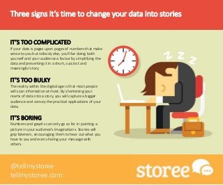
Whether you need to make a presentation in work, explain a complex process to a client or convey your understanding of a topic to your university class, it’s likely that you are experiencing information overload. When you’re faced with the difficult challenge of summing up information in an accessible and interesting way, it can be difficult to communicate the width and breadth of information you’ve studied. Stories are a great tool for boiling down information to include only its essential components without losing any depth or meaning. We’ve made a list of three signs that it might be time to change your data into stories! IT’S TOO COMPLICATED If your data is pages upon pages of numbers that make sense to you but nobody else, you’ll be doing both yourself and your audience a favour by simplifying the data and presenting it in a short, succinct and meaningful story. IT’S TOO BULKY The reality within the digital age is that most people will scan information at most. By shortening your reams of data into a story, you will capture a bigger audience and convey the practical applications of your data. IT’S BORING Numbers and graphs can only go so far in painting a picture in your audience’s imaginations. Stories will grip listeners, encouraging them to hear out what you have to say and even sharing your message with others. For the latest storytelling updates, tips and guides, follow @tellmystoree on Twitter or visit tellmystoree.com
Recommended

Recommended
More Related Content
Viewers also liked
Viewers also liked (13)
More from Aurion Learning
More from Aurion Learning (20)
Recently uploaded
Recently uploaded (18)
Three signs it's time to change your data into stories
- 1. Three signs it’s time to change your data into stories IT’S TOO COMPLICATED If your data is pages upon pages of numbers that make sense to you but nobody else, you’ll be doing both yourself and your audience a favour by simplifying the data and presenting it in a short, succinct and meaningful story. IT’S TOO BULKY The reality within the digital age is that most people will scan information at most. By shortening your reams of data into a story, you will capture a bigger audience and convey the practical applications of your data. IT’S BORING Numbers and graphs can only go so far in painting a picture in your audience’s imaginations. Stories will grip listeners, encouraging them to hear out what you have to say and even sharing your message with others. @tellmystoree tellmystoree.com