
Recommandé
Contenu connexe
Similaire à Visualizing the economy
Similaire à Visualizing the economy (20)
Dernier
Dernier (20)
Visualizing the economy
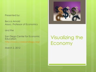
- 1. Presented by: Becca Arnold Assoc. Professor of Economics and the San Diego Center for Economic Education Visualizing the http://www.cceesandiego.org/ Economy March 2, 2012
- 2. What is an interactive map? “a computer-based system that stores geographically referenced data linked to textual attributes (a database) and allows for mapping, display, analysis, and modeling” (http://www.fdlp.gov/administration/handbook/155- appendixe) “A computer application used to store, view, and analyze geographical information, especially maps” (thefreedictionary.com) “A map you can click on” (Becca) Caveat: graphs and tables are part of these lessons
- 3. Why use interactive maps? Answer questions more thoroughly http://www.imf.org/external/datamapper/index.php Eye-catching way for students to gain real- world perspective http://www.brightpointinc.com/Gallery/USTradeDeficit.as Practice critical thinking
- 4. Research findings Student interest Self-reported helpfulness of maps: 3.8/5 Not all map usage equal… The more students “click” the better And not all maps equal… The less economic indicators per map, the better Caveats College students Old-style maps You tube video: type in “GIS beccasa” and you’ll find it
- 5. What makes a “good” map? Reliable source Government statistics Visually“easy” Relatively current Downturn in economy makes this both a challenge and an opportunity
- 6. About the curriculum 6 lessons One class period per lesson Review concept along with mapping Designed to be done in pairs Follow up questions included Appendices with map links
- 7. Let’s look over visualizing unemployment! Butfirst turn to the section on County unemployment and change that very long url to: goo.gl/jJcyW
- 8. Developing a classroom culture of maps Happens naturally with lessons if enough time is given. Extra credit http://www.radicalcartography.net/9thcensus/9th35.jp http://www.usgovernmentspending.com/year_spendin
- 9. Thank you! Andbe sure to contact me with questions: barnold@sdccd.edu