SlideShare une entreprise Scribd logo
1  sur  19
Evaluation  By Rebecca Mahan
In what way does your media product use, develop or challenge forms and conventions of real media products? I have took this idea of having a big masthead and also putting the masthead in front of the model from my previous research that I did earlier on in my blog. I liked the way on most magazines they had the masthead either in front or behind depending on the model they had. If they were famous and a big star then the model would be in front of the masthead to show how important they are and also to make them stand out. On the other hand some magazines had the masthead on the main picture. This would make it easier for the customer to recognise the magazine and be able to see the title better. As you can see my masthead doesn’t have a background behind it because I tried it and I thought that it didn’t look very professional because the masthead has effects on it to make it stand out anyway. So this made the masthead look like there was too much going on.  I had the idea of making an indie magazine from all of the indie magazines already out there. This is because it would make my research easier. I also picked indie because it is the music I am most into. I think that my inspiration has come from the research and planning on my blog but also looking at magazines on the internet and in magazine stores. I wanted to use a colour that would attract both sexes to increase the market. I think that my magazine is conventional because it has all the conventions as a real media product. I tried to make put conventions into my magazine so it didn’t look out of place on the selves but also that it wasn’t unexpected by the public.  I have got this idea of having little subheadings underneath my masthead from the music covers that I have researched. I got the idea from the music magazine Q. I thought instead of having it tiny underneath the masthead, I would have it easy to read. This is so  that the customer would be able to see what edition it is and also to see when it was released and the price of the music magazine. I think by having the glow around the writing also makes it stand out a lot more from the bright and vibrant background. This is good because it catches the eye of the public more because it stands out from the blue background. I think that this is still a convention but I have pushed it to its limit because if it was much bigger or on top of the mast head then it wouldn’t be a convention at all. I think by having this detain to the magazine makes it a lot more professional.
In what way does your media product use, develop or challenge forms and conventions of real media products? This is an idea I had from the music magazines I have been looking at. I think that having a banner on the magazine makes it look more professional and also I think that it makes it more effective and it stands out to, this will also be able to catch the eye of the potential customers. This is a good effect to have because it shows the reader what is also inside the magazine without having to read it. This could make the customer want to buy the magazine more because I am making the magazine desirable by adding contents of the inside of the magazine to the outside to give the customers a little taster.  I have also got this idea from the Q magazine. There are many different designs for barcodes on magazines. On the magazines I researched there was a vertical one on the Q magazine, a horizontal one on the VIBE magazine and a horizontal one on the KERRANG magazine. These are all of the barcodes that I have researched and thought were conventional. I  think that the second one is the best as it has the website underneath it co the customer can research the magazine if they want to. I have chosen a horizontal barcode because I think that it fits in with my layout better then a vertical one would. I have used a big splash on my front cover so the customers know what is on my music magazine. This will allow them to have a preview of what is inside of the magazine. This will attract the customer to the magazine. I had a lot of inspiration from the research I had collected earlier. This allowed me to use this research to my best ability. On most magazines they use their splash for a song title, a quote for the interview or a eye catching headline. I thought that taking a quote from the interview would be the best option as it stands out to the reader a lot more because they will want to read the magazine to see what else the artists has said. This is an example of the NME magazine. This will attract the customers eyes because it is so eye catching but on the other hand it isn’t a convention. So this would have been a shock to the customer which would of made them want to read more.
In what way does your media product use, develop or challenge forms and conventions of real media products? I have researched many front covers on lots of different types of magazines. I saw which layout looked better with the layout of the picture. I really liked this layout with this picture because the picture is big and covers up half of the page meaning that the customer can see it very well. I thought that this was a good place to have my photo because it is very eye catching. I think that it is more eye catching because the colour of the clothing stands out from the background of the magazine. This means that the customer will see the picture a lot more quickly because it is a contrast between the two colours. Where as the font colour and the picture link in together by the colours from the dress are used as the font colours. This makes the magazine link together meaning that it is more professional. I think that this is a convention because on most of the front covers I researched the font colours linked in the what the model was wearing on the colour to make it look more professional and also make the font stand out more then it usually would. As you can see on this Spin magazine the colours of her top are the font colour of the text around her. This also shows that she is a big star on the magazine.  I have used this dress style because I thought that I wanted to make the magazine look expensive and worth its money. Also I think that this shows that indie girls can still look nice without wearing the conventional things. I pushed the convention to the boundary because not many music magazines dress their models in nice dresses but I thought that I could show a different side of this. I think that this is a good outfit for my magazine because it shows that the models of a indie magazine can wear dressy clothes instead of casual clothes. I got this idea from looking through all of my magazines that I had researched and saw how the models were dressed in nothing or just casual clothes. This dress shows a little flesh meaning that I wasn’t pushing the convention to the edge because the dress is a strapless.  I have picked a female model because I thought that the colours of the magazine were more on the female side of things rather then male because it is a light blue that is used and not dark blue. So this means that this model would attract males to my magazine. But on the other hand it would still attract girls to my magazine because they would like to see and read more about this model because she looks nice and welcoming which is essential on a front cover magazine depending what magazine it was. I have used the subtle make up look to show that the girls don’t have to wear a lot of makeup to look pretty.
In what way does your media product use, develop or challenge forms and conventions of real media products? This is my content page and I have been looking at my research that I have done earlier on my blog for inspiration. I didn’t want to copy any of the contents pages because I wanted to have my own look. I thought that this layout looked very good with my pictures. I think that the layout of the text is in a good position because  it looks good with the layout with my pictures because it makes the pictures stand out more and acts like a boarder. This is good because it catches the customers eye and makes them read the contents because it stands out and it is in your face. I think that it is good that there isn’t much writing on my contents because that will turn people off from reading it. I also think that the big sub headings are good because it makes it easier for the reader to see what it is under the headings. I think that they stand out more because they are black and big but they have got a which glow behind them which gives it a 3d effect. This is a good effect as people will be able to see the writing more clearly then before. I got the idea of using sub headings from a music magazine called NME. I also got some ideas from the magazine Kerrang.This shows the readers that this is a monthly magazine that has a lot of updates in.  From this contents page I think that the masthead for this page is the main feature because it really stands out. I got this idea from a magazine called Vibe. There contents page is really big which inspired me to have a big one because it is the first thing that catches the eye of the audience. I think that this is conventional because it it meant to take the audiences attention of the text. I think that this masthead is good because it links in with my masthead on the front page which suggests that my contents page is very professional and this is then another convention because every magazine is consistent to show that they are professional so I have tried to do this head on many of things including my masthead and my background and you can also see that my text has glow on it the same as the text on the front cover.  I think that these pictures are conventional to the fact that there is pictures on the contents page but then they are not a convention because they are not in a box or they aren’t small. I also got this idea from the contents page called Vibe. I think that this is a good idea to do because it takes the readers eye of the writing. You can also tell that this picture is important because the models head is in front of the contents title. I got this idea of using this pose from the Spin front cover.
In what way does your media product use, develop or challenge forms and conventions of real media products? Also on my contents page I have put an special offer. This is a convention because most of the contents page I looked at all had a special offer either on the contents page or on the front cover. I wanted to put it on my contents page so people would be attracted to read the contents page because the special offer will catch their eye. this also means putting a special offer will make the customer buy the next issue because they get a 20|%discount on Kasabian tickets. I got this idea mainly from the magazine NME magazine. My special offer isn’t in your face as much as the NME special offer but this is because they have used more vibrant colours that ties in with their theme. I have used darker blues but I think they still fit in with my theme which makes it a convention because I am keep the colours of my magazine throughout my magazine to make it look a lot more professional.  i got the idea of the idea of the circles around the special offer from the magazine called NME as well but this was from the front cover and not from the contents page. I think that this circle effect is good around the writing because it makes the special offer stand out a lot more then usual. I used the idea of using a bright vibrant colour for the key terms from looking at the special offer from the NME magazine but the offer that was of the contents page. Because I thought that the colour yellow stood out a lot mote then a dark blue.
In what way does your media product use, develop or challenge forms and conventions of real media products? I think that this double page spread doesn’t look conventional at all. This is because all of the music magazine I researched were only asking one group or one artist questions. Where as I am asking two artists questions because they are competing against each other. I think that this still takes some of the contentions of a normal double page spread but I am pushing mine to the limit to make it look a lot different to other peoples double page spread. I wanted to do this so it stood out and people would want to read this article. I didn’t want to put too much writing into this double page spread because people would be turned off from this.  The main convention on this double page spread would be the fact I have used page numbers at the bottom of the page and also I have used quotations from the article. I got the idea of using page numbers from all the music magazines that I had researched earlier in my project. I thought that the use of quotations would be good on my double page spread because all the magazines use them to draw the customer to read the article. I have pushed this convention to its limit because all the double page spreads I researched had very little quotations where as mine are very big and I have only got one from each artist. But this is because they are big and they stand out and catch the readers eye.  The title of the magazine is in the corner of the double page spread so people knew what magazine this article was from and also I wanted to keep the theme running through the magazine. This is why I have used the same background that I have used all the way through my magazine. I also think that this makes it a lot more professional. As you can also see I have used the same text through the magazine as well. This gives it the consistency it needs.  I have used these pictures of the model because the portray that the artist are very willing to do whatever it takes to win and also that they are both as competitive as the other as well as strong. But also from the clothes they are wearing they look friendly and not scary which is good. I think that this is a convention because I have been looking through all the magazines and the models all look very friendly. This makes the customer like the artist because they look friendly. I have also used this picture because they look like they have got a lot of attitude which could mean that their music is very good.
How does your media product represent particular social groups? To get the right genre for my media work I had to do a lot of research on what people like and also what is the most common music around. I also had to research what age group the music market targets at. I did this by doing questionnaires of what magazine I should do but also by looking at magazines I was researching to see if they had a certain way they tried to portray the magazine was for a certain age group. I always wanted to do my magazine for the age group of around 13-19. this was because I thought that this is the age a person likes to get into music but they get to start to discover new trends and styles from the music they listen to and watch on the television or on the internet. I think this starts to happen when they go up to high school or into year nine. This is what made me make up my mind.  The genre I have picked for my music magazine is indie. This is because I researched that this is the most popular music style to teenagers and I also found out that it brings in most of the income into the music industry through magazines. I thought that this would be a good genre to base my magazine on because I had a lot of music magazines I could research. Every music genre can be portrayed it lots of different ways and this is bought onto the children. The children use music genre as different ways to dress and be different from other people. You can also see this from the make up they wear and the songs they listen to.  This genre of  music can be found in different forms. One of those forms can be from the music magazines on the shelves. This will show the teenager how to dress and be different from other people. So I wanted to get this so they didn’t look that different from other people. I also wanted my models to wear the clothes that the public wear. I wanted to show that my age group was the teenagers so I used models that were young and looked like they would buy my magazine. I did this because now a days looks are very important to people because they can get judged easily in school or out of school. Through my magazine I wanted to attract the younger population by the models I used on my front cover, the colours I used and the language. I thought that this will be a good way to attract the younger population because now a days teenagers use informal language all the time and I thought that if I portrayed this into my magazine then they would be attracted to my magazine a lot more because they would know it is a magazine for them. The models on my music magazine would catch the eye of the younger population because they will be able to relate to them. This is because they are the same age as the people I want to be attracted to my magazine and they are wearing clothes that people of the age 13-18 would. I think by dressing my models into trends that relate to the indie style is good because some people just like the indie music because of the styles the artists wear. I used the colours I did because they were bright and vibrant and I thought that they would attract to the younger population more because they like colourful colours, where as older people like things to be more subtle. I think that blue was a good colour to use because it would attract the attention of both girls and boy because I personally think that it is a neutral colour.  I thought that the stories I used for my magazine would have a lot of impact on who would buy my magazine. This is because teenagers like interesting gossip that they can either relate to or they find as eye catching and juicy information about different celebrities. The article has to stand out on the shelves for the teenager to pick it because if I was targeting the music magazine at the older generation then I would use more informative stories and not interesting.
What kind of institution might distribute your media product and why? There are many different institutions that might distribute my media product. From being a media studies student I knew about most of these companies and I had researched them before. The main ones are IPC, ‘Music Mags’, Factory Media and Future Publishing. I think that it would be a very good idea to distribute my product because I think that my magazine would appeal to the teenagers because my magazine talks about all the music gossip and then it gives them information of gigs coming up. Also it has special offers inside. This would made the teenagers very attracted to my magazine. Therefore I think that my magazine will bring in a lot of money for any institution.  I think that one thing that could be a problem for my music magazine to get distributed by an institution might be the fact that there is a lot of indie magazines already on the market. This means that the teenagers might already have a music magazine that they buy every week this might mean it could be hard for my magazine to get custom and money.
IPC I have found out that the magazine that I have done the most research on to help create my magazine was the NME and this was distributed by the institution IPC ( http://www.ipcmedia.com/ ). They do very big brands and this made me want to distribute my product by this company. This was also because NME was the same genre as my magazine so I thought that they would be more in favour to distribute a magazine that is following genres that have already distributed. But then I found out that this is the only indie magazine that they have published. The rest of the magazine that the have published are hobby magazines. Here are some of the magazines that IPC distribute. They are a good company but I think because they have only distributed one music magazines I am going to research another company that will be better for my magazine.  I have researched a lot about IPC to find out what is good and what is bad about using IPC as my distributor. The good this is that it is one of the well known institution which makes it easier for people to know my magazine because they can do more advertising because they will have the most money. I know they are well known because they own 23% of the market business. I also think that it will be good to be with these because they have distributed the most magazines. But on the other hand, it is a big company so they are not likely to distribute a new magazine. Plus they have only distributed one Indie magazine so this might mean that they don’t want to take the risk of distributing it because there is so many indie magazines on the market. This could also be an advantage because they might want to distribute more Indie magazines because they haven’t distributed that many and they want to open to a wider audience.
Music Mags The second institution I am going to research to distribute my magazine is music mags ( www.musicmags.net ). I think that this will be a good institution to distribute they are a smaller institution then IPC this might mean that they might be a little bit more riskier because they need to get the money but also become more well known so more magazines get distributed by them.  The benefits with going with Music Mags will be that the sampling of the publications will be sent to the retailer which means that they can see whether they want to sell it in their shop or not. Another would be that the trade advertising with USA and Canada which will make my magazine well known and more international. I will also save money and time by all these benefits because I wont have to do anything because it will be done for me by Music Mags.  Another advantage is that I can see from looking at what magazines they have distributed there are many music magazine which means that they like music magazine. On the other hand this might mean that they wont want to distribute any more.  I think that I am going to pick Music Mags as my institution to distribute my magazine because they have got more advantages than disadvantages and also I think that they will suit my magazine more then the IPC do. Also on the website it tells me a lot mote information about the distribution of the magazine and what will happen which also made me pick this institution.
Who would be your audience for your media product? My media product would mainly aim at teenagers from the age of 13-18. This is because I think that I have picked the colours that would suit this age group and also everything else relates to them. I targeted my magazine at this age because whilst I was looking at other indie magazines they were targeted at around the same age. This meant that I thought if I targeted my magazine at the same age group then people would read it and I help to attract these people by taking ideas from other indie magazines that were successful like the NME. I have chosen these colours to stand out to the younger generation because I thought that they would catch their eye and attention. I also thought that if I used a blue then it would be a neutral colour that would attract both sexes. For example if I have picked the colour pink then only the girls would have been attracted to my magazine because if the boys were to buy my magazine then they would be called names because of how the society is now a days. I also thought that blue suited the genre of the magazine better then any other colours. I also found out that most people in my class were doing a black/ grey and white theme for their indie magazine so I thought I would be different and add a little colour into the magazine. I also wanted to have this audience because I think that teenagers are most of the population that buys the music industry. This is because they want to know what is going on because they like to know all of the gossip first. The magazines that I had researched help me make the decision. One of the thing that I thought was very important was the colours of the magazines.  The second thing that I thought was very important was the type of models that were on the front. This was because girl models would attract mainly boys to the magazine and visa versa. I looked at many of the indie magazines and other genre magazines and I found out that interesting images and poses catches the attention of the public, such as this NME magazine. I wanted to choose a girl model that was young so that it would attract both sexes. This would attract the girls to buy the magazine because they would be attracted to the clothes that the model is wearing.  I think that my name of my magazine portrays the indie genre because people like to have a lot of Freedom so I think that it also portrays of what the teenagers do so people will be intrigued into the magazine. I also think that it is good because the name Freedom has never been used before. I think overall this will attract the indie population.  Overall, I think that I will attract the teenager population which is a niche market because I have used different things from magazines to make my magazine more appealing. I think that this will attract this population because of the vibrant colours, juicy articles and models. I think that there might be a chance of the people that like pop music looking at my magazine because of the colours.
How did you attract address your audience? I researched a lot of music magazines to see what they had done on their magazines to attract the audiences of their choice. I thought that this was a good way to get a lot of ideas from how to attract the audiences of the magazine even though I had some already in mind. I though that if I got some ideas from other magazines that are well known that my magazine will  be just as big.  The first sign I thought that would attract my teenage audience would be the title. This is because I was looking at every magazine and they were very big and bold so that the customer was able to see the magazine on the shop shelves easily. I think that my masthead is very big and would stand out a lot more then any other magazine because it is a vibrant colour that will catch the eye of my audience.  As you can see from below I tried to take inspiration from both of these mastheads even though they are completely different. I took the effect of having the model in front of the masthead but not as much so the target market is able to see most of the masthead and be able to recognise the magazine. I also took the idea of having a glow/ bold border around the writing to make it stand out more from the NME magazine but turned it into my own idea. I think that this attracts my audience because it is both combinations mixed together to make it look better and also I have used a brighter colour so it would stand out more.  The second thing that I thought would attract my audience was the picture on the front and also where it was situated on the page. I think that it doesn’t matter where the model is on the page as long as it is big and visible for the audience to see. I got my idea of having my picture down the side of my front cover from seeing that none of the indie magazines have done it yet so I thought if I did something different and made my picture stand out with having a glow around her then people will see her a lot more then if she was just on the side of the page.  I think that the splash on the picture and the stories around the picture. This attracts them to the magazine because teenagers like to know about all the gossip which is going on. I got this idea of having a lot of gossip around the picture and on the picture from all of the magazines I have researched. But I thought that the most appealing splash and text around the picture was the Q magazine this is because it was really big. I didn’t want to make mine this big because you wouldn’t be able to see the clothes and the model.
How did you attract address your audience continued… I have used the font and the size of the font because I thought that it would attract the younger population because it is a little unusual and weird. This goes with my genre and that is why I picked it. I also wanted to pick this font because I thought that it would attract my audience because it is not what you would usually expect on a magazine. I think that this font will stand out to the rest of the magazines which are on the shelf. I have used two different fonts to make sure that both the fonts stand out to the target market and also I think that both of the fonts will attract the niche market because they are unique.  I have used the ages model that I have because I thought that a younger model would attract the younger population because they can relate to what she is wearing and also how she looks i.e. how her make up is done and also he hair. This is because then can then take this and play with it themselves. I think that a young model will attract this population because the boys will be attracted to her looks and the girls will be interested in the way she looks so they might want to copy her and also see what fashion trends she has.  I chose the clothes I did because I thought that the teenagers would be able to relate to the fashion and also be able to buy the clothes if they like them that much. I also think that it is good that I have took the colours of the clothes and used it in the colour of my font to link the two things together.  I have chosen both informal and formal text so that it attracts all of the teenage population because not all teenagers use text speak. I think that  this is important use not all one type of language because then it will put the other teenagers of. I think that this is a good way to attract the readers because they will be interested if they know that the magazine is aimed at them in different ways.
What have you learnt about the technologies from the process of constructing this product? I have used of new technology whilst doing media so this has expanding my knowledge about the software and the technology. I have also been thinking a lot more about taking photos and what resources I need to do this. I think a lot more into how my work is represented and what it looks like because I know that it is open to the web. I have learnt about new programmes. This has made my knowledge stronger in media as I wasn’t really that interested in it but now I know a lot more about it I think that I am now more interested in it because it helps me in every day life.  The first thing that I think I have improved on is the hardware for example using a camera. Before I just used to take pictures without thinking of my surroundings or the lighting. Where as for my products I have been thinking about the lighting on how it will look on their face and how will it translate into a picture and also what angle to take the picture at. I need to have a good angle to show the best features of my model and also my target market should be able to see the clothes clearly and also their expression. The framing needed to be right so that everything fitted into my picture that I wanted it to. I think that the clothes are important because as I have been saying throughout my evaluation it relates to what my audience like wearing and what is expected from an indie magazine.  I think that also my knowledge has got broader from using the computers more from when I was finding my research to the construction of my products. I used the computers a lot when finding my research to get the magazine. I thought that this was the best way to do my research because I was able to find a lot of different magazines without paying from them. I could also zoom on in certain effects so I was able to translate this to my own magazine. It was the first time I had ever posted my work on the internet. I found that this was a very easy way to do my work because I think that I am good with writing on a computer anyway so I thought that it was also a lot faster and this meant that it was less time consuming.  I already had a lot of knowledge about computers and websites because I have took I.C.T and I find it very interesting. But I have never used Blogger before so this was really new to me. But as I kept using it to post my work I was getting a lot more used to it. I would then look at all the buttons which got me a lot more used to the programme. I then felt like I had been using it all my life. I thought that this programme was really good because I didn’t have to print of any of my work and I felt that it was a lot better writing my work up onto the computer and also doing my designs on the computer because I am not very good at drawing so it made my products look a lot more professional. This also took less time which meant I had a lot more time to do my other coursework for example my research.
The biggest improvement through making this media product is with the programme fireworks. This is the programme that I have learnt most about. This is because I have never used this before so I got really stressed when I couldn’t make my products but as i got more help of pupils and of the teacher my knowledge got better and so did my products. From learning how to use fireworks I was able to locate all the tools and effects that I could use for my media products.  What have you learnt about the technologies from the process of constructing this product continued… This is a screenshot of how I faded my background on my media products to make it look more effective. I only found out how to do this when I was improving my first drafts because I was experimenting with all the buttons. As you can see that you can pick any fade you want to have on your project. This will then fade your image which makes it a lot more effective as you can see on my front cover. You can then pick another effect that you would also like to have on the image to make it look a lot more effective then it is. I also used this to make sure it stood out to my target audience. I think that this is a really good button to use as it is really simple to do when you get the hang of the programme.  To the left, this is a toolbar that shows all the tool that you can use on fireworks to make you product look a lot more authentic and professional. I have used many of these tools for different things. I have used the  polygon lasso tool  to go around my pictures and take away the background. This is a good toll because you can use the wizard wand but this might get rid of some of the picture so with the polygon lasso tool you can use this free hand and cut what you want out of the picture.  This is the picture on the left before i used the polygon lasso tool. As you can see the picture has a background around. The picture on the right has no background which makes it look a lot better.  On the right of the screen you can see the other tool bar that you can also use for the text. This is what I used for my mast head. This is called the assets. This is the difference between using it and not using it. I think that this is a good tool because it gives the magazine a bigger effect as the writing stands out a lot more.
What have you learnt about the technologies from the process of constructing this product continued… I think that I have also improved on using the programme PowerPoint. This is because I have been using it a lot whilst I have been doing this media course. I think that it is good that my knowledge is expending with different programmes as it will help me when I leave school and have to go to work. This would means that I would be able to bring my knowledge when I go for an interview. I think that that my knowledge of PowerPoint has grown because I have been using it a lot to show my research and I have learnt how to present my work better on PowerPoint. On the screenshot below it shows a button highlighted. This button is a shadow button which gives a better effect on your work and makes it look a lot more professional.  Another new programme I have used is this website called Dafont. I think that this wasn’t a hard programme to get my head around but I thought that it was a really good website to use. This was because I could use fonts that aren't on fireworks or word this meant that my title was unique and weird compared to other peoples products because I had a lot more fonts to choose from. All you had to do was to download the font and then extract it from the file that was downloaded on to the computer. This meant that I can use this programme in other subjects now as well to make my products/ work look better. I got two fonts of this website and this is what they were: Karabine and Tosca zero. The last programme that I have been using a lot is Slideshare. This is because I have used PowerPoint whilst I have been doing my work because I thought that it looks a lot more professional and presentable then just putting it on Blogger. This means that I have also got used to this programme as it was another new programme for me. This is a screenshot of all the presentations I have put onto blogger through Slideshare.  Overall I think that media has helped with my media product a lot and it will also help for the future and I go for a job. This means that I will be able to show people these programmes to help them in life as well. But I think that using these programmes have helped me get ahead because my product wouldn’t be as good as it is if I wouldn’t have had the programmes I did.  Media studies Media studies This is the effect that the shadow button has on writing, I have used the same writing and the same size for both of the texts and then I have just clicked the shadow button which makes the writing lighter and have a shadow behind it.
Look back at your preliminary task, what do you feel you have learnt from the progression from it to the full product? My final product My Preliminary As you can see from my final products there are many different changes from my preliminary and my final products.  This is because my knowledge has been improving through out the course and this meant that when I fist started I didn’t know much bout the technology meaning that I couldn’t do many effective things on my prelim. I have also made improvements because I did a lot more research before doing my final product so I could improve on conventions and also what is professional in the magazine industry.  Firstly, I feel like i didn’t do my research properly for my prelim because I was just starting media studies. This meant I didn’t get to see the layout or the styles of school magazines. This meant that my efforts were poor. But for my final product I think that I have done lots of research which means I have been able to look the fonts, pictures, language, style, layout and ideas from other magazines. This also meant that I could see the conventions that were used in every magazine throughout the music magazine industry.  I feel that when making my prelim I didn’t use my time well which meant that I had to rush my prelim because this meant that my prelim wasn’t as good as other peoples. But I learnt from this mistake and throughout the media studies course from that I used my time well and always gave my work in on time and to the best of my ability. I think that I used most of my time looking for a good font and picture for my prelim. I think that this also carried on to my final product because it took me a lot of time to get motivated to do my pictures so I thought that this task was time consuming. But I helped my self with having all of my magazines done and only having to put the pictures in place. The thing that helped me with that was the layouts I had to do before hand and also doing the mock ups.  I thought that after I had used fireworks for the first time for my prelim and saw that my prelim wasn’t as good as everybody else's I used my time wisely to get to know the programme better which helped me for my final products as I was able to adapt to what I was doing and doing in the time we had. This was because I didn’t look around fireworks to get to know it better I just did my products which meant that they were simple and had no effects. I think that this course has be
Look back at your preliminary task, what do you feel you have learnt from the progression from it to the full product continued … Furthermore, I think hat my final product is a lot more attractive and aesthetically pleasing to the audience because the colours are soft but still vibrant and all the colours used on my final product are linked together nicely. Where as on my preliminary they are vibrant but harsh on the eye which doesn’t make it to appealing. I have leant all these techniques from the research and planning I have done throughout the media course.  Overall, I have made a drastic improvement from my preliminary to my final product. I think that the task we had to make a prelim was very good and did have a meaning and this meaning was to see how you have improved over the course and also to see where you went wrong or didn’t to so well. I think that this shows me that I have improved and this is because of the technology and all the research I have been doing throughout the course.

Contenu connexe

Tendances

Evaluation 7
Evaluation 7Evaluation 7
Evaluation 7zelrii
 
My Media Evaluation
My Media EvaluationMy Media Evaluation
My Media Evaluationdaniellaaaaa
 
Music Magazine Evaluation
Music Magazine EvaluationMusic Magazine Evaluation
Music Magazine Evaluationguest6d0ca6
 
Evaluation 1 for media
Evaluation 1 for media Evaluation 1 for media
Evaluation 1 for media ruba ibnwargan
 
Question 1 - Media Evaluation
Question 1 - Media EvaluationQuestion 1 - Media Evaluation
Question 1 - Media Evaluationbeckiemcconnell
 
Emma whitehand 2
Emma whitehand 2Emma whitehand 2
Emma whitehand 2afrench14
 
In what ways does your media product use mr stevens 2
In what ways does your media product use mr stevens 2In what ways does your media product use mr stevens 2
In what ways does your media product use mr stevens 2edthompson13
 
Question one of magazine analysis
Question one of magazine analysisQuestion one of magazine analysis
Question one of magazine analysis812455
 
Evaluationneed to finish
Evaluationneed to finishEvaluationneed to finish
Evaluationneed to finishsarahwalley
 
Question one to my A-level magazine analysis
Question one to my A-level magazine analysisQuestion one to my A-level magazine analysis
Question one to my A-level magazine analysis812455
 
Evaluation 1 for media
Evaluation 1 for media Evaluation 1 for media
Evaluation 1 for media ruba ibnwargan
 

Tendances (19)

Evaluation
EvaluationEvaluation
Evaluation
 
Evaluation 7
Evaluation 7Evaluation 7
Evaluation 7
 
My Media Evaluation
My Media EvaluationMy Media Evaluation
My Media Evaluation
 
Music Magazine Evaluation
Music Magazine EvaluationMusic Magazine Evaluation
Music Magazine Evaluation
 
Evaluation 1 for media
Evaluation 1 for media Evaluation 1 for media
Evaluation 1 for media
 
Question 1 - Media Evaluation
Question 1 - Media EvaluationQuestion 1 - Media Evaluation
Question 1 - Media Evaluation
 
Emma whitehand 2
Emma whitehand 2Emma whitehand 2
Emma whitehand 2
 
Question 2
Question 2Question 2
Question 2
 
Magazine Evaluation PowerPoint
Magazine Evaluation PowerPointMagazine Evaluation PowerPoint
Magazine Evaluation PowerPoint
 
In what ways does your media product use mr stevens 2
In what ways does your media product use mr stevens 2In what ways does your media product use mr stevens 2
In what ways does your media product use mr stevens 2
 
Question one of magazine analysis
Question one of magazine analysisQuestion one of magazine analysis
Question one of magazine analysis
 
Evaluationneed to finish
Evaluationneed to finishEvaluationneed to finish
Evaluationneed to finish
 
Evaluation
EvaluationEvaluation
Evaluation
 
Evaluation
EvaluationEvaluation
Evaluation
 
Question one to my A-level magazine analysis
Question one to my A-level magazine analysisQuestion one to my A-level magazine analysis
Question one to my A-level magazine analysis
 
Evaluation
EvaluationEvaluation
Evaluation
 
Evaluation 1 for media
Evaluation 1 for media Evaluation 1 for media
Evaluation 1 for media
 
Evaluation
Evaluation Evaluation
Evaluation
 
Presentation1
Presentation1Presentation1
Presentation1
 

En vedette (7)

Evaluation Media Studies
Evaluation Media StudiesEvaluation Media Studies
Evaluation Media Studies
 
Scream media
Scream mediaScream media
Scream media
 
Prom night Digi pack
Prom night Digi packProm night Digi pack
Prom night Digi pack
 
Evaluation
EvaluationEvaluation
Evaluation
 
Media Studies Stages
Media Studies StagesMedia Studies Stages
Media Studies Stages
 
Saw
SawSaw
Saw
 
Sktc ppd pekan
Sktc ppd pekanSktc ppd pekan
Sktc ppd pekan
 

Similaire à Evaluation Powerpoint

Similaire à Evaluation Powerpoint (20)

Ben mantell
Ben mantellBen mantell
Ben mantell
 
Ben mantell
Ben mantellBen mantell
Ben mantell
 
Research 3.
Research 3.Research 3.
Research 3.
 
Contents page
Contents pageContents page
Contents page
 
Evaluation
EvaluationEvaluation
Evaluation
 
Question 1
Question 1Question 1
Question 1
 
Question 1
Question 1Question 1
Question 1
 
Question 1
Question 1Question 1
Question 1
 
Question 1
Question 1Question 1
Question 1
 
Question 1
Question 1Question 1
Question 1
 
Evaluation
EvaluationEvaluation
Evaluation
 
Evaluation
EvaluationEvaluation
Evaluation
 
Research
ResearchResearch
Research
 
Evaluation
EvaluationEvaluation
Evaluation
 
Evaluation
EvaluationEvaluation
Evaluation
 
Question One Evaluation
Question One Evaluation Question One Evaluation
Question One Evaluation
 
Evaluation
EvaluationEvaluation
Evaluation
 
Evaluation
EvaluationEvaluation
Evaluation
 
Question 1
Question 1Question 1
Question 1
 
Evaluation Question 1
Evaluation Question 1Evaluation Question 1
Evaluation Question 1
 

Dernier

Kishan Reddy Report To People (2019-24).pdf
Kishan Reddy Report To People (2019-24).pdfKishan Reddy Report To People (2019-24).pdf
Kishan Reddy Report To People (2019-24).pdfKISHAN REDDY OFFICE
 
Powerful Love Spells in Phoenix, AZ (310) 882-6330 Bring Back Lost Lover
Powerful Love Spells in Phoenix, AZ (310) 882-6330 Bring Back Lost LoverPowerful Love Spells in Phoenix, AZ (310) 882-6330 Bring Back Lost Lover
Powerful Love Spells in Phoenix, AZ (310) 882-6330 Bring Back Lost LoverPsychicRuben LoveSpells
 
Nara Chandrababu Naidu's Visionary Policies For Andhra Pradesh's Development
Nara Chandrababu Naidu's Visionary Policies For Andhra Pradesh's DevelopmentNara Chandrababu Naidu's Visionary Policies For Andhra Pradesh's Development
Nara Chandrababu Naidu's Visionary Policies For Andhra Pradesh's Developmentnarsireddynannuri1
 
Lorenzo D'Emidio_Lavoro sullaNorth Korea .pptx
Lorenzo D'Emidio_Lavoro sullaNorth Korea .pptxLorenzo D'Emidio_Lavoro sullaNorth Korea .pptx
Lorenzo D'Emidio_Lavoro sullaNorth Korea .pptxlorenzodemidio01
 
Nurturing Families, Empowering Lives: TDP's Vision for Family Welfare in Andh...
Nurturing Families, Empowering Lives: TDP's Vision for Family Welfare in Andh...Nurturing Families, Empowering Lives: TDP's Vision for Family Welfare in Andh...
Nurturing Families, Empowering Lives: TDP's Vision for Family Welfare in Andh...narsireddynannuri1
 
Julius Randle's Injury Status: Surgery Not Off the Table
Julius Randle's Injury Status: Surgery Not Off the TableJulius Randle's Injury Status: Surgery Not Off the Table
Julius Randle's Injury Status: Surgery Not Off the Tableget joys
 
Embed-2 (1).pdfb[k[k[[k[kkkpkdpokkdpkopko
Embed-2 (1).pdfb[k[k[[k[kkkpkdpokkdpkopkoEmbed-2 (1).pdfb[k[k[[k[kkkpkdpokkdpkopko
Embed-2 (1).pdfb[k[k[[k[kkkpkdpokkdpkopkobhavenpr
 
1971 war india pakistan bangladesh liberation.ppt
1971 war india pakistan bangladesh liberation.ppt1971 war india pakistan bangladesh liberation.ppt
1971 war india pakistan bangladesh liberation.pptsammehtumblr
 
BDSM⚡Call Girls in Sector 135 Noida Escorts >༒8448380779 Escort Service
BDSM⚡Call Girls in Sector 135 Noida Escorts >༒8448380779 Escort ServiceBDSM⚡Call Girls in Sector 135 Noida Escorts >༒8448380779 Escort Service
BDSM⚡Call Girls in Sector 135 Noida Escorts >༒8448380779 Escort ServiceDelhi Call girls
 
BDSM⚡Call Girls in Greater Noida Escorts >༒8448380779 Escort Service
BDSM⚡Call Girls in Greater Noida Escorts >༒8448380779 Escort ServiceBDSM⚡Call Girls in Greater Noida Escorts >༒8448380779 Escort Service
BDSM⚡Call Girls in Greater Noida Escorts >༒8448380779 Escort ServiceDelhi Call girls
 
2024 03 13 AZ GOP LD4 Gen Meeting Minutes_FINAL.docx
2024 03 13 AZ GOP LD4 Gen Meeting Minutes_FINAL.docx2024 03 13 AZ GOP LD4 Gen Meeting Minutes_FINAL.docx
2024 03 13 AZ GOP LD4 Gen Meeting Minutes_FINAL.docxkfjstone13
 
Enjoy Night⚡Call Girls Rajokri Delhi >༒8448380779 Escort Service
Enjoy Night⚡Call Girls Rajokri Delhi >༒8448380779 Escort ServiceEnjoy Night⚡Call Girls Rajokri Delhi >༒8448380779 Escort Service
Enjoy Night⚡Call Girls Rajokri Delhi >༒8448380779 Escort ServiceDelhi Call girls
 
2024 04 03 AZ GOP LD4 Gen Meeting Minutes FINAL.docx
2024 04 03 AZ GOP LD4 Gen Meeting Minutes FINAL.docx2024 04 03 AZ GOP LD4 Gen Meeting Minutes FINAL.docx
2024 04 03 AZ GOP LD4 Gen Meeting Minutes FINAL.docxkfjstone13
 
WhatsApp 📞 8448380779 ✅Call Girls In Chaura Sector 22 ( Noida)
WhatsApp 📞 8448380779 ✅Call Girls In Chaura Sector 22 ( Noida)WhatsApp 📞 8448380779 ✅Call Girls In Chaura Sector 22 ( Noida)
WhatsApp 📞 8448380779 ✅Call Girls In Chaura Sector 22 ( Noida)Delhi Call girls
 
29042024_First India Newspaper Jaipur.pdf
29042024_First India Newspaper Jaipur.pdf29042024_First India Newspaper Jaipur.pdf
29042024_First India Newspaper Jaipur.pdfFIRST INDIA
 
Enjoy Night⚡Call Girls Iffco Chowk Gurgaon >༒8448380779 Escort Service
Enjoy Night⚡Call Girls Iffco Chowk Gurgaon >༒8448380779 Escort ServiceEnjoy Night⚡Call Girls Iffco Chowk Gurgaon >༒8448380779 Escort Service
Enjoy Night⚡Call Girls Iffco Chowk Gurgaon >༒8448380779 Escort ServiceDelhi Call girls
 
30042024_First India Newspaper Jaipur.pdf
30042024_First India Newspaper Jaipur.pdf30042024_First India Newspaper Jaipur.pdf
30042024_First India Newspaper Jaipur.pdfFIRST INDIA
 
Defensa de JOH insiste que testimonio de analista de la DEA es falso y solici...
Defensa de JOH insiste que testimonio de analista de la DEA es falso y solici...Defensa de JOH insiste que testimonio de analista de la DEA es falso y solici...
Defensa de JOH insiste que testimonio de analista de la DEA es falso y solici...AlexisTorres963861
 
Pakistan PMLN Election Manifesto 2024.pdf
Pakistan PMLN Election Manifesto 2024.pdfPakistan PMLN Election Manifesto 2024.pdf
Pakistan PMLN Election Manifesto 2024.pdfFahimUddin61
 
Israel Palestine Conflict, The issue and historical context!
Israel Palestine Conflict, The issue and historical context!Israel Palestine Conflict, The issue and historical context!
Israel Palestine Conflict, The issue and historical context!Krish109503
 

Dernier (20)

Kishan Reddy Report To People (2019-24).pdf
Kishan Reddy Report To People (2019-24).pdfKishan Reddy Report To People (2019-24).pdf
Kishan Reddy Report To People (2019-24).pdf
 
Powerful Love Spells in Phoenix, AZ (310) 882-6330 Bring Back Lost Lover
Powerful Love Spells in Phoenix, AZ (310) 882-6330 Bring Back Lost LoverPowerful Love Spells in Phoenix, AZ (310) 882-6330 Bring Back Lost Lover
Powerful Love Spells in Phoenix, AZ (310) 882-6330 Bring Back Lost Lover
 
Nara Chandrababu Naidu's Visionary Policies For Andhra Pradesh's Development
Nara Chandrababu Naidu's Visionary Policies For Andhra Pradesh's DevelopmentNara Chandrababu Naidu's Visionary Policies For Andhra Pradesh's Development
Nara Chandrababu Naidu's Visionary Policies For Andhra Pradesh's Development
 
Lorenzo D'Emidio_Lavoro sullaNorth Korea .pptx
Lorenzo D'Emidio_Lavoro sullaNorth Korea .pptxLorenzo D'Emidio_Lavoro sullaNorth Korea .pptx
Lorenzo D'Emidio_Lavoro sullaNorth Korea .pptx
 
Nurturing Families, Empowering Lives: TDP's Vision for Family Welfare in Andh...
Nurturing Families, Empowering Lives: TDP's Vision for Family Welfare in Andh...Nurturing Families, Empowering Lives: TDP's Vision for Family Welfare in Andh...
Nurturing Families, Empowering Lives: TDP's Vision for Family Welfare in Andh...
 
Julius Randle's Injury Status: Surgery Not Off the Table
Julius Randle's Injury Status: Surgery Not Off the TableJulius Randle's Injury Status: Surgery Not Off the Table
Julius Randle's Injury Status: Surgery Not Off the Table
 
Embed-2 (1).pdfb[k[k[[k[kkkpkdpokkdpkopko
Embed-2 (1).pdfb[k[k[[k[kkkpkdpokkdpkopkoEmbed-2 (1).pdfb[k[k[[k[kkkpkdpokkdpkopko
Embed-2 (1).pdfb[k[k[[k[kkkpkdpokkdpkopko
 
1971 war india pakistan bangladesh liberation.ppt
1971 war india pakistan bangladesh liberation.ppt1971 war india pakistan bangladesh liberation.ppt
1971 war india pakistan bangladesh liberation.ppt
 
BDSM⚡Call Girls in Sector 135 Noida Escorts >༒8448380779 Escort Service
BDSM⚡Call Girls in Sector 135 Noida Escorts >༒8448380779 Escort ServiceBDSM⚡Call Girls in Sector 135 Noida Escorts >༒8448380779 Escort Service
BDSM⚡Call Girls in Sector 135 Noida Escorts >༒8448380779 Escort Service
 
BDSM⚡Call Girls in Greater Noida Escorts >༒8448380779 Escort Service
BDSM⚡Call Girls in Greater Noida Escorts >༒8448380779 Escort ServiceBDSM⚡Call Girls in Greater Noida Escorts >༒8448380779 Escort Service
BDSM⚡Call Girls in Greater Noida Escorts >༒8448380779 Escort Service
 
2024 03 13 AZ GOP LD4 Gen Meeting Minutes_FINAL.docx
2024 03 13 AZ GOP LD4 Gen Meeting Minutes_FINAL.docx2024 03 13 AZ GOP LD4 Gen Meeting Minutes_FINAL.docx
2024 03 13 AZ GOP LD4 Gen Meeting Minutes_FINAL.docx
 
Enjoy Night⚡Call Girls Rajokri Delhi >༒8448380779 Escort Service
Enjoy Night⚡Call Girls Rajokri Delhi >༒8448380779 Escort ServiceEnjoy Night⚡Call Girls Rajokri Delhi >༒8448380779 Escort Service
Enjoy Night⚡Call Girls Rajokri Delhi >༒8448380779 Escort Service
 
2024 04 03 AZ GOP LD4 Gen Meeting Minutes FINAL.docx
2024 04 03 AZ GOP LD4 Gen Meeting Minutes FINAL.docx2024 04 03 AZ GOP LD4 Gen Meeting Minutes FINAL.docx
2024 04 03 AZ GOP LD4 Gen Meeting Minutes FINAL.docx
 
WhatsApp 📞 8448380779 ✅Call Girls In Chaura Sector 22 ( Noida)
WhatsApp 📞 8448380779 ✅Call Girls In Chaura Sector 22 ( Noida)WhatsApp 📞 8448380779 ✅Call Girls In Chaura Sector 22 ( Noida)
WhatsApp 📞 8448380779 ✅Call Girls In Chaura Sector 22 ( Noida)
 
29042024_First India Newspaper Jaipur.pdf
29042024_First India Newspaper Jaipur.pdf29042024_First India Newspaper Jaipur.pdf
29042024_First India Newspaper Jaipur.pdf
 
Enjoy Night⚡Call Girls Iffco Chowk Gurgaon >༒8448380779 Escort Service
Enjoy Night⚡Call Girls Iffco Chowk Gurgaon >༒8448380779 Escort ServiceEnjoy Night⚡Call Girls Iffco Chowk Gurgaon >༒8448380779 Escort Service
Enjoy Night⚡Call Girls Iffco Chowk Gurgaon >༒8448380779 Escort Service
 
30042024_First India Newspaper Jaipur.pdf
30042024_First India Newspaper Jaipur.pdf30042024_First India Newspaper Jaipur.pdf
30042024_First India Newspaper Jaipur.pdf
 
Defensa de JOH insiste que testimonio de analista de la DEA es falso y solici...
Defensa de JOH insiste que testimonio de analista de la DEA es falso y solici...Defensa de JOH insiste que testimonio de analista de la DEA es falso y solici...
Defensa de JOH insiste que testimonio de analista de la DEA es falso y solici...
 
Pakistan PMLN Election Manifesto 2024.pdf
Pakistan PMLN Election Manifesto 2024.pdfPakistan PMLN Election Manifesto 2024.pdf
Pakistan PMLN Election Manifesto 2024.pdf
 
Israel Palestine Conflict, The issue and historical context!
Israel Palestine Conflict, The issue and historical context!Israel Palestine Conflict, The issue and historical context!
Israel Palestine Conflict, The issue and historical context!
 

Evaluation Powerpoint

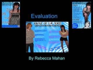
  • 1. Evaluation By Rebecca Mahan
  • 2. In what way does your media product use, develop or challenge forms and conventions of real media products? I have took this idea of having a big masthead and also putting the masthead in front of the model from my previous research that I did earlier on in my blog. I liked the way on most magazines they had the masthead either in front or behind depending on the model they had. If they were famous and a big star then the model would be in front of the masthead to show how important they are and also to make them stand out. On the other hand some magazines had the masthead on the main picture. This would make it easier for the customer to recognise the magazine and be able to see the title better. As you can see my masthead doesn’t have a background behind it because I tried it and I thought that it didn’t look very professional because the masthead has effects on it to make it stand out anyway. So this made the masthead look like there was too much going on. I had the idea of making an indie magazine from all of the indie magazines already out there. This is because it would make my research easier. I also picked indie because it is the music I am most into. I think that my inspiration has come from the research and planning on my blog but also looking at magazines on the internet and in magazine stores. I wanted to use a colour that would attract both sexes to increase the market. I think that my magazine is conventional because it has all the conventions as a real media product. I tried to make put conventions into my magazine so it didn’t look out of place on the selves but also that it wasn’t unexpected by the public. I have got this idea of having little subheadings underneath my masthead from the music covers that I have researched. I got the idea from the music magazine Q. I thought instead of having it tiny underneath the masthead, I would have it easy to read. This is so that the customer would be able to see what edition it is and also to see when it was released and the price of the music magazine. I think by having the glow around the writing also makes it stand out a lot more from the bright and vibrant background. This is good because it catches the eye of the public more because it stands out from the blue background. I think that this is still a convention but I have pushed it to its limit because if it was much bigger or on top of the mast head then it wouldn’t be a convention at all. I think by having this detain to the magazine makes it a lot more professional.
  • 3. In what way does your media product use, develop or challenge forms and conventions of real media products? This is an idea I had from the music magazines I have been looking at. I think that having a banner on the magazine makes it look more professional and also I think that it makes it more effective and it stands out to, this will also be able to catch the eye of the potential customers. This is a good effect to have because it shows the reader what is also inside the magazine without having to read it. This could make the customer want to buy the magazine more because I am making the magazine desirable by adding contents of the inside of the magazine to the outside to give the customers a little taster. I have also got this idea from the Q magazine. There are many different designs for barcodes on magazines. On the magazines I researched there was a vertical one on the Q magazine, a horizontal one on the VIBE magazine and a horizontal one on the KERRANG magazine. These are all of the barcodes that I have researched and thought were conventional. I think that the second one is the best as it has the website underneath it co the customer can research the magazine if they want to. I have chosen a horizontal barcode because I think that it fits in with my layout better then a vertical one would. I have used a big splash on my front cover so the customers know what is on my music magazine. This will allow them to have a preview of what is inside of the magazine. This will attract the customer to the magazine. I had a lot of inspiration from the research I had collected earlier. This allowed me to use this research to my best ability. On most magazines they use their splash for a song title, a quote for the interview or a eye catching headline. I thought that taking a quote from the interview would be the best option as it stands out to the reader a lot more because they will want to read the magazine to see what else the artists has said. This is an example of the NME magazine. This will attract the customers eyes because it is so eye catching but on the other hand it isn’t a convention. So this would have been a shock to the customer which would of made them want to read more.
  • 4. In what way does your media product use, develop or challenge forms and conventions of real media products? I have researched many front covers on lots of different types of magazines. I saw which layout looked better with the layout of the picture. I really liked this layout with this picture because the picture is big and covers up half of the page meaning that the customer can see it very well. I thought that this was a good place to have my photo because it is very eye catching. I think that it is more eye catching because the colour of the clothing stands out from the background of the magazine. This means that the customer will see the picture a lot more quickly because it is a contrast between the two colours. Where as the font colour and the picture link in together by the colours from the dress are used as the font colours. This makes the magazine link together meaning that it is more professional. I think that this is a convention because on most of the front covers I researched the font colours linked in the what the model was wearing on the colour to make it look more professional and also make the font stand out more then it usually would. As you can see on this Spin magazine the colours of her top are the font colour of the text around her. This also shows that she is a big star on the magazine. I have used this dress style because I thought that I wanted to make the magazine look expensive and worth its money. Also I think that this shows that indie girls can still look nice without wearing the conventional things. I pushed the convention to the boundary because not many music magazines dress their models in nice dresses but I thought that I could show a different side of this. I think that this is a good outfit for my magazine because it shows that the models of a indie magazine can wear dressy clothes instead of casual clothes. I got this idea from looking through all of my magazines that I had researched and saw how the models were dressed in nothing or just casual clothes. This dress shows a little flesh meaning that I wasn’t pushing the convention to the edge because the dress is a strapless. I have picked a female model because I thought that the colours of the magazine were more on the female side of things rather then male because it is a light blue that is used and not dark blue. So this means that this model would attract males to my magazine. But on the other hand it would still attract girls to my magazine because they would like to see and read more about this model because she looks nice and welcoming which is essential on a front cover magazine depending what magazine it was. I have used the subtle make up look to show that the girls don’t have to wear a lot of makeup to look pretty.
  • 5. In what way does your media product use, develop or challenge forms and conventions of real media products? This is my content page and I have been looking at my research that I have done earlier on my blog for inspiration. I didn’t want to copy any of the contents pages because I wanted to have my own look. I thought that this layout looked very good with my pictures. I think that the layout of the text is in a good position because it looks good with the layout with my pictures because it makes the pictures stand out more and acts like a boarder. This is good because it catches the customers eye and makes them read the contents because it stands out and it is in your face. I think that it is good that there isn’t much writing on my contents because that will turn people off from reading it. I also think that the big sub headings are good because it makes it easier for the reader to see what it is under the headings. I think that they stand out more because they are black and big but they have got a which glow behind them which gives it a 3d effect. This is a good effect as people will be able to see the writing more clearly then before. I got the idea of using sub headings from a music magazine called NME. I also got some ideas from the magazine Kerrang.This shows the readers that this is a monthly magazine that has a lot of updates in. From this contents page I think that the masthead for this page is the main feature because it really stands out. I got this idea from a magazine called Vibe. There contents page is really big which inspired me to have a big one because it is the first thing that catches the eye of the audience. I think that this is conventional because it it meant to take the audiences attention of the text. I think that this masthead is good because it links in with my masthead on the front page which suggests that my contents page is very professional and this is then another convention because every magazine is consistent to show that they are professional so I have tried to do this head on many of things including my masthead and my background and you can also see that my text has glow on it the same as the text on the front cover. I think that these pictures are conventional to the fact that there is pictures on the contents page but then they are not a convention because they are not in a box or they aren’t small. I also got this idea from the contents page called Vibe. I think that this is a good idea to do because it takes the readers eye of the writing. You can also tell that this picture is important because the models head is in front of the contents title. I got this idea of using this pose from the Spin front cover.
  • 6. In what way does your media product use, develop or challenge forms and conventions of real media products? Also on my contents page I have put an special offer. This is a convention because most of the contents page I looked at all had a special offer either on the contents page or on the front cover. I wanted to put it on my contents page so people would be attracted to read the contents page because the special offer will catch their eye. this also means putting a special offer will make the customer buy the next issue because they get a 20|%discount on Kasabian tickets. I got this idea mainly from the magazine NME magazine. My special offer isn’t in your face as much as the NME special offer but this is because they have used more vibrant colours that ties in with their theme. I have used darker blues but I think they still fit in with my theme which makes it a convention because I am keep the colours of my magazine throughout my magazine to make it look a lot more professional. i got the idea of the idea of the circles around the special offer from the magazine called NME as well but this was from the front cover and not from the contents page. I think that this circle effect is good around the writing because it makes the special offer stand out a lot more then usual. I used the idea of using a bright vibrant colour for the key terms from looking at the special offer from the NME magazine but the offer that was of the contents page. Because I thought that the colour yellow stood out a lot mote then a dark blue.
  • 7. In what way does your media product use, develop or challenge forms and conventions of real media products? I think that this double page spread doesn’t look conventional at all. This is because all of the music magazine I researched were only asking one group or one artist questions. Where as I am asking two artists questions because they are competing against each other. I think that this still takes some of the contentions of a normal double page spread but I am pushing mine to the limit to make it look a lot different to other peoples double page spread. I wanted to do this so it stood out and people would want to read this article. I didn’t want to put too much writing into this double page spread because people would be turned off from this. The main convention on this double page spread would be the fact I have used page numbers at the bottom of the page and also I have used quotations from the article. I got the idea of using page numbers from all the music magazines that I had researched earlier in my project. I thought that the use of quotations would be good on my double page spread because all the magazines use them to draw the customer to read the article. I have pushed this convention to its limit because all the double page spreads I researched had very little quotations where as mine are very big and I have only got one from each artist. But this is because they are big and they stand out and catch the readers eye. The title of the magazine is in the corner of the double page spread so people knew what magazine this article was from and also I wanted to keep the theme running through the magazine. This is why I have used the same background that I have used all the way through my magazine. I also think that this makes it a lot more professional. As you can also see I have used the same text through the magazine as well. This gives it the consistency it needs. I have used these pictures of the model because the portray that the artist are very willing to do whatever it takes to win and also that they are both as competitive as the other as well as strong. But also from the clothes they are wearing they look friendly and not scary which is good. I think that this is a convention because I have been looking through all the magazines and the models all look very friendly. This makes the customer like the artist because they look friendly. I have also used this picture because they look like they have got a lot of attitude which could mean that their music is very good.
  • 8. How does your media product represent particular social groups? To get the right genre for my media work I had to do a lot of research on what people like and also what is the most common music around. I also had to research what age group the music market targets at. I did this by doing questionnaires of what magazine I should do but also by looking at magazines I was researching to see if they had a certain way they tried to portray the magazine was for a certain age group. I always wanted to do my magazine for the age group of around 13-19. this was because I thought that this is the age a person likes to get into music but they get to start to discover new trends and styles from the music they listen to and watch on the television or on the internet. I think this starts to happen when they go up to high school or into year nine. This is what made me make up my mind. The genre I have picked for my music magazine is indie. This is because I researched that this is the most popular music style to teenagers and I also found out that it brings in most of the income into the music industry through magazines. I thought that this would be a good genre to base my magazine on because I had a lot of music magazines I could research. Every music genre can be portrayed it lots of different ways and this is bought onto the children. The children use music genre as different ways to dress and be different from other people. You can also see this from the make up they wear and the songs they listen to. This genre of music can be found in different forms. One of those forms can be from the music magazines on the shelves. This will show the teenager how to dress and be different from other people. So I wanted to get this so they didn’t look that different from other people. I also wanted my models to wear the clothes that the public wear. I wanted to show that my age group was the teenagers so I used models that were young and looked like they would buy my magazine. I did this because now a days looks are very important to people because they can get judged easily in school or out of school. Through my magazine I wanted to attract the younger population by the models I used on my front cover, the colours I used and the language. I thought that this will be a good way to attract the younger population because now a days teenagers use informal language all the time and I thought that if I portrayed this into my magazine then they would be attracted to my magazine a lot more because they would know it is a magazine for them. The models on my music magazine would catch the eye of the younger population because they will be able to relate to them. This is because they are the same age as the people I want to be attracted to my magazine and they are wearing clothes that people of the age 13-18 would. I think by dressing my models into trends that relate to the indie style is good because some people just like the indie music because of the styles the artists wear. I used the colours I did because they were bright and vibrant and I thought that they would attract to the younger population more because they like colourful colours, where as older people like things to be more subtle. I think that blue was a good colour to use because it would attract the attention of both girls and boy because I personally think that it is a neutral colour. I thought that the stories I used for my magazine would have a lot of impact on who would buy my magazine. This is because teenagers like interesting gossip that they can either relate to or they find as eye catching and juicy information about different celebrities. The article has to stand out on the shelves for the teenager to pick it because if I was targeting the music magazine at the older generation then I would use more informative stories and not interesting.
  • 9. What kind of institution might distribute your media product and why? There are many different institutions that might distribute my media product. From being a media studies student I knew about most of these companies and I had researched them before. The main ones are IPC, ‘Music Mags’, Factory Media and Future Publishing. I think that it would be a very good idea to distribute my product because I think that my magazine would appeal to the teenagers because my magazine talks about all the music gossip and then it gives them information of gigs coming up. Also it has special offers inside. This would made the teenagers very attracted to my magazine. Therefore I think that my magazine will bring in a lot of money for any institution. I think that one thing that could be a problem for my music magazine to get distributed by an institution might be the fact that there is a lot of indie magazines already on the market. This means that the teenagers might already have a music magazine that they buy every week this might mean it could be hard for my magazine to get custom and money.
  • 10. IPC I have found out that the magazine that I have done the most research on to help create my magazine was the NME and this was distributed by the institution IPC ( http://www.ipcmedia.com/ ). They do very big brands and this made me want to distribute my product by this company. This was also because NME was the same genre as my magazine so I thought that they would be more in favour to distribute a magazine that is following genres that have already distributed. But then I found out that this is the only indie magazine that they have published. The rest of the magazine that the have published are hobby magazines. Here are some of the magazines that IPC distribute. They are a good company but I think because they have only distributed one music magazines I am going to research another company that will be better for my magazine. I have researched a lot about IPC to find out what is good and what is bad about using IPC as my distributor. The good this is that it is one of the well known institution which makes it easier for people to know my magazine because they can do more advertising because they will have the most money. I know they are well known because they own 23% of the market business. I also think that it will be good to be with these because they have distributed the most magazines. But on the other hand, it is a big company so they are not likely to distribute a new magazine. Plus they have only distributed one Indie magazine so this might mean that they don’t want to take the risk of distributing it because there is so many indie magazines on the market. This could also be an advantage because they might want to distribute more Indie magazines because they haven’t distributed that many and they want to open to a wider audience.
  • 11. Music Mags The second institution I am going to research to distribute my magazine is music mags ( www.musicmags.net ). I think that this will be a good institution to distribute they are a smaller institution then IPC this might mean that they might be a little bit more riskier because they need to get the money but also become more well known so more magazines get distributed by them. The benefits with going with Music Mags will be that the sampling of the publications will be sent to the retailer which means that they can see whether they want to sell it in their shop or not. Another would be that the trade advertising with USA and Canada which will make my magazine well known and more international. I will also save money and time by all these benefits because I wont have to do anything because it will be done for me by Music Mags. Another advantage is that I can see from looking at what magazines they have distributed there are many music magazine which means that they like music magazine. On the other hand this might mean that they wont want to distribute any more. I think that I am going to pick Music Mags as my institution to distribute my magazine because they have got more advantages than disadvantages and also I think that they will suit my magazine more then the IPC do. Also on the website it tells me a lot mote information about the distribution of the magazine and what will happen which also made me pick this institution.
  • 12. Who would be your audience for your media product? My media product would mainly aim at teenagers from the age of 13-18. This is because I think that I have picked the colours that would suit this age group and also everything else relates to them. I targeted my magazine at this age because whilst I was looking at other indie magazines they were targeted at around the same age. This meant that I thought if I targeted my magazine at the same age group then people would read it and I help to attract these people by taking ideas from other indie magazines that were successful like the NME. I have chosen these colours to stand out to the younger generation because I thought that they would catch their eye and attention. I also thought that if I used a blue then it would be a neutral colour that would attract both sexes. For example if I have picked the colour pink then only the girls would have been attracted to my magazine because if the boys were to buy my magazine then they would be called names because of how the society is now a days. I also thought that blue suited the genre of the magazine better then any other colours. I also found out that most people in my class were doing a black/ grey and white theme for their indie magazine so I thought I would be different and add a little colour into the magazine. I also wanted to have this audience because I think that teenagers are most of the population that buys the music industry. This is because they want to know what is going on because they like to know all of the gossip first. The magazines that I had researched help me make the decision. One of the thing that I thought was very important was the colours of the magazines. The second thing that I thought was very important was the type of models that were on the front. This was because girl models would attract mainly boys to the magazine and visa versa. I looked at many of the indie magazines and other genre magazines and I found out that interesting images and poses catches the attention of the public, such as this NME magazine. I wanted to choose a girl model that was young so that it would attract both sexes. This would attract the girls to buy the magazine because they would be attracted to the clothes that the model is wearing. I think that my name of my magazine portrays the indie genre because people like to have a lot of Freedom so I think that it also portrays of what the teenagers do so people will be intrigued into the magazine. I also think that it is good because the name Freedom has never been used before. I think overall this will attract the indie population. Overall, I think that I will attract the teenager population which is a niche market because I have used different things from magazines to make my magazine more appealing. I think that this will attract this population because of the vibrant colours, juicy articles and models. I think that there might be a chance of the people that like pop music looking at my magazine because of the colours.
  • 13. How did you attract address your audience? I researched a lot of music magazines to see what they had done on their magazines to attract the audiences of their choice. I thought that this was a good way to get a lot of ideas from how to attract the audiences of the magazine even though I had some already in mind. I though that if I got some ideas from other magazines that are well known that my magazine will be just as big. The first sign I thought that would attract my teenage audience would be the title. This is because I was looking at every magazine and they were very big and bold so that the customer was able to see the magazine on the shop shelves easily. I think that my masthead is very big and would stand out a lot more then any other magazine because it is a vibrant colour that will catch the eye of my audience. As you can see from below I tried to take inspiration from both of these mastheads even though they are completely different. I took the effect of having the model in front of the masthead but not as much so the target market is able to see most of the masthead and be able to recognise the magazine. I also took the idea of having a glow/ bold border around the writing to make it stand out more from the NME magazine but turned it into my own idea. I think that this attracts my audience because it is both combinations mixed together to make it look better and also I have used a brighter colour so it would stand out more. The second thing that I thought would attract my audience was the picture on the front and also where it was situated on the page. I think that it doesn’t matter where the model is on the page as long as it is big and visible for the audience to see. I got my idea of having my picture down the side of my front cover from seeing that none of the indie magazines have done it yet so I thought if I did something different and made my picture stand out with having a glow around her then people will see her a lot more then if she was just on the side of the page. I think that the splash on the picture and the stories around the picture. This attracts them to the magazine because teenagers like to know about all the gossip which is going on. I got this idea of having a lot of gossip around the picture and on the picture from all of the magazines I have researched. But I thought that the most appealing splash and text around the picture was the Q magazine this is because it was really big. I didn’t want to make mine this big because you wouldn’t be able to see the clothes and the model.
  • 14. How did you attract address your audience continued… I have used the font and the size of the font because I thought that it would attract the younger population because it is a little unusual and weird. This goes with my genre and that is why I picked it. I also wanted to pick this font because I thought that it would attract my audience because it is not what you would usually expect on a magazine. I think that this font will stand out to the rest of the magazines which are on the shelf. I have used two different fonts to make sure that both the fonts stand out to the target market and also I think that both of the fonts will attract the niche market because they are unique. I have used the ages model that I have because I thought that a younger model would attract the younger population because they can relate to what she is wearing and also how she looks i.e. how her make up is done and also he hair. This is because then can then take this and play with it themselves. I think that a young model will attract this population because the boys will be attracted to her looks and the girls will be interested in the way she looks so they might want to copy her and also see what fashion trends she has. I chose the clothes I did because I thought that the teenagers would be able to relate to the fashion and also be able to buy the clothes if they like them that much. I also think that it is good that I have took the colours of the clothes and used it in the colour of my font to link the two things together. I have chosen both informal and formal text so that it attracts all of the teenage population because not all teenagers use text speak. I think that this is important use not all one type of language because then it will put the other teenagers of. I think that this is a good way to attract the readers because they will be interested if they know that the magazine is aimed at them in different ways.
  • 15. What have you learnt about the technologies from the process of constructing this product? I have used of new technology whilst doing media so this has expanding my knowledge about the software and the technology. I have also been thinking a lot more about taking photos and what resources I need to do this. I think a lot more into how my work is represented and what it looks like because I know that it is open to the web. I have learnt about new programmes. This has made my knowledge stronger in media as I wasn’t really that interested in it but now I know a lot more about it I think that I am now more interested in it because it helps me in every day life. The first thing that I think I have improved on is the hardware for example using a camera. Before I just used to take pictures without thinking of my surroundings or the lighting. Where as for my products I have been thinking about the lighting on how it will look on their face and how will it translate into a picture and also what angle to take the picture at. I need to have a good angle to show the best features of my model and also my target market should be able to see the clothes clearly and also their expression. The framing needed to be right so that everything fitted into my picture that I wanted it to. I think that the clothes are important because as I have been saying throughout my evaluation it relates to what my audience like wearing and what is expected from an indie magazine. I think that also my knowledge has got broader from using the computers more from when I was finding my research to the construction of my products. I used the computers a lot when finding my research to get the magazine. I thought that this was the best way to do my research because I was able to find a lot of different magazines without paying from them. I could also zoom on in certain effects so I was able to translate this to my own magazine. It was the first time I had ever posted my work on the internet. I found that this was a very easy way to do my work because I think that I am good with writing on a computer anyway so I thought that it was also a lot faster and this meant that it was less time consuming. I already had a lot of knowledge about computers and websites because I have took I.C.T and I find it very interesting. But I have never used Blogger before so this was really new to me. But as I kept using it to post my work I was getting a lot more used to it. I would then look at all the buttons which got me a lot more used to the programme. I then felt like I had been using it all my life. I thought that this programme was really good because I didn’t have to print of any of my work and I felt that it was a lot better writing my work up onto the computer and also doing my designs on the computer because I am not very good at drawing so it made my products look a lot more professional. This also took less time which meant I had a lot more time to do my other coursework for example my research.
  • 16. The biggest improvement through making this media product is with the programme fireworks. This is the programme that I have learnt most about. This is because I have never used this before so I got really stressed when I couldn’t make my products but as i got more help of pupils and of the teacher my knowledge got better and so did my products. From learning how to use fireworks I was able to locate all the tools and effects that I could use for my media products. What have you learnt about the technologies from the process of constructing this product continued… This is a screenshot of how I faded my background on my media products to make it look more effective. I only found out how to do this when I was improving my first drafts because I was experimenting with all the buttons. As you can see that you can pick any fade you want to have on your project. This will then fade your image which makes it a lot more effective as you can see on my front cover. You can then pick another effect that you would also like to have on the image to make it look a lot more effective then it is. I also used this to make sure it stood out to my target audience. I think that this is a really good button to use as it is really simple to do when you get the hang of the programme. To the left, this is a toolbar that shows all the tool that you can use on fireworks to make you product look a lot more authentic and professional. I have used many of these tools for different things. I have used the polygon lasso tool to go around my pictures and take away the background. This is a good toll because you can use the wizard wand but this might get rid of some of the picture so with the polygon lasso tool you can use this free hand and cut what you want out of the picture. This is the picture on the left before i used the polygon lasso tool. As you can see the picture has a background around. The picture on the right has no background which makes it look a lot better. On the right of the screen you can see the other tool bar that you can also use for the text. This is what I used for my mast head. This is called the assets. This is the difference between using it and not using it. I think that this is a good tool because it gives the magazine a bigger effect as the writing stands out a lot more.
  • 17. What have you learnt about the technologies from the process of constructing this product continued… I think that I have also improved on using the programme PowerPoint. This is because I have been using it a lot whilst I have been doing this media course. I think that it is good that my knowledge is expending with different programmes as it will help me when I leave school and have to go to work. This would means that I would be able to bring my knowledge when I go for an interview. I think that that my knowledge of PowerPoint has grown because I have been using it a lot to show my research and I have learnt how to present my work better on PowerPoint. On the screenshot below it shows a button highlighted. This button is a shadow button which gives a better effect on your work and makes it look a lot more professional. Another new programme I have used is this website called Dafont. I think that this wasn’t a hard programme to get my head around but I thought that it was a really good website to use. This was because I could use fonts that aren't on fireworks or word this meant that my title was unique and weird compared to other peoples products because I had a lot more fonts to choose from. All you had to do was to download the font and then extract it from the file that was downloaded on to the computer. This meant that I can use this programme in other subjects now as well to make my products/ work look better. I got two fonts of this website and this is what they were: Karabine and Tosca zero. The last programme that I have been using a lot is Slideshare. This is because I have used PowerPoint whilst I have been doing my work because I thought that it looks a lot more professional and presentable then just putting it on Blogger. This means that I have also got used to this programme as it was another new programme for me. This is a screenshot of all the presentations I have put onto blogger through Slideshare. Overall I think that media has helped with my media product a lot and it will also help for the future and I go for a job. This means that I will be able to show people these programmes to help them in life as well. But I think that using these programmes have helped me get ahead because my product wouldn’t be as good as it is if I wouldn’t have had the programmes I did. Media studies Media studies This is the effect that the shadow button has on writing, I have used the same writing and the same size for both of the texts and then I have just clicked the shadow button which makes the writing lighter and have a shadow behind it.
  • 18. Look back at your preliminary task, what do you feel you have learnt from the progression from it to the full product? My final product My Preliminary As you can see from my final products there are many different changes from my preliminary and my final products. This is because my knowledge has been improving through out the course and this meant that when I fist started I didn’t know much bout the technology meaning that I couldn’t do many effective things on my prelim. I have also made improvements because I did a lot more research before doing my final product so I could improve on conventions and also what is professional in the magazine industry. Firstly, I feel like i didn’t do my research properly for my prelim because I was just starting media studies. This meant I didn’t get to see the layout or the styles of school magazines. This meant that my efforts were poor. But for my final product I think that I have done lots of research which means I have been able to look the fonts, pictures, language, style, layout and ideas from other magazines. This also meant that I could see the conventions that were used in every magazine throughout the music magazine industry. I feel that when making my prelim I didn’t use my time well which meant that I had to rush my prelim because this meant that my prelim wasn’t as good as other peoples. But I learnt from this mistake and throughout the media studies course from that I used my time well and always gave my work in on time and to the best of my ability. I think that I used most of my time looking for a good font and picture for my prelim. I think that this also carried on to my final product because it took me a lot of time to get motivated to do my pictures so I thought that this task was time consuming. But I helped my self with having all of my magazines done and only having to put the pictures in place. The thing that helped me with that was the layouts I had to do before hand and also doing the mock ups. I thought that after I had used fireworks for the first time for my prelim and saw that my prelim wasn’t as good as everybody else's I used my time wisely to get to know the programme better which helped me for my final products as I was able to adapt to what I was doing and doing in the time we had. This was because I didn’t look around fireworks to get to know it better I just did my products which meant that they were simple and had no effects. I think that this course has be
  • 19. Look back at your preliminary task, what do you feel you have learnt from the progression from it to the full product continued … Furthermore, I think hat my final product is a lot more attractive and aesthetically pleasing to the audience because the colours are soft but still vibrant and all the colours used on my final product are linked together nicely. Where as on my preliminary they are vibrant but harsh on the eye which doesn’t make it to appealing. I have leant all these techniques from the research and planning I have done throughout the media course. Overall, I have made a drastic improvement from my preliminary to my final product. I think that the task we had to make a prelim was very good and did have a meaning and this meaning was to see how you have improved over the course and also to see where you went wrong or didn’t to so well. I think that this shows me that I have improved and this is because of the technology and all the research I have been doing throughout the course.