SlideShare une entreprise Scribd logo
1  sur  5
United Way (Poster)
Colours:
The colours in this poster are fairly muted and dark, symbolizing a storm
overhead of the person. The dark colours give the effect of feeling isolated and
lonely, which fits well with the purpose of the poster and what the designer is
wanting you to feel. The large hand that is acting as the shelter stands out in the
foreground of the poster due to being significantly lighter than the rest of the
poster. The logo also works well, standing as almost a beacon on the page with
it’s bright red colour tone.
Imagery:
The image is very moving, it looks to have being painted – the hand is acting as a
shelter for the person below. This represents the purpose of the charity and
giving out a hand to help and support people who have become homeless,
becoming the shelter. The rain seems to be heavy surrounding the person which
gives the fewer the knowledge that the person is, in hypothetical terms – safe.
The street is bare which relates back to feeling isolated and alone, as if there is no
source of help for people who are homeless – the poster challenges that
statement.
Layout:
The composition is central, with the images and text on top of one another so
that the eye natural guides down, understanding the story and purpose of the
picture. The alignment of the text breaks up the central layout so that the logo
and tagline stand out substantially on the page. There isn’t very much negative
space, a lot has been filled with parts of the image such as the rain and the
pavement. The central layout and heavy picture ratio allows the viewer to
understand the poster and it’s purpose more easily than it being heavily jumbled.
Message:
The message behind this poster is that the United Way gives out a “helping hand”
to support people that feel isolated and alone, as if they can turn to no one when
they are in need. It demonstrates visually one of the services they offer which is
shelter and in the text below it specifies briefly other ways they help homeless
people. I think this advert is easy to understand from a distance due to the
position of the person and the environment they are in, people who take a closer
look could understand more thoroughly by the brief information below.
Overall Tone:
The tone of this poster is dark and poses the effects of homelessness in a negative
mannerism. The colours and muted and dimmed to express the intensity of the
storm surrounding the subject, using a brighter selection of colours would give a
more positive outlook on the purpose of the poster, which would be useful if the
poster was describing the benefits of the charity etc.
STREAT (Poster)
Colours:
The colours here are mainly based on a grayscale with slight tones of red on the
parts of the poster that are made to stand out such as the “Stop” signs, similar to
how they are displayed on the road. Red is psychologically based on alarm and
danger, which is why it’s associated with road signs and posters giving warning.
The grayscale acts as a good canvas for the red text so that the eye immediately
follows from the red and then onto the grey.
Imagery:
There isn’t any real imagery here other than the background surrounding the sign
that the man is holding, his feet are only just visible beneath the sign to show the
significance of the streets relating to homelessness. The foreground of the image
is the poster which is full of a series of different elements of text in a variety of
fonts that have been warped to fit each other within the image. The colours of
the text has been alternated and fit in a curved motion that still allows it to be
read clearly in a consecutive order.
Layout:
The layout of this image has been heavily based on the text and the way it has
been aligned and set out across the page to form the curves and diagonal format
of how it has been warped. There is very little negative space but about a inch of
space has been left around the edges of the posters of that it falls into a central
composition, allowing the poster to not look as heavy and crammed, unable to
understand clearly. Certain elements of the text have been warped and framed to
fit the purpose of the word, for instance “80,000”, a large number - has been
stretched to be larger than the rest of the text to symbolize it’s significance and
the capacity.
Message:
The message behind this image isn’t hidden behind the image and the overall
purpose can be read visually on the front of the poster. The overall purpose is to
stress equality in society and introduce a fair economy to help the homeless
people and prevent it. Using road signs to stress stopping and quality is a
representation in this poster of life in the streets and using the strict sense of
alarm in “Stop” signs etc. The “Streat” charity helps to arrange meals and
meetings at which homeless people can come and get warm and have a meal, the
charity encourages volunteers to take part in these events.
Overall Tone:
The tone of this image is persuasive and influential at making a change bringing
equality to society, the charity uses brief facts and terminology to convince a reader
to look into the charity and perhaps volunteer or donate. It also includes the small
section of the man to relate it’s meaning to the people and the surrounding streets.
National Coalition for the Homeless
Campaign (Poster)
Colours:
The colour ratio here is mainly grayscale with one part red text, which
represents the intensity behind the sentence “I have.” The monotone
imagery reflects the bleak, depressive lifestyle of being homeless –
brighter colours would of being more signifying with a positive outlook
on homelessness. This poster is particular is made to make the viewer
feel emotional and change their overall views on being homeless.
Imagery:
The image here takes up the majority of the page, a strong focal point
has been placed on the face of the man to draw attention to his facial
expression, especially his eye. The man’s expression depicts his sadness
and photographing him at a close cropped angle gives the illusion of
him being trapped behind a fence or in a change, which is
representative of the feeling of isolation and having no where to go
when becoming homeless. The purpose of the expression is so
sympathize the ld man and his eyes have being significantly brightness
to show emotion in his experiences.
Layout:
The layout of this poster is quite simple and not as extravagantly put
together as the previous two. It has an equal ratio of image and text so
that it is easy to understand the comparisons between the context and
the picture. The text has being laid out in equal lines that gradually
grow smaller, it represents the feeling of losing hope and his chances
of being able to help others growing slimmer. The dynamic colour
block of read for “I have.” is a strong depiction of the message that
change is possible in society to help and prevent homelessness. The
information and charity details are placed underneath the headings
and the image for people who look closely at the poster to gain more
information on the charity.
Message:
The message behind this poster is encouraging that change is possible,
often when someone becomes homeless they are alone and feel as if
they don’t know what to do or where to go. These use of the term “No
idea.” stands by that emotion and relates it to how others perceive
homelessness, not knowing how they could help etc. The strong impact
here is the red sentence, “I have.” which refers to the man in the
picture exclaimed that he has an idea of how someone could help, for example giving him a
shelter or a warm meal. The hidden message is in correspondence with how no one will ever
truly know about homelessness until it has been experienced.
Overall Tone:
The tone of this poster is quite dismal and upsetting looking at the emotions in the facial
expression of the man and how he is holding on the fence helplessly, almost looking as if he
wants to escape, imprisoned. The red colouring acts as a alarm or a beacon so that it stands
out against the monotone imagery and white text, making the eye and mind immediately drift
to why this particular sentence is so important and its meaning. The small text below gives a
more detailed analysis of what the charity sets out to do and how the poster intertwines with
the purpose of the campaign.
SASH UK (Website) Colours:
The colours used here are a series of green tones on the buttons, logo, links and context.
The green is used a positive symbol in the charity, it’s calming appearance works well with
representing change, help and safety. SASH also encourages recycling to help raise money
for the charity, which green is associated with due to the familiar logo – overall the green is
standing for a better earth. Using more alarming, impact colours such as reds and electric
blues can take away the aspect of the website’s purpose and it would be not as relatable to
it’s campaign.
Imagery:
Not much imagery is used on the first page apart from the transition slideshows showing
pictures of members of the public that have taken part in the charity. The photos are
positive, portrait photographs of people smiling and looking overall well – this perceives a
positive message on how the charity wants to be viewed and the impact it has on the
community. On the separate pages there are other images of people taking part in charity
events and parties, which demonstrates SASH as a united charity with a large sense of
community and equality. All the photos are bright and eye-catching to show positivity
rather than muted and dimmed.
Layout:
The layout of the website is quite simplistic and contemporary, the
target audience isn’t visually apparent and photos of young and older
people give the assumption that the charity focuses on a mass audience
of people 16+. On a computer the website appears central and quite
small with a large white border surrounding, but to look at the website
on a mobile or tablet – it would stretch to the full length of the
screen, meaning the website is adaptable for several forms of media. It
is set out in a default website layout with a large space for images and a
drop down side bar to the right for updates and news. The front page is
fairly easy to guide yourself and familiarize yourself with the website. 4
easy subheadings allow easy navigation and quick answers to questions
on the charity.
Font & Text:
The font used in this photo is block, sans serif lettering which alternates
between been green and white. There are lots of shapes and buttons
used that are slightly transparent when overlapping images to not give
the appearance of a heavily cluttered page. There are no dramatic
elements of large text apart from the logo and everything is separated in
colums and by bold and normal formats of text. I think Arial was used in
the majority of the context as it is a go to font to give a simplistic, clean
look and an overall professional appearance.
There is a significantly higher ratio of text over imagery on the home
page but the text is laid out around the image to not over cram and
make it easy to understand and read through without difficulty.
Shelter (Poster)
Colours:
The colours in these images are quite dark apart from the main subject being
the cardboard cot. The photograph has been taken of a black background that
allows a gradual gradient of dark to a lighter grey along with the shallows
created by the angle of the cot, almost as if it has being displayed. The white
text stands out dramatically against the black background and dramatizes the
impact of the text and meaning behind it. The cot stands out to a viewer so
that it draws attention to the hidden message and the meaning. Why is the
cot made of cardboard? Etc.
Imagery:
The imagery used here is quite contemporary, the composition is central and
the alignment of the object has allowed vivid shadows underneath – giving
indication that artificial lights and perhaps flash was used to take the image.
This cot symbolizes young children and the cardboard signifies being
homeless and not happening a proper bed to sleep in. It can also be seen as a
representation of a childhood been taken and thrown into a desperate
lifestyle. Overall the image projects negative perception on being homeless
and the lifestyle surrounding, it also shows an emotional comparison between
a child with a home and a child without.
Layout:
The layout is based around a central composition with the text aligned to the
left and the right to show variety of compositions rather than keeping it
central, which would create a much larger extent of negative space. The cot
has been tilted to an angle so that the poster has more depth and creates
visible shadows, giving an almost 3D effect. The text gradually grows small,
having a heading and subheading, then below the charity logo and tagline.
Message:
The message behind this image is the comparison between children who have
homes and children who don’t. It demonstrates being deprived of beds to
sleep in and the cardboard shaped into a cot represents the extent of how
young children are becoming homeless. It also gives visual brief facts of the
number of children becoming homeless as well as the representation.
Overall Tone:
The tone of this poster is quite pessimistic of how homelessness is perceived, it a
stereotypical term that comes to mind when we think of being homeless, living in
cardboard boxes. Shelter relates this statement into their poster to make it
recognizable to a viewer. The dark colours give a gloomy overlook on the message
and the cot looks to be swallowed up by the dark. It’s almost quite a statement
image using crisp packet boxes etc. to create bed frames – it’s interesting to see how
this would be perceived by parents.

Contenu connexe

Tendances

Research in to existing charities
Research in to existing charitiesResearch in to existing charities
Research in to existing charitieskatiesteph5
 
Ppt double page spread
Ppt   double page spreadPpt   double page spread
Ppt double page spreadAsmaSabir
 
Our documentary plan
Our  documentary planOur  documentary plan
Our documentary planTayo Saraki
 
Designing informationfinalwaugh
Designing informationfinalwaughDesigning informationfinalwaugh
Designing informationfinalwaughpatricktwaugh
 
Task 3 and 4 re done
Task 3 and 4 re done Task 3 and 4 re done
Task 3 and 4 re done olibrandon
 
Evaluation Question II: How effective is the combination of your main product...
Evaluation Question II: How effective is the combination of your main product...Evaluation Question II: How effective is the combination of your main product...
Evaluation Question II: How effective is the combination of your main product...aimeelee12
 
Colour scheme ideas
Colour scheme ideasColour scheme ideas
Colour scheme ideaszoetoase
 
Advertising and marketing
Advertising and marketingAdvertising and marketing
Advertising and marketingcaitlinmitham
 
Rwd (uk grime magazine)
Rwd (uk grime magazine)Rwd (uk grime magazine)
Rwd (uk grime magazine)Ranolph
 

Tendances (11)

Research in to existing charities
Research in to existing charitiesResearch in to existing charities
Research in to existing charities
 
Ppt double page spread
Ppt   double page spreadPpt   double page spread
Ppt double page spread
 
Task 3
Task 3Task 3
Task 3
 
campaigns
campaigns campaigns
campaigns
 
Our documentary plan
Our  documentary planOur  documentary plan
Our documentary plan
 
Designing informationfinalwaugh
Designing informationfinalwaughDesigning informationfinalwaugh
Designing informationfinalwaugh
 
Task 3 and 4 re done
Task 3 and 4 re done Task 3 and 4 re done
Task 3 and 4 re done
 
Evaluation Question II: How effective is the combination of your main product...
Evaluation Question II: How effective is the combination of your main product...Evaluation Question II: How effective is the combination of your main product...
Evaluation Question II: How effective is the combination of your main product...
 
Colour scheme ideas
Colour scheme ideasColour scheme ideas
Colour scheme ideas
 
Advertising and marketing
Advertising and marketingAdvertising and marketing
Advertising and marketing
 
Rwd (uk grime magazine)
Rwd (uk grime magazine)Rwd (uk grime magazine)
Rwd (uk grime magazine)
 

Similaire à Purposes & Impacts

Task 3 Homeless Charity Analysis
Task 3 Homeless Charity AnalysisTask 3 Homeless Charity Analysis
Task 3 Homeless Charity AnalysisHatieBruton
 
Research into exsisting products
Research into exsisting productsResearch into exsisting products
Research into exsisting productssavannahryan11
 
Homessless posters
Homessless postersHomessless posters
Homessless postersrachel1305
 
Task 11 and 12 Final Products and Evaluation
Task 11 and 12 Final Products and EvaluationTask 11 and 12 Final Products and Evaluation
Task 11 and 12 Final Products and EvaluationHatieBruton
 
Research for posters LO2
Research for posters LO2Research for posters LO2
Research for posters LO2Hannah Sewell
 
Mood boards and flat plans
Mood boards and flat plansMood boards and flat plans
Mood boards and flat planshannahlaufeyson
 
Refining my planning 1
Refining my planning 1Refining my planning 1
Refining my planning 1savannahryan11
 
Social action and community media presentation
Social action and community media presentationSocial action and community media presentation
Social action and community media presentationhndoja
 
Sash presentation
Sash presentation Sash presentation
Sash presentation olibrandon
 
Product research
Product researchProduct research
Product researchOliviaBolt
 
Social action
Social actionSocial action
Social actionchamahan
 
Production Powerpoint
Production PowerpointProduction Powerpoint
Production Powerpointhayleylou11
 
Production Powerpoint
Production PowerpointProduction Powerpoint
Production Powerpointhayleylou11
 

Similaire à Purposes & Impacts (20)

Task 3 Homeless Charity Analysis
Task 3 Homeless Charity AnalysisTask 3 Homeless Charity Analysis
Task 3 Homeless Charity Analysis
 
Social action presentation
Social action presentationSocial action presentation
Social action presentation
 
Research into exsisting products
Research into exsisting productsResearch into exsisting products
Research into exsisting products
 
Homessless posters
Homessless postersHomessless posters
Homessless posters
 
Task 11 and 12 Final Products and Evaluation
Task 11 and 12 Final Products and EvaluationTask 11 and 12 Final Products and Evaluation
Task 11 and 12 Final Products and Evaluation
 
Task 3
Task 3Task 3
Task 3
 
TASK 2A
TASK 2ATASK 2A
TASK 2A
 
Research for posters LO2
Research for posters LO2Research for posters LO2
Research for posters LO2
 
Flatplan 10
Flatplan 10Flatplan 10
Flatplan 10
 
Mood boards and flat plans
Mood boards and flat plansMood boards and flat plans
Mood boards and flat plans
 
Refining my planning 1
Refining my planning 1Refining my planning 1
Refining my planning 1
 
Ideas
IdeasIdeas
Ideas
 
Flatplan 11
Flatplan 11Flatplan 11
Flatplan 11
 
Social action and community media presentation
Social action and community media presentationSocial action and community media presentation
Social action and community media presentation
 
Sash presentation
Sash presentation Sash presentation
Sash presentation
 
Product research
Product researchProduct research
Product research
 
Social action
Social actionSocial action
Social action
 
Posters
PostersPosters
Posters
 
Production Powerpoint
Production PowerpointProduction Powerpoint
Production Powerpoint
 
Production Powerpoint
Production PowerpointProduction Powerpoint
Production Powerpoint
 

Plus de calandjess

Plus de calandjess (20)

Broadtabloid
BroadtabloidBroadtabloid
Broadtabloid
 
Presentation2
Presentation2Presentation2
Presentation2
 
Magattempts
MagattemptsMagattempts
Magattempts
 
Pagelayout
PagelayoutPagelayout
Pagelayout
 
Leaflet analysis
Leaflet analysisLeaflet analysis
Leaflet analysis
 
Evaluationphoto
EvaluationphotoEvaluationphoto
Evaluationphoto
 
Moodboard
MoodboardMoodboard
Moodboard
 
Photograph casestudies
Photograph casestudiesPhotograph casestudies
Photograph casestudies
 
Experimental photography 2014
Experimental photography 2014Experimental photography 2014
Experimental photography 2014
 
Experimental2
Experimental2Experimental2
Experimental2
 
Experiments
Experiments Experiments
Experiments
 
Aims and considerations sheet
Aims and considerations sheetAims and considerations sheet
Aims and considerations sheet
 
Mcdonalds
McdonaldsMcdonalds
Mcdonalds
 
Swot
SwotSwot
Swot
 
Flyball
FlyballFlyball
Flyball
 
Case Study
Case StudyCase Study
Case Study
 
Evaluation
EvaluationEvaluation
Evaluation
 
Draft2eval
Draft2evalDraft2eval
Draft2eval
 
Evalutationcan
EvalutationcanEvalutationcan
Evalutationcan
 
Tests
TestsTests
Tests
 

Dernier

The Most Attractive Hyderabad Call Girls Kothapet 𖠋 9332606886 𖠋 Will You Mis...
The Most Attractive Hyderabad Call Girls Kothapet 𖠋 9332606886 𖠋 Will You Mis...The Most Attractive Hyderabad Call Girls Kothapet 𖠋 9332606886 𖠋 Will You Mis...
The Most Attractive Hyderabad Call Girls Kothapet 𖠋 9332606886 𖠋 Will You Mis...chandars293
 
Call Girls Siliguri Just Call 8250077686 Top Class Call Girl Service Available
Call Girls Siliguri Just Call 8250077686 Top Class Call Girl Service AvailableCall Girls Siliguri Just Call 8250077686 Top Class Call Girl Service Available
Call Girls Siliguri Just Call 8250077686 Top Class Call Girl Service AvailableDipal Arora
 
Best Rate (Hyderabad) Call Girls Jahanuma ⟟ 8250192130 ⟟ High Class Call Girl...
Best Rate (Hyderabad) Call Girls Jahanuma ⟟ 8250192130 ⟟ High Class Call Girl...Best Rate (Hyderabad) Call Girls Jahanuma ⟟ 8250192130 ⟟ High Class Call Girl...
Best Rate (Hyderabad) Call Girls Jahanuma ⟟ 8250192130 ⟟ High Class Call Girl...astropune
 
Call Girls Varanasi Just Call 8250077686 Top Class Call Girl Service Available
Call Girls Varanasi Just Call 8250077686 Top Class Call Girl Service AvailableCall Girls Varanasi Just Call 8250077686 Top Class Call Girl Service Available
Call Girls Varanasi Just Call 8250077686 Top Class Call Girl Service AvailableDipal Arora
 
Call Girls Ludhiana Just Call 9907093804 Top Class Call Girl Service Available
Call Girls Ludhiana Just Call 9907093804 Top Class Call Girl Service AvailableCall Girls Ludhiana Just Call 9907093804 Top Class Call Girl Service Available
Call Girls Ludhiana Just Call 9907093804 Top Class Call Girl Service AvailableDipal Arora
 
Call Girls Aurangabad Just Call 8250077686 Top Class Call Girl Service Available
Call Girls Aurangabad Just Call 8250077686 Top Class Call Girl Service AvailableCall Girls Aurangabad Just Call 8250077686 Top Class Call Girl Service Available
Call Girls Aurangabad Just Call 8250077686 Top Class Call Girl Service AvailableDipal Arora
 
(Low Rate RASHMI ) Rate Of Call Girls Jaipur ❣ 8445551418 ❣ Elite Models & Ce...
(Low Rate RASHMI ) Rate Of Call Girls Jaipur ❣ 8445551418 ❣ Elite Models & Ce...(Low Rate RASHMI ) Rate Of Call Girls Jaipur ❣ 8445551418 ❣ Elite Models & Ce...
(Low Rate RASHMI ) Rate Of Call Girls Jaipur ❣ 8445551418 ❣ Elite Models & Ce...parulsinha
 
Premium Call Girls Cottonpet Whatsapp 7001035870 Independent Escort Service
Premium Call Girls Cottonpet Whatsapp 7001035870 Independent Escort ServicePremium Call Girls Cottonpet Whatsapp 7001035870 Independent Escort Service
Premium Call Girls Cottonpet Whatsapp 7001035870 Independent Escort Servicevidya singh
 
Night 7k to 12k Navi Mumbai Call Girl Photo 👉 BOOK NOW 9833363713 👈 ♀️ night ...
Night 7k to 12k Navi Mumbai Call Girl Photo 👉 BOOK NOW 9833363713 👈 ♀️ night ...Night 7k to 12k Navi Mumbai Call Girl Photo 👉 BOOK NOW 9833363713 👈 ♀️ night ...
Night 7k to 12k Navi Mumbai Call Girl Photo 👉 BOOK NOW 9833363713 👈 ♀️ night ...aartirawatdelhi
 
All Time Service Available Call Girls Marine Drive 📳 9820252231 For 18+ VIP C...
All Time Service Available Call Girls Marine Drive 📳 9820252231 For 18+ VIP C...All Time Service Available Call Girls Marine Drive 📳 9820252231 For 18+ VIP C...
All Time Service Available Call Girls Marine Drive 📳 9820252231 For 18+ VIP C...Arohi Goyal
 
Call Girls Ooty Just Call 8250077686 Top Class Call Girl Service Available
Call Girls Ooty Just Call 8250077686 Top Class Call Girl Service AvailableCall Girls Ooty Just Call 8250077686 Top Class Call Girl Service Available
Call Girls Ooty Just Call 8250077686 Top Class Call Girl Service AvailableDipal Arora
 
Top Rated Bangalore Call Girls Mg Road ⟟ 9332606886 ⟟ Call Me For Genuine S...
Top Rated Bangalore Call Girls Mg Road ⟟   9332606886 ⟟ Call Me For Genuine S...Top Rated Bangalore Call Girls Mg Road ⟟   9332606886 ⟟ Call Me For Genuine S...
Top Rated Bangalore Call Girls Mg Road ⟟ 9332606886 ⟟ Call Me For Genuine S...narwatsonia7
 
Russian Call Girls Service Jaipur {8445551418} ❤️PALLAVI VIP Jaipur Call Gir...
Russian Call Girls Service  Jaipur {8445551418} ❤️PALLAVI VIP Jaipur Call Gir...Russian Call Girls Service  Jaipur {8445551418} ❤️PALLAVI VIP Jaipur Call Gir...
Russian Call Girls Service Jaipur {8445551418} ❤️PALLAVI VIP Jaipur Call Gir...parulsinha
 
Top Rated Bangalore Call Girls Ramamurthy Nagar ⟟ 9332606886 ⟟ Call Me For G...
Top Rated Bangalore Call Girls Ramamurthy Nagar ⟟  9332606886 ⟟ Call Me For G...Top Rated Bangalore Call Girls Ramamurthy Nagar ⟟  9332606886 ⟟ Call Me For G...
Top Rated Bangalore Call Girls Ramamurthy Nagar ⟟ 9332606886 ⟟ Call Me For G...narwatsonia7
 
Premium Call Girls In Jaipur {8445551418} ❤️VVIP SEEMA Call Girl in Jaipur Ra...
Premium Call Girls In Jaipur {8445551418} ❤️VVIP SEEMA Call Girl in Jaipur Ra...Premium Call Girls In Jaipur {8445551418} ❤️VVIP SEEMA Call Girl in Jaipur Ra...
Premium Call Girls In Jaipur {8445551418} ❤️VVIP SEEMA Call Girl in Jaipur Ra...parulsinha
 
College Call Girls in Haridwar 9667172968 Short 4000 Night 10000 Best call gi...
College Call Girls in Haridwar 9667172968 Short 4000 Night 10000 Best call gi...College Call Girls in Haridwar 9667172968 Short 4000 Night 10000 Best call gi...
College Call Girls in Haridwar 9667172968 Short 4000 Night 10000 Best call gi...perfect solution
 
Premium Bangalore Call Girls Jigani Dail 6378878445 Escort Service For Hot Ma...
Premium Bangalore Call Girls Jigani Dail 6378878445 Escort Service For Hot Ma...Premium Bangalore Call Girls Jigani Dail 6378878445 Escort Service For Hot Ma...
Premium Bangalore Call Girls Jigani Dail 6378878445 Escort Service For Hot Ma...tanya dube
 
Call Girls in Delhi Triveni Complex Escort Service(🔝))/WhatsApp 97111⇛47426
Call Girls in Delhi Triveni Complex Escort Service(🔝))/WhatsApp 97111⇛47426Call Girls in Delhi Triveni Complex Escort Service(🔝))/WhatsApp 97111⇛47426
Call Girls in Delhi Triveni Complex Escort Service(🔝))/WhatsApp 97111⇛47426jennyeacort
 
Call Girls Cuttack Just Call 9907093804 Top Class Call Girl Service Available
Call Girls Cuttack Just Call 9907093804 Top Class Call Girl Service AvailableCall Girls Cuttack Just Call 9907093804 Top Class Call Girl Service Available
Call Girls Cuttack Just Call 9907093804 Top Class Call Girl Service AvailableDipal Arora
 
Top Rated Bangalore Call Girls Richmond Circle ⟟ 9332606886 ⟟ Call Me For Ge...
Top Rated Bangalore Call Girls Richmond Circle ⟟  9332606886 ⟟ Call Me For Ge...Top Rated Bangalore Call Girls Richmond Circle ⟟  9332606886 ⟟ Call Me For Ge...
Top Rated Bangalore Call Girls Richmond Circle ⟟ 9332606886 ⟟ Call Me For Ge...narwatsonia7
 

Dernier (20)

The Most Attractive Hyderabad Call Girls Kothapet 𖠋 9332606886 𖠋 Will You Mis...
The Most Attractive Hyderabad Call Girls Kothapet 𖠋 9332606886 𖠋 Will You Mis...The Most Attractive Hyderabad Call Girls Kothapet 𖠋 9332606886 𖠋 Will You Mis...
The Most Attractive Hyderabad Call Girls Kothapet 𖠋 9332606886 𖠋 Will You Mis...
 
Call Girls Siliguri Just Call 8250077686 Top Class Call Girl Service Available
Call Girls Siliguri Just Call 8250077686 Top Class Call Girl Service AvailableCall Girls Siliguri Just Call 8250077686 Top Class Call Girl Service Available
Call Girls Siliguri Just Call 8250077686 Top Class Call Girl Service Available
 
Best Rate (Hyderabad) Call Girls Jahanuma ⟟ 8250192130 ⟟ High Class Call Girl...
Best Rate (Hyderabad) Call Girls Jahanuma ⟟ 8250192130 ⟟ High Class Call Girl...Best Rate (Hyderabad) Call Girls Jahanuma ⟟ 8250192130 ⟟ High Class Call Girl...
Best Rate (Hyderabad) Call Girls Jahanuma ⟟ 8250192130 ⟟ High Class Call Girl...
 
Call Girls Varanasi Just Call 8250077686 Top Class Call Girl Service Available
Call Girls Varanasi Just Call 8250077686 Top Class Call Girl Service AvailableCall Girls Varanasi Just Call 8250077686 Top Class Call Girl Service Available
Call Girls Varanasi Just Call 8250077686 Top Class Call Girl Service Available
 
Call Girls Ludhiana Just Call 9907093804 Top Class Call Girl Service Available
Call Girls Ludhiana Just Call 9907093804 Top Class Call Girl Service AvailableCall Girls Ludhiana Just Call 9907093804 Top Class Call Girl Service Available
Call Girls Ludhiana Just Call 9907093804 Top Class Call Girl Service Available
 
Call Girls Aurangabad Just Call 8250077686 Top Class Call Girl Service Available
Call Girls Aurangabad Just Call 8250077686 Top Class Call Girl Service AvailableCall Girls Aurangabad Just Call 8250077686 Top Class Call Girl Service Available
Call Girls Aurangabad Just Call 8250077686 Top Class Call Girl Service Available
 
(Low Rate RASHMI ) Rate Of Call Girls Jaipur ❣ 8445551418 ❣ Elite Models & Ce...
(Low Rate RASHMI ) Rate Of Call Girls Jaipur ❣ 8445551418 ❣ Elite Models & Ce...(Low Rate RASHMI ) Rate Of Call Girls Jaipur ❣ 8445551418 ❣ Elite Models & Ce...
(Low Rate RASHMI ) Rate Of Call Girls Jaipur ❣ 8445551418 ❣ Elite Models & Ce...
 
Premium Call Girls Cottonpet Whatsapp 7001035870 Independent Escort Service
Premium Call Girls Cottonpet Whatsapp 7001035870 Independent Escort ServicePremium Call Girls Cottonpet Whatsapp 7001035870 Independent Escort Service
Premium Call Girls Cottonpet Whatsapp 7001035870 Independent Escort Service
 
Night 7k to 12k Navi Mumbai Call Girl Photo 👉 BOOK NOW 9833363713 👈 ♀️ night ...
Night 7k to 12k Navi Mumbai Call Girl Photo 👉 BOOK NOW 9833363713 👈 ♀️ night ...Night 7k to 12k Navi Mumbai Call Girl Photo 👉 BOOK NOW 9833363713 👈 ♀️ night ...
Night 7k to 12k Navi Mumbai Call Girl Photo 👉 BOOK NOW 9833363713 👈 ♀️ night ...
 
All Time Service Available Call Girls Marine Drive 📳 9820252231 For 18+ VIP C...
All Time Service Available Call Girls Marine Drive 📳 9820252231 For 18+ VIP C...All Time Service Available Call Girls Marine Drive 📳 9820252231 For 18+ VIP C...
All Time Service Available Call Girls Marine Drive 📳 9820252231 For 18+ VIP C...
 
Call Girls Ooty Just Call 8250077686 Top Class Call Girl Service Available
Call Girls Ooty Just Call 8250077686 Top Class Call Girl Service AvailableCall Girls Ooty Just Call 8250077686 Top Class Call Girl Service Available
Call Girls Ooty Just Call 8250077686 Top Class Call Girl Service Available
 
Top Rated Bangalore Call Girls Mg Road ⟟ 9332606886 ⟟ Call Me For Genuine S...
Top Rated Bangalore Call Girls Mg Road ⟟   9332606886 ⟟ Call Me For Genuine S...Top Rated Bangalore Call Girls Mg Road ⟟   9332606886 ⟟ Call Me For Genuine S...
Top Rated Bangalore Call Girls Mg Road ⟟ 9332606886 ⟟ Call Me For Genuine S...
 
Russian Call Girls Service Jaipur {8445551418} ❤️PALLAVI VIP Jaipur Call Gir...
Russian Call Girls Service  Jaipur {8445551418} ❤️PALLAVI VIP Jaipur Call Gir...Russian Call Girls Service  Jaipur {8445551418} ❤️PALLAVI VIP Jaipur Call Gir...
Russian Call Girls Service Jaipur {8445551418} ❤️PALLAVI VIP Jaipur Call Gir...
 
Top Rated Bangalore Call Girls Ramamurthy Nagar ⟟ 9332606886 ⟟ Call Me For G...
Top Rated Bangalore Call Girls Ramamurthy Nagar ⟟  9332606886 ⟟ Call Me For G...Top Rated Bangalore Call Girls Ramamurthy Nagar ⟟  9332606886 ⟟ Call Me For G...
Top Rated Bangalore Call Girls Ramamurthy Nagar ⟟ 9332606886 ⟟ Call Me For G...
 
Premium Call Girls In Jaipur {8445551418} ❤️VVIP SEEMA Call Girl in Jaipur Ra...
Premium Call Girls In Jaipur {8445551418} ❤️VVIP SEEMA Call Girl in Jaipur Ra...Premium Call Girls In Jaipur {8445551418} ❤️VVIP SEEMA Call Girl in Jaipur Ra...
Premium Call Girls In Jaipur {8445551418} ❤️VVIP SEEMA Call Girl in Jaipur Ra...
 
College Call Girls in Haridwar 9667172968 Short 4000 Night 10000 Best call gi...
College Call Girls in Haridwar 9667172968 Short 4000 Night 10000 Best call gi...College Call Girls in Haridwar 9667172968 Short 4000 Night 10000 Best call gi...
College Call Girls in Haridwar 9667172968 Short 4000 Night 10000 Best call gi...
 
Premium Bangalore Call Girls Jigani Dail 6378878445 Escort Service For Hot Ma...
Premium Bangalore Call Girls Jigani Dail 6378878445 Escort Service For Hot Ma...Premium Bangalore Call Girls Jigani Dail 6378878445 Escort Service For Hot Ma...
Premium Bangalore Call Girls Jigani Dail 6378878445 Escort Service For Hot Ma...
 
Call Girls in Delhi Triveni Complex Escort Service(🔝))/WhatsApp 97111⇛47426
Call Girls in Delhi Triveni Complex Escort Service(🔝))/WhatsApp 97111⇛47426Call Girls in Delhi Triveni Complex Escort Service(🔝))/WhatsApp 97111⇛47426
Call Girls in Delhi Triveni Complex Escort Service(🔝))/WhatsApp 97111⇛47426
 
Call Girls Cuttack Just Call 9907093804 Top Class Call Girl Service Available
Call Girls Cuttack Just Call 9907093804 Top Class Call Girl Service AvailableCall Girls Cuttack Just Call 9907093804 Top Class Call Girl Service Available
Call Girls Cuttack Just Call 9907093804 Top Class Call Girl Service Available
 
Top Rated Bangalore Call Girls Richmond Circle ⟟ 9332606886 ⟟ Call Me For Ge...
Top Rated Bangalore Call Girls Richmond Circle ⟟  9332606886 ⟟ Call Me For Ge...Top Rated Bangalore Call Girls Richmond Circle ⟟  9332606886 ⟟ Call Me For Ge...
Top Rated Bangalore Call Girls Richmond Circle ⟟ 9332606886 ⟟ Call Me For Ge...
 

Purposes & Impacts

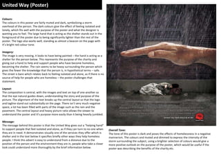
  • 1. United Way (Poster) Colours: The colours in this poster are fairly muted and dark, symbolizing a storm overhead of the person. The dark colours give the effect of feeling isolated and lonely, which fits well with the purpose of the poster and what the designer is wanting you to feel. The large hand that is acting as the shelter stands out in the foreground of the poster due to being significantly lighter than the rest of the poster. The logo also works well, standing as almost a beacon on the page with it’s bright red colour tone. Imagery: The image is very moving, it looks to have being painted – the hand is acting as a shelter for the person below. This represents the purpose of the charity and giving out a hand to help and support people who have become homeless, becoming the shelter. The rain seems to be heavy surrounding the person which gives the fewer the knowledge that the person is, in hypothetical terms – safe. The street is bare which relates back to feeling isolated and alone, as if there is no source of help for people who are homeless – the poster challenges that statement. Layout: The composition is central, with the images and text on top of one another so that the eye natural guides down, understanding the story and purpose of the picture. The alignment of the text breaks up the central layout so that the logo and tagline stand out substantially on the page. There isn’t very much negative space, a lot has been filled with parts of the image such as the rain and the pavement. The central layout and heavy picture ratio allows the viewer to understand the poster and it’s purpose more easily than it being heavily jumbled. Message: The message behind this poster is that the United Way gives out a “helping hand” to support people that feel isolated and alone, as if they can turn to no one when they are in need. It demonstrates visually one of the services they offer which is shelter and in the text below it specifies briefly other ways they help homeless people. I think this advert is easy to understand from a distance due to the position of the person and the environment they are in, people who take a closer look could understand more thoroughly by the brief information below. Overall Tone: The tone of this poster is dark and poses the effects of homelessness in a negative mannerism. The colours and muted and dimmed to express the intensity of the storm surrounding the subject, using a brighter selection of colours would give a more positive outlook on the purpose of the poster, which would be useful if the poster was describing the benefits of the charity etc.
  • 2. STREAT (Poster) Colours: The colours here are mainly based on a grayscale with slight tones of red on the parts of the poster that are made to stand out such as the “Stop” signs, similar to how they are displayed on the road. Red is psychologically based on alarm and danger, which is why it’s associated with road signs and posters giving warning. The grayscale acts as a good canvas for the red text so that the eye immediately follows from the red and then onto the grey. Imagery: There isn’t any real imagery here other than the background surrounding the sign that the man is holding, his feet are only just visible beneath the sign to show the significance of the streets relating to homelessness. The foreground of the image is the poster which is full of a series of different elements of text in a variety of fonts that have been warped to fit each other within the image. The colours of the text has been alternated and fit in a curved motion that still allows it to be read clearly in a consecutive order. Layout: The layout of this image has been heavily based on the text and the way it has been aligned and set out across the page to form the curves and diagonal format of how it has been warped. There is very little negative space but about a inch of space has been left around the edges of the posters of that it falls into a central composition, allowing the poster to not look as heavy and crammed, unable to understand clearly. Certain elements of the text have been warped and framed to fit the purpose of the word, for instance “80,000”, a large number - has been stretched to be larger than the rest of the text to symbolize it’s significance and the capacity. Message: The message behind this image isn’t hidden behind the image and the overall purpose can be read visually on the front of the poster. The overall purpose is to stress equality in society and introduce a fair economy to help the homeless people and prevent it. Using road signs to stress stopping and quality is a representation in this poster of life in the streets and using the strict sense of alarm in “Stop” signs etc. The “Streat” charity helps to arrange meals and meetings at which homeless people can come and get warm and have a meal, the charity encourages volunteers to take part in these events. Overall Tone: The tone of this image is persuasive and influential at making a change bringing equality to society, the charity uses brief facts and terminology to convince a reader to look into the charity and perhaps volunteer or donate. It also includes the small section of the man to relate it’s meaning to the people and the surrounding streets.
  • 3. National Coalition for the Homeless Campaign (Poster) Colours: The colour ratio here is mainly grayscale with one part red text, which represents the intensity behind the sentence “I have.” The monotone imagery reflects the bleak, depressive lifestyle of being homeless – brighter colours would of being more signifying with a positive outlook on homelessness. This poster is particular is made to make the viewer feel emotional and change their overall views on being homeless. Imagery: The image here takes up the majority of the page, a strong focal point has been placed on the face of the man to draw attention to his facial expression, especially his eye. The man’s expression depicts his sadness and photographing him at a close cropped angle gives the illusion of him being trapped behind a fence or in a change, which is representative of the feeling of isolation and having no where to go when becoming homeless. The purpose of the expression is so sympathize the ld man and his eyes have being significantly brightness to show emotion in his experiences. Layout: The layout of this poster is quite simple and not as extravagantly put together as the previous two. It has an equal ratio of image and text so that it is easy to understand the comparisons between the context and the picture. The text has being laid out in equal lines that gradually grow smaller, it represents the feeling of losing hope and his chances of being able to help others growing slimmer. The dynamic colour block of read for “I have.” is a strong depiction of the message that change is possible in society to help and prevent homelessness. The information and charity details are placed underneath the headings and the image for people who look closely at the poster to gain more information on the charity. Message: The message behind this poster is encouraging that change is possible, often when someone becomes homeless they are alone and feel as if they don’t know what to do or where to go. These use of the term “No idea.” stands by that emotion and relates it to how others perceive homelessness, not knowing how they could help etc. The strong impact here is the red sentence, “I have.” which refers to the man in the picture exclaimed that he has an idea of how someone could help, for example giving him a shelter or a warm meal. The hidden message is in correspondence with how no one will ever truly know about homelessness until it has been experienced. Overall Tone: The tone of this poster is quite dismal and upsetting looking at the emotions in the facial expression of the man and how he is holding on the fence helplessly, almost looking as if he wants to escape, imprisoned. The red colouring acts as a alarm or a beacon so that it stands out against the monotone imagery and white text, making the eye and mind immediately drift to why this particular sentence is so important and its meaning. The small text below gives a more detailed analysis of what the charity sets out to do and how the poster intertwines with the purpose of the campaign.
  • 4. SASH UK (Website) Colours: The colours used here are a series of green tones on the buttons, logo, links and context. The green is used a positive symbol in the charity, it’s calming appearance works well with representing change, help and safety. SASH also encourages recycling to help raise money for the charity, which green is associated with due to the familiar logo – overall the green is standing for a better earth. Using more alarming, impact colours such as reds and electric blues can take away the aspect of the website’s purpose and it would be not as relatable to it’s campaign. Imagery: Not much imagery is used on the first page apart from the transition slideshows showing pictures of members of the public that have taken part in the charity. The photos are positive, portrait photographs of people smiling and looking overall well – this perceives a positive message on how the charity wants to be viewed and the impact it has on the community. On the separate pages there are other images of people taking part in charity events and parties, which demonstrates SASH as a united charity with a large sense of community and equality. All the photos are bright and eye-catching to show positivity rather than muted and dimmed. Layout: The layout of the website is quite simplistic and contemporary, the target audience isn’t visually apparent and photos of young and older people give the assumption that the charity focuses on a mass audience of people 16+. On a computer the website appears central and quite small with a large white border surrounding, but to look at the website on a mobile or tablet – it would stretch to the full length of the screen, meaning the website is adaptable for several forms of media. It is set out in a default website layout with a large space for images and a drop down side bar to the right for updates and news. The front page is fairly easy to guide yourself and familiarize yourself with the website. 4 easy subheadings allow easy navigation and quick answers to questions on the charity. Font & Text: The font used in this photo is block, sans serif lettering which alternates between been green and white. There are lots of shapes and buttons used that are slightly transparent when overlapping images to not give the appearance of a heavily cluttered page. There are no dramatic elements of large text apart from the logo and everything is separated in colums and by bold and normal formats of text. I think Arial was used in the majority of the context as it is a go to font to give a simplistic, clean look and an overall professional appearance. There is a significantly higher ratio of text over imagery on the home page but the text is laid out around the image to not over cram and make it easy to understand and read through without difficulty.
  • 5. Shelter (Poster) Colours: The colours in these images are quite dark apart from the main subject being the cardboard cot. The photograph has been taken of a black background that allows a gradual gradient of dark to a lighter grey along with the shallows created by the angle of the cot, almost as if it has being displayed. The white text stands out dramatically against the black background and dramatizes the impact of the text and meaning behind it. The cot stands out to a viewer so that it draws attention to the hidden message and the meaning. Why is the cot made of cardboard? Etc. Imagery: The imagery used here is quite contemporary, the composition is central and the alignment of the object has allowed vivid shadows underneath – giving indication that artificial lights and perhaps flash was used to take the image. This cot symbolizes young children and the cardboard signifies being homeless and not happening a proper bed to sleep in. It can also be seen as a representation of a childhood been taken and thrown into a desperate lifestyle. Overall the image projects negative perception on being homeless and the lifestyle surrounding, it also shows an emotional comparison between a child with a home and a child without. Layout: The layout is based around a central composition with the text aligned to the left and the right to show variety of compositions rather than keeping it central, which would create a much larger extent of negative space. The cot has been tilted to an angle so that the poster has more depth and creates visible shadows, giving an almost 3D effect. The text gradually grows small, having a heading and subheading, then below the charity logo and tagline. Message: The message behind this image is the comparison between children who have homes and children who don’t. It demonstrates being deprived of beds to sleep in and the cardboard shaped into a cot represents the extent of how young children are becoming homeless. It also gives visual brief facts of the number of children becoming homeless as well as the representation. Overall Tone: The tone of this poster is quite pessimistic of how homelessness is perceived, it a stereotypical term that comes to mind when we think of being homeless, living in cardboard boxes. Shelter relates this statement into their poster to make it recognizable to a viewer. The dark colours give a gloomy overlook on the message and the cot looks to be swallowed up by the dark. It’s almost quite a statement image using crisp packet boxes etc. to create bed frames – it’s interesting to see how this would be perceived by parents.