
Recommandé
Contenu connexe
En vedette
En vedette (8)
Similaire à Vegetarian
Similaire à Vegetarian (20)
Plus de calandjess
Vegetarian
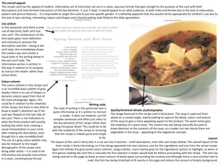
- 1. The overall appeal: This recipe card has the appeal of modern, informative set of instruction set out in a clean, spacious format that gets straight to the purpose of the card with breif descriptions and note-formed instructions of the key elements in just 3 steps. It would appeal to an adult audience, of both male and female due to the lack of colouration, pattern and picture features – it is impossible to target this card at just one specific gender. It is defiantly apparent that this would not be appropriate for children’s use due to the lack of eye-catching, interesting colours and shapes and a formal writing style fitted to the older generation. Use of font: In this particular card there is only use of two fonts, both serif and sans serif. The combination of the font styles gives more definition and intensity to sections the description and title – being in the serif style, this immediately draws the readers eye and creates a visual path to the writing below in the sans serif style. The informative section is written in this way in relation to its purpose, to instruct the reader rather than entice them. Colour scheme: The colour scheme in this recipe card is an incredibly basic palette of grey shades, there is no use of shapes or dynamic colours apart from that of the main photograph. Again, this could be in relation to the simplicity Writing style: of the recipe, but there is very little to The style of writing in this particular text is draw a reader’s attention say if the Quality/technical details of photography: quite informative as it is written to instruct card was flipped on the text side of The image featured in this recipe card is fairly basic. The soup is captured from a reader. It does not however use full the card. There is not indication to above on a canted angle, mainly looking to capture the detail, colour and texture complex sentences and often just refers to what the finish product will visually of the soup to give a more appealing aspect to the product. The warm tones give the key elements of the recipe rather than looking like other than creating a the emphasis of a warm meal. The camera has also being manually focused to going into grave detail. This could be to do visual interpretation in your mind draw attention to the contents of the soup, so a reader can see clearly there are with the simplicity of the recipe or stressing after reading the description, even vegetables in the soup – appealing to the vegetarian concept. that the recipe is indeed quick and simple though this is also incredibly brief. to do. Layout: The use of a grey colour palette may The layout of this card is fairly dull, it is set out into 3 sections – brief description, main title and recipe bellow. The overall layout of the also be relevant to the target main recipe is fairly interesting, as it has being separated into two columns, one for the ingredients and one from the actual recipe. demographic of the recipe card, Again this follows the grey toned colour scheme, using a darker, more intense grey for the ingredients section to highlight, as when at being older adults – it is used to be first glance reading the card this is naturally the first element a reader would look for before proceeding with the recipe. The text has informative and provide instructions being centred in the page to leave an even amount of blank space surrounding the context and although there is very minimal text to in a clean, contemporary format. read, the font has being stretched to fit evenly in the page and reduce the amount of empty background.
- 2. Colour scheme: The colour scheme of this recipe card only features 3 shades of colour, green, dark grey and light grey. The main visual aspect of the text side of the recipe card is the green text such as the headings, numbers and the title. Green is used in relevance to the sole purpose of the card, being to appeal to the vegetarian market. In traditional society we associate the colour green with natural resources, eco-friendly etc. Also the colour green can be used in reference to the vegetarian mark we see on food products to symbolize that they are suitable for vegetarians. Use of font: On this card the author has use a majority of basic, structured text in the sans serif format. This makes it easy to navigate your way through the page and understand all the elements of the context, some words are highlighted in a different colour or made bigger e.g. “Fillings” to draw attention to that particular section of the page. The use of a sans serif text again refers to the simplicity of the recipe, it gives a modern, contemporary appeal that would attract the younger audience. The producer of the recipe card has also experimented with the warped tool in Photoshop with the title of the card. Warping the text gives a brief sense of fun and comes away slightly from the basic, informative step-by-step guide. The word “jacket” has being warped into the shape of a smile, again although this is only basic it can appeal more to a younger audience without being too childish. Writing style: The style of writing in this card is built up of small sentences put together in short paragraphs. Short Quality/technical details of photography: sentences are often use to get a point across or to There is more than one consecutive photograph in this recipe card , it features 6 images set out in a grid format showing instruct/inform. They are effective in this context as all the different available toppings, going from “The simplest” to the most advanced form. The photographer has chosen they provide a simple method, again referring to the to use sharp focus and a shallow depth of field (for example f/5.6 etc.) to extenuate the potato against the clean, blank effortlessness of the meal – rather than detailed, background. Also the photos have being slightly cropped so that initially the eye looks at the topping on the potato comprehensive amount of text covering every rather than the actual jacket itself. The use of more than one photo opens up more opportunities to experimenting with element rather than just the key pointers relevant a simple dish, this often appeals to the student audience – wanting to break the boundaries of traditional food and to making the dish. It is laid out like what you would experiment with day-to-day appliances they find in their kitchen cupboard. see in a traditional recipe book with a step-by-step Layout: guide and provides several options of how to finish The layout of this recipe card is quite detailed and information appears to of been crammed into the spaces of the page. the meal (with fillings) rather than just the one. This The context is set out into paragraphs going in the order of the process used to create the product, describing firstly how can appeal to the vegetarian market as it is easy to to make the jacket potato and then the majority of the context describes how to experiment with new toppings. The often feel restricted in what they can eat and how instructions are fairly basic and bog-standard, this can be in relation to the purpose of the cards being fit for students, to experiment with their meals. would traditionally require simple, basic instructions that are quick and easy rather than detailed, complicated context. It appears to be easy to navigate the eye throughout the page from top to bottom rather than scanning from left to right like the previous card.
- 3. Use of font: In this recipe card the producer can chosen to use big, spacious text that takes up round about 1/6 th of the page each time, this allows easy reading and being able to quickly navigate your way through the page. The added diagrams also give that extra bit of guidance to children in order to help them understand the step by step guide, as well as adding a fun and innovative concept to preparing the meal. The font stays fluent throughout in a sans serif format, especially for children is a more smooth format to read and understand rather than heavy italic fonts seen in classic forms of cookery books created for an older audience. This type of font is usually seen in other children’s books and narratives found in the primary school sector, again a child can refer to this easier being able to recognize the font from past text books. Colour scheme: The colour scheme of this recipe card is much more bright and innovative than the previous two examples. When working with the target demographic of younger children is important to stress fun through bright, exciting colours that stand out on the page amongst all the text. This recipe card has been predominantly focused on the basic 3 primary colours, red, yellow and blue. Again this can be an educational feature for a younger audience being able to recognize the three colours. Also the colour green has been used through the majority of the card, this is again representational of a natural resource and the purpose of the book – appealing to the vegetarian audience. Quality/technical details of photography (illustrations): This recipe card is the first card we have come across that features illustrations with the instructions as well as a photograph of the finished product. Using illustrations to show progress through the creation of the meal can appeal to children as they can see how it looks as their parents are making it. Also scientific studies show that traditionally children respond more Writing style: to visual elements such as video and pictures rather The style of writing in this card is again built up of small, compound sentences that describe each step briefly, than text. The photograph was taken positioning the pointing out the key elements with the support of an illustration. The sentence is written in an informative context to camera above the subject, being the food. This allows instruct but does not use an complicated pronouns that children would struggle to understand. Overall the nature of you to see the finished meal in all elements rather the text is very relaxed, for example “Slice them as finally as you can.” gives the reader as sense of comfort when than just one section, which you would see from proceeding through the recipe, knowing there is no precise way to create the finished meal and there is no need to taking another style of shot (canted/off centre etc.) stress. This can be again, a comfort with children and parents – it is important when working with the younger target Layout: demographic to make the step-by-step guide fun and interesting, especially when working with simple foods. The layout of this recipe card appears incredibly detailed to the eye as it includes both text, illustrations and photographers. The text and picture have being laid out in a 3x3 grid and the remaining space has being appropriately used for things such as the title and other small images. Often cramming a lot of information into one page can prove confusing for a younger audience but in this particular context the information has being enlarged and spaced equally, creating a pattern of picture and then text underneath – as to not create confusion. In this particular card the use of fitting a lot of information onto one page has proved successful as two recipes have being fitted onto one card. This card can almost being referenced as being similar to a traditional children’s picture book, a picture accompanied by text to describe what is happening – again this is something that can strongly appeal to the target demographic.
- 4. Use of font: In this recipe card the producer has chosen to use a combination of sans serif and serif fonts. This can be useful to separate certain elements of the recipe e.g. the ingredients and the method. Incidentally there is no fluent font in the text, every section appears to change font and often this does not appeal to people as they struggle to navigate their way through the steps fluently. The font also switches between bold and italics, again this can prove difficult for a reader to understand whether certain aspects of the texts are in referral to them or another source. A good element of this recipe card is that the key elements have being highlighted in bold, such as the ingredients and helpful hints – this can be used as a way to naturally attract the eye to where the important aspects of the recipe lie rather than frantically scanning through lots of text. Colour scheme: There is no particular colour scheme when it comes to this recipe card. It revolves mainly around the natural grey shades colour palette, with very intense blacks around the key factors like the title and the list of ingredients. The initial target demographic of the recipe cards are to appeal to “punks”, there a several elements within the card that can relate to the genre – one been the Impact font used for the head title surrounded by a harsh, black banner. Also faintly in the background of the contents it reads “Vegan Vengeance” this can relate to the sense of rebellion, standing against eating meat etc. The producer’s of these recipe cards have chosen to take a very dynamic, controversial approach to creating recipes. Writing style: The style of this writing is more technical and detailed than the previous 3 examples. Instead of sticking to the key features of the recipe, it elaborates more, for example why they should do a particular step. This particular recipe card also follows through with informative language, but again similar to a previous example it is written to make the reader feel comfortable and not to stress, e.g. “If it does crumble a Quality/technical details of photography (illustrations): bit, don’t fret, just put it back into shape. Sections such as the list of There are no photographs or any form of illustration on this particular recipe card. Again there is ingredients are wrote in note form in bullet points being very short and no logical reason for this other than the approach of the producers. Although it could be to do with to the point. I think the target demographic for this particular selection the overall nature and attitude of the message they are trying to portray, this being a rebellious of recipe cards is 16+, as the overall layout is very modern and reflects fashion which perhaps is not deemed appropriate to have pictures. The lack of pictures leaves the teenage rebellion – but also features formal, to the point language in recipe card with a lot of empty space that initially draws attention away from the purpose, because an informative style, so as not to come across too childish. the card is so blank.
- 5. Use Of Font : Writing Style : This particular recipe card The writing style on this recipe card is very formal. The card clearly and accurately shows you only uses very basic font how to create the dish that they have shown. They do this using a step by step method which Overall Appeal : type such as Arial, but with is very easy to follow. I feel that this writing style is very common in recipe cards and is used I feel that the overall appeal slight variation over each to ensure that an adult can make the food with little difficulty. I will be employing something of the recipe card is very page. The heading on the similar in my own work. good. It clearly shows the front page and the slogan image of the finished on the front page both use product on the front. It also a serif font with the two shows the company colours that are heavily responsible for the recipe featured in the colour card. The back clearly shows scheme. On the back the instructions on how to however the headings use make the recipe and all of a serif font whilst the main the ingredients that will be body of the text use a Sans needed to complete it. The Serif font. This may have colour scheme attracts been used to add people to read the recipe emphasis on the fact that and the simple writing style the gold serif fonts are the makes the recipe easily titles whilst the rest is accessible to people of all instruction. The use of ages. The culmination of all font on this recipe card of the features of this recipe shows that it is a more card makes it very easy to modern meal due to its read and understand and is use of both serif and sans- visually enjoyable as well. serif fonts. Content : Layout : Colour Scheme : The content of this picture shows the Festive Filo The layout of the recipe card is very simple but The colour scheme of this recipe card has connotations Pillow. The food has been cut open to show the effective. The front of the card has a full page of the festive season, however, the card does not use contents of the pillow as well, this will make the image with the title and the official logo of the the traditional Christmas colours (red, gold, green) food look more desirable. The image has a shallow company behind the recipe. The back of the card whilst there are some uses of gold the card generally depth of field to ensure the meal gets maximum is a little more complex with a smaller image of sticks to a non denominational colour scheme. There is exposure and is the main focal point. The content the meal to use as a reference point whilst a variety of gold and purple on the back of the card of the instructions side breaks down the meal into making it without having to turn the card over, used in the font. The headings are set in gold and other easy steps, clearly displaying all the ingredients. and the ingredients and method set out in key points are highlighted by the purple text. The actual Certain details are shown inside baubles which columns beside each other. This layout is very text instructions however, remain a standard black continue the festive theme of the meal. This style similar to most layouts when looking at recipe colour, they also use a basic font. This makes the back of recipe card is very different to most, I realise cards and is a style that I will try and incorporate of the card look very decorative and appealing to that it is due to the festive nature of the meal into my own work when the time comes. people. however it still adds something unique to the card.
- 6. Content : I have spoke about the content a little bit whilst I was discussing the layout Use Of Font : of the page. I feel that the colours they use and the way they set everything The font that is used on this recipe card is sticking with the theme of out on the back page is great. It is informative whilst remaining eye catching appealing to children. The font is very similar to comic sans, which is not a for the children to look at. The sticky note style things at the top are a great font you would usually see in something like a cook book. The letters in addition and the bottom left shows a giant splat of paint with information the font are slight unaligned with the previous letter, giving the illusion inside. The usage of the sticky note to tell a parent what the child can help that the text is bouncing. I also notice that the font size is relatively small with will make the child feel involved in making it and that is a feeling that which leaves a lot of space in-between sections I feel it could look a little children enjoy. better with a slightly larger font size. Overall appeal : Writing Style : I feel that the overall Whilst this is a appeal of this recipe recipe for a child's card was done really meal and that well. The instructions should appeal to and recipes were well children. The written for an adult to writing style is read, but the layout and content of the card written in a style were laid out so that a that an adult would child could enjoy the prefer, this is due to visuals. The sticky note the fact that the telling you what the parent will be child can help with is preparing and also a great idea. The cooking the meal photograph of the meal on the front of the card not the child. The is also very good as the design is purely meal does look very made to make the appetising and is an child want it. accurate representation of the meal. Quality of photography : Layout : The photograph was taken with a wider aperture which gave the photo a shallow The recipe card is has been arranged in a manner so that it appeals to kids. depth of field, this style of photograph is used to accentuate the pasta meal. The The picture of the meal has lots of bright colours in it on the plates, forks and image has been taken with the purpose of filling up the entire front of the recipe cups this appeals to children. The back of the recipe card is set out as if it was card. The picture is taken slightly off centre which leaves more of the left side of drawn on lined paper which the child may remember from school. It also has the image there. I feel that this is a style that I would like to avoid when taking the the title and a sub heading telling you what the child can help with at the top, photographs for my recipe cards, I feel that if the picture was centred it would be both of these appear as if they are written on sticky notes. This type of layout more suitable for this style of recipe card. is something that I can consider using for my own project which will be based around similar things.
- 7. Content : The content that is featured in this recipe card is also very similar to other Use Of Font : recipe cards with no real innovation to be seen. One thing that is a great idea The font used throughout this card is one that I have come across on nearly all as I briefly mentioned in the layout section is the use of the nutritional recipe cards that I have looked at. This does not necessarily make it a bad content section on the back page. This is the first time I have come across it thing it just means that they are using a font that is commonly accessible and on a recipe card and I think it is something that I would like to include on my will be easy to read. Sometimes trying to be overly creative with fonts for own recipe cards. Not only does it make the recipe card informative by things that should be simple can complicate things. I think that using a basic teaching you about nutritonal content, some people may only eat meals that font like Arial or Calibri for my recipe cards is the way that I will go. have certain content in, this makes it easier for them to find. Writing style : Overall Appeal : The writing style of this recipe card This is one of my favourite is, like many other recipe cards, recipe cards that I have written in a formal manner with seen. It keeps everything the intention of instructing. It is very simple using only one written to be understood by adults large image and two that are looking to make a meal for columns of text. The colour their child it is written to the point scheme sports a few dashes and everything is listed in columns. of bright colour but The method list is split up into 11 underneath the title is steps which clearly define what homed in a green bar. Green you should be doing at each point. is commonly known to Some recipe cards feature represent vegetarians or illustrations to help you to other things that are eco understand what things should friendly. The instructions look like as they go along. However are very easy to understand I think that sticking to text only is and the steps are broken probably the best way of doing down in a way that makes it things. This type of writing style is almost impossible to go the kind of style I shall be wrong. I may use some of incorporating into my work as I feel these features in my final it will best fit the brief that I am product. working too. Quality of photography : Layout : I feel that the quality of the photography in this photo is definitely something This slide layout is very generic and is very similar to a lot of other recipe that I would like to try and incorporate into my work the photographer has taken cards that are out there, however it does serve its purpose teaching you an extreme close up of the food and has split open the meal to show the the correct way to make the food and what quantities of things you should contents as well. This is an excellent idea as it not only shows what the finished be using. One of the ways that this layout differs from other layouts is the product will be like it also shows how delicious the meal will look whilst being fact that it has all the nutritional content on the layout as well. This will be eaten. I feel that other than this technique I may use a technique which is similar key for some people who are perhaps dieting or are very fussy about what to my previous slide which incorporates the use of a wide aperture to create a they eat as it will tell them exactly what is going into their meal and they shallow depth of field on the item in question. will not have to research it themselves.
- 8. After looking at these examples of previous recipe cards we have taken lots of pointers and inspiration to incorporate e into our own work. Elements we would like to work with are experimenting with different fonts, we are looking to work with a target demographic of young children so things like brightly coloured, spacious font would appeal strongly. Other methods we could try are warping and shaping the text around images, this can give a contemporary, dynamic look to a simple set of instructions that can entice a child to look further. In terms of colour scheme, with children it’s important to start off with the basic colours such as the primary colour palette – a child can recognize these colour and be able to recite them, so the card can be seen through educational purposes as well as instructions. We could include pictures of bright red tomato's, yellow peppers and a blue plate to introduce colours to as child as well as relate them back to healthy food. But another important colour to include is the colour green, this is representational of nature and also relates to the vegetarian label seen on vegetarian food products. Another important element to consider is the writing style, it is important we do not use complicated, long sentences that a child may not be able to fully stand. Short, to-the-point sentences, preferably in a list form in a large text – are more simple and easier for a child to read. Its important to consider a child will be participating the cooking activity with a parents so it’s important to stress bonding and communication between the parent and child by using sentences such as “Get an adult to help you.” It’s also incredibly important to stress the safety elements such as beware of sharp objects and boiling water.