
Recommandé
Contenu connexe
Tendances
Tendances (20)
En vedette
En vedette (15)
Similaire à Front Page Creation
Similaire à Front Page Creation (20)
Dernier
Dernier (20)
Front Page Creation
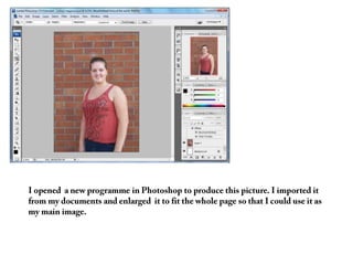
- 1. I opened a new programme in Photoshop to produce this picture. I imported it from my documents and enlarged it to fit the whole page so that I could use it as my main image.
- 2. Secondly I created the title for my magazine. I decided to make the title red because it would stand out and attract the reader, but I also added effects to it to make it look ‘embossed’ and a different font to the cover lines so it would again, attract the reader.
- 3. After creating my masthead, I added my main cover line to the front cover. I made the colour red so it would anchor with the masthead.Ialso used an
- 4. After completing my main cover line I moved on to creating my other cover lines. I placed them around the main image to frame it along with the masthead and main cover line.
- 5. I repeated placing my cover lines around the main image so that it was still visible and not covered.
- 6. For this cover line, the font was bigger than the other cover lines so it covered some of the main image. This is ok because it does not cover the face.
- 7. Finally I added my last cover line on my front cover. I decided to do all my cover lines white to make them stand out against the brick wall background and to create a colour scheme that was simple but attractive to the eye.