
Recommandé
Contenu connexe
Dernier
Dernier (20)
En vedette
En vedette (20)
Media Powerpoint...
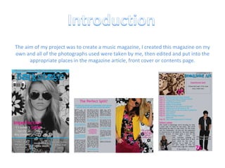
- 1. The aim of my project was to create a music magazine, I created this magazine on my own and all of the photographs used were taken by me, then edited and put into the appropriate places in the magazine article, front cover or contents page.
- 2. The genre of my magazine was chart music. I tried to focus on a mixture of music to make it more appealing to a wider audience, such as Females aged 15+, this would mean that my magazine would be making more sales as it is bought and read by a larger selective audience. On my front cover I used conventions such as a masthead and text grabs, these would make the audience want to read the magazine as they sound appealing and inviting I decided to use Q magazine as my inspiration for my magazine content, this is because its has a similar music genre and is widely available to buy, it is a very successful magazine which is what I would have wanted my magazine to be like. It uses conventions such as a photograph that stands out, I think the photos that my magazine and Q uses are very similar. The main story’s on the cover are stood out in a bold and different colour which means this would be what the audience instantly see
- 3. In my contents page I put a competition on the back page, this would encourage the reader to read through the entire magazine to get to that particular page. I also included lots of pictures to make it look fun and interesting, such as the image on the bottom right corner of the page. The page contains an editors letter which would add some informality to the magazine and would make the reader feel as though they know the editor and it makes them sound like they are your average everyday person. This photo adds a more interesting aspect to the page The editors letter makes the page more informal and friendly
- 4. Main photograph which would grab the audiences attention Contents to briefly inform and interest the reader An editors letter would add some informality to the page, making the reader feel as though they are friends with them A special in the magazine on oasis which is a very popular band would mean that more people would buy this months issue ‘’ Headlining Act’’ is a pun as it makes the magazine sound like a concert and the headlining act is the main article Images make the page look more interactive and exciting than just simple text
- 5. In my feature article I used a subheading in a different and brighter colour to make it stand out a lot more on the page and this way they reader would be getting a brief summary of the article, this means that the reader can get an understanding of the story they are going to be reading about and it could mean that they are more likely to read on if it is persuading enough. The main thing that stands out on the page is my photograph, I think that it makes the page look very professional as it uses very vibrant colours in her clothes and the settings on the camera were set so that bright colours are brought out more on the picture. The aim of this means that the reader will look directly to the picture and see how casual and relaxed she looks, this would create a more relaxed view on the article. As this takes up a half of the page it makes the article look like it has less writing which would be more appealing to the target audience. I used ‘’The Perfect Split?’’ as my heading because it is a very good play on words, the band were called imperfection and it is like the title is saying that the split could actually be a good thing, this sounds catchy and would stick in the readers heads.
- 6. A pun as a headline makes it catchy and can also have a meaning to it The subheading means that the reader can get a brief understanding of the story before they start to read This photograph brings out colour on the page which makes it look brighter and fuller Text grabs get the readers attention instantly The questions are kept brief and straight to the point to prevent the article getting off the subject matter
- 7. The social group I have tried to represent is the young female celebrity. On the cover I used a medium close up shot of her, this means that the main focus is on her facial expression. She is wearing sunglasses which could be stereotypical to this type of group as celebrities are almost always pictured naturally in a magazine walking down the street with a pair of sunglasses on. In the feature article I dressed my model in bright clothes, this would make the page look very bright and colourful, I also chose to put some pink into her outfit because then this would match up with the subheading. I edited the photo so then it looked bright and then it would stand out on the entire page. I think the image creates a positive role model for the target audience to look up to, the colours could be a representation of her character and personality which could also be bright, cheerful and colourful. She has been constructed to look like a good person who would be ideal for people to look up to. As you can see the images are similar On the content page I photographed my model with a guitar. This prop is appropriate to the magazine because it is musical, it also makes her look rockish which would make the photograph look good on the page as it relates to the style of magazine.
- 8. Bauer media group would be a potential company to publish my magazine because they have also published Q magazine which is a similar one to mine. The company also publish Kerrang magazine which is a rock magazine, however this magazine is aimed at mainly males which is not the main aim of my magazine. I think the company would want to publish my magazine because it is different to other ones and this would mean that it has a wider audience to appeal to because it is aimed at females. There also aren’t many music magazines that are aimed specifically at females so this would be a unique selling point for them.
- 9. The target audience of my magazine is female teenagers aged 14-18. The reader would need to have a particular interest in music especially music that is in the charts at that time. After looking at my audience feedback it has gained a lot of positive comments on the questions, there are some criticism but these can be used to improve the magazine even further. This is a good audience to target because females have a particular interest in reading magazines and finding out all the latest celebrity gossip in the music world, ‘’it suggests this magazine is about interviews and gossip between music artists’’ On the left is a pie chart to show the results from a question in my audience feedback, this could help me to improve the magazine to appeal to the target audience even further as the questionnaire was completed by them
- 10. I used particular colours in the magazine that would be appealing to females such as the colour pink and baby blue colours. The title would be appealing to my target audience because it is called ‘backstage’ it makes it sound like the magazine is going to be about gossip behind the scenes that other magazines wouldn’t be writing about, this makes the reader more likely to want to open the magazine and then buy it. The audience would recognise this as a reason to buy the magazine as it would instantly become appealing to them. “ Suggests this magazine is about interviews and gossip” I used a text grab on the cover because this would give the reader an insight to the feature article before they even buy the magazine, this way when they pick it up to have a glance at it they would see what the main story would be and this would look appealing to them therefore they are more likely to buy it. I also included the main story’s at the bottom of the cover, this is so that they could get the main idea of what the magazine will be covering this particular month. I made sure that the story’s would appeal to my target audience and these would most likely be the story’s that they are buying the magazine to look at.
- 11. On my contents page I made sure that the main storyline would attract the audience because it is the only interview that the artist is doing so they would want to see what they are going to be doing with their future and how they have reacted to the split up. The reader would see this as their only chance to read about how they feel and they might think that they will be missing out if they don’t buy it. My audience feedback was very positive when asked about the contents page, they said that it not only informed them about what was in the magazine but it made them want to read on as well. The photo’s, I feel, worked as a great advantage because this would make the page look busy and the reader would feel like there are lots of things to read about and also they wouldn’t be overcome by too much text on the page, as this might have put them off buying it. “ It is very informative, yet still eye catching” I tried to make my page seem very musical, I did this by including headlines such as “Headlining Act” this would make the magazine seem like a concert and the headlining act would effectively be the main feature article. The main story’s in the magazine had a photograph on the contents page with a page number next to it, this mean that the reader could instantly find where these particular story’s where. However, I think some improvements could have been made where there are empty spaces on the page, this would add to the ‘fuller effect’.
- 12. The article isn’t too long and this means that it looks better to ready because the reader would think it is quick to the point with all very relevant questions. I chose a specific layout on the page to attract the audience. I made my picture look very bright and colourful which would stand out on the page. The photograph was made to take up a full side of the feature article and this would make the page look like it has less writing on it, this would be appealing because they wont look at it and instantly be de-motivated to read it due to the length. I took the photograph to reflect on the target audience as it is not how photographs are usually taken, with the top of her head cut off it shows how she doesn't always follow the rules of everybody else which is stereotypical to teenagers as they like to be rebellious and stand out from the crowd. However some improvements could have been made on the page, these have been pointed out on the diagram below... Could have used a different colour to make it more clear Questions that relate to the audience could have been asked This could have been a different colour to stand out more on the page
- 14. I also learnt how to use the website www.blogger.com which is where I posted all my information about how I created my magazine and then an update on every step I did. This has acted as an online diary which is useful to look back at and see how I progressed. However there are some advantages and disadvantages of using this kind of software. Advantages Disadvantages Photos can be edited to look good It is hard to grasp how to use it Different texts and fonts can be accessed It is prone to being slow or crashing Things can be moved, edited and deleted if they don’t look right. Everything must be completed in class (no access to software at home) If you make a mistake it can be fixed easily The amount of software can become confusing when using different ones at the same time
- 16. Overall I think my magazine has turned out very well and positive. I am pleased with my finished result I think it has been created to look just the way I wanted it too. My magazine shows both strengths and weaknesses and they have been pointed out below... Strengths Weaknesses Photographs look professional Dark cover image, could be brightened Feature article is quick to the point Contents page has empty spaces Questions asked are all relevant and not misleading A larger variety of colours could have been used Text grabs draw in the readers attention Not a large range of story’s in the contents page Puns used to sound catchy and exciting The cover doesn’t make you instantly want to buy it at a first glance
- 17. Personal Response By doing this project I have learnt that it is not as simple as I first thought to create a magazine, I thought it would be quite simple to take some photographs and put it all together but it took a lot of effort and patience to create it to look right. I have learnt an entire new range of skills which include how to use Photoshop and InDesign. Personal Development Looking back through my blog and analysing the progression that I have made, I feel that this has been a great success. I have learnt how you can direct an audience efficiently by using a specific range of colours and photograph framing. I enjoy doing photography as a hobby and think that by doing this project I have learnt some new skills in that area as well. I have learnt that you don’t always have to follow the usual guidelines of how to frame certain images as my feature article photograph has connotations of not caring about what other people think of the picture and still making it look good and effective for the target audience