
Recommandé
Contenu connexe
Tendances
Tendances (16)
En vedette
En vedette (15)
Similaire à Paint.NET Graphics Editor Review
Similaire à Paint.NET Graphics Editor Review (20)
Plus de chloecotterill1
Dernier
Dernier (20)
Paint.NET Graphics Editor Review
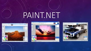
- 1. PAINT.NET
- 2. Paint.NET is a free graphics editing programme which is available on Microsoft Windows which was created in 2004. As it is relatively modern technology and has recently been updated it implies that the tools that will be made available on this software will be advanced in order to make my products look contemporary. This graphics editor is likely to be used to construct my magazine pages but also for my billboard, therefore, by using the same software, it increases the chances of producing brand identity as my products are more likely to look similar. This is crucial for identification, for example, for my institution to become a recognisable brand so that it is more memorable for the reader. This will increase the likelihood of the Two Step Flow Effect from taking place because people are more likely to share their opinions on the magazine if it grows in popularity because they will want to commute with their friends and find common interests.
- 3. What I already know about Paint.net: • The measurements to create a magazine size image is 27.3x 40.5 and for a double page spread it is 54.6x40.5. For my billboard, the measurements in real life are typically 14 feet high and 48 feet wide so this will be transferred onto Paint.NET to fit the conventional horizontal shape because it is more likely to be acknowledged by readers if they are familiar with the format. This knowledge is useful in order to gain an accurate measurements so that my products appear realistic to the reader, therefore, it will appear of a higher quality. Therefore, this will make the reader feel special due to having access to an elite magazine and also build trust with the reader. • I am also aware that different fonts can be exported onto Paint.net through using the copy& paste functions and this will mean that I can use more complex and detailed fonts through finding them on websites such as font space. By importing these varied fonts, it will make my product look more interesting and visual. Additionally, it will help when producing my logo so that this can be more eye-catching across all three of my products, therefore, if my logo appears more iconic, it will be embedded into the audiences minds and again make my institution more memorable which will influence repurchase. • Additionally, I recall being able to add a variety of different shapes onto the platform which is important when highlighting particular cover lines with a box so that they will stand out and therefore appear more significant to the reader which means that they are more likely to read them. It is also helpful when you want to highlight a puff or a promotion as it is conventional to place them in colourful boxes to make them appear fun and exciting which influences the audiences to get involved and be more interactive with the institution. This is especially important in order to build positive consumer- institution relationships as it will make the reader feel welcomed and supported. • Another important tool is that you can create different layers and as many as you like and this is especially helpful when creating a magazine as there will always be a variety of different elements on the page, for example, one layer will be the image, another will be text. It is important that when using layers that you add a different layer whenever you add something new. This is because if you make a complete error, you can delete the layer and start again without affecting the entire image. Therefore, this is why it will prevent me from having to constantly restart the editing process and hopefully make it quicker because mistakes can be resolved much easier.
- 4. However, as my memory is weak on using Paint.NET, I will watch a YouTube tutorial on how to create a magazine first in order to refresh myself on the appropriate skills and tools to use which will make my products look more professional. The first tutorial that I watched focused on the basic skills of Paint.NET. https://www.youtube.com/watch?v=ImsxVWOhvLg
- 5. • The first thing which I learnt from the tutorial is that you can move the windows such as the tool box and colour box around so that they will not distract your editing process or get in the way which means that I can place a greater focus on my editing process so that it can be edited with greater precision. Therefore, this connotes that the software is flexible. • Also, to undo a mistake you can go to the top and press undo but also press Control Z which saves time and is a much simpler way to undo mistakes. • On the top left of the tool box, there is a selection tool and this useful when you will want to specific select a section and delete it which is a more simpler way than using the eraser tool because it can be done at the click of a button. However, it is important that when deleting sections, they are on an individual layer so that it does not affect any other elements on the page because this can make the page look disorganized and less legible for the reader. • On the top right of the tool box, this is the moving tool which will allow me to misplace particular elements of my magazine which is useful when I will want to change my ideas and experiment. For example, the placement of the masthead will be at the top however it is debatable whether it should be left, centre or right aligned so the moving tools helps to decide which placement is the best fit. • Underneath the selection tool there is the lasso tool which makes it so particular parts of an image can be selection, for example, if you wanted to duplicate an image of a persons face, it would be possible to do this. However, it again emphasizes the importance of layers because if this tool is used without layers it can make the entire page look dismantled which will mean that it will lack the prestige look which fashion magazines are meant to conventionally have. It is unlikely that this tool will serve any benefit in my production as I do not want to duplicate elements of the pages or the billboard because this could look repetitive and therefore make my production lack interest and diversity. Therefore, it would not appeal to my target audience because it will appear boring. • Underneath this tool there is an ellipsis tool where you can add circle shapes which will be beneficial when create puffs as they conventionally are placed in a bright circle so it will connote how my magazine is stranded from the theme of fashion so the correct target audience can be achieved. This being young, glamorous women who are influenced by the world of fashion. However, it is important to hold shift when creating a circle shape so that the shape remains of an equal ratio which will make it look more professional which means that the audience are more likely to trust my institution, this will help with popularity as it will be seen as reliable.
- 6. Another important tool is the magic wand tool which will make it so that specific areas can be deleted, for example, the backgrounds of images and this will be useful to use in my production because it is conventional that magazines cut out images of clothes and place them in the magazine to encourage people to purchase the products as they will have an insight to what they will look like on. Therefore, this tool is used by clicking on the area which you want to remove but you need to change the tolerance so that it makes the area you are removing more precise and then you delete it which means that it can give images a cut-out collage effect. Perhaps this will appeal to my younger target audience as it will create nostalgia of creating scrapbooks as a child and therefore will influence young adults to become more creative and create their own collages, which also is a way that my institution can increase the likelihood of interactivity.
- 7. To prevent my pages from looking like a complete block colour, the gradient tool can be applied by choosing two colours that can be used to create a more visual and creative image of a page which will perhaps make it more interesting to read my magazine. However, using this tool will purely depend on the design of each individual page, for example, if I am doing a feature of minimal fashion, I am more likely to use a more basic and plain background in order to anchor the clothing. However, if the clothing involves prints, a more creative background that includes a gradient will be used to anchor this to connote how when you wear printed clothing, you will stand out from the crowd. Doing this will embrace individuality which is a key purpose to introducing a fashion magazine in Leicester. One element which I am most likely going to avoid is the paint brush because this will serve no benefit in making my production look professional as it will literally appear as a doodle on the page. Therefore, it could make my magazine look of a lower quality and also immature which will be off putting for my target audience because they will not see how the magazine will make them feel special or elite if it appears of a poor quality. Also, if this tool was used, it may even make my magazine lack seriousness which means that it will be perceived as a less reliable source which limits the magazines chances of gaining popularity. The text tool is useful to add typography to the page however, as the options are very limited, it is better to be used when you want to use more basic and conventional typography. Therefore, as it is simplistic, it will be useful typography to be used on my billboard because it will make it clearer when people are driving past so it is therefore more likely to be embedded by the audience which means that they will feel curious about what the magazine will include and therefore pick up an edition of the magazine. Also, the text tool will be useful for writing the main body of my double page spread because it again will be legible for the audience which means that they will have a greater understanding about what the feature is about. This means that The Uses and Gratifications Theory can take place because individuals will feel as though they have been informed so the role of becoming educated from reading content is achieved.
- 8. The blur effects is useful to use and this is found by clicking on the effect button under the category of blurs. This can help to make objects blend in more., for example, text boxes that are placed behind text. This is because if they are a complete block colour, they will look uncreative and plain which will not attract the reader. Therefore, it is another way to make it look more interesting to read in order to build popularity. The video also explained that you can make typography glow however it is unlikely that this is going to be used in my production because it will make it look tacky because it will make the text look illuminated. Of course this would be useful for a club music magazine or a holiday magazine for 18-30’s however as fashion magazines typically take a more formal and sophisticated look, it would not convey the genre clearly which could make audiences confused on whether it will suit them which would not make the magazine feel specific to their needs. Therefore, this could lead to my products being decoded as oppositional reading is an outcome because individuals will feel as though the institution has ignored their interests.
- 9. I then decided to watch another video on how to create shadows and manipulate particular images which would again improve my editing skills on my images and this is particularly important because images are what are most likely to hook the readers attention because they give tips on styling and make the products visible so it gives the reader an insight to what they will look like on them. Also, the images are usually the unique selling point because male and female gaze takes place where the reader will purchase the magazine or read the website due to physical attractions which then leads to idolization where the audience will want to read further to find out more about their icon. This is how the Dyer Star Theory takes place because the reader will see the star as an ideology so that they can feel closer to them by reading about their personal life which will make the reader feel engaged with them by finding out this exclusive news which signifies how interactivity is at a peak. Furthermore, the video discusses how to create shadows under images so that it creates a 3D effect. Not only does this make the image look more realistic but also it increases engagement because the image will feel closer to the audience through the three dimensional image that the image has, therefore, it makes the reader feel as though the product is more accessible. Firstly, you create a shape on a new layer, for example, you can draw or paint a straight black line or even create a rectangle shape. However, because this looks ‘blocky’ , you then take the blur tool to smoothen out the image and give it a softer look which then adds a shadow effect. This will be used in my production to edit photos that are purely taken of products, for example, makeup or clothing so that they stand out and are more likely to grab the readers attention. https://www.youtube.com/watch?v=QBY5_d8uwro
- 10. Below is a video of me practicing the skills on Paint.NET by creating a fake magazine, just simply to experiment on how to use the software and become more familiar before my production so I can use it with confidence. https://youtu.be/L_ZAyTFy-Vo