SlideShare une entreprise Scribd logo
1  sur  89
Label placement in forms
and other time-consuming forms controversies
Caroline Jarrett
User Experience Lisbon 2010
FORMS
CONTENT
A bit about me:
Caroline Jarrett
Consultancy: www.effortmark.co.uk
Training: www.usabilitythatworks.com
Forms advice: www.formsthatwork.com
Editing tips: www.editingthatworks.com
Jarrett and Gaffney (2008)
Forms that work:
Designing web forms
for usability
Morgan Kaufmann
Stone, Jarrett, Woodroffe
and Minocha (2005)
User interface
design and
evaluation
Morgan Kaufmann
2
Agenda Where people look on forms
What that implies for placing labels
Let’s stress about unimportant details
Three details that do affect users
If it looks good, it’s easy to use
Final reminder: it’s what you ask and
why that really matters
3
Reading forms is different from using them
4
Reading forms is different from using them
5
Are my observations confirmed
by eye-tracking? A look at some heat maps
Examples thanks to permission from
Ian Roddis, Head of Online Services, The Open University
6
Ordering
a prospectus
• User has
chosen a
prospectus
• Postcode
lookup for
the address
7
Now try it for yourself
• Look at this printout of a forms page
• Circle the places where you think that users looked
• Put a cross on the places where users clicked
8
9
One person’s
heat map
• Small green
dots show
narrow focus
on labels and
left end of fields
• Red crosses
show clicks
10
An aggregate
• Narrow focus
on the easy
questions
at the top
• Gets messy
further down:
harder
questions,
more answers
to consider
11
The ‘narrow focus’ means big jumps for the users’ eyes.
12
Agenda Where people look on forms
What that implies for placing labels
Let’s stress about unimportant details
Three details that do affect users
If it looks good, it’s easy to use
Final reminder: it’s what you ask and
why that really matters
13
Where to
put labels
1. Labels outside boxes
2. Hints inside boxes
3. Labels inside boxes
14
Mario Penzo’s recommendation:
“Place labels above or right-align them”
Penzo, M (2006) Label Placement in Forms
http://www.uxmatters.com/MT/archives/000107.php 15
Are all these questions equivalent?
Where do the answers come from?
• Your address
• Your city
• Company you work for
• Number of colleagues
• Your address
• Your city
• Company you work for
• no
of colleagues
• Name
• Surname
• Age
• City
1616
Easy questions and hard
questions prompt different
patterns of reading
• Users glance at
populated answers
• Users look mostly at
the left end of the
answer space for
easy questions
• Users read complex
instructions quite
carefully...
• ... provided they are on
the way to their goal
17
Update:
Labels above the fields may be no faster
than right aligned labels
• Das, McEwan and Douglas investigated label placement
• Chose a simple form with simple questions
• Found no difference between labels above the fields and
right-aligned labels
Das, McEwan and Douglas (2008)
Using eye-tracking to evaluate label alignment in online forms,
NordiCHI '08: Proceedings of the 5th Nordic conference on Human-
computer interaction: building bridges 18
A section of a form where I think left-aligned
labels really are necessary
19
Users can
survive a lot
20
Update: Roland Feichtinger finds that labels
below the boxes may work better in Austria
21
Method 1 (more effort, and may not work):
Decide where to put your labels according to
your users, their goals, and the questions
Your users and
their goals ....
Your questions ... Put the labels ...
Willing to reveal the
answers; filling in
the form helps them
to achieve a goal
Simple, only a few of
them
Above
Simple but lots of
them
Right-justified
Complex Left-justified
Unwilling to reveal
answers or reluctant
to fill in the form
Simple or complex Left-justified
(you’ll need more
explanation)
22
23
Method 2 (easier, and guaranteed success):
Choose anything harmonious then test and test
• Any reasonably harmonious arrangement of labels and
boxes is likely to be OK
• The only guaranteed way of achieving a good form is:
– Test YOUR form with YOUR users
– Make changes based on what you find
– Test again with (different) users
– Make more changes
– Repeat until the form works
24
Screenshot
best available
http://37signals.com/svn/posts/1867-design-decisions-new-signup-form
25
26
Where to
put labels
1. Labels outside boxes
2. Hints inside boxes
3. Labels inside boxes
27
Some terminology: my definitions of
label, hint, and default
• Label: the text that stands for a question
– May be just a word: “Phone”
– May be a fully-formed request: “Please give us a contact phone number”
– May be a fully-formed question: “What phone number may we call?”
• Hint: an extra piece of text that helps to explain the label
– May be a formatting hint: “(XXX) XXXX - XXXX”
– May explain what to put in the box: “your usual daytime number”
• Default: a value that is already entered for the user
– May be a standard default that works for many users
– May be a pre-populated value from data collected elsewhere
28
It’s not always obvious.
Which of these are label, hint, or default?
29
Users often interpret hints as defaults
• 98% of the scientific users of this form accepted the hint
as a default
• 60% of expert users accepted the hint as a default
30
Do not put hints inside fields on web forms
 Moving the hint to one side on click doesn’t work
– The user doesn’t click into the field because it is a default
 Reducing the visual impact of the hint doesn’t work
– Users don’t understand why the hint is less legible
 Putting the hint outside the field should work
– Provided the user sees the hint when it is needed
31
Where to
put labels
1. Labels outside boxes
2. Hints inside boxes
3. Labels inside boxes
32
I’m seeing some labels inside the boxes
33
Which test won – A or B?
A B
http://whichtestwon.com/archives/3442
34
Don’t put the labels inside the boxes
• No specific evidence for this
• Just seems like a silly idea
• Anyone willing to test it?
35
Agenda Where people look on forms
What that implies for placing labels
Let’s stress about unimportant details
Three details that do affect users
If it looks good, it’s easy to use
Final reminder: it’s what you ask and
why that really matters
36
Let’s stress
about
unimportant
details
Colons at the end of labels?
Sentence or title case?
Required field indicator?
37
Colons at the ends of labels are
a matter of considerable debate
Pick one style. Stick with it. It’s not worth arguing about.
http://www.usabilitynews.com/news/article3200.asp and
http://www.usabilitynews.com/news/article3112.asp
38
Sentence or title case?
Sentence case wins. (But only just).
• This is sentence case
• This is Title Case
• This Is Capitalisation Of Each Initial Letter
• ISO-9241 part 17 says
• "Initial upper-case (capital) letter for field labels: To facilitate readability, the text field
labels begin with an upper-case letter. The rest of the label should contain lower case
(small) letters except for cases where the label is a logo, an acronym or language
convention that requires each word in the label to begin with a capital letter.“
• Sentence case is slightly more legible due to familiarity
• It’s not worth changing a big suite of forms to fix this
http://www.usabilitynews.com/news/article2594.asp 39
Required field indicator?
• Miriam Frost Jungwirth:
• “I was once charged with testing that.
Seriously. $10,000 of manhours testing asterisk placement.
There was no difference in user performance. At all.“
• I’m a little more interested in this discussion:
– Indicators placed to the right of the field are likely to be invisible
– Put the text describing the indicator at the top of the fields
(that is, not at the end of the form and not in the instructions)
– Use the same indicator in both places (text and next to required field)
– Use the alt-text ‘required’ (not ‘asterisk’)
– Always indicate required; don’t switch to indicating optional
– If you feel the urge to indicate optional, use the full word ‘optional’
– Do not use colour on its own as an indicator
Miriam Frost Jungwirth, posting on CHI-WEB, 19 April 2007
There’s a theme developing here ....
40
An example of required field indicators using
colour alone
41
An example of required field indicators at the
wrong end of the field
42
Which is the most important problem
• Examine the Michigan Department of Transport form
• Find as many usability problems as you can
• Decide which ONE problem is the most important
43
Agenda Where people look on forms
What that implies for placing labels
Let’s stress about unimportant details
Three details that do affect users
If it looks good, it’s easy to use
Final reminder: it’s what you ask and
why that really matters
44
Three details
that do affect
users
1. It’s not OK and I don’t want to Cancel
2. Shorter preambles
3. ‘False ends’
45
Buttons really do matter to users.
46
1. Label the button with what it does.
2. If the user doesn't want to do it,
don't have a button for it.
• “OK” works – if it makes sense to say “OK” at that point
• “Reset” probably doesn’t work
• Reset Button: INPUT TYPE=RESET
An INPUT element with `TYPE=RESET' represents an input option, typically a button,
that instructs the user agent to reset the form's fields to their initial states. The VALUE
attribute, if present, indicates a label for the input (button).
When you are finished, you may submit this request: <input type=submit><br>
You may clear the form and start over at any time: <input type=reset>
http://www.w3.org/MarkUp/html-spec/html-spec_8.html#SEC8.1.2.8 47
LukeW writes about buttons
http://www.lukew.com/resources/articles/PSactions.asp
48
LukeW and Etre tested a selection of different
button placements and styles
49
Which one do you prefer? Why?
Is there a better option?
Only Option E performed
poorly during our testing 50
Which one do you prefer? Why?
Is there a better option?
“Only Option E performed
poorly during our testing” 51
A new selection of options: get rid of E,
add another one?
52
Method 2 (easier, and guaranteed success):
Choose anything sensible then test and test
• Any arrangement of buttons that puts the SUBMIT
(action) button where users expect to find it
will probably be OK
• Make sure that the SUBMIT button cannot be confused
with destructive buttons
• The only guaranteed way of achieving a good form is:
– Test YOUR form with YOUR users
– Make changes based on what you find
– Test again with (different) users
– Make more changes
– Repeat until the form works
53
Three details
that do affect
users
1. It’s not OK and I don’t want to Cancel
2. Shorter preambles
3. ‘False ends’
54
A/B
testing
Varied:
• photo
• background
• colours
• shading
• buttons
• preamble
55
In our 2004 study, we found that only
a better preamble made any real difference
• We tested a wide selection of visual variants of a form
• Variants improved conversion rates
• The only variation that achieved statistical significance
was the improved preamble:
– Shorter
– Clearer
– Better layout
Jarrett, C. and Minott, C. (2004) Making a better web form Proceedings of the
Usability Professionals' Association Conference, Minneapolis, Minnesota, USA.
http://www.formsthatwork.com/files/Articles/BetterForm.pdf 56
66 words
57
28 words
58
Jason Fried talks about the new signup form.
• “The previous form … was dated and too long… we
wanted the redesigned form to be markedly shorter than
the one it was replacing”.
• “We spent a lot of time on the language, graphical
elements in the sidebar, and overall information flow
throughout the process”.
59http://37signals.com/svn/posts/1867-design-decisions-new-signup-form
Three details
that do affect
users
1. It’s not OK and I don’t want to Cancel
2. Shorter preambles
3. ‘False ends’
60
‘False ends’: if it feels like the end of
the conversation, users will stop
61
‘False ends’: if it feels like the end of
the conversation, users will stop
62
Avoid screens in the middle of forms that
have no fields for user entries
• Option 1: save a ‘false end’ screen for the true end of
the conversation
• Option 2: include a question that guides users around
the ‘false end’ screen
63
Agenda Where people look on forms
What that implies for placing labels
Let’s stress about unimportant details
Three details that do affect users
If it looks good, it’s easy to use
Final reminder: it’s what you ask and
why that really matters
64
If it looks
good,
it’s easy to
use
Keep the logo in proportion
Calm your creative impulses
Design to a grid
65
Some branding reinforces
your form’s credibility.
66
Is this enough?
67
Where is the form?
Too much branding
68
Another, more recent, look at the Marvel site
69
Another, more recent, look at the Marvel site
70
Is this just right?
Or too much?
71
If it looks
good,
it’s easy to
use
Keep the logo in proportion
Calm your creative impulses
Design to a grid
72
Calm your creative impulses.
73
More conventional:
still offers opportunities for improvement
74
If it looks
good,
it’s easy to
use
Keep the logo in proportion
Calm your creative impulses
Design to a grid
75
Design to a grid: work with the graphics in the
shape of the page
76
Keeping to a grid: starts well
77
Example: chipping at the grid
78
Design to a grid:
if you give up entirely, it looks a bit inept
79
Design to a grid:
if you give up entirely, it looks a bit inept
80
A before- and after- example.
First of all, the old one. Plenty of grid problems.
81
Currently:
tidied up, and with page furniture
82
Design to a grid:
think about the whole page as well as the fields
83
Design to a grid:
has a grid – but also invisible instructions
84
Now try it for yourself
• Design a solution for ‘invisible instructions’ on the ACT
form
85
Equivalent page May 2010
86
Agenda Where people look on forms
What that implies for placing labels
Let’s stress about unimportant details
Three details that do affect users
If it looks good, it’s easy to use
Final reminder: it’s what you ask and
why that really matters
87
It’s what you ask and why that really matters
• Users rarely abandon forms because of:
– Label placement
– Use of colons
– Required field indicators
– Sentence or title case
• Users often abandon forms or lie on them because of:
– Questions that they don’t understand
– Questions that they have no answer for
– Intrusive questions that are inappropriate to the task
– Validations that refuse their preferred or correct answer
88
Question
time
Caroline Jarrett
carolinej@effortmark.co.uk
+44 1525 370379
I’m a consultant, hire me:
Consultancy: www.effortmark.co.uk
Training: www.usabilitythatworks.com
Free stuff:
Forms advice: www.formsthatwork.com
Editing: www.editingthatworks.com
Columns: www.usabilitynews.com
“Caroline’s Corner”
www.uxmatters.com
“Good Questions”
89

Contenu connexe

Similaire à Labels On Forms For Uxlx 2010

Labels on forms for STC Dallas, 2010
Labels on forms  for STC Dallas, 2010Labels on forms  for STC Dallas, 2010
Labels on forms for STC Dallas, 2010Caroline Jarrett
 
Label placement on forms, STC Seattle 2010
Label placement on forms, STC Seattle 2010Label placement on forms, STC Seattle 2010
Label placement on forms, STC Seattle 2010Caroline Jarrett
 
Using Eye Tracking To Analyse Form Design
Using Eye Tracking To Analyse Form DesignUsing Eye Tracking To Analyse Form Design
Using Eye Tracking To Analyse Form DesignAcuity ETS Limited
 
MSc Seminar on Forms Design
MSc Seminar on Forms DesignMSc Seminar on Forms Design
MSc Seminar on Forms DesignCaroline Jarrett
 
Engl317 project4 slidedoc2_stepsto_designux_test
Engl317 project4 slidedoc2_stepsto_designux_testEngl317 project4 slidedoc2_stepsto_designux_test
Engl317 project4 slidedoc2_stepsto_designux_testZachary Williamson
 
Designing forms for technical specialists by @cjforms
Designing forms for technical specialists by @cjformsDesigning forms for technical specialists by @cjforms
Designing forms for technical specialists by @cjformsCaroline Jarrett
 
Complex forms for APPU, October 2010
Complex forms for APPU, October 2010Complex forms for APPU, October 2010
Complex forms for APPU, October 2010Caroline Jarrett
 
The ‘Why’ and ‘How’ of the Top 5 Web Form Practices
The ‘Why’ and ‘How’ of the Top 5 Web Form PracticesThe ‘Why’ and ‘How’ of the Top 5 Web Form Practices
The ‘Why’ and ‘How’ of the Top 5 Web Form PracticesTargetX
 
Caroline Jarrett: Forms and their Users
Caroline Jarrett: Forms and their UsersCaroline Jarrett: Forms and their Users
Caroline Jarrett: Forms and their UsersFrancis Rowland
 
Jordan Kasteler Usability SEO
Jordan Kasteler Usability SEOJordan Kasteler Usability SEO
Jordan Kasteler Usability SEOJordan Kasteler
 
Jordan Kasteler Usability SEO
Jordan Kasteler Usability SEOJordan Kasteler Usability SEO
Jordan Kasteler Usability SEOJordan Kasteler
 
Usabilidad ¿Por qué es importante?
Usabilidad ¿Por qué es importante?Usabilidad ¿Por qué es importante?
Usabilidad ¿Por qué es importante?Míriam González
 
Design better forms
Design better formsDesign better forms
Design better formsSjors Timmer
 
Web Form Usability and Validation
Web Form Usability and ValidationWeb Form Usability and Validation
Web Form Usability and ValidationGlobalLogic Ukraine
 
Design better forms – Mobile UX London
Design better forms – Mobile UX LondonDesign better forms – Mobile UX London
Design better forms – Mobile UX LondonSjors Timmer
 

Similaire à Labels On Forms For Uxlx 2010 (20)

Labels on forms for STC Dallas, 2010
Labels on forms  for STC Dallas, 2010Labels on forms  for STC Dallas, 2010
Labels on forms for STC Dallas, 2010
 
Label placement on forms, STC Seattle 2010
Label placement on forms, STC Seattle 2010Label placement on forms, STC Seattle 2010
Label placement on forms, STC Seattle 2010
 
Using Eye Tracking To Analyse Form Design
Using Eye Tracking To Analyse Form DesignUsing Eye Tracking To Analyse Form Design
Using Eye Tracking To Analyse Form Design
 
MSc Seminar on Forms Design
MSc Seminar on Forms DesignMSc Seminar on Forms Design
MSc Seminar on Forms Design
 
Complex forms-for-upa2010
Complex forms-for-upa2010Complex forms-for-upa2010
Complex forms-for-upa2010
 
Ux, UI and US v1.2
Ux, UI and US v1.2Ux, UI and US v1.2
Ux, UI and US v1.2
 
Engl317 project4 slidedoc2_stepsto_designux_test
Engl317 project4 slidedoc2_stepsto_designux_testEngl317 project4 slidedoc2_stepsto_designux_test
Engl317 project4 slidedoc2_stepsto_designux_test
 
Designing forms for technical specialists by @cjforms
Designing forms for technical specialists by @cjformsDesigning forms for technical specialists by @cjforms
Designing forms for technical specialists by @cjforms
 
Complex forms for APPU, October 2010
Complex forms for APPU, October 2010Complex forms for APPU, October 2010
Complex forms for APPU, October 2010
 
The ‘Why’ and ‘How’ of the Top 5 Web Form Practices
The ‘Why’ and ‘How’ of the Top 5 Web Form PracticesThe ‘Why’ and ‘How’ of the Top 5 Web Form Practices
The ‘Why’ and ‘How’ of the Top 5 Web Form Practices
 
Caroline Jarrett: Forms and their Users
Caroline Jarrett: Forms and their UsersCaroline Jarrett: Forms and their Users
Caroline Jarrett: Forms and their Users
 
Between Two Form Tags
Between Two Form TagsBetween Two Form Tags
Between Two Form Tags
 
Jordan Kasteler Usability SEO
Jordan Kasteler Usability SEOJordan Kasteler Usability SEO
Jordan Kasteler Usability SEO
 
Jordan Kasteler Usability SEO
Jordan Kasteler Usability SEOJordan Kasteler Usability SEO
Jordan Kasteler Usability SEO
 
Usabilidad ¿Por qué es importante?
Usabilidad ¿Por qué es importante?Usabilidad ¿Por qué es importante?
Usabilidad ¿Por qué es importante?
 
Design better forms
Design better formsDesign better forms
Design better forms
 
Web Form Usability and Validation
Web Form Usability and ValidationWeb Form Usability and Validation
Web Form Usability and Validation
 
Between Two Form Tags
Between Two Form TagsBetween Two Form Tags
Between Two Form Tags
 
Design better forms – Mobile UX London
Design better forms – Mobile UX LondonDesign better forms – Mobile UX London
Design better forms – Mobile UX London
 
Part3 quistionare
Part3 quistionarePart3 quistionare
Part3 quistionare
 

Plus de Caroline Jarrett

Creating truly accessible forms, SDinGov 2024
Creating truly accessible forms, SDinGov 2024Creating truly accessible forms, SDinGov 2024
Creating truly accessible forms, SDinGov 2024Caroline Jarrett
 
Using surveys to uncover audience insights
Using surveys to uncover audience insightsUsing surveys to uncover audience insights
Using surveys to uncover audience insightsCaroline Jarrett
 
2023 Surveys that work Olin.pptx
2023 Surveys that work Olin.pptx2023 Surveys that work Olin.pptx
2023 Surveys that work Olin.pptxCaroline Jarrett
 
The Phylogenetic Tree in forms design - making forms work for complex academ...
The Phylogenetic Tree in forms design - making forms work for complex  academ...The Phylogenetic Tree in forms design - making forms work for complex  academ...
The Phylogenetic Tree in forms design - making forms work for complex academ...Caroline Jarrett
 
Four ways to make a better survey WebExpo2023
Four ways to make a better survey WebExpo2023Four ways to make a better survey WebExpo2023
Four ways to make a better survey WebExpo2023Caroline Jarrett
 
Content design in practice May 2023.pptx
Content design in practice May 2023.pptxContent design in practice May 2023.pptx
Content design in practice May 2023.pptxCaroline Jarrett
 
Two ways to improve your survey, webinar for Delib 2023.pptx
Two ways to improve your survey, webinar for Delib 2023.pptxTwo ways to improve your survey, webinar for Delib 2023.pptx
Two ways to improve your survey, webinar for Delib 2023.pptxCaroline Jarrett
 
How to save money by fixing forms, WebExpo2023
How to save money by fixing forms, WebExpo2023How to save money by fixing forms, WebExpo2023
How to save money by fixing forms, WebExpo2023Caroline Jarrett
 
Two ways to improve your surveys: the Most Crucial Question and the Burning I...
Two ways to improve your surveys: the Most Crucial Question and the Burning I...Two ways to improve your surveys: the Most Crucial Question and the Burning I...
Two ways to improve your surveys: the Most Crucial Question and the Burning I...Caroline Jarrett
 
How to look at a form Boye 22.pptx
How to look at a form Boye 22.pptxHow to look at a form Boye 22.pptx
How to look at a form Boye 22.pptxCaroline Jarrett
 
Prune tune postpone explain.pptx
Prune tune postpone explain.pptxPrune tune postpone explain.pptx
Prune tune postpone explain.pptxCaroline Jarrett
 
What is a service designer SDinGOV 22 with all stickies.pptx
What is a service designer SDinGOV 22 with all stickies.pptxWhat is a service designer SDinGOV 22 with all stickies.pptx
What is a service designer SDinGOV 22 with all stickies.pptxCaroline Jarrett
 
Helping teenage boys to become responsible adults.pptx
Helping teenage boys to become responsible adults.pptxHelping teenage boys to become responsible adults.pptx
Helping teenage boys to become responsible adults.pptxCaroline Jarrett
 
Some thoughts on surveys: Boye and Company member conference call
Some thoughts on surveys: Boye and Company member conference callSome thoughts on surveys: Boye and Company member conference call
Some thoughts on surveys: Boye and Company member conference callCaroline Jarrett
 
Better surveys - presentation to Loyal Health March 2022.pptx
Better surveys - presentation to Loyal Health March 2022.pptxBetter surveys - presentation to Loyal Health March 2022.pptx
Better surveys - presentation to Loyal Health March 2022.pptxCaroline Jarrett
 
Plain language to improve your survey houston 2022
Plain language to improve your survey houston 2022Plain language to improve your survey houston 2022
Plain language to improve your survey houston 2022Caroline Jarrett
 
Surveys that work:training course for Rosenfeld Media, day 1
Surveys that work:training course for Rosenfeld Media, day 1Surveys that work:training course for Rosenfeld Media, day 1
Surveys that work:training course for Rosenfeld Media, day 1Caroline Jarrett
 
Surveys that work: training course for Rosenfeld media, day 2
Surveys that work: training course for Rosenfeld media, day 2Surveys that work: training course for Rosenfeld media, day 2
Surveys that work: training course for Rosenfeld media, day 2Caroline Jarrett
 
Surveys that work: training course for Rosenfeld Media, day 3
Surveys that work: training course for Rosenfeld Media, day 3 Surveys that work: training course for Rosenfeld Media, day 3
Surveys that work: training course for Rosenfeld Media, day 3 Caroline Jarrett
 
Surveys that work: an introduction to the Survey Octopus and Total Survey Error
Surveys that work: an introduction to the Survey Octopus and Total Survey ErrorSurveys that work: an introduction to the Survey Octopus and Total Survey Error
Surveys that work: an introduction to the Survey Octopus and Total Survey ErrorCaroline Jarrett
 

Plus de Caroline Jarrett (20)

Creating truly accessible forms, SDinGov 2024
Creating truly accessible forms, SDinGov 2024Creating truly accessible forms, SDinGov 2024
Creating truly accessible forms, SDinGov 2024
 
Using surveys to uncover audience insights
Using surveys to uncover audience insightsUsing surveys to uncover audience insights
Using surveys to uncover audience insights
 
2023 Surveys that work Olin.pptx
2023 Surveys that work Olin.pptx2023 Surveys that work Olin.pptx
2023 Surveys that work Olin.pptx
 
The Phylogenetic Tree in forms design - making forms work for complex academ...
The Phylogenetic Tree in forms design - making forms work for complex  academ...The Phylogenetic Tree in forms design - making forms work for complex  academ...
The Phylogenetic Tree in forms design - making forms work for complex academ...
 
Four ways to make a better survey WebExpo2023
Four ways to make a better survey WebExpo2023Four ways to make a better survey WebExpo2023
Four ways to make a better survey WebExpo2023
 
Content design in practice May 2023.pptx
Content design in practice May 2023.pptxContent design in practice May 2023.pptx
Content design in practice May 2023.pptx
 
Two ways to improve your survey, webinar for Delib 2023.pptx
Two ways to improve your survey, webinar for Delib 2023.pptxTwo ways to improve your survey, webinar for Delib 2023.pptx
Two ways to improve your survey, webinar for Delib 2023.pptx
 
How to save money by fixing forms, WebExpo2023
How to save money by fixing forms, WebExpo2023How to save money by fixing forms, WebExpo2023
How to save money by fixing forms, WebExpo2023
 
Two ways to improve your surveys: the Most Crucial Question and the Burning I...
Two ways to improve your surveys: the Most Crucial Question and the Burning I...Two ways to improve your surveys: the Most Crucial Question and the Burning I...
Two ways to improve your surveys: the Most Crucial Question and the Burning I...
 
How to look at a form Boye 22.pptx
How to look at a form Boye 22.pptxHow to look at a form Boye 22.pptx
How to look at a form Boye 22.pptx
 
Prune tune postpone explain.pptx
Prune tune postpone explain.pptxPrune tune postpone explain.pptx
Prune tune postpone explain.pptx
 
What is a service designer SDinGOV 22 with all stickies.pptx
What is a service designer SDinGOV 22 with all stickies.pptxWhat is a service designer SDinGOV 22 with all stickies.pptx
What is a service designer SDinGOV 22 with all stickies.pptx
 
Helping teenage boys to become responsible adults.pptx
Helping teenage boys to become responsible adults.pptxHelping teenage boys to become responsible adults.pptx
Helping teenage boys to become responsible adults.pptx
 
Some thoughts on surveys: Boye and Company member conference call
Some thoughts on surveys: Boye and Company member conference callSome thoughts on surveys: Boye and Company member conference call
Some thoughts on surveys: Boye and Company member conference call
 
Better surveys - presentation to Loyal Health March 2022.pptx
Better surveys - presentation to Loyal Health March 2022.pptxBetter surveys - presentation to Loyal Health March 2022.pptx
Better surveys - presentation to Loyal Health March 2022.pptx
 
Plain language to improve your survey houston 2022
Plain language to improve your survey houston 2022Plain language to improve your survey houston 2022
Plain language to improve your survey houston 2022
 
Surveys that work:training course for Rosenfeld Media, day 1
Surveys that work:training course for Rosenfeld Media, day 1Surveys that work:training course for Rosenfeld Media, day 1
Surveys that work:training course for Rosenfeld Media, day 1
 
Surveys that work: training course for Rosenfeld media, day 2
Surveys that work: training course for Rosenfeld media, day 2Surveys that work: training course for Rosenfeld media, day 2
Surveys that work: training course for Rosenfeld media, day 2
 
Surveys that work: training course for Rosenfeld Media, day 3
Surveys that work: training course for Rosenfeld Media, day 3 Surveys that work: training course for Rosenfeld Media, day 3
Surveys that work: training course for Rosenfeld Media, day 3
 
Surveys that work: an introduction to the Survey Octopus and Total Survey Error
Surveys that work: an introduction to the Survey Octopus and Total Survey ErrorSurveys that work: an introduction to the Survey Octopus and Total Survey Error
Surveys that work: an introduction to the Survey Octopus and Total Survey Error
 

Labels On Forms For Uxlx 2010

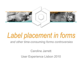
  • 1. Label placement in forms and other time-consuming forms controversies Caroline Jarrett User Experience Lisbon 2010 FORMS CONTENT
  • 2. A bit about me: Caroline Jarrett Consultancy: www.effortmark.co.uk Training: www.usabilitythatworks.com Forms advice: www.formsthatwork.com Editing tips: www.editingthatworks.com Jarrett and Gaffney (2008) Forms that work: Designing web forms for usability Morgan Kaufmann Stone, Jarrett, Woodroffe and Minocha (2005) User interface design and evaluation Morgan Kaufmann 2
  • 3. Agenda Where people look on forms What that implies for placing labels Let’s stress about unimportant details Three details that do affect users If it looks good, it’s easy to use Final reminder: it’s what you ask and why that really matters 3
  • 4. Reading forms is different from using them 4
  • 5. Reading forms is different from using them 5
  • 6. Are my observations confirmed by eye-tracking? A look at some heat maps Examples thanks to permission from Ian Roddis, Head of Online Services, The Open University 6
  • 7. Ordering a prospectus • User has chosen a prospectus • Postcode lookup for the address 7
  • 8. Now try it for yourself • Look at this printout of a forms page • Circle the places where you think that users looked • Put a cross on the places where users clicked 8
  • 9. 9
  • 10. One person’s heat map • Small green dots show narrow focus on labels and left end of fields • Red crosses show clicks 10
  • 11. An aggregate • Narrow focus on the easy questions at the top • Gets messy further down: harder questions, more answers to consider 11
  • 12. The ‘narrow focus’ means big jumps for the users’ eyes. 12
  • 13. Agenda Where people look on forms What that implies for placing labels Let’s stress about unimportant details Three details that do affect users If it looks good, it’s easy to use Final reminder: it’s what you ask and why that really matters 13
  • 14. Where to put labels 1. Labels outside boxes 2. Hints inside boxes 3. Labels inside boxes 14
  • 15. Mario Penzo’s recommendation: “Place labels above or right-align them” Penzo, M (2006) Label Placement in Forms http://www.uxmatters.com/MT/archives/000107.php 15
  • 16. Are all these questions equivalent? Where do the answers come from? • Your address • Your city • Company you work for • Number of colleagues • Your address • Your city • Company you work for • no of colleagues • Name • Surname • Age • City 1616
  • 17. Easy questions and hard questions prompt different patterns of reading • Users glance at populated answers • Users look mostly at the left end of the answer space for easy questions • Users read complex instructions quite carefully... • ... provided they are on the way to their goal 17
  • 18. Update: Labels above the fields may be no faster than right aligned labels • Das, McEwan and Douglas investigated label placement • Chose a simple form with simple questions • Found no difference between labels above the fields and right-aligned labels Das, McEwan and Douglas (2008) Using eye-tracking to evaluate label alignment in online forms, NordiCHI '08: Proceedings of the 5th Nordic conference on Human- computer interaction: building bridges 18
  • 19. A section of a form where I think left-aligned labels really are necessary 19
  • 21. Update: Roland Feichtinger finds that labels below the boxes may work better in Austria 21
  • 22. Method 1 (more effort, and may not work): Decide where to put your labels according to your users, their goals, and the questions Your users and their goals .... Your questions ... Put the labels ... Willing to reveal the answers; filling in the form helps them to achieve a goal Simple, only a few of them Above Simple but lots of them Right-justified Complex Left-justified Unwilling to reveal answers or reluctant to fill in the form Simple or complex Left-justified (you’ll need more explanation) 22
  • 23. 23
  • 24. Method 2 (easier, and guaranteed success): Choose anything harmonious then test and test • Any reasonably harmonious arrangement of labels and boxes is likely to be OK • The only guaranteed way of achieving a good form is: – Test YOUR form with YOUR users – Make changes based on what you find – Test again with (different) users – Make more changes – Repeat until the form works 24
  • 26. 26
  • 27. Where to put labels 1. Labels outside boxes 2. Hints inside boxes 3. Labels inside boxes 27
  • 28. Some terminology: my definitions of label, hint, and default • Label: the text that stands for a question – May be just a word: “Phone” – May be a fully-formed request: “Please give us a contact phone number” – May be a fully-formed question: “What phone number may we call?” • Hint: an extra piece of text that helps to explain the label – May be a formatting hint: “(XXX) XXXX - XXXX” – May explain what to put in the box: “your usual daytime number” • Default: a value that is already entered for the user – May be a standard default that works for many users – May be a pre-populated value from data collected elsewhere 28
  • 29. It’s not always obvious. Which of these are label, hint, or default? 29
  • 30. Users often interpret hints as defaults • 98% of the scientific users of this form accepted the hint as a default • 60% of expert users accepted the hint as a default 30
  • 31. Do not put hints inside fields on web forms  Moving the hint to one side on click doesn’t work – The user doesn’t click into the field because it is a default  Reducing the visual impact of the hint doesn’t work – Users don’t understand why the hint is less legible  Putting the hint outside the field should work – Provided the user sees the hint when it is needed 31
  • 32. Where to put labels 1. Labels outside boxes 2. Hints inside boxes 3. Labels inside boxes 32
  • 33. I’m seeing some labels inside the boxes 33
  • 34. Which test won – A or B? A B http://whichtestwon.com/archives/3442 34
  • 35. Don’t put the labels inside the boxes • No specific evidence for this • Just seems like a silly idea • Anyone willing to test it? 35
  • 36. Agenda Where people look on forms What that implies for placing labels Let’s stress about unimportant details Three details that do affect users If it looks good, it’s easy to use Final reminder: it’s what you ask and why that really matters 36
  • 37. Let’s stress about unimportant details Colons at the end of labels? Sentence or title case? Required field indicator? 37
  • 38. Colons at the ends of labels are a matter of considerable debate Pick one style. Stick with it. It’s not worth arguing about. http://www.usabilitynews.com/news/article3200.asp and http://www.usabilitynews.com/news/article3112.asp 38
  • 39. Sentence or title case? Sentence case wins. (But only just). • This is sentence case • This is Title Case • This Is Capitalisation Of Each Initial Letter • ISO-9241 part 17 says • "Initial upper-case (capital) letter for field labels: To facilitate readability, the text field labels begin with an upper-case letter. The rest of the label should contain lower case (small) letters except for cases where the label is a logo, an acronym or language convention that requires each word in the label to begin with a capital letter.“ • Sentence case is slightly more legible due to familiarity • It’s not worth changing a big suite of forms to fix this http://www.usabilitynews.com/news/article2594.asp 39
  • 40. Required field indicator? • Miriam Frost Jungwirth: • “I was once charged with testing that. Seriously. $10,000 of manhours testing asterisk placement. There was no difference in user performance. At all.“ • I’m a little more interested in this discussion: – Indicators placed to the right of the field are likely to be invisible – Put the text describing the indicator at the top of the fields (that is, not at the end of the form and not in the instructions) – Use the same indicator in both places (text and next to required field) – Use the alt-text ‘required’ (not ‘asterisk’) – Always indicate required; don’t switch to indicating optional – If you feel the urge to indicate optional, use the full word ‘optional’ – Do not use colour on its own as an indicator Miriam Frost Jungwirth, posting on CHI-WEB, 19 April 2007 There’s a theme developing here .... 40
  • 41. An example of required field indicators using colour alone 41
  • 42. An example of required field indicators at the wrong end of the field 42
  • 43. Which is the most important problem • Examine the Michigan Department of Transport form • Find as many usability problems as you can • Decide which ONE problem is the most important 43
  • 44. Agenda Where people look on forms What that implies for placing labels Let’s stress about unimportant details Three details that do affect users If it looks good, it’s easy to use Final reminder: it’s what you ask and why that really matters 44
  • 45. Three details that do affect users 1. It’s not OK and I don’t want to Cancel 2. Shorter preambles 3. ‘False ends’ 45
  • 46. Buttons really do matter to users. 46
  • 47. 1. Label the button with what it does. 2. If the user doesn't want to do it, don't have a button for it. • “OK” works – if it makes sense to say “OK” at that point • “Reset” probably doesn’t work • Reset Button: INPUT TYPE=RESET An INPUT element with `TYPE=RESET' represents an input option, typically a button, that instructs the user agent to reset the form's fields to their initial states. The VALUE attribute, if present, indicates a label for the input (button). When you are finished, you may submit this request: <input type=submit><br> You may clear the form and start over at any time: <input type=reset> http://www.w3.org/MarkUp/html-spec/html-spec_8.html#SEC8.1.2.8 47
  • 48. LukeW writes about buttons http://www.lukew.com/resources/articles/PSactions.asp 48
  • 49. LukeW and Etre tested a selection of different button placements and styles 49
  • 50. Which one do you prefer? Why? Is there a better option? Only Option E performed poorly during our testing 50
  • 51. Which one do you prefer? Why? Is there a better option? “Only Option E performed poorly during our testing” 51
  • 52. A new selection of options: get rid of E, add another one? 52
  • 53. Method 2 (easier, and guaranteed success): Choose anything sensible then test and test • Any arrangement of buttons that puts the SUBMIT (action) button where users expect to find it will probably be OK • Make sure that the SUBMIT button cannot be confused with destructive buttons • The only guaranteed way of achieving a good form is: – Test YOUR form with YOUR users – Make changes based on what you find – Test again with (different) users – Make more changes – Repeat until the form works 53
  • 54. Three details that do affect users 1. It’s not OK and I don’t want to Cancel 2. Shorter preambles 3. ‘False ends’ 54
  • 55. A/B testing Varied: • photo • background • colours • shading • buttons • preamble 55
  • 56. In our 2004 study, we found that only a better preamble made any real difference • We tested a wide selection of visual variants of a form • Variants improved conversion rates • The only variation that achieved statistical significance was the improved preamble: – Shorter – Clearer – Better layout Jarrett, C. and Minott, C. (2004) Making a better web form Proceedings of the Usability Professionals' Association Conference, Minneapolis, Minnesota, USA. http://www.formsthatwork.com/files/Articles/BetterForm.pdf 56
  • 59. Jason Fried talks about the new signup form. • “The previous form … was dated and too long… we wanted the redesigned form to be markedly shorter than the one it was replacing”. • “We spent a lot of time on the language, graphical elements in the sidebar, and overall information flow throughout the process”. 59http://37signals.com/svn/posts/1867-design-decisions-new-signup-form
  • 60. Three details that do affect users 1. It’s not OK and I don’t want to Cancel 2. Shorter preambles 3. ‘False ends’ 60
  • 61. ‘False ends’: if it feels like the end of the conversation, users will stop 61
  • 62. ‘False ends’: if it feels like the end of the conversation, users will stop 62
  • 63. Avoid screens in the middle of forms that have no fields for user entries • Option 1: save a ‘false end’ screen for the true end of the conversation • Option 2: include a question that guides users around the ‘false end’ screen 63
  • 64. Agenda Where people look on forms What that implies for placing labels Let’s stress about unimportant details Three details that do affect users If it looks good, it’s easy to use Final reminder: it’s what you ask and why that really matters 64
  • 65. If it looks good, it’s easy to use Keep the logo in proportion Calm your creative impulses Design to a grid 65
  • 66. Some branding reinforces your form’s credibility. 66
  • 68. Where is the form? Too much branding 68
  • 69. Another, more recent, look at the Marvel site 69
  • 70. Another, more recent, look at the Marvel site 70
  • 71. Is this just right? Or too much? 71
  • 72. If it looks good, it’s easy to use Keep the logo in proportion Calm your creative impulses Design to a grid 72
  • 73. Calm your creative impulses. 73
  • 74. More conventional: still offers opportunities for improvement 74
  • 75. If it looks good, it’s easy to use Keep the logo in proportion Calm your creative impulses Design to a grid 75
  • 76. Design to a grid: work with the graphics in the shape of the page 76
  • 77. Keeping to a grid: starts well 77
  • 78. Example: chipping at the grid 78
  • 79. Design to a grid: if you give up entirely, it looks a bit inept 79
  • 80. Design to a grid: if you give up entirely, it looks a bit inept 80
  • 81. A before- and after- example. First of all, the old one. Plenty of grid problems. 81
  • 82. Currently: tidied up, and with page furniture 82
  • 83. Design to a grid: think about the whole page as well as the fields 83
  • 84. Design to a grid: has a grid – but also invisible instructions 84
  • 85. Now try it for yourself • Design a solution for ‘invisible instructions’ on the ACT form 85
  • 87. Agenda Where people look on forms What that implies for placing labels Let’s stress about unimportant details Three details that do affect users If it looks good, it’s easy to use Final reminder: it’s what you ask and why that really matters 87
  • 88. It’s what you ask and why that really matters • Users rarely abandon forms because of: – Label placement – Use of colons – Required field indicators – Sentence or title case • Users often abandon forms or lie on them because of: – Questions that they don’t understand – Questions that they have no answer for – Intrusive questions that are inappropriate to the task – Validations that refuse their preferred or correct answer 88
  • 89. Question time Caroline Jarrett carolinej@effortmark.co.uk +44 1525 370379 I’m a consultant, hire me: Consultancy: www.effortmark.co.uk Training: www.usabilitythatworks.com Free stuff: Forms advice: www.formsthatwork.com Editing: www.editingthatworks.com Columns: www.usabilitynews.com “Caroline’s Corner” www.uxmatters.com “Good Questions” 89