10 Visual Design Tips for eLearning and Slides
•
171 likes•21,416 views

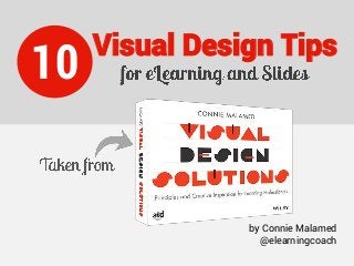
You don't need to be an artist to be effective at design. You can go from BORING to BOLD by learning how to excite audiences through visuals. These 10 tips are drawn from my book, Visual Design Solutions: Principles and Creative Inspiration for Learning Professionals.

Recommended
More Related Content
Recently uploaded
Recently uploaded (20)
Featured
Featured (20)
10 Visual Design Tips for eLearning and Slides
- 1. 10 Visual Design Tips by Connie Malamed @elearningcoach
- 2. INTRO YOU DON’T NEED TO BE AN ARTIST TO BE EFFECTIVE AT VISUAL DESIGN. ©Connie Malamed, 2015
- 3. INTRO VISUAL DESIGN AND ART ARE TWO DIFFERENT CRAFTS. Design has a utilitarian purpose and art is an end in itself. So, learn the basic principles of design, pay attention to design in the world around you and keep practicing. You will improve!
- 4. LAYOUT Two ways to organize the elements of a slide are in a symmetrical layout and an asymmetrical one. A symmetrical design is stable and static. An asymmetrical design is dynamic. Choose the one that fits the tone you want to project. 1 Cut out people courtesy of eLearning Art.Graphics from Visual Design Solutions.
- 5. IMAGES—TRY SILHOUETTES Consider using silhouettes for some of your imagery needs. Silhouettes are subtle and suggestive. They add a gentle visual element without being too distracting from the instructional message. And they can be any color. 2 Do all that you can to make new hires feel welcome on their first day. Onboarding Example of using a silhouette in an Onboarding course to express “Welcome.”
- 6. WORKING WITH ONE TYPEFACE If you’re not sure how to combine fonts then just use one. Find a legible font family with a personality that matches your content and audience. Then make sure it has the styles and symbols you need. 3 Roboto Roman Roboto Italic Roboto Medium Roboto Bold Roboto Black Roboto Light Roboto Condensed Roboto Condensed Light See Visual Design Solutions for more on Typography for Learning Professionals.
- 7. 4 Palette generated from the photo using Adobe Kuler. Use a consistent color palette throughout a course. You can generate one from a sample photograph that has a pleasing set of colors. One of several palette generators is Adobe Kuler. You upload the image and it will generate a palette. COLOR PALETTE Graphic from Visual Design Solutions.
- 8. CREATE A VISUAL HIERARCHY The visual hierarchy establishes the order in which a person views the elements of a slide. The most important element(s) should be the dominant ones. Use size or brightness or a position at the top to create dominance over the other elements. 5 Sample learning portal menu shows how bright colors dominate the other elements. Graphic from Visual Design Solutions.
- 9. UNIFY WITH REPETITION A unified design supports learning. A certain level of similarity can reduce cognitive effort because learners know what to expect. You can create unity by re-using layouts and by repeating elements, such as shapes, as shown below. 6 The repetition of shapes and colors creates a unified design. Graphics from Visual Design Solutions.
- 10. 7 You can use the visual language of contrast to create meaning. By contrasting the size, color or shape of elements, you create emphasis. This shows what is most important and helps to create a visual hierarchy. USE CONTRAST FOR EMPHASIS Contrast in size and color emphasizes the main character. Graphic from Visual Design Solutions.
- 11. Group related elements together to help learners perceive relationships quickly and efficiently. For example, in this drag-and- drop exercise, the drag objects are in one group (bottom right) and the target objects are in another group (upper right). 8 GROUP FOR MEANING Grouping similar elements makes it easier to understand the exercise. Graphic from Visual Design Solutions.
- 12. Provide your audience with visual cues to control where they look. For example, people typically follow someone else’s eye gaze. Therefore, you can use a photo of a person looking up, to direct the eyes to something important, like a definition. 9 EYE GAZE DIRECTS THE EYES Eye gaze works like an arrow, pointing to the important text.
- 13. 10 GO BEYOND THE BOX Learners get bored with the same old look. To add flair to your designs, position elements so they break through the borders of a box or other shape. The result is more dynamic. Cut out person courtesy of eLearning Art.
- 14. Don’t suffer with graphics.