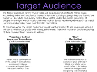
1. The target audience for my music video will be people who listen to metal music. According to Burton’s audience theory, in terms of social groupings they are likely to be aged 16 – 24, white and mostly males. They will fall under the media groupings of people who might watch music channels such as Scuzz, read magazines such as Metal Hammer and possibly have an interest in horror films. To ascertain what my target audience would want or expect to see in a music video, I will ask a small focus group to fill in a questionnaire. Then I will make an audio recording of their comments on two music videos. “ Progenies of the Great Apocalypse” Dimmu Borgir (Click thumbnail to view) There is lots to comment on in this video in terms of mise-en-scene (makeup, costume, setting etc) and the special effects used “ Halo” Machine Head (Click thumbnail to view) This video also has lots to comment on; it is filmed in black and white, using special effects, including album art imagery and integrating some narrative Target Audience
2. “ Progenies of the Great Apocalypse” Person 1: “ The lighting is quite dramatic and makes the band members look scary, which definitely suits the music, especially the big orchestra part at the beginning. Their costumes and makeup create the same feelings .” Person 2: “ The setting is the best part of this video because it’s very big and elaborate and the lighting makes it look scary. It is very conventional for a metal video. ” Person 3: “ I agree that the setting and costumes are the best part of this video. There are also some good camera angles that show the band and their costumes/makeup really well.” Focus group (screenings)
3. Person 1: “ It’s clever how they integrated the album art in the video, but it makes it seem too much like an advert. But I really like the black and white effect used throughout, it would make me stop and watch it if I saw it on a music channel ” Person 2: “ It has a loose storyline which is quite easy to follow, it’s basically showing the church to be evil. I liked the camera effects too, it makes it different to a lot of other metal videos .” Person 3: “ The black and white looks quite cool at first but it’s a bit boring to use it throughout the whole video. They could have made the band shots in colour, for instance. However there are some interesting shots and angles used which makes up for this a bit I think ” “ Halo” Focus group (screenings)
4.
5. Person 1: “ I would buy this album anyway because I love the band, but all the bodies and creatures on it would make me look at it if I saw it in a shop.” Person 2: “ The band name should be bigger or clearer, but I can see why it isn’t because the main image is so busy.” Person 3: “ The art should be simpler, but it is still good because there are lots of things to look at. The actual images depicted are conventional for metal because they show death and pain.” Focus group (albums)
6. Person 1: “ The band name should be more of a focus than what it is on here, but the album art is very cool and representative of the genre so it might encourage me to buy it.” Person 2: “ The colours look good, though they’re not very conventional because they’re so bright. However the main image is quite conventional for heavy metal and the biker image.” Person 3: “ The album art would attract me to it if I saw it in a shop because it looks interesting. The band name being in the corner is letting it down though.” Focus group (albums)
7. Person 1: “ I like the simplicity of this one, and the band name’s font is very representative of the genre because of the spikes etc.” Person 2: “ The image is conventional for metal because it’s dark and the sky makes it quite evil looking, plus the font is easily recognisable for fans of the band.” Person 3: “ The first thing you see is the band name which is good, the album title isn’t very clear though but it’s not too important because the whole thing still looks really effective.” Focus group (albums)
8. Person 1: “ The band name stands out and is the first thing you notice on the page which is good. Also this advert uses the actual album art which might make me buy it because I’d recognise it in the shop.” Person 2: “ The page isn’t too busy but it’s not too simple either which is effective. The use of the skeleton is very conventional for metal, but the fact it’s in a suit is different and unique, which would interest me if I saw it in a shop.” Person 3: “ This is the best one because the band name is so bright and stands out so much. It is also not very busy, and there is just the right amount of text. The colour scheme is simple and effective.” Focus group (adverts)
9. Person 1: “ This is the most conventional of the three because of the colours used, and the main image. This would probably persuade me to listen to the band because of the image.” Person 2: “ It would look better if the picture of the album cover wasn’t used, the skeleton would look much better on its own. The yellow text stands out too much and doesn’t look right with everything else on the page.” Person 3: “ I don’t like the band so even though the picture is really cool, it wouldn’t make me want to buy the album.” Focus group (adverts)
10. Person 1: “ I like the simplicity of this one. The white stands out really well against the black, and the band name is very clear. But there is nothing on here that would really make me want to buy the album.” Person 2: “ The band name and font is iconic so it doesn’t have to be that big, but it still stands out well because the page isn’t crowded.” Person 3: “ I like the image, it’s simple and conventional for metal because it’s quite evil looking, and the black background helps with this. The text is set out nicely too so it’s easy to read.” Focus group (adverts)