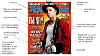
SlideShare une entreprise Scribd logo
1  sur  4
Masthead. 
Main cover line; possibly 
exclusive content. 
Cover lines/hooks. 
Potentially aimed at an 
older target audience. 
2 different types of 
font have been 
used. 
Eminem is used 
because he is 
appealing to all ages 
and genders, he is 
also a common 
household name. 
Banner 
Excusive/extra 
content. 
Issue date and 
price. 
Orange/red, yellow, white 
and blue colour scheme. 
Black border around the 
white writing similar to 
Eminem’s white top 
with a black jacket. 
Main image.
Masthead and 
definition of what it 
stands for Also talks about things 
other than music inside 
Competitions to draw the 
reader in 
Red, white and black colour 
scheme with hints of green 
and blue inserted. 
Main image. 
Free products, getting 
more than the moneys 
worth. 
Price. 
Barcode 
Artist’s name in big 
bold bright letters 
across the middle of 
the magazine to catch 
peoples eyes. 
Red is used because it is 
a colour which stands 
out. 
Other artists named to 
attract an audience who 
prefer different genres of 
music 
Issue date. 
Quote from the main 
attraction to prove that it is 
a real interview inside. 
Banner
Well known musicians who also 
create rap music. 
Barcode 
Masthead – XXL magazine – 
Featured at the top left of the 
page, this is done because people 
always read from left to right. 
Therefore this is the first thing 
the reader will see. 
Exclusive content 
Monochrome colour scheme 
with hints of red to add some 
more colour. 
The main headline featuring the 
artist’s name is situated in the 
middle of the page. It is usually a 
different font compared to 
anything else on the page, this 
catches the readers eye. 
Conformation of 
new album 
Winner of a competition, showing 
he is a well liked artist. 
Well known rapper, top of the business in his 
genre of music 
Although the masthead can be 
thought of as the most important 
thing on the magazine cover, it is not. 
The main image is the most important 
feature on a magazine cover. 
The main image is placed in the 
centre of the cover, this is done 
because it maximises the impact 
to the viewer and gives a good 
first impression to the magazine; 
especially if it is featuring an 
artists that you like. 
The coverlines in the case are used to 
a bare minimum, they are placed on 
the right hand side at the top and in 
the middle. The more important 
coverlines are usually paced at the 
top and are usually written in a 
different colour, this helps them stand 
out as well as being one of the first 
things you read. 
The barcode and price are at the bottom 
right of the page, it is usually one of the 
smallest things featured on the magazine 
because it is not deemed as important to 
the reader; especially if the price is 
expensive they want to make sure they are 
impressed by the magazine therefore the 
more content printed onto the front the 
better. Anything printed in the bottom right 
hand corner are not visible when placed on 
the shelf.
Banner. 
Inside content, not wrote about 
anywhere else. 
Talking about Cabaret inside to draw in 
readers who are interested in that 
music genre. And also because that is 
also the kind of music the artist on the 
cover performs. 
Talking about other genres of music to 
catch the eyes of people who into other 
genres of music. 
Main image. 
Exclusive content, only for this 
magazine. 
Release of plans of ideas by other artists to 
catch peoples attentions by stating that they 
should wait because new content is about to 
be released. 
Barcode. 
Not covering the tattoos showing that 
he is an artist who is mainly aged at 
an older target audience. 
Red, grey, white and black colour 
scheme, simple but effective. 
Main image in front of the ‘Q’ logo 
stating that it is a well known magazine 
and the logo is not needed on full 
show. 
Interview including some of the artists’ 
secrets, and information about their 
private life. This makes the readers feel 
important because they are getting an 
insight to the artists life. 
Backstage pass to an award show, 
allowing the reader to have a look as 
to what actually happens behind the 
scenes. 
4 different fonts used to keep the 
cover from looking plain. 
Colour scheme is matching the artists 
hair colour, suit and also the magazine 
logo. 
Artist’s name in big bold letters to catch 
the readers attention because it will be 
one of the first things they see.

Contenu connexe

Tendances

Analysis of Cover, Double Page Spread & Contents Page
Analysis of Cover, Double Page Spread & Contents Page Analysis of Cover, Double Page Spread & Contents Page
Analysis of Cover, Double Page Spread & Contents Page
shania1999
 
Ideas for my Pop Magazine
Ideas for my Pop Magazine Ideas for my Pop Magazine
Ideas for my Pop Magazine
jessicamaythorpe
 
Initial introductory task 1
Initial introductory task 1Initial introductory task 1
Initial introductory task 1
asmediad14
 
Media question one
Media question oneMedia question one
Media question one
ArchieC
 
Evaluation questions Jack Thompson
Evaluation questions Jack ThompsonEvaluation questions Jack Thompson
Evaluation questions Jack Thompson
jackthompson10
 

Tendances (19)

Evaluation
EvaluationEvaluation
Evaluation
 
Genre research
Genre researchGenre research
Genre research
 
Planning
PlanningPlanning
Planning
 
Pitch Presentation
Pitch PresentationPitch Presentation
Pitch Presentation
 
Evaluation Q5
Evaluation Q5Evaluation Q5
Evaluation Q5
 
Evaluation Q5
Evaluation Q5Evaluation Q5
Evaluation Q5
 
My proposal
My proposalMy proposal
My proposal
 
My magazine proposal
My magazine proposalMy magazine proposal
My magazine proposal
 
How did you attract
How did you attractHow did you attract
How did you attract
 
Analysis of Cover, Double Page Spread & Contents Page
Analysis of Cover, Double Page Spread & Contents Page Analysis of Cover, Double Page Spread & Contents Page
Analysis of Cover, Double Page Spread & Contents Page
 
Ideas for my Pop Magazine
Ideas for my Pop Magazine Ideas for my Pop Magazine
Ideas for my Pop Magazine
 
Initial introductory task 1
Initial introductory task 1Initial introductory task 1
Initial introductory task 1
 
Music magazine
Music magazineMusic magazine
Music magazine
 
Magazine front cover Analysis
Magazine front cover Analysis Magazine front cover Analysis
Magazine front cover Analysis
 
Lo2
Lo2Lo2
Lo2
 
Media question one
Media question oneMedia question one
Media question one
 
Media homework1 (3)
Media homework1 (3)Media homework1 (3)
Media homework1 (3)
 
Evaluation questions Jack Thompson
Evaluation questions Jack ThompsonEvaluation questions Jack Thompson
Evaluation questions Jack Thompson
 
Evaluation- one
Evaluation- one Evaluation- one
Evaluation- one
 

Similaire à Media music magazine analysis powerpoint (20)

Music magazines
Music magazinesMusic magazines
Music magazines
 
Nme
NmeNme
Nme
 
Nme
NmeNme
Nme
 
As media research assignment for music magazines
As media research assignment for music magazinesAs media research assignment for music magazines
As media research assignment for music magazines
 
3 magazines
3 magazines3 magazines
3 magazines
 
Unit 13 - L02
Unit 13 - L02 Unit 13 - L02
Unit 13 - L02
 
Lewis Merle magazine analysis
Lewis Merle  magazine analysisLewis Merle  magazine analysis
Lewis Merle magazine analysis
 
Music magazine analysis
Music magazine analysisMusic magazine analysis
Music magazine analysis
 
FCD 2
FCD 2FCD 2
FCD 2
 
Magazine Anaylsis
Magazine AnaylsisMagazine Anaylsis
Magazine Anaylsis
 
Dizze rascal
Dizze rascalDizze rascal
Dizze rascal
 
Dizze rascal
Dizze rascalDizze rascal
Dizze rascal
 
Front cover analysis essay and labelled analysis
Front cover analysis essay and labelled analysisFront cover analysis essay and labelled analysis
Front cover analysis essay and labelled analysis
 
Nme front cover analysis
Nme front cover analysisNme front cover analysis
Nme front cover analysis
 
Nme - rachel knowles
Nme - rachel knowlesNme - rachel knowles
Nme - rachel knowles
 
Mojo’ magazine analysis
Mojo’ magazine analysisMojo’ magazine analysis
Mojo’ magazine analysis
 
Codes and Conventions of Front Covers
Codes and Conventions of Front CoversCodes and Conventions of Front Covers
Codes and Conventions of Front Covers
 
Dizze rascal
Dizze rascalDizze rascal
Dizze rascal
 
Task 3 music magazine analysis, Front cover and Contents pages
Task 3  music magazine analysis, Front cover and Contents pagesTask 3  music magazine analysis, Front cover and Contents pages
Task 3 music magazine analysis, Front cover and Contents pages
 
Factual Project
Factual ProjectFactual Project
Factual Project
 

Plus de courteneyharding (11)

Evaluation question 2 – part 1
Evaluation question 2 – part 1Evaluation question 2 – part 1
Evaluation question 2 – part 1
 
Evaluation 3
Evaluation 3Evaluation 3
Evaluation 3
 
Subject page art powerpoint
Subject page   art powerpointSubject page   art powerpoint
Subject page art powerpoint
 
Contents page analysis
Contents page analysis Contents page analysis
Contents page analysis
 
Evaluation question 1
Evaluation question 1Evaluation question 1
Evaluation question 1
 
Questionnaire
Questionnaire Questionnaire
Questionnaire
 
Questionnaire
Questionnaire Questionnaire
Questionnaire
 
What age group are you in?
What age group are you in?What age group are you in?
What age group are you in?
 
Questionnaire
QuestionnaireQuestionnaire
Questionnaire
 
What gender are you?
What gender are you?What gender are you?
What gender are you?
 
Media music magazine front cover analysis
Media music magazine front cover analysisMedia music magazine front cover analysis
Media music magazine front cover analysis
 

Media music magazine analysis powerpoint

  • 1. Masthead. Main cover line; possibly exclusive content. Cover lines/hooks. Potentially aimed at an older target audience. 2 different types of font have been used. Eminem is used because he is appealing to all ages and genders, he is also a common household name. Banner Excusive/extra content. Issue date and price. Orange/red, yellow, white and blue colour scheme. Black border around the white writing similar to Eminem’s white top with a black jacket. Main image.
  • 2. Masthead and definition of what it stands for Also talks about things other than music inside Competitions to draw the reader in Red, white and black colour scheme with hints of green and blue inserted. Main image. Free products, getting more than the moneys worth. Price. Barcode Artist’s name in big bold bright letters across the middle of the magazine to catch peoples eyes. Red is used because it is a colour which stands out. Other artists named to attract an audience who prefer different genres of music Issue date. Quote from the main attraction to prove that it is a real interview inside. Banner
  • 3. Well known musicians who also create rap music. Barcode Masthead – XXL magazine – Featured at the top left of the page, this is done because people always read from left to right. Therefore this is the first thing the reader will see. Exclusive content Monochrome colour scheme with hints of red to add some more colour. The main headline featuring the artist’s name is situated in the middle of the page. It is usually a different font compared to anything else on the page, this catches the readers eye. Conformation of new album Winner of a competition, showing he is a well liked artist. Well known rapper, top of the business in his genre of music Although the masthead can be thought of as the most important thing on the magazine cover, it is not. The main image is the most important feature on a magazine cover. The main image is placed in the centre of the cover, this is done because it maximises the impact to the viewer and gives a good first impression to the magazine; especially if it is featuring an artists that you like. The coverlines in the case are used to a bare minimum, they are placed on the right hand side at the top and in the middle. The more important coverlines are usually paced at the top and are usually written in a different colour, this helps them stand out as well as being one of the first things you read. The barcode and price are at the bottom right of the page, it is usually one of the smallest things featured on the magazine because it is not deemed as important to the reader; especially if the price is expensive they want to make sure they are impressed by the magazine therefore the more content printed onto the front the better. Anything printed in the bottom right hand corner are not visible when placed on the shelf.
  • 4. Banner. Inside content, not wrote about anywhere else. Talking about Cabaret inside to draw in readers who are interested in that music genre. And also because that is also the kind of music the artist on the cover performs. Talking about other genres of music to catch the eyes of people who into other genres of music. Main image. Exclusive content, only for this magazine. Release of plans of ideas by other artists to catch peoples attentions by stating that they should wait because new content is about to be released. Barcode. Not covering the tattoos showing that he is an artist who is mainly aged at an older target audience. Red, grey, white and black colour scheme, simple but effective. Main image in front of the ‘Q’ logo stating that it is a well known magazine and the logo is not needed on full show. Interview including some of the artists’ secrets, and information about their private life. This makes the readers feel important because they are getting an insight to the artists life. Backstage pass to an award show, allowing the reader to have a look as to what actually happens behind the scenes. 4 different fonts used to keep the cover from looking plain. Colour scheme is matching the artists hair colour, suit and also the magazine logo. Artist’s name in big bold letters to catch the readers attention because it will be one of the first things they see.