
Recommandé
Contenu connexe
Plus de David Hay
Dernier
Dernier (20)
Mixmag analysis annie mac
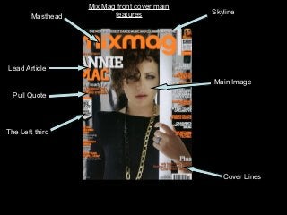
- 1. Masthead Lead Article Main Image Cover Lines The Left third Pull Quote Skyline Mix Mag front cover main features
- 2. The masthead at the top of the magazine, it is very bold, and the font is made to look tatty, it is the same masthead that is on every cover of mixmag, the name of the magazine associates it with the genre of music which dance and clubbing music. The strap line at the top of the magazine creates customer pride as they are being reassured that they are buying the world’s biggest dance music and clubbing magazine, not only is it the biggest dance and club magazine in the UK, but the world. The magazine has bright orange writing, this makes it very eye-catching, it is a very acid orange which links in with the genre of music, it is an energetic colour which also associates with the genre of music. The colour scheme is black, white and orange they all contrast together to make a colourful, bright eye- catching front cover. The front cover overall is not that effective unless you are interested about that style of music, if you are not the only bonus is the free CD, it doesn’t give a good indication of what’s inside except for the CD and the songs on the CD, it is designed to appeal to hardcore clubbers, if you do not like club music the magazine does not appeal to you at all, however even if you are really into club music it doesn’t really appeal that much to you apart from the free CD, this clearly indicates that one of the unique selling points of this edition is the free CD. The price and issue number are located at the bottom right of the cover and are easily noticeable. However is in effective is the aspect that it is very noticeable on a shelf of magazines due to its bright colour scheme. The readers of mixmag value the free CD give away. The free CD adds value to the magazine. Mixmag Front Cover Analysis
- 3. The ‘mixmag’ contents page has a theme running through of black and white. These are very good colours to be using as they can be both masculine and feminine. The only other font colour used is yellow, this teamed with black and white has connotations of electricity and energy. The font style of the contents matches the style of the title font cover. The contents page for 'mixmag' has 4 main images which are linked to stories inside, these are the most dominant pictures of the page. This is to make the page look attractive by filling up much of the page, while providing useful information with the page numbers. All the written main information of a contents page is in the middle of the magazine, the font on this page is attractive but nothing to fancy, it is still readable. The page title is small but stands out as it is white on a black background. The main image used is very exciting, it helps add to the sexy and exciting vibe of ‘mixmag’. The image is very dark and looks quite 80’s. It has an air of glamour about it as it looks like Lady Gaga is wearing a lot of glitz and the background behind her is made of glass. This fits well with ‘mixmag’. The picture of Annie Mac also portrays her looking broody. She is wearing black and white which matches the house style of magazine. This helps to create a bond between the artist and the magazine. There is a free CD given with this magazine, at the bottom of the contents page there is a little bit written about the artist Mixmag Contents Analysis
- 4. Layout and Design The colour scheme for this double page spread is black, white and orange, it is a dark background with all white writing and some hints of orange, the title is white and orange but is slightly faded and the writing is made to look like it is slightly faded. Black and white are usual colours used in magazine layouts, however by using a hint of orange in this page is quite random, usually dance music is random and lively, orange also representing the mood of liveliness. The image also has hints of orange in it also this colour is present in the picture as over the people in the image there is a glow of orange. Images Used The lead image is on the right hand side of the page and is of a picture of Annie Mac. The photo is mainly in there to make the page stand out more and because the front cover is all about her. She is portrayed in this photograph as a sort of sluggish look. She is leaning to one side with her hand on her hip as though she is a party animal and has just got back from a party. She is positioned in a chilled out manner and has one leg lifted a bit as though she is tapping her feet to the beat. This has been done purposely for the full effect of the image to stand out. Mixmag double page spread analysis Headline The magazine has used the word ‘BOOM’ because it relates to the style of music that Annie Mac plays which gives the main image an energetic effect. It also sais ‘AT THE TOP’ which makes it sound like there is room for Annie Mac at the top. The font style is plain but is the only writing on the whole page which is colourful which makes it stand out the most. Standfirst The journalist introduces the article by using a rhetorical question which makes the reader want to read more about her. He also compares Annie Mac to another famous artist called Pete Tong. This also makes the article more interesting. Copy The article only has one quote in the whole article which Annie Mac said which was that she is “a happy person”. This clearly makes the artist sound like she enjoys what she does. The artist I think would be happy about how she is portrayed in this image because it states how she is and what she does.