
Recommandé
Contenu connexe
Tendances
Tendances (18)
Similaire à MAC Cosmetics
Similaire à MAC Cosmetics (20)
Dernier
Dernier (20)
MAC Cosmetics
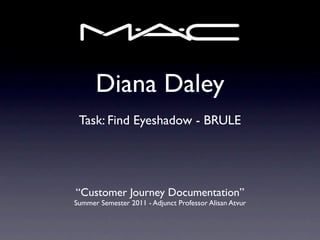
- 1. Diana Daley Task: Find Eyeshadow - BRULE “Customer Journey Documentation” Summer Semester 2011 - Adjunct Professor Alisan Atvur
- 2. “How do I find Brule?”
- 3. Part 1 In-Store Experience NORDSTROM
- 28. Part 1 In-Store Experience MACY’S
- 86. Differences In Navigation Experience • In-store: First, you walk through other departments [in a department store] to get to the MAC counter. This is not only more time consuming, but it also increases the likelihood of the consumer to get distracted by other, unrelated products (like shoes). This opens up the possibility of the consumer spending their money elsewhere. In-store, the eye shadows are organized by color family - not name. It works on the assumption that you will test the product before you buy it. If the display is big (like in Macy’s), it becomes harder to find things. If the display is small (like in Nordstrom), there are fewer products to choose from. Makeup artists are readily available to assist with navigation and perform product demonstrations. • Online: The navigation is displayed in small font and appears cluttered. Each category includes an unnecessary description of product features – that should be reserved as product descriptions. The text is hard to see, especially with all the distracting graphics. However, the images set an artsy, and more daring mood. This likely increases the chances that a consumer will try a bold shade or new trend. Alphabetical organization made the product easy to find. However, shopping for eye shadow probably wouldn’t be as easy if you didn’t know what you were shopping for. The customer can’t test the product nor receive a “make- over” from a makeup artist.
- 87. In-Store Navigation Difficulties • The dynamic of the store pulls the consumer to the “tester” products. This assumes that customers prefer to experience the item before purchase. The “tester” items are organized by color family or color harmony, and do not display names predominately. If a consumer knows the name of the item - but cannot recognize it immediately (as many shades are similar) - then the organization of the store is inefficient. He or she will likely have to ask for help. The eye shadows that are packaged for purchase are, in fact, alphabetized. However, the packaging is black and the “for purchase” items seem to hide on a back wall somewhere. I didn’t even notice they were there until I started to ask the makeup artist for the product. This is probably part of the placement strategy. The longer MAC can keep their consumers interacting with the product, the more likely consumers are to purchase more than they intended to.
- 88. Online Navigation Difficulties • First, the fact that the navigation is small and dark makes it obsolete next to large, colorful, moving images. The icons or images associated with each of the categories do not help the consumer. These images are too artsy to be recognizable. The categories are so complex and detail-oriented that they should take up more of the screen. The size of the navigation font makes the names and descriptions seem verbose. Selections require a double-, not single-click. This slows down the entire process. An expanding, rainbow divider between navigation panels is annoying and gets in the way. It is interactive for no reason – it is useless.
- 89. Why Shop Online vs. In-Store? • First-time MAC customers are far more likely to shop in-store. This allows them to test the products, receive makeovers, watch demonstrations, and ask questions. Repeat customers that want to re-purchase a product are more likely to do so online. This would save them a trip to the mall (i.e. time & gas). The online store is more accommodating to someone familiar with the products.
Notes de l'éditeur
- \n
- \n
- \n
- \n
- \n
- \n
- \n
- \n
- \n
- \n
- \n
- \n
- \n
- \n
- \n
- \n
- \n
- \n
- \n
- \n
- \n
- \n
- \n
- \n
- \n
- \n
- \n
- \n
- \n
- \n
- \n
- \n
- \n
- \n
- \n
- \n
- \n
- \n
- \n
- \n
- \n
- \n
- \n
- \n
- \n
- \n
- \n
- \n
- \n
- \n
- \n
- \n
- \n
- \n
- \n
- \n
- \n
- \n
- \n
- \n
- \n
- \n
- \n
- \n
- \n
- \n
- \n
- \n
- \n
- \n
- \n
- \n
- \n
- \n
- \n
- \n
- \n
- \n
- \n
- \n
- \n
- \n
- \n
- \n
- \n
- \n
- \n
- \n
- \n