![[object Object],[object Object],[object Object],[object Object]](data:image/gif;base64,R0lGODlhAQABAIAAAAAAAP///yH5BAEAAAAALAAAAAABAAEAAAIBRAA7)
Recommandé
Contenu connexe
Tendances
Tendances (16)
En vedette
En vedette (19)
Similaire à Research music magazines
Similaire à Research music magazines (20)
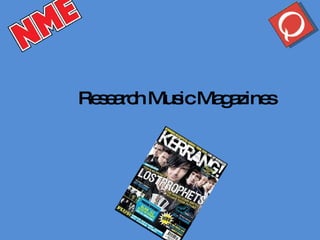
Research music magazines
- 3. New music express Masthead is overlapped by picture, this shows informality. Main article title in the red to attract the readers attention. Hand written text to make the reader feel the magazine is more personal. Lures are used to entice the potential customer into buying the magazine
- 4. Big long articles, these articles are for readers that are really into music, but the way the font is written still has informality entwined into it. Collage of images, this gives the reader something interesting to look at after the large chunk of text. Picture used in the centre of the article so the readers eyes will gaze back at it when reading the article.
- 6. Picture over laps the magazines logo, this gives an aspect of informality to the cover. This article lure shows that the magazine follows the artists life styles as well as the music they produce. Slogan is used. The cartoon background is not regular in this magazine, this will be seen as a novelty to regular readers.
- 7. Pictures collage, formally laid out, this represents the style the magazine is trying to reach for. Over sized opening letter, draws the readers attention to the article. Large cluster of text, similar to that of NME magazine.
- 9. Masthead is right at the top of the page, same layout as all KERRANG! Issues. Title of main article is placed in the centre of the page, to have all of the information spread out. Show case of other articles that are featured within the magazine.
- 10. Large picture which is traditional to KERRANG!. White font on a red background differentiates this article to other articles. Changing font, will draw attention to the reader. “ scruffy” layout is common in most KERRANG! Articles.