
Recommandé
Contenu connexe
Tendances
Tendances (19)
En vedette
Similaire à Monday Morning Madness Poster Analysis
Similaire à Monday Morning Madness Poster Analysis (20)
Plus de Dave M
Monday Morning Madness Poster Analysis
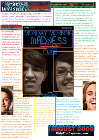
- 1. Together we came to the decision that we would use the Pineapple express idea by having both characters’ faces on the poster. We liked the idea of only having half their faces showing as it portrays a clear distinction between both characters and we can distinguish-8382001047750-8191505676900Beneath the title “Pineapple Express” they display their slogan. We decided to use this idea as a little catchy saying may stick in the mind of the people who will see this poster, which means they will be reminded of this film whenever they hear it.The title is one of the most important parts about the poster and from our research we decided to have it near the top in the centre as this is clear to the audience and stands out to them and just like the title on Pineapple express they use a colour which stands out from the background.1219200-771525-819150-771525Attract the audience and provide them information, if they see a well known name and they like the actor(s) from previous films they have been in this will bring them in to watching and buying the film.This is a cutting form the Titanic poster from our research, we have used there convention of having the names of the actors at the top of the poster on the side the character they are playing, we felt in our poster this would work well above the title as the audience can see the “well known” names which82169010668002730500-771525<br />To complete the look of the Pineapple express Poster, we pasted the other character’s face onto the opposite side. Together both faces look very effective due to their contradicting facial expressions. “Charlotte’s” face is much happier and smiley, with the addition of glasses the audience can already denote the idea that she may be a “geek” who enjoys work and school, which is in fact the message we intended to send out.<br />5432425116840<br />some obvious traits thatare present.<br />As our<br />We also decided to use the idea of having a website because we want the viewers to know we are also accessible via the web. This means that they can retrieve information 24/7 and usually it gives sneak previews of what the film will be like. Most posters have this as well so that’s where our idea originated fromEvery poster that is released is bound to have a release date so the people who look at it know when the film will be appearing in cinema screens. Just like Pineapple express, we displayed a large date “March 2010” with the corresponding font to the title, which will hopefully attract the attention of the viewers.short film is black and white we decided to colour the faces in a sepia tone to match the conventions of silent movies. This way the audience know what kind of film to expect.<br />From “Joe’s” face we can see that he isn’t a bright person and from this we can deduce that he may be lazy – of which he of course is and this is what we want the audience to see and recognise when they look at this poster. The first impression is always key, we wanted the audience to go away knowing what will be in the film, but wondering what the film will include.25527001521460<br />