SlideShare une entreprise Scribd logo
1  sur  3
Colour– More basic style of colours but slight changes; black, white, pink, purple.           Design Principle Used – the magazine front cover follows the
                                                                        These are all dark and bright colours connotation of that there is maybe two sides            Guttenberg design principle as it has full balance and goes diagonally
                                                                        to this about Rihanna and in the magazine. The colour pink stereotypes girls as it is         as the viewer is attracted to the masthead, to the picture then to the
                                                                        the typical colour to associate with girls it is a representation of gender on this           barcode in which they see the text as well.
                                                                        cover. The colour pink also has very sensual and sexual connotations to it and the
                                                                        connotation of love this suggests that she is trying to care for the audience it also
 Masthead– It is a unique style it fits in the top left corner of the   gives off a friendly styled approach to the magazine cover as it is bright and
 cover and is a short easy to remember name “NME” it is unique          cheerful.
 because most mastheads cover the whole top line of the
 magazine cover whereas this is in the top left. Bright pink colour                                                                                                    Typefaces– The typeface is more formal on this cover, partially
 and big size makes it stand out.                                                                                                                                      suggesting that this magazine in particular is aimed at an older more
                                                                                                                                                                       young adults typed target audience yet the star appeals to a younger
                                                                                                                                                                       audience that see her as a role model. The typeface is more mature
                                                                                                                                                                       and formal to appeal to an older audience as they would read more
 Main image– Main image is a picture of Rihanna so it therefore
                                                                                                                                                                       whereas a younger target audience may look more to the pictures
 appeals to her fans automatically. She is making direct address
                                                                                                                                                                       rather than the text. The selling line of this is the writing just under
 to the camera she has a seductive look, it’s appealing, and sort
                                                                                                                                                                       the masthead which says “New Musical Express” this suggests that
 of a convention to magazine covers appeals to a male audience.
                                                                                                                                                                       this is a new style of magazine it appeals to the audience as the new
 The bird sat on her shoulder is all glammed up, representation
                                                                                                                                                                       thing that’s upcoming it is the products marketing scheme.
 of social class that she is rich and famous. She is the unique
 selling point. She is also an appealing part to younger target
 audience more than likely girls due to it being Rihanna as she is                                                                                                     Photography Lighting– The lighting is high key this gives the
 seen as a role model to them she is an ideology of what they                                                                                                          connotation that she is a bright character and doing well in life it
 would like to be so she is the star profile of the magazine cover.                                                                                                    appeals to the audience because it makes them want to take her
 This links to the theory of Blumler and Katz of uses and                                                                                                              advice and listen to what she says, take notice of her. The use of
 gratifications that if the audience read this they will find out                                                                                                      bright lighting on her shows she’s a stereotyped seductive type of
 how to be like Rihanna take her advice, it’s a search for                                                                                                             star maybe the convention that she is a flirty character. This appeals
 entertainment and this source of the ideology it appeals and                                                                                                          to the male audience side of things at the teen age to around middle
 sells. The fact it is in the centre of the page suggests she is also                                                                                                  age it’s a source of money making in this and a typical convention of
 the centre of attention on this cover.                                                                                                                                music magazine covers.


Model credit– The model credit is a quote from Rihanna so it
                                                                                                                                                                      Coverlines– The cover lines use the big bold text as pink so it stands
therefore appeals to the target audience, it gives the audience
                                                                                                                                                                      out then the font and size changes so we know that this is what it is
a showing of almost her attitude and the way that she herself
                                                                                                                                                                      the colour changes to black so it is formal as it is spaced out well and
speaks. It has an influence to the target audience and fans of
                                                                                                                                                                      is easy to understand. The cover lines frame the main image itself
her as they may see it and because it is her actually listen to it
                                                                                                                                                                      which is a quite common usual thing apart from the main cover line in
and follow what she says.
                                                                                                                                                                      the middle of the frame but that is used to show it is from Rihanna
                                                                                                                                                                      and as soon as you see the image you are meant to see that. Also
                                                                                                                                                                      how other big name stars are listed below the bold cover line it
                                                                                                                                                                      suggests that the whole magazine will be about these, shows what
Main cover line– This is the biggest text on the page other than the                                                                                                  the genre is and it appeals to the target audience that these stars are
masthead so it therefore stands out and shows that the audience is                                                                                                    in the magazine and it sells, helps make money by doing this.
meant to see it. It appeals to the target audience as it appeals to
Rihanna fans and it is also appealing to a more middle-age audience
or young adults because of the language that is used it shows her           House Style- The colours that are used are there to be used as a symbolic was they suggest that this is a loving type of cover and
personal attitude and gives the viewer a sense as if they are getting       magazine, from the colours the audience can automatically get an idea of who this magazine is aimed at, the colours are more
to know the star profile here. It also suggests that there will be a        bright and the pink suggests it is more girly. It is a formal style to a magazine it is the type of design that you would expect. The
longer article in the magazine about Rihanna.                               size and font of everything is consistent throughout the design and there are more darker colours to stand out in a dark image the
                                                                            colour is emphasised. The image is in the centre to be the unique selling point of this it is a convention of placement on magazines
                                                                            and it is there to be centre of attention.
Colour– The colours on this issue are quite basic as there are only 4 which are; black, red, dark red, grey. These
                                                                           are all colours that can be symbolic for darkness especially red, the colour goes on Eminem’s name as red this
                                                                           links to the part saying he almost dies as red is symbolic of blood and death so this can suggest that Eminem
                                                                           went through lots of pain before becoming clean but he has survived it. There are only 4 colours used which is
                                                                           quite typical for magazine covers it keeps it formal and common. The colours are dark suggesting this issue
                                                                           may be dark, relating to rap music and stereotypes within it.


  Masthead– ‘VIBE’ it is quite common and a convention of music                                                                                                                   Design Principle Used – The front cover is used thoroughly to the
  magazine covers it is quite typical for it to cover the full top line                                                                                                           extent of the Guttenberg design principle as the iconic V of the VIBE
  so this is formal and the colour of it stands out on the page so                                                                                                                masthead stands out and is placed in the right place; also the barcode
  that the viewer automatically notices it as it is the biggest font                                                                                                              is placed in the dead zone of the magazine front cover.
  on the page.


Main image– the centre of attention and the unique selling point of
this magazine cover as automatically the audience can recognise
Eminem as a international star, even if you were from another
country the viewer would most likely know who this is. He is the star
profile of this cover and he automatically attracts a wide range                                                                                                                  Typefaces– The text is more formal, there isn’t much of it and the way
audience, his music is mainly aimed at males so this suggests that this                                                                                                           the language is presented shows it is an issue aimed at rap fans, this
                                                                                                                                                                                  shown by the main image too. The typeface is framing the main
magazine may be aiming at a male audience. A big well known star is
a convention of music magazine covers so it follows this way, the                                                                                                                 image which is a convention of magazine covers and suggests it is
proxemics of the star is that he is tough the way he gives direct                                                                                                                 more formal. The selling line of the cover is the quote at the top “Is
address to the camera suggests this too, he is stood with his arms                                                                                                                1998 raps last classic year?” this suggests that there will be a growing
folded looking tough which empathises that he is a rap artist, his                                                                                                                debate and opinionated view inside the magazine which has the
arms are full of tattoos which relates to the stereotype of rappers                                                                                                               effect of getting the audience involved with it and causing them to
that they are like gangster type characters so this appeals to rap fans.                                                                                                          want to be a part of it by buying this magazine.
The cross necklace he has on suggests that he is religious as are most
rap artists so this can be related to the style of music Eminem does.
                                                                                                                                                                                  Photography Lighting– High key lighting is used on Eminem suggesting
                                                                                                                                                                                  he has come back into the light this is also connotation of death
Model credit– The model credit is where it says ‘I latterly almost                                                                                                                seeing the white light before dying this can be intertextual to the text
died’ this suggests that he does not do drugs or anything that he                                                                                                                 saying he almost died as he has survived it and come back to life,
has finished doing bad things, almost like appealing to the                                                                                                                       suggesting his music and fans are a source of life to him. Appeals
audience saying that it is a new him, he’s survived and feels lucky                                                                                                               massively to the audience as the light is very bright on Eminem’s face
which relates to him being a religious man, the model credit is                                                                                                                   suggesting he will open up in the story about him in this issue. It can
formal and shows what type of character Eminem is and that he’s                                                                                                                   also link to his style of music as usually it is quite open and he uses his
sort of like a ‘bad boy’ appealing to a girl audience.                                                                                                                            life to make his songs have a certain meaning and unique story to
                                                                                                                                                                                  them.

                                                                                                                                                                                  House Style– The colours that are used on this cover are quite dark
Coverlines– The cover lines that are on this cover are not direct to                                                                                                              and common but they have links and connote the style of music that
the main image they relate to other things giving the viewer                                                                                                                      is being represented in this issue, it is common and unique as it
information of what will be in the magazine, suggesting that it will                                                                                                              relates massively to the main image on this cover which suggests that
give the buyer their money’s worth and be worth paying for, this                                                                                                                  he is such a well know star that he must be centre of attention on this
                                                                                   Main cover line– ‘Eminem Comes Clean’ this appeals to all Eminem fans and it shows             cover. The colours suggest that it is aimed at a more male audience
appeals to the audience as it suggests that there is a lot for them
                                                                                   that its information he wants out there it’s almost like he’s communicating with the           this issue as the colour red is usually associated more with males. The
to see in this magazine and that they should buy it. It appeals as it
                                                                                   buyer of this magazine end it is associated with the main image of the cover                   size and font of the typeface on the cover suggest that it is a more
names other big artists to get the viewer interested.
                                                                                   suggesting that there will be a big story inside on Eminem that he is the star profile of      formal type of magazine. The placement of the main image is
                                                                                   this issue, it appeals massively and targets specific audiences as being his fans for this     common and the way the typeface frames the image is quite usual for
                                                                                   issue. Shows that he is the unique selling point but it could also be seen as model            magazine covers.
                                                                                   credit for the cover.
Colour– 4 colours used; red, gold, white, black – quite simple and basic. Quite common
for a magazine cover to use the same colours through the cover and a small range of                           Design Principle Used – it follows the Rule of thirds design
                                                                                                                                                                                            Typefaces– The text is more formal and is common as it frames
them it keeps the cover basic and simple, also more formal. For example the colour gold                       principle on the magazine as the top left third of the cover is
                                                                                                                                                                                            the main image of the cover, a more mature font is used to
is used as it is symbolised to mean wealth, fame, power, and this suggests that the                           the huge masthead of Q and the big main image attracts the
                                                                                                                                                                                            appeal to a more mature audience and the style of the writing is
people in the magazine and the main image are associated with this. Also the colours                          viewer to it as it is in control of the majority of the thirds of the
                                                                                                                                                                                            formal this suggests that it is aimed at an older audience. The
used are brighter, cheerful covers suggesting that the magazine brings almost good news                       magazine.
                                                                                                                                                                                            typical convention of text framing the image is included here. The
to the audience.
                                                                                                                                                                                            selling line of the cover is the top of the page going straight
                                                                                                                                                                                            across covering the whole top line saying “The 10 most exciting
                                                                                                                                                                                            people in music now” this suggests that the magazine has a
       Masthead– “Q” big, unusual type of design, huge font, the titles in                                                                                                                  whole load of stars in just for the audience to read about, appeals
       the corner. Recognisable it is easy to remember, short, bold, red                                                                                                                    to the audience and makes them want to read it.
       and white colours, top left hand corner so it is less formal. A
       unique design of the masthead which has a strong impact on the
       audience it helps them remember it as it is short and simple


     Main image– The unique selling point of the magazine cover, the
     centre of attention meaning he is the central protagonist of this                                                                                                                      Photography Lighting– The lighting is high key, the white
     cover. The size of it is big and in the centre of the page, placed there                                                                                                               background. Giving it a suggestion he’s a bright figure, the colour
     so that the audience notices it straight away and once they notice                                                                                                                     white is usually connoted with heaven, god, sparking a
     who the star is they instantly become gripped and want to read the                                                                                                                     suggestion that Jay-Z is being shown as a godlike figure in the
     magazine, it attracts readers and attention to the magazine through                                                                                                                    music industry. It surrounds the indication that his serious look
     the use of this star profile. The star is giving direct address to the                                                                                                                 with the close up shot used it suggesting he is a serious man and
     camera and this is used to make the audience feel like they are                                                                                                                        takes care with his work. This look also links to his style of music;
     connecting with the star, this is a typical convention of what you                                                                                                                     rap. It is a serious type of style he does. The lighting is bright and
     would expect on a music magazine cover, a big star that is known                                                                                                                       dominates the stars face this is showing his full face to the
     worldwide for his achievements. This is a relation to the uses and                                                                                                                     audience which appeals to females who would love a man like
     gratifications theory that if you read this magazine you will get the                                                                                                                  Jay-Z and it’s near enough seductive to the female gender. He is
     inside view on stars and find out more about them how to be and                                                                                                                        stereotyped with the type of music he does through the serious
     dress like them. He himself is an ideology to having this perfect                                                                                                                      look that is represented by the lighting.
     lifestyle that everybody wants. Fame, money, girls, appeals to male
     audience

   Model credit– The model credit that is shown is not directed at the
   main image of the magazine cover so it is quite unique and unusual,                                                                                                                           House Style– The colours that are used on this cover are
   it is formal, but the artists stated of the model credit is a different                                                                                                                       used to show different meanings and connote things to the
   colour so that aspect is not formal of the magazine cover. For                                                                                                                                star of it that is the main image; the cover is more direct
   example it says “Muse? That guy is a superstar” this appeals to the                                                                                                                           and less relative to the main image itself which is unusual
   audience and fans of this artist as this also connotes that the whole                                                                                                                         to most magazine covers. Also the colours that are used
   magazine is packed with stars so the target audience of the cover is                                                                                                                          automatically suggest it is formal and indicates that the
   widened due to this.                                                                                                                                                                          target audience may be older and more that style. The
                                                                                                                                                                                                 colour also suggests it is more aimed at the male audience
                                                                                                                                                                                                 as they are linked to men more the colours. The size and
   Coverlines– The Coverlines that are shown on the cover are not
                                                                                                                                                                                                 style of the font through the cover is similar so that
   related or direct to the main image whereas the main cover line is.
                                                                                                                                                                                                 indicates it is more formal. The placement of the image is
   The Coverlines are aimed at other artists, suggesting that there is a        Main cover line– The main cover line of the magazine cover is the star of the main images name, this             empathised by the photography lighting with a bright
   lot in this magazine for the reader and it is worth the money they           suggests that the magazine will be about him mostly in an article through it, that this star is so big he        symbolisation. The image is in the centre to be the unique
   pay for it so this therefore appeals through this, it gives the reader a     gets to be the centre of attention on this issue of the magazine. It appeals to fans of Jay-Z and a more         selling point of this it is a convention of placement on
   very brief text to what their story in the magazine will be about,           male audience, more likely an old teens-middle age. Which maybe even listen to his music and enjoy               magazines and it is there to be centre of attention.
   gripping them to buy and read.                                               it, follow him round for gigs that he does? He is the star profile of the cover and the fact the main
                                                                                cover line is his name in bold and biggest size of the cover suggests he is very important.

Contenu connexe

Plus de domhayes03

Question 2 coursework evaluation
Question 2 coursework evaluation Question 2 coursework evaluation
Question 2 coursework evaluation
domhayes03
 
Coursework evaluation question 1
Coursework evaluation question 1 Coursework evaluation question 1
Coursework evaluation question 1
domhayes03
 
A2 advanced portfolio_production_diary_template
A2 advanced portfolio_production_diary_template A2 advanced portfolio_production_diary_template
A2 advanced portfolio_production_diary_template
domhayes03
 
Music video report
Music video reportMusic video report
Music video report
domhayes03
 
Market research
Market researchMarket research
Market research
domhayes03
 
Eminem feat rihanna love the way you lie
Eminem feat rihanna love the way you lieEminem feat rihanna love the way you lie
Eminem feat rihanna love the way you lie
domhayes03
 
Ed sheeran give me love
Ed sheeran give me loveEd sheeran give me love
Ed sheeran give me love
domhayes03
 
Devlin feat ed sheeran
Devlin feat ed sheeranDevlin feat ed sheeran
Devlin feat ed sheeran
domhayes03
 
Power point of analysis
Power point of analysisPower point of analysis
Power point of analysis
domhayes03
 
Power point of the analysis
Power point of the analysisPower point of the analysis
Power point of the analysis
domhayes03
 
Question 5 evaluation power point
Question 5 evaluation power pointQuestion 5 evaluation power point
Question 5 evaluation power point
domhayes03
 
Question 6 evaluation powerpoint
Question 6 evaluation powerpointQuestion 6 evaluation powerpoint
Question 6 evaluation powerpoint
domhayes03
 
Image manipulation analysis
Image manipulation analysisImage manipulation analysis
Image manipulation analysis
domhayes03
 
Produce raw images
Produce raw imagesProduce raw images
Produce raw images
domhayes03
 
Questionnaires results
Questionnaires resultsQuestionnaires results
Questionnaires results
domhayes03
 
Music magazine questionnaire
Music magazine questionnaireMusic magazine questionnaire
Music magazine questionnaire
domhayes03
 

Plus de domhayes03 (20)

Question 2 coursework evaluation
Question 2 coursework evaluation Question 2 coursework evaluation
Question 2 coursework evaluation
 
Coursework evaluation question 1
Coursework evaluation question 1 Coursework evaluation question 1
Coursework evaluation question 1
 
A2 advanced portfolio_production_diary_template
A2 advanced portfolio_production_diary_template A2 advanced portfolio_production_diary_template
A2 advanced portfolio_production_diary_template
 
hxcjshf
hxcjshfhxcjshf
hxcjshf
 
Music video report
Music video reportMusic video report
Music video report
 
Market research
Market researchMarket research
Market research
 
Eminem feat rihanna love the way you lie
Eminem feat rihanna love the way you lieEminem feat rihanna love the way you lie
Eminem feat rihanna love the way you lie
 
Ed sheeran give me love
Ed sheeran give me loveEd sheeran give me love
Ed sheeran give me love
 
Devlin feat ed sheeran
Devlin feat ed sheeranDevlin feat ed sheeran
Devlin feat ed sheeran
 
Power point of analysis
Power point of analysisPower point of analysis
Power point of analysis
 
Power point of the analysis
Power point of the analysisPower point of the analysis
Power point of the analysis
 
Test pp
Test ppTest pp
Test pp
 
Question 2
Question 2Question 2
Question 2
 
Question 2
Question 2Question 2
Question 2
 
Question 5 evaluation power point
Question 5 evaluation power pointQuestion 5 evaluation power point
Question 5 evaluation power point
 
Question 6 evaluation powerpoint
Question 6 evaluation powerpointQuestion 6 evaluation powerpoint
Question 6 evaluation powerpoint
 
Image manipulation analysis
Image manipulation analysisImage manipulation analysis
Image manipulation analysis
 
Produce raw images
Produce raw imagesProduce raw images
Produce raw images
 
Questionnaires results
Questionnaires resultsQuestionnaires results
Questionnaires results
 
Music magazine questionnaire
Music magazine questionnaireMusic magazine questionnaire
Music magazine questionnaire
 

3 magazine cover analysis by dominic hayes

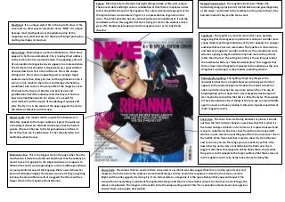
  • 1. Colour– More basic style of colours but slight changes; black, white, pink, purple. Design Principle Used – the magazine front cover follows the These are all dark and bright colours connotation of that there is maybe two sides Guttenberg design principle as it has full balance and goes diagonally to this about Rihanna and in the magazine. The colour pink stereotypes girls as it is as the viewer is attracted to the masthead, to the picture then to the the typical colour to associate with girls it is a representation of gender on this barcode in which they see the text as well. cover. The colour pink also has very sensual and sexual connotations to it and the connotation of love this suggests that she is trying to care for the audience it also Masthead– It is a unique style it fits in the top left corner of the gives off a friendly styled approach to the magazine cover as it is bright and cover and is a short easy to remember name “NME” it is unique cheerful. because most mastheads cover the whole top line of the magazine cover whereas this is in the top left. Bright pink colour Typefaces– The typeface is more formal on this cover, partially and big size makes it stand out. suggesting that this magazine in particular is aimed at an older more young adults typed target audience yet the star appeals to a younger audience that see her as a role model. The typeface is more mature and formal to appeal to an older audience as they would read more Main image– Main image is a picture of Rihanna so it therefore whereas a younger target audience may look more to the pictures appeals to her fans automatically. She is making direct address rather than the text. The selling line of this is the writing just under to the camera she has a seductive look, it’s appealing, and sort the masthead which says “New Musical Express” this suggests that of a convention to magazine covers appeals to a male audience. this is a new style of magazine it appeals to the audience as the new The bird sat on her shoulder is all glammed up, representation thing that’s upcoming it is the products marketing scheme. of social class that she is rich and famous. She is the unique selling point. She is also an appealing part to younger target audience more than likely girls due to it being Rihanna as she is Photography Lighting– The lighting is high key this gives the seen as a role model to them she is an ideology of what they connotation that she is a bright character and doing well in life it would like to be so she is the star profile of the magazine cover. appeals to the audience because it makes them want to take her This links to the theory of Blumler and Katz of uses and advice and listen to what she says, take notice of her. The use of gratifications that if the audience read this they will find out bright lighting on her shows she’s a stereotyped seductive type of how to be like Rihanna take her advice, it’s a search for star maybe the convention that she is a flirty character. This appeals entertainment and this source of the ideology it appeals and to the male audience side of things at the teen age to around middle sells. The fact it is in the centre of the page suggests she is also age it’s a source of money making in this and a typical convention of the centre of attention on this cover. music magazine covers. Model credit– The model credit is a quote from Rihanna so it Coverlines– The cover lines use the big bold text as pink so it stands therefore appeals to the target audience, it gives the audience out then the font and size changes so we know that this is what it is a showing of almost her attitude and the way that she herself the colour changes to black so it is formal as it is spaced out well and speaks. It has an influence to the target audience and fans of is easy to understand. The cover lines frame the main image itself her as they may see it and because it is her actually listen to it which is a quite common usual thing apart from the main cover line in and follow what she says. the middle of the frame but that is used to show it is from Rihanna and as soon as you see the image you are meant to see that. Also how other big name stars are listed below the bold cover line it suggests that the whole magazine will be about these, shows what Main cover line– This is the biggest text on the page other than the the genre is and it appeals to the target audience that these stars are masthead so it therefore stands out and shows that the audience is in the magazine and it sells, helps make money by doing this. meant to see it. It appeals to the target audience as it appeals to Rihanna fans and it is also appealing to a more middle-age audience or young adults because of the language that is used it shows her House Style- The colours that are used are there to be used as a symbolic was they suggest that this is a loving type of cover and personal attitude and gives the viewer a sense as if they are getting magazine, from the colours the audience can automatically get an idea of who this magazine is aimed at, the colours are more to know the star profile here. It also suggests that there will be a bright and the pink suggests it is more girly. It is a formal style to a magazine it is the type of design that you would expect. The longer article in the magazine about Rihanna. size and font of everything is consistent throughout the design and there are more darker colours to stand out in a dark image the colour is emphasised. The image is in the centre to be the unique selling point of this it is a convention of placement on magazines and it is there to be centre of attention.
  • 2. Colour– The colours on this issue are quite basic as there are only 4 which are; black, red, dark red, grey. These are all colours that can be symbolic for darkness especially red, the colour goes on Eminem’s name as red this links to the part saying he almost dies as red is symbolic of blood and death so this can suggest that Eminem went through lots of pain before becoming clean but he has survived it. There are only 4 colours used which is quite typical for magazine covers it keeps it formal and common. The colours are dark suggesting this issue may be dark, relating to rap music and stereotypes within it. Masthead– ‘VIBE’ it is quite common and a convention of music Design Principle Used – The front cover is used thoroughly to the magazine covers it is quite typical for it to cover the full top line extent of the Guttenberg design principle as the iconic V of the VIBE so this is formal and the colour of it stands out on the page so masthead stands out and is placed in the right place; also the barcode that the viewer automatically notices it as it is the biggest font is placed in the dead zone of the magazine front cover. on the page. Main image– the centre of attention and the unique selling point of this magazine cover as automatically the audience can recognise Eminem as a international star, even if you were from another country the viewer would most likely know who this is. He is the star profile of this cover and he automatically attracts a wide range Typefaces– The text is more formal, there isn’t much of it and the way audience, his music is mainly aimed at males so this suggests that this the language is presented shows it is an issue aimed at rap fans, this shown by the main image too. The typeface is framing the main magazine may be aiming at a male audience. A big well known star is a convention of music magazine covers so it follows this way, the image which is a convention of magazine covers and suggests it is proxemics of the star is that he is tough the way he gives direct more formal. The selling line of the cover is the quote at the top “Is address to the camera suggests this too, he is stood with his arms 1998 raps last classic year?” this suggests that there will be a growing folded looking tough which empathises that he is a rap artist, his debate and opinionated view inside the magazine which has the arms are full of tattoos which relates to the stereotype of rappers effect of getting the audience involved with it and causing them to that they are like gangster type characters so this appeals to rap fans. want to be a part of it by buying this magazine. The cross necklace he has on suggests that he is religious as are most rap artists so this can be related to the style of music Eminem does. Photography Lighting– High key lighting is used on Eminem suggesting he has come back into the light this is also connotation of death Model credit– The model credit is where it says ‘I latterly almost seeing the white light before dying this can be intertextual to the text died’ this suggests that he does not do drugs or anything that he saying he almost died as he has survived it and come back to life, has finished doing bad things, almost like appealing to the suggesting his music and fans are a source of life to him. Appeals audience saying that it is a new him, he’s survived and feels lucky massively to the audience as the light is very bright on Eminem’s face which relates to him being a religious man, the model credit is suggesting he will open up in the story about him in this issue. It can formal and shows what type of character Eminem is and that he’s also link to his style of music as usually it is quite open and he uses his sort of like a ‘bad boy’ appealing to a girl audience. life to make his songs have a certain meaning and unique story to them. House Style– The colours that are used on this cover are quite dark Coverlines– The cover lines that are on this cover are not direct to and common but they have links and connote the style of music that the main image they relate to other things giving the viewer is being represented in this issue, it is common and unique as it information of what will be in the magazine, suggesting that it will relates massively to the main image on this cover which suggests that give the buyer their money’s worth and be worth paying for, this he is such a well know star that he must be centre of attention on this Main cover line– ‘Eminem Comes Clean’ this appeals to all Eminem fans and it shows cover. The colours suggest that it is aimed at a more male audience appeals to the audience as it suggests that there is a lot for them that its information he wants out there it’s almost like he’s communicating with the this issue as the colour red is usually associated more with males. The to see in this magazine and that they should buy it. It appeals as it buyer of this magazine end it is associated with the main image of the cover size and font of the typeface on the cover suggest that it is a more names other big artists to get the viewer interested. suggesting that there will be a big story inside on Eminem that he is the star profile of formal type of magazine. The placement of the main image is this issue, it appeals massively and targets specific audiences as being his fans for this common and the way the typeface frames the image is quite usual for issue. Shows that he is the unique selling point but it could also be seen as model magazine covers. credit for the cover.
  • 3. Colour– 4 colours used; red, gold, white, black – quite simple and basic. Quite common for a magazine cover to use the same colours through the cover and a small range of Design Principle Used – it follows the Rule of thirds design Typefaces– The text is more formal and is common as it frames them it keeps the cover basic and simple, also more formal. For example the colour gold principle on the magazine as the top left third of the cover is the main image of the cover, a more mature font is used to is used as it is symbolised to mean wealth, fame, power, and this suggests that the the huge masthead of Q and the big main image attracts the appeal to a more mature audience and the style of the writing is people in the magazine and the main image are associated with this. Also the colours viewer to it as it is in control of the majority of the thirds of the formal this suggests that it is aimed at an older audience. The used are brighter, cheerful covers suggesting that the magazine brings almost good news magazine. typical convention of text framing the image is included here. The to the audience. selling line of the cover is the top of the page going straight across covering the whole top line saying “The 10 most exciting people in music now” this suggests that the magazine has a Masthead– “Q” big, unusual type of design, huge font, the titles in whole load of stars in just for the audience to read about, appeals the corner. Recognisable it is easy to remember, short, bold, red to the audience and makes them want to read it. and white colours, top left hand corner so it is less formal. A unique design of the masthead which has a strong impact on the audience it helps them remember it as it is short and simple Main image– The unique selling point of the magazine cover, the centre of attention meaning he is the central protagonist of this Photography Lighting– The lighting is high key, the white cover. The size of it is big and in the centre of the page, placed there background. Giving it a suggestion he’s a bright figure, the colour so that the audience notices it straight away and once they notice white is usually connoted with heaven, god, sparking a who the star is they instantly become gripped and want to read the suggestion that Jay-Z is being shown as a godlike figure in the magazine, it attracts readers and attention to the magazine through music industry. It surrounds the indication that his serious look the use of this star profile. The star is giving direct address to the with the close up shot used it suggesting he is a serious man and camera and this is used to make the audience feel like they are takes care with his work. This look also links to his style of music; connecting with the star, this is a typical convention of what you rap. It is a serious type of style he does. The lighting is bright and would expect on a music magazine cover, a big star that is known dominates the stars face this is showing his full face to the worldwide for his achievements. This is a relation to the uses and audience which appeals to females who would love a man like gratifications theory that if you read this magazine you will get the Jay-Z and it’s near enough seductive to the female gender. He is inside view on stars and find out more about them how to be and stereotyped with the type of music he does through the serious dress like them. He himself is an ideology to having this perfect look that is represented by the lighting. lifestyle that everybody wants. Fame, money, girls, appeals to male audience Model credit– The model credit that is shown is not directed at the main image of the magazine cover so it is quite unique and unusual, House Style– The colours that are used on this cover are it is formal, but the artists stated of the model credit is a different used to show different meanings and connote things to the colour so that aspect is not formal of the magazine cover. For star of it that is the main image; the cover is more direct example it says “Muse? That guy is a superstar” this appeals to the and less relative to the main image itself which is unusual audience and fans of this artist as this also connotes that the whole to most magazine covers. Also the colours that are used magazine is packed with stars so the target audience of the cover is automatically suggest it is formal and indicates that the widened due to this. target audience may be older and more that style. The colour also suggests it is more aimed at the male audience as they are linked to men more the colours. The size and Coverlines– The Coverlines that are shown on the cover are not style of the font through the cover is similar so that related or direct to the main image whereas the main cover line is. indicates it is more formal. The placement of the image is The Coverlines are aimed at other artists, suggesting that there is a Main cover line– The main cover line of the magazine cover is the star of the main images name, this empathised by the photography lighting with a bright lot in this magazine for the reader and it is worth the money they suggests that the magazine will be about him mostly in an article through it, that this star is so big he symbolisation. The image is in the centre to be the unique pay for it so this therefore appeals through this, it gives the reader a gets to be the centre of attention on this issue of the magazine. It appeals to fans of Jay-Z and a more selling point of this it is a convention of placement on very brief text to what their story in the magazine will be about, male audience, more likely an old teens-middle age. Which maybe even listen to his music and enjoy magazines and it is there to be centre of attention. gripping them to buy and read. it, follow him round for gigs that he does? He is the star profile of the cover and the fact the main cover line is his name in bold and biggest size of the cover suggests he is very important.