
Recommandé
Contenu connexe
Dernier
Dernier (20)
En vedette
En vedette (20)
Color Education
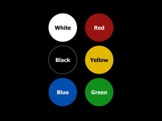
- 1. White Black Blue Red Yellow Green
- 2. White Black Blue “ Safe” Colors
- 3. White Purity Cleanliness Simplicity
- 8. Black Elegance Sophistication Mystery
- 10. Blue Honesty Trust Stability
- 14. White Black Blue “ Safe” Colors
- 15. Red Yellow Green “ Persuasion” Colors
- 16. Red Yellow Green “ Persuasion” Colors
- 17. Red Danger Power Passion
- 21. Danger Power Passion $$$
- 22. Danger Power Passion BUY NOW! SALE!
- 23. Yellow Alertness Energy Happiness
- 28. Green Growth Health Environment
- 30. Growth Health Environment $$$
- 32. Pure Elegant Honest Danger Alert Growth
Notes de l'éditeur
- Here’s a crash-course covering what I consider to be the six most important colors, what they represent, and the best ways to use them in SHOWING your idea. The first two, Black & White, are not actually colors, but they are still the most important. Any visuals you produce should reproduce well in Black & White for quick photocopying, faxing, and any decision makers who may be color-blind.
- White, Black, and Blue are considered safe colors.
- WHITE represents purity, cleanliness, and simplicity.
- For example, brides wear White to convey purity.
- Hospitals use a lot of white to reinforce cleanliness and sterility.
- Apple computer uses White to convey simplicity.
- White is the background of our word processors, and most web pages, simulating paper. Traditional text is almost always Black on a white background. As a background, it’s more about the empty “White spaces” than filling with content. Nine times out of 10, you’ll choose a White background to SHOW your idea.
- BLACK is the absence of color and represents elegance, sophistication, and mystery.
- Black as a background can be very strong as it sets a formal tone and makes other colors appear brighter.
- BLUE represents honesty, trust, and stability. Blue is primary color of choice for corporations around the world.
- To this day, IBM is known as “Big Blue.”
- Blue is common color for uniformed paramedics, firemen, and police.
- Blue suggests precision and intellect and it’s no wonder that American Express named their new cash rewards card, “Blue.” Blue is a considered a safe color – use it for accents and sometimes in place of Black.
- So there are your safe colors, White, Black, and Blue.
- The next set of colors, Green, Yellow, and Red, are persuasion colors…
- … and their meanings are best related to a traffic signal, “Stop – Caution – and GO!
- RED (my favorite color) represents danger, power, and passion.
- In a traffic signal, it means, “stop”
- … and on signs it means “danger.”
- Red is the color of fire trucks, emergency lights, and fire.
- In accounting, Red means negative or losing money – a bad thing in business. Red is generally a negative color, associated with downward/backward movement…
- but can be effectively used to stimulate or draw attention, as in “sale” or “buy now.” Use Red sparingly and carefully.
- YELLOW represents alertness, energy, and happiness.
- In a traffic signal, it means, “slow down.”
- On signs it means, “caution.”
- Taxicabs are yellow to get your attention.
- Yellow is cheerful and optimistic – highlight your gold nuggets with yellow!
- GREEN represents growth, health, and the environment.
- In a traffic signal, it means “go!”
- In accounting, Green means positive cash flow, so Green means money – especially in U.S. dollars. Green is generally a positive color and is usually associated with upward/forward movement.
- As well as nature and the environment. Highlight your gold nuggets with green!
- Add in, what are my colors saying? And since you made it this far, I’ll give you the best tip of them all…