British Railways - An interactive map of Great Britain's rail network | Merritt Cartographic

This presentation accompanies an interactive map of Great Britain's rail network, designed and created by Merritt Cartographic. This map itself, built with OpenData from the Ordnance Survey, highlights the routes operated by each train operating company, the estimated usage of each station in Great Britain (from data published by the Office of Rail Regulation), as well as providing a range of other statistics about the British rail network. The interactive map which this presentation relates to can be found at the link here: http://www.merrittcartographic.co.uk/british_railways.html The symbols used to represent stations on the map (as seen on many of the slides within this presentation) are shown at a size proportional to the total number of entries and exits for 2012-2013 (using a logarithmic scale). The white circles represent, proportionally, the number of rail user interchanges that occurred at each station for 2012-2013. In this presentation, I attempt to highlight a range of interesting facts and figures, to supplement information found on the map itself, which relate to the stations found on Great Britain’s rail network.

Recommended
Recommended
More Related Content
Recently uploaded
Recently uploaded (20)
Featured
Featured (20)
British Railways - An interactive map of Great Britain's rail network | Merritt Cartographic
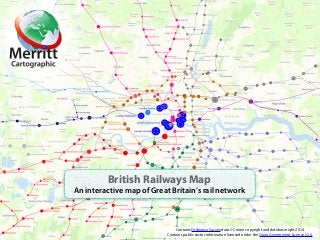
- 1. British Railways Map An interactive map of Great Britain’s rail network Contains Ordnance Survey data © Crown copyright and database right 2014. Contains public sector information licensed under the Open Government Licence v2.0.
- 2. British Railways Map An interactive map of Great Britain’s rail network Built with OpenData from the Ordnance Survey and statistics from the Office of Rail Regulation. The map itself highlights the routes operated by each train operating company, the estimated usage of each station in Great Britain as well as providing a range of other statistics about the British rail network. Data is for the period 2012-2013. In this presentation, I will attempt to highlight a range of facts and figures, to supplement information found on the map itself, which relate to the stations found on Great Britain’s rail network! Contains Ordnance Survey data © Crown copyright and database right 2014. Contains public sector information licensed under the Open Government Licence v2.0. An interactive map of Great Britain's rail network by Merritt Cartographic http://www.merrittcartographic.co.uk/british_railways.html
- 3. • 8 of the 10 most used stations in Great Britain, by passenger entries and exits for 2012–2013, are located in central London. • The largest of these is London Waterloo, with nearly 96 million entries and exits (95,936,542). London Victoria (77,346,676) and London Liverpool Street (58,448,814) are the second and third busiest. • Birmingham New Street (32,090,346) and Glasgow Central (27,185,020) are the only two stations within the top 10 not located in central London (8th and 10th). Source: Office of Rail Regulation British Railways Map Most used stations An interactive map of Great Britain's rail network by Merritt Cartographic http://www.merrittcartographic.co.uk/british_railways.html Contains Ordnance Survey data © Crown copyright and database right 2014. Contains public sector information licensed under the Open Government Licence v2.0.
- 4. • The least used railway station in Great Britain in 2012-2013 was Tees-side Airport with only 8 entries and exits. • Coombe Junction Halt, Cornwall, with 48 entries and exits and Shippea Hill, Cambridgeshire, with 50 entries and exits, were the second and third least used stations in 2012-2013. • In 2012-2013 there were 7 stations with fewer than 100 entries and exits. The other 4 were Barry Links (52), Kildonan (62), Elton & Orston (72) and Buckenham (72). Source: Office of Rail Regulation Contains Ordnance Survey data © Crown copyright and database right 2014. Contains public sector information licensed under the Open Government Licence v2.0. An interactive map of Great Britain's rail network by Merritt Cartographic http://www.merrittcartographic.co.uk/british_railways.html British Railways Map Least used stations
- 5. • The station with the most transfers or interchanges in 2012-2013 was Clapham Junction with 23,334,118. • London Waterloo (9,389,235) and London Bridge (8,568,138) had the second and third most number of interchanges. • Outside of Greater London, Birmingham New Street (5,164,606) had the most number of transfers. Ranked 6th overall behind London Victoria (4th) and East Croydon (5th). Source: Office of Rail Regulation Contains Ordnance Survey data © Crown copyright and database right 2014. Contains public sector information licensed under the Open Government Licence v2.0. An interactive map of Great Britain's rail network by Merritt Cartographic http://www.merrittcartographic.co.uk/british_railways.html British Railways Map Interchanges
- 6. • Dorking West is the station with highest annual percentage change in terms of passenger entries and exits (from 2011-2012 to 2012-2013) with an increase from 16 to 55,774 entries and exits. * • Bedford St Johns * (10,140 to 154,976) and Denton (30 to 194) are ranked second and third in terms of the annual percentage change in passenger entries and exits. • As a percentage, the biggest fall in entries and exits between 2011-2012 and 2012-2013 occurred at Shippea Hill (376 to 50). Kildonan (240 to 62) and Dalmarnock ** (79,558 to 21,506) saw the second and third greatest percentage decrease. Source: Office of Rail Regulation * Increase due, primarily, to the way tickets are issued and the way in which the statistics have been gathered. ** Station closed for a long period from June 2012. Contains Ordnance Survey data © Crown copyright and database right 2014. Contains public sector information licensed under the Open Government Licence v2.0. An interactive map of Great Britain's rail network by Merritt Cartographic http://www.merrittcartographic.co.uk/british_railways.html British Railways Map Annual increase and decrease
- 7. • Of the 1,128 entries and exits at Gainsborough Central, Lincolnshire, in 2012-2013, 98.94% used a full fare ticket (as opposed to a reduced fare or season ticket). The highest percentage of any station where the data is available. • Of the 104,504 entries and exits at Newquay, Cornwall, in 2012-2013, 98.13% used a reduced fare ticket (as opposed to a full fare or season ticket). The highest percentage of any station with more than 1,000 entries and exits. Only Quintrel Downs, Cornwall, with 99.02% of 814 people has a higher percentage. • Of the 28,102 entries and exits in 2012-2013 at Doleham, East Sussex, 27,646 used a season ticket. The highest percentage, 98.38%, of any station. This may, to a large extent, be due to the fact that there are no ticket issuing facilities located here. Source: Office of Rail Regulation Contains Ordnance Survey data © Crown copyright and database right 2014. Contains public sector information licensed under the Open Government Licence v2.0. An interactive map of Great Britain's rail network by Merritt Cartographic http://www.merrittcartographic.co.uk/british_railways.html British Railways Map Ticket types
- 8. Thank-you for viewing this presentation. To find your nearest railway station and its associated information, use the link in the panel below to view this interactive map from Merritt Cartographic. Contains Ordnance Survey data © Crown copyright and database right 2014. Contains public sector information licensed under the Open Government Licence v2.0. http://www.merrittcartographic.co.uk/british_railways.html An interactive map of Great Britain’s rail network