
Recommended
Recommended
More Related Content
Viewers also liked
Recently uploaded
Recently uploaded (20)
Editor's Notes
- The project leads. Matthew Shaxted matthew.shaxted@som.com Erik Klimczak @truthlabs.com hello@truthlabs.com
- A small team of focused individuals.
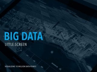
- The agenda
- Everyone likes data porn right? Early on we decided that we weren’t going to rely on flashy visualizations to get the job done.
- We rooted our visualizations in these three urban planning principles. Specially how Twitter enhances livability, open 311 data enhances resiliency, and ride-share programs like Divvy help with mobility.
- Two main interaction threads emerged: Exploration - We wanted to allow people to find their own stories. So we allowed the visualizations to be full manipulated. In essence, people can start from their own neighborhood or birth day to draw their own personal conclusions Discovery - We provided a time based interaction to allow people to visualize shifts over time. This combined with the exploration allowed folks to make unlikely connections with the data they are seeing on the screen.
- The process of creating a 3D city in WebGL started with importing massive amounts of data. Then outlining and extruding building perimeters to create a silhouette of Chicago.
- One of the early visuals generated with this approach
- We Kept asking ourselves, “where are the interesting parts of the data?”
- Traditional visual tools like Photoshop and Illustrator aren’t built to visualize big data. You need more than one tool to iterate quickly. We developed a unique workflow to generate the data visuals then composite them in traditional tools. One key objective of ours was to create visualizations we knew we could realistically leverage in the production application.
- We used a variety of tools that let us see between and beyond the flat data sets.
- One workflow we used to quickly generate visualizations: Chicago Data Portal https://data.cityofchicago.org/ D3.js http://d3js.org/
- Another workflow we used to quickly generate visualizations. The beauty of this setup was that it doesn’t require any server or backend databases or complex analytic tools to explore the data. Chicago Data Portal https://data.cityofchicago.org/ Underscore.js http://underscorejs.org/ Google Charts https://developers.google.com/chart/
- We also used raw data and pipped it into cinema 4d via python to generate distinctive looks and feels for our visualizations. Then we used Illustrator and Photoshop to composite the visuals. Python https://www.python.org/ cinema 4d http://www.maxon.net/products/cinema-4d-prime/who-should-use-it.html
- The shell is a 2D UI layer that ran communicated with 3D visualization. Tweenlite helped us achieve 60fps with very complex animation chaining. TweenLite http://www.greensock.com/gsap-js/
- The entire system was web-based running inside of Chrome in kiosk mode. A lot of custom touch code was generated to support multi-touch interactions. We leveraged the PxTouch js library to help with this. PxTouch https://github.com/thinkpixellab/PxTouch
- We also used D3 to generate custom static SVG elements that were used throughout the system.
- Our goal was to use a completely open source stack of geo-spatial tools to connect the dots between raw data and webGL in html.
- Used to perform geospatial mapping between the data and the city footprint.
- PostGIS is a database that is specifically designed to house geospatial data.
- Used to make many many tables of data available in the cloud via simple web APIs.
- Node helped us massage the data and communicate with the Shell layer to produce the interactivity.
- WebGL and Three.Js was used to produce the final interactive. ThreeJs http://threejs.org/