
Recommandé
Contenu connexe
Tendances
Tendances (20)
Similaire à Cotents page stages of development
Similaire à Cotents page stages of development (20)
Cotents page stages of development
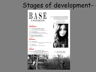
- 2. To start my front cover I inserted a text box to write my magazine name as base, I have used the same font style as my front cover but have changed the colour due to the change in colour of the background and also changed the font size I have then put the word content underneath so that the reader knows this is the contents page.
- 3. I then have added in the sub headings for the different sections of my magazine, these headings are in capital letter and are the colour red. I have also used red rectangles under all of these headings, by using this colour it makes the headings stand out from the page and makes them easy to notice, this text has no effects.
- 4. I then added the numbers on the contents page so that the readers can locate what they want easily, I have used a more elegant female looking text so that it interests the readers also I feel that it contrasts well with the rest of the text on the page.
- 5. I chose my text for the contents page, I got ideas for what to write off a couple of music magazines and mixed them in with the stories on my front cover. I made the headings of the text slightly bigger and black which is a general overview of what's on the page and then added the smaller text underneath to show more detail of what you will find in the articles and news.
- 6. I have placed these two images at the bottom of the page, they are both of the same person in the same setting but from different angles, both of these images have two effects on them, they have a brighter contrast and are also in black and white.
- 7. With this final image I have darkened the contrast but brightened the image, it has also been put in black and white to match the other photos and contrast with the colours of the text, all the pictures are in black and white on this page as I have tried to make it look simple but proffessional.