SlideShare une entreprise Scribd logo
1  sur  10
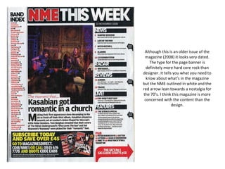
Although this is an older issue of the magazine (2008) it looks very dated. The type for the page banner is definitely more hard core rock than designer. It tells you what you need to know about what’s in the magazine but the NME outlined in white and the red arrow lean towards a nostalgia for the 70’s. I think this magazine is more concerned with the content than the design.
A page from a 2005 issue but this is another long established title (Issue number 968 from 6 years ago!) that looks as though it cares more about content than design. The basic layout is utilitarian and looks like it just fits into a standard layout format that they would use and maybe vary only slightly each issue. The nice black and white shot gets your attention as does the title underneath, the two main articles are both highlighted straight away by the use of large type for the page numbers as well as the only photographic elements on the page. Neat, serves its purpose but not exciting in design terms.
Using a cut out snapshot of the cover on the main page banner to complement the intro cleverly combines what would be two pages in some magazines into one. The images are neatly boxed with a controversial picture pulled out and bled off the page to the left braking up the overall scheme. Yellow and black boxes with type reversed out of them highlight and split the sections of the contents up  and draw attention to specific page numbers. I find the layout too busy but I think people who buy this magazine would probably like it.
Red , black and white seem to be favourite colours with music magazine designers – in this instance the effect is clean and clear. The solid black headings with reversed out ‘Q’ logo work well and the main section headings are highlighted by the same technique. The only other coloured type on the page is used in the Oasis Special panel seaparating it from the rest of the contents. The main photo is very posed and doesn’t sit well with the guys featured in it – they look as though they were being told exactly what to do and they weren’t particularly enjoying it. Nice that they used a quote from a band members’ mum to focus the readers attention on the article.
A very striking photo dominates this page the image is fun and the typography is too. The letters piled onto each other with just the white outline of the ‘V’ which is repeated in the position of the girls legs is very clever and well thought out. The rest of the type is neat with main headings pulled out in a modern script style font while the body type is clean and simple but picks out elements in capitals and black and grey to make it more interesting.
Quite a retro look to this page (although it is from 2002) again using those music magazine designers favourite colours. On the right the page has a scrapbook feel to it as though each photo and title have just been cut out and glued in place. The comic book imagery is amusing but does not complement the general feel of the page. I find the typography messy and disjointed although the font is quite nice.
Images take up the majority of the page with type overlaid onto each photo making it quite easy to see and locate, by page number, the main features inside. The content lists are quite bland in small type running on the left in coloured outliner text boxes. The solid band of black at the top of the page is quite a nice heading and the arrows pointing to the right in the reversed out orange block at the base right hand corner encourage you to turn onto the next page.
Great use of the image as an overall background to the page with a nice quirky pull quote from the article presented in a fun pink cartoon style quote mark. The font used is a non serif modern looking one and the information on the page is presented clearly and cleanly. I think the tag line at the bottom promoting the website is another clever design feature.
A very neat clean layout, with very good use of white space and bold black type. The theme of this particular issue is a review of 2010 and there is no way any reader is meant to miss it. The strong typography is really in your face. The images with page numbers draw your attention to specific articles that may be of immediate interest. Other regular features have their pages highlighted in red but much smaller type. Nice neat picture credit run vertically down the right hand side of the page.
The contents page reflects the overall style of the whole magazine – the name is carried on in the same font and colours used for the front cover and the ‘Contents’ and ‘No1’ headings use the very graphic split lettering font to show cohesion on the overall page. Visual images dominate the layout and coloured text draws attention to particular articles and features to entice the reader. Page numbers on the photos allow you to skip to the pages that interest you most.

Contenu connexe

Tendances

Magazine Contents Page Analysis
Magazine Contents Page AnalysisMagazine Contents Page Analysis
Magazine Contents Page AnalysisFran Davies
 
Deconstructions
DeconstructionsDeconstructions
Deconstructionsoliviadoug
 
Contents analysis
Contents analysisContents analysis
Contents analysisjackahern11
 
Contents analysid[1]
Contents analysid[1]Contents analysid[1]
Contents analysid[1]Charis Creber
 
Content page analysis
Content page analysisContent page analysis
Content page analysisGeorgia Grant
 
Front cover analysis!
Front cover analysis!Front cover analysis!
Front cover analysis!MitchElsey
 
Music Magazine Analysis
Music Magazine AnalysisMusic Magazine Analysis
Music Magazine Analysisellie57
 
Fashion Magazine CP Analysis
Fashion Magazine CP AnalysisFashion Magazine CP Analysis
Fashion Magazine CP AnalysisJoynesEllie
 
Magazine analysis
Magazine analysisMagazine analysis
Magazine analysisAlice Bates
 
Contents page analysis (main task)
Contents page analysis (main task)Contents page analysis (main task)
Contents page analysis (main task)EDPRICE93
 
Analysis of professional contents pages
Analysis of professional contents pages Analysis of professional contents pages
Analysis of professional contents pages katepownall
 
Music Magazine Contents Page Analysis
Music Magazine Contents Page AnalysisMusic Magazine Contents Page Analysis
Music Magazine Contents Page Analysisperri_94
 
5 magazine double page spreads
5 magazine double page spreads5 magazine double page spreads
5 magazine double page spreadsrobyngarcia
 
Magazine analysis
Magazine analysisMagazine analysis
Magazine analysisAlice Bates
 
Front cover, contents page & double page spread
Front cover, contents page & double page spreadFront cover, contents page & double page spread
Front cover, contents page & double page spreadChloeDrury
 
Contents Page Research
Contents Page ResearchContents Page Research
Contents Page Researchbeckyjay26
 

Tendances (17)

Magazine Contents Page Analysis
Magazine Contents Page AnalysisMagazine Contents Page Analysis
Magazine Contents Page Analysis
 
Deconstructions
DeconstructionsDeconstructions
Deconstructions
 
Contents analysis
Contents analysisContents analysis
Contents analysis
 
Contents analysid[1]
Contents analysid[1]Contents analysid[1]
Contents analysid[1]
 
Content page analysis
Content page analysisContent page analysis
Content page analysis
 
Front cover analysis!
Front cover analysis!Front cover analysis!
Front cover analysis!
 
Music Magazine Analysis
Music Magazine AnalysisMusic Magazine Analysis
Music Magazine Analysis
 
Fashion Magazine CP Analysis
Fashion Magazine CP AnalysisFashion Magazine CP Analysis
Fashion Magazine CP Analysis
 
Magazine analysis
Magazine analysisMagazine analysis
Magazine analysis
 
Contents page analysis (main task)
Contents page analysis (main task)Contents page analysis (main task)
Contents page analysis (main task)
 
Analysis of professional contents pages
Analysis of professional contents pages Analysis of professional contents pages
Analysis of professional contents pages
 
Music Magazine Contents Page Analysis
Music Magazine Contents Page AnalysisMusic Magazine Contents Page Analysis
Music Magazine Contents Page Analysis
 
5 magazine double page spreads
5 magazine double page spreads5 magazine double page spreads
5 magazine double page spreads
 
Magazine analysis
Magazine analysisMagazine analysis
Magazine analysis
 
Magazine analysis
Magazine analysisMagazine analysis
Magazine analysis
 
Front cover, contents page & double page spread
Front cover, contents page & double page spreadFront cover, contents page & double page spread
Front cover, contents page & double page spread
 
Contents Page Research
Contents Page ResearchContents Page Research
Contents Page Research
 

En vedette

STaR chart
STaR chartSTaR chart
STaR chartdegibson
 
Photos planning production
 Photos planning production Photos planning production
Photos planning productionellieyoungman
 
1 s tarchart
1 s tarchart1 s tarchart
1 s tarchartccoleman3
 
University of Chicago Alumni Career Webinar
University of Chicago Alumni Career WebinarUniversity of Chicago Alumni Career Webinar
University of Chicago Alumni Career WebinarTony Mayo
 
doc2app - the case for migration
doc2app - the case for migrationdoc2app - the case for migration
doc2app - the case for migrationLandscape
 
Texas s ta r chart
Texas s ta r chartTexas s ta r chart
Texas s ta r chartsljones212
 
College magazine cover/contents analysis
College magazine cover/contents analysisCollege magazine cover/contents analysis
College magazine cover/contents analysisellieyoungman
 
(3) lo sviluppo umano nel nostro tempo {s.barresi}
(3) lo sviluppo umano nel nostro tempo {s.barresi}(3) lo sviluppo umano nel nostro tempo {s.barresi}
(3) lo sviluppo umano nel nostro tempo {s.barresi}Salvatore [Sasa'] Barresi
 
The Case for Business Apps
The Case for Business AppsThe Case for Business Apps
The Case for Business AppsLandscape
 
Godrej's Blood donation drive at Jabalpur 08/08/2013
Godrej's Blood donation drive at Jabalpur 08/08/2013Godrej's Blood donation drive at Jabalpur 08/08/2013
Godrej's Blood donation drive at Jabalpur 08/08/2013Sumit Lokhande
 
Line or manaba~授業外活動における情報共有ツールの選択を考える~公開配布用
Line or manaba~授業外活動における情報共有ツールの選択を考える~公開配布用Line or manaba~授業外活動における情報共有ツールの選択を考える~公開配布用
Line or manaba~授業外活動における情報共有ツールの選択を考える~公開配布用Akihiko Koga
 
Barresi salvatore, amore e senso per la vita 2010
Barresi salvatore, amore e senso per la vita 2010Barresi salvatore, amore e senso per la vita 2010
Barresi salvatore, amore e senso per la vita 2010Salvatore [Sasa'] Barresi
 
Texas campus s ta r chart summary
Texas campus s ta r chart summaryTexas campus s ta r chart summary
Texas campus s ta r chart summarylctipton
 
Route object creation white paper
Route object creation white paper Route object creation white paper
Route object creation white paper peterehiwe
 
Technlogoy Action Plan
Technlogoy Action PlanTechnlogoy Action Plan
Technlogoy Action PlanRubberman
 
Literaturamedieval metrica
Literaturamedieval metricaLiteraturamedieval metrica
Literaturamedieval metricaagarridog
 
Purdue rec center take 2
Purdue rec center take 2Purdue rec center take 2
Purdue rec center take 2dannyboy64
 

En vedette (20)

Starchart-1
Starchart-1Starchart-1
Starchart-1
 
STaR chart
STaR chartSTaR chart
STaR chart
 
Photos planning production
 Photos planning production Photos planning production
Photos planning production
 
Contents pages
Contents pagesContents pages
Contents pages
 
1 s tarchart
1 s tarchart1 s tarchart
1 s tarchart
 
University of Chicago Alumni Career Webinar
University of Chicago Alumni Career WebinarUniversity of Chicago Alumni Career Webinar
University of Chicago Alumni Career Webinar
 
Conferenza del partenariato provinciale
Conferenza del partenariato provincialeConferenza del partenariato provinciale
Conferenza del partenariato provinciale
 
doc2app - the case for migration
doc2app - the case for migrationdoc2app - the case for migration
doc2app - the case for migration
 
Texas s ta r chart
Texas s ta r chartTexas s ta r chart
Texas s ta r chart
 
College magazine cover/contents analysis
College magazine cover/contents analysisCollege magazine cover/contents analysis
College magazine cover/contents analysis
 
(3) lo sviluppo umano nel nostro tempo {s.barresi}
(3) lo sviluppo umano nel nostro tempo {s.barresi}(3) lo sviluppo umano nel nostro tempo {s.barresi}
(3) lo sviluppo umano nel nostro tempo {s.barresi}
 
The Case for Business Apps
The Case for Business AppsThe Case for Business Apps
The Case for Business Apps
 
Godrej's Blood donation drive at Jabalpur 08/08/2013
Godrej's Blood donation drive at Jabalpur 08/08/2013Godrej's Blood donation drive at Jabalpur 08/08/2013
Godrej's Blood donation drive at Jabalpur 08/08/2013
 
Line or manaba~授業外活動における情報共有ツールの選択を考える~公開配布用
Line or manaba~授業外活動における情報共有ツールの選択を考える~公開配布用Line or manaba~授業外活動における情報共有ツールの選択を考える~公開配布用
Line or manaba~授業外活動における情報共有ツールの選択を考える~公開配布用
 
Barresi salvatore, amore e senso per la vita 2010
Barresi salvatore, amore e senso per la vita 2010Barresi salvatore, amore e senso per la vita 2010
Barresi salvatore, amore e senso per la vita 2010
 
Texas campus s ta r chart summary
Texas campus s ta r chart summaryTexas campus s ta r chart summary
Texas campus s ta r chart summary
 
Route object creation white paper
Route object creation white paper Route object creation white paper
Route object creation white paper
 
Technlogoy Action Plan
Technlogoy Action PlanTechnlogoy Action Plan
Technlogoy Action Plan
 
Literaturamedieval metrica
Literaturamedieval metricaLiteraturamedieval metrica
Literaturamedieval metrica
 
Purdue rec center take 2
Purdue rec center take 2Purdue rec center take 2
Purdue rec center take 2
 

Similaire à Contents pages

Contents page music magazine deconstruction
Contents page music magazine deconstructionContents page music magazine deconstruction
Contents page music magazine deconstructionRebecca Black
 
Contents analysis
Contents analysisContents analysis
Contents analysisLongmark12
 
TOC analysis
TOC analysisTOC analysis
TOC analysisLaraMedia
 
Double page rolling stones
Double page rolling stonesDouble page rolling stones
Double page rolling stonesYves Robinson
 
Contents analysis
Contents analysisContents analysis
Contents analysiskimb0ot
 
Contents analysis
Contents analysisContents analysis
Contents analysiskimb0ot
 
Magazine analysis
Magazine analysisMagazine analysis
Magazine analysisAlice Bates
 
Tasks 1, 2 & 3 music magazine covers powerpoint
Tasks 1, 2 & 3 music magazine covers powerpointTasks 1, 2 & 3 music magazine covers powerpoint
Tasks 1, 2 & 3 music magazine covers powerpointlindseyberrill
 
Analyse of front cover, contents and double page spread
Analyse of front cover, contents and double page spreadAnalyse of front cover, contents and double page spread
Analyse of front cover, contents and double page spreadasmediae15
 
Table of contents analyze
Table of contents analyzeTable of contents analyze
Table of contents analyzeRosie
 
Table of contents Analyze
Table of contents AnalyzeTable of contents Analyze
Table of contents AnalyzeRosie
 
Contents page analysis final
Contents page analysis finalContents page analysis final
Contents page analysis finaltashaa_smith
 
Contents Page Analysis
Contents Page AnalysisContents Page Analysis
Contents Page Analysisbanesybaby
 
As media 2u
As media 2uAs media 2u
As media 2u07tjames
 
Analysing music magazines
Analysing music magazinesAnalysing music magazines
Analysing music magazines07tjames
 

Similaire à Contents pages (20)

Double page spreads
Double page spreadsDouble page spreads
Double page spreads
 
Double page spreads
Double page spreadsDouble page spreads
Double page spreads
 
Contents page music magazine deconstruction
Contents page music magazine deconstructionContents page music magazine deconstruction
Contents page music magazine deconstruction
 
Contents analysis
Contents analysisContents analysis
Contents analysis
 
TOC analysis
TOC analysisTOC analysis
TOC analysis
 
Contents page analysis
Contents page analysisContents page analysis
Contents page analysis
 
Contents page analysis
Contents page analysisContents page analysis
Contents page analysis
 
Contents page analysis
Contents page analysisContents page analysis
Contents page analysis
 
Double page rolling stones
Double page rolling stonesDouble page rolling stones
Double page rolling stones
 
Contents analysis
Contents analysisContents analysis
Contents analysis
 
Contents analysis
Contents analysisContents analysis
Contents analysis
 
Magazine analysis
Magazine analysisMagazine analysis
Magazine analysis
 
Tasks 1, 2 & 3 music magazine covers powerpoint
Tasks 1, 2 & 3 music magazine covers powerpointTasks 1, 2 & 3 music magazine covers powerpoint
Tasks 1, 2 & 3 music magazine covers powerpoint
 
Analyse of front cover, contents and double page spread
Analyse of front cover, contents and double page spreadAnalyse of front cover, contents and double page spread
Analyse of front cover, contents and double page spread
 
Table of contents analyze
Table of contents analyzeTable of contents analyze
Table of contents analyze
 
Table of contents Analyze
Table of contents AnalyzeTable of contents Analyze
Table of contents Analyze
 
Contents page analysis final
Contents page analysis finalContents page analysis final
Contents page analysis final
 
Contents Page Analysis
Contents Page AnalysisContents Page Analysis
Contents Page Analysis
 
As media 2u
As media 2uAs media 2u
As media 2u
 
Analysing music magazines
Analysing music magazinesAnalysing music magazines
Analysing music magazines
 

Plus de ellieyoungman

Uses and Gratifications Theory
Uses and Gratifications TheoryUses and Gratifications Theory
Uses and Gratifications Theoryellieyoungman
 
Uses and gratifications Theory
Uses and gratifications TheoryUses and gratifications Theory
Uses and gratifications Theoryellieyoungman
 
Prelim audience research feedback
Prelim audience research feedbackPrelim audience research feedback
Prelim audience research feedbackellieyoungman
 
Prelim audience research feedback
Prelim audience research feedbackPrelim audience research feedback
Prelim audience research feedbackellieyoungman
 
MMade Audience Feedback
MMade Audience FeedbackMMade Audience Feedback
MMade Audience Feedbackellieyoungman
 
MMade audience feedback
MMade  audience feedbackMMade  audience feedback
MMade audience feedbackellieyoungman
 
Prelim front cover+contents
Prelim front cover+contents Prelim front cover+contents
Prelim front cover+contents ellieyoungman
 
Prelim front cover+contents
Prelim front cover+contentsPrelim front cover+contents
Prelim front cover+contentsellieyoungman
 
Preliminary evaluation
Preliminary evaluationPreliminary evaluation
Preliminary evaluationellieyoungman
 
Rolling stone Flatplan
Rolling stone FlatplanRolling stone Flatplan
Rolling stone Flatplanellieyoungman
 
Front cover draft idea1
Front cover draft idea1Front cover draft idea1
Front cover draft idea1ellieyoungman
 

Plus de ellieyoungman (20)

Uses and Gratifications Theory
Uses and Gratifications TheoryUses and Gratifications Theory
Uses and Gratifications Theory
 
Uses and gratifications Theory
Uses and gratifications TheoryUses and gratifications Theory
Uses and gratifications Theory
 
Prelim audience research feedback
Prelim audience research feedbackPrelim audience research feedback
Prelim audience research feedback
 
Prelim audience research feedback
Prelim audience research feedbackPrelim audience research feedback
Prelim audience research feedback
 
MMade Audience Feedback
MMade Audience FeedbackMMade Audience Feedback
MMade Audience Feedback
 
MMade audience feedback
MMade  audience feedbackMMade  audience feedback
MMade audience feedback
 
Final Evaluation
Final Evaluation Final Evaluation
Final Evaluation
 
Prelim front cover+contents
Prelim front cover+contents Prelim front cover+contents
Prelim front cover+contents
 
Prelim front cover+contents
Prelim front cover+contentsPrelim front cover+contents
Prelim front cover+contents
 
Final DPS
Final DPSFinal DPS
Final DPS
 
Draft Layout Ideas
Draft Layout IdeasDraft Layout Ideas
Draft Layout Ideas
 
MMade Flatplan
MMade FlatplanMMade Flatplan
MMade Flatplan
 
Final contents page
Final contents pageFinal contents page
Final contents page
 
Final front cover
Final front coverFinal front cover
Final front cover
 
Preliminary evaluation
Preliminary evaluationPreliminary evaluation
Preliminary evaluation
 
Personal Learning
Personal Learning Personal Learning
Personal Learning
 
MMade timeline
MMade timelineMMade timeline
MMade timeline
 
Rolling stone Flatplan
Rolling stone FlatplanRolling stone Flatplan
Rolling stone Flatplan
 
Nme Flatplan
Nme FlatplanNme Flatplan
Nme Flatplan
 
Front cover draft idea1
Front cover draft idea1Front cover draft idea1
Front cover draft idea1
 

Contents pages

  • 1. Although this is an older issue of the magazine (2008) it looks very dated. The type for the page banner is definitely more hard core rock than designer. It tells you what you need to know about what’s in the magazine but the NME outlined in white and the red arrow lean towards a nostalgia for the 70’s. I think this magazine is more concerned with the content than the design.
  • 2. A page from a 2005 issue but this is another long established title (Issue number 968 from 6 years ago!) that looks as though it cares more about content than design. The basic layout is utilitarian and looks like it just fits into a standard layout format that they would use and maybe vary only slightly each issue. The nice black and white shot gets your attention as does the title underneath, the two main articles are both highlighted straight away by the use of large type for the page numbers as well as the only photographic elements on the page. Neat, serves its purpose but not exciting in design terms.
  • 3. Using a cut out snapshot of the cover on the main page banner to complement the intro cleverly combines what would be two pages in some magazines into one. The images are neatly boxed with a controversial picture pulled out and bled off the page to the left braking up the overall scheme. Yellow and black boxes with type reversed out of them highlight and split the sections of the contents up and draw attention to specific page numbers. I find the layout too busy but I think people who buy this magazine would probably like it.
  • 4. Red , black and white seem to be favourite colours with music magazine designers – in this instance the effect is clean and clear. The solid black headings with reversed out ‘Q’ logo work well and the main section headings are highlighted by the same technique. The only other coloured type on the page is used in the Oasis Special panel seaparating it from the rest of the contents. The main photo is very posed and doesn’t sit well with the guys featured in it – they look as though they were being told exactly what to do and they weren’t particularly enjoying it. Nice that they used a quote from a band members’ mum to focus the readers attention on the article.
  • 5. A very striking photo dominates this page the image is fun and the typography is too. The letters piled onto each other with just the white outline of the ‘V’ which is repeated in the position of the girls legs is very clever and well thought out. The rest of the type is neat with main headings pulled out in a modern script style font while the body type is clean and simple but picks out elements in capitals and black and grey to make it more interesting.
  • 6. Quite a retro look to this page (although it is from 2002) again using those music magazine designers favourite colours. On the right the page has a scrapbook feel to it as though each photo and title have just been cut out and glued in place. The comic book imagery is amusing but does not complement the general feel of the page. I find the typography messy and disjointed although the font is quite nice.
  • 7. Images take up the majority of the page with type overlaid onto each photo making it quite easy to see and locate, by page number, the main features inside. The content lists are quite bland in small type running on the left in coloured outliner text boxes. The solid band of black at the top of the page is quite a nice heading and the arrows pointing to the right in the reversed out orange block at the base right hand corner encourage you to turn onto the next page.
  • 8. Great use of the image as an overall background to the page with a nice quirky pull quote from the article presented in a fun pink cartoon style quote mark. The font used is a non serif modern looking one and the information on the page is presented clearly and cleanly. I think the tag line at the bottom promoting the website is another clever design feature.
  • 9. A very neat clean layout, with very good use of white space and bold black type. The theme of this particular issue is a review of 2010 and there is no way any reader is meant to miss it. The strong typography is really in your face. The images with page numbers draw your attention to specific articles that may be of immediate interest. Other regular features have their pages highlighted in red but much smaller type. Nice neat picture credit run vertically down the right hand side of the page.
  • 10. The contents page reflects the overall style of the whole magazine – the name is carried on in the same font and colours used for the front cover and the ‘Contents’ and ‘No1’ headings use the very graphic split lettering font to show cohesion on the overall page. Visual images dominate the layout and coloured text draws attention to particular articles and features to entice the reader. Page numbers on the photos allow you to skip to the pages that interest you most.