SlideShare une entreprise Scribd logo
1  sur  3
Red: It focuses on the world as their band logo, more as a                 Colour theme: They’ve chosen to keep the theme
map then a globe on the front cover, but again inside there           throughout as a dirty cream colour, as if the same as an old
           is two globes used emphasising this.                                  map just like the front cover shows.        Green: On either side of the CD it contains images as if
                                                                                                                            showing a story, or a piece of history. They all look out at
                            Blue: Using a crown to form around their A for Architects                                        sea. Also the images have been kept thin, cut off as to
                           works great for looks but also gives the subliminal meaning                                     focus on one thing in the picture rather then everything in
                                               of ruling or power.                                                                                  the scene.
To the left and right of where the CD is held, is where
they have chosen to place the main body of artwork.
This will because when opening the digipak to get to
the CD this is where your eyes will be focused first
(apart from the front cover itself). The artwork feels
as if it is only half a story, covering up the majority of
the image with a stripe pattern and having you only
see what they want, which could be the message
involved with this, that everything is only shown as to
how much the person wants you to see, everything
else is hidden. They could have also meant for it to be
like this so that you focus one part of the image,
leaving in only what is important. After researching
online there is no story behind the artwork that I can
find, but after looking at the digipak I believe because
of the image of the front cover being a globe of the
world the containing artwork shows different historic
events that may or may not have happened.
- OTHER ALBUMS
1st album (2006)                                         2ndalbum (2007)                                            With Architects first and second album they have gone
                                                                                                                    with a completely different style then they had with their
                                                                                                                    next 3 albums. On ‘Nightmares’ there first studio album it
                                                                                                                    shows a women’s face breathing (what I can only presume
                                                                                                                    is) fire/lava and the back of her hand is made up of what
                                                                                                                    looks like trees and branches, while the bottom of her face
                                                                                                                    is crumbling. I believe this represents how we are
                                                                                                                    destroying ourselves with our actions. The woman
                                                                                                                    breathing the fire is causing the trees to then burn and
                                                                                                                    turn to ash which in turn breaks away her face. This is an
                                                                                                                    example for many things we do that destroy us and the
                                                                                                                    world. The 2nd album Ruin shows exactly as the album title
                                                                                                                    says with the artwork. It is a mess with insect outlines and
 3rdalbum (2009)                                            th
                                                           5 album (2012)                                           other strange shapes and lines which does not give the
                                                                                                                    audience an idea of what is going on with the artwork. It
                                                                                                                    matches the title but nothing else more. Finally; Studio
                                                                                                                    album 3, 4 & 5 finally found there means. The A from
                                                                                                                    Architects within a crown has followed throughout, but
                                                                                                                    just changed slightly. 1st in Hollow Crown but with a circle
                                                                                                                    round circle round the A. is a very powerful shape showing
                                                                                                                    everlasting life and unity. Two things very important when
                                                                                                                    getting a band too work, this gives off a great feeling that
                                                                                                                    you know they’ll be around a while. Also the album is black
                                                                                                                    showing that they could be going through a dark time, and
                                                                                                                    the lyrics and music will represent this. With The here and
                                                                                                                    now album, though the front cover does not contain the A
                                                                                                                    it is -
- Then printed on the front of the CD still existing but there focus is elsewhere. It is also slanted on faded ruined paper; I believe this album signifies the struggle, and
how they are building themselves up musically and as a band. Also linking back to how we treat the world, and its history. Album 5 then indicates them being there
where they want to be, the light white colour showing happiness and that they feel that this is them and they’ve made it; but they’ve switched up the crown, you can
still see the shape but it is made out of thorns. The crown of thorns is a symbol of royalty/majesty but turning it into something painful. This is there to show they are
on top still, but they also get a lot of hate from some people that don’t like that they do or are jealous of their personal fame.

Contenu connexe

Similaire à Architects

Similaire à Architects (20)

Cd analysis
Cd analysis Cd analysis
Cd analysis
 
Script
ScriptScript
Script
 
Album cover (idea 3)
Album cover (idea 3)Album cover (idea 3)
Album cover (idea 3)
 
Album cover anayslied
Album cover anaysliedAlbum cover anayslied
Album cover anayslied
 
The script album analysis
The script album analysisThe script album analysis
The script album analysis
 
Draft i
Draft iDraft i
Draft i
 
Draft i
Draft iDraft i
Draft i
 
Draft ii
Draft iiDraft ii
Draft ii
 
Draft ii
Draft iiDraft ii
Draft ii
 
Draft ii
Draft iiDraft ii
Draft ii
 
Draft ii
Draft iiDraft ii
Draft ii
 
Cd analysis 3
Cd analysis 3Cd analysis 3
Cd analysis 3
 
Draft i
Draft iDraft i
Draft i
 
Research into film posters
Research into film postersResearch into film posters
Research into film posters
 
Research into film posters
Research into film postersResearch into film posters
Research into film posters
 
Album covers 2
Album covers 2Album covers 2
Album covers 2
 
Researching digipaks
Researching digipaksResearching digipaks
Researching digipaks
 
Band images
Band imagesBand images
Band images
 
Music album covers
Music album coversMusic album covers
Music album covers
 
La roux
La roux La roux
La roux
 

Plus de elliotnjones (20)

Effects pres
Effects presEffects pres
Effects pres
 
Audio pres
Audio presAudio pres
Audio pres
 
1
11
1
 
Final
FinalFinal
Final
 
Draft 1
Draft 1Draft 1
Draft 1
 
Content outline
Content outlineContent outline
Content outline
 
Script
ScriptScript
Script
 
LO4
LO4LO4
LO4
 
Lo4
Lo4Lo4
Lo4
 
Proposal for video game review for vibe productions
Proposal for video game review for vibe productionsProposal for video game review for vibe productions
Proposal for video game review for vibe productions
 
Index
IndexIndex
Index
 
Booklet
BookletBooklet
Booklet
 
LO1
LO1LO1
LO1
 
Lo3
Lo3Lo3
Lo3
 
LO2
LO2LO2
LO2
 
LO2
LO2 LO2
LO2
 
LO1 -
LO1 -LO1 -
LO1 -
 
Once there was a little monkey named Kiki Marie
Once there was a little monkey named Kiki MarieOnce there was a little monkey named Kiki Marie
Once there was a little monkey named Kiki Marie
 
Adtr
AdtrAdtr
Adtr
 
Music video techniques
Music video techniquesMusic video techniques
Music video techniques
 

Architects

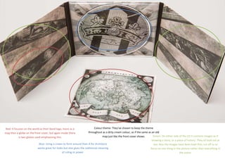
  • 1. Red: It focuses on the world as their band logo, more as a Colour theme: They’ve chosen to keep the theme map then a globe on the front cover, but again inside there throughout as a dirty cream colour, as if the same as an old is two globes used emphasising this. map just like the front cover shows. Green: On either side of the CD it contains images as if showing a story, or a piece of history. They all look out at Blue: Using a crown to form around their A for Architects sea. Also the images have been kept thin, cut off as to works great for looks but also gives the subliminal meaning focus on one thing in the picture rather then everything in of ruling or power. the scene.
  • 2. To the left and right of where the CD is held, is where they have chosen to place the main body of artwork. This will because when opening the digipak to get to the CD this is where your eyes will be focused first (apart from the front cover itself). The artwork feels as if it is only half a story, covering up the majority of the image with a stripe pattern and having you only see what they want, which could be the message involved with this, that everything is only shown as to how much the person wants you to see, everything else is hidden. They could have also meant for it to be like this so that you focus one part of the image, leaving in only what is important. After researching online there is no story behind the artwork that I can find, but after looking at the digipak I believe because of the image of the front cover being a globe of the world the containing artwork shows different historic events that may or may not have happened.
  • 3. - OTHER ALBUMS 1st album (2006) 2ndalbum (2007) With Architects first and second album they have gone with a completely different style then they had with their next 3 albums. On ‘Nightmares’ there first studio album it shows a women’s face breathing (what I can only presume is) fire/lava and the back of her hand is made up of what looks like trees and branches, while the bottom of her face is crumbling. I believe this represents how we are destroying ourselves with our actions. The woman breathing the fire is causing the trees to then burn and turn to ash which in turn breaks away her face. This is an example for many things we do that destroy us and the world. The 2nd album Ruin shows exactly as the album title says with the artwork. It is a mess with insect outlines and 3rdalbum (2009) th 5 album (2012) other strange shapes and lines which does not give the audience an idea of what is going on with the artwork. It matches the title but nothing else more. Finally; Studio album 3, 4 & 5 finally found there means. The A from Architects within a crown has followed throughout, but just changed slightly. 1st in Hollow Crown but with a circle round circle round the A. is a very powerful shape showing everlasting life and unity. Two things very important when getting a band too work, this gives off a great feeling that you know they’ll be around a while. Also the album is black showing that they could be going through a dark time, and the lyrics and music will represent this. With The here and now album, though the front cover does not contain the A it is - - Then printed on the front of the CD still existing but there focus is elsewhere. It is also slanted on faded ruined paper; I believe this album signifies the struggle, and how they are building themselves up musically and as a band. Also linking back to how we treat the world, and its history. Album 5 then indicates them being there where they want to be, the light white colour showing happiness and that they feel that this is them and they’ve made it; but they’ve switched up the crown, you can still see the shape but it is made out of thorns. The crown of thorns is a symbol of royalty/majesty but turning it into something painful. This is there to show they are on top still, but they also get a lot of hate from some people that don’t like that they do or are jealous of their personal fame.