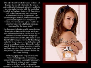
1. This advert conforms to the usual perfume ad because the model, who is also the famous actress Natalie Portman, is attractive and looks stereotypically feminine with the bow in her long hair and delicate features. All these things will make the consumer associate these attributes with buying this perfume, The colours are pale and soft, further iterating the graceful atmosphere that is expected of women. The colours also a give a feel for the actual perfume; is it a light and summery fragrance like the image hints? Furthermore the background is washed out so that she is the focus of the image, she is also central in a medium shot and her eyes lay in the area of the rule of thirds that people subconsciously look at first. The model is also directly addressing the viewer. All these things make the viewer drawn to her, to her face and almost sensual expression. The model is also naked, delicately covering herself up which is subtly provocative. This shows that if you buy this product you too may be sexy, desired for, but also still classy. The typography is also very feminine, the “miss” implying youth and not being committed to anyone; a young flirtatious girl. Everything is written in a very central, symmetrical way and it is known that symmetry is usually more attractive to viewers.
2. Here is a male perfume advert. Again the model, who is a famous actor, is stereotypically attractive with a muscular physique; attributes that are desired by many men. He also appears to be in a dramatic setting, perhaps he has just saved someone from drowning or some other heroic act that further “proves” his masculinity. The model is central in the shot and the camera is slightly high angle. This could be because the viewer is looking down at him as he valiantly gets out of the rough waters and it could imply that if you buy this product you could also be in his position. The wet clothing also accentuates his muscle which improves his appearance; he is a fit, well-kept man and you could be too if you purchase this perfume. The model is directly addressing the viewer in the rule of thirds, if not slightly off eye line. This shows a slight distance between you and the model but it whets the appetite; if you want to fully engage in this lifestyle you should buy the perfume. The colours are also mainly black and white, adding a masculine class to the image which also reflects the status of the designer. The only text in colour is the name of the perfume; Sport. This makes it stand out implies that this perfume brings things to life and adds vibrancy. Lastly the typography also looks classy and almost has a wealthy look to it. Lastly the slogan; “The new fragrance for men” is in bold signifying strength. The fact that it says “THE NEW…” implies there is no other scent out there as good as this one.
3. This advert, like the previous two, conforms to the ‘rule’ that the model should be central, the eye line lying on the top middle third and a strong symmetrical composition. The model is directly addressing the audience, she is confident and not afraid to look you in the eye. It is a slightly low angle shot implying she is superior to the viewer. The model is wearing a cat suit, something famously associated with sexy women with feline attitude, even her eye make is the “cat eye” effect. The lighting is soft, inoffensive to the viewer and so doesn’t distract from the model. In the background the model appears to be holding the seemingly innocent ribbon like a whip; she is dominant but cute and classy at the same time which could be an envious quality that the viewer desires. The colours are flirtatious and this could reflect the kind of scent the perfume is and could show that if you buy this product you will smell sexy. The ribbon, which is usually dainty cloth, has taken on a metallic appearance inciting strength and dominance of the seemingly dainty women. It wraps around her body in a flirty way and altogether adds to the sexy and girly atmosphere of the advert. The typography, like the others, has a fluidity and has a written effect to it implying class and elegance.
4. Red This conforms to the conventional idea of a perfume advert firstly because of the model. The model is beautiful in a conventional way with her blonde hair and blue eyes. Her red lip stick is sexy and shows she is confident and these are two things that most women strive for. What she is wearing looks expensive; her rings especially. The colours of white, black and red connote wealth and sleek living. The name is understated and slightly pretentious, like many of the perfume names out there at the moment. The model is also laying down, her head to her face like a damsel in distress, she is alluring and looks sensual, you can imagine putting on the perfume and perhaps feeling the same way. The lighting is very bright which washes everything out except for colour like the blues of her eyes and the red of her lips, this in turn attracts you to her beauty all the more. Furthermore the typography is also very flirty and signifies prosperity. The model’s eye contact which is direct address, showing further she is confident. Red
5. Sue SUE This advert subverts from the conventional perfume adverts you see today. The model is not conventionally attractive and she does not appear as something you may want to be like. The bottle is frumpy, it shows no elegance and is similar to that of cleaning product. This does not show glamour and would not appeal to women trying to feel sexy and confident. The colours are pale and dreary too and do not connote glamour and ‘fast living’ which is lusted after by many. The typography is also simple and basic but in a very tacky and cheap looking way.