![1st Draft ,[object Object]](data:image/gif;base64,R0lGODlhAQABAIAAAAAAAP///yH5BAEAAAAALAAAAAABAAEAAAIBRAA7)
Recommandé
Contenu connexe
Tendances
Tendances (17)
Similaire à Front cover development
Similaire à Front cover development (20)
Plus de emmarogers
Plus de emmarogers (18)
Dernier
Dernier (20)
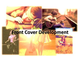
Front cover development
- 3. Cover lines don’t stand out enough, easily missed at first glance.
- 4. The WIN circle is the most noticeable thing on the page needs to be more transparent.
- 5. Picture too dark for the plain black headline.
- 7. Strapline doesn’t stand out enough, hard to read.
- 8. Top20 stands out better now the red makes it more exciting and eye catching so the reader cant miss out on this opportunity.
- 9. Exclusive interviews stands out really well and the list makes it seem like the magazine is packed full of exclusives.
- 10. The glow around the Headline allows it to jump forward from the page.
- 12. Adding a glow around the strapline makes it stand out more.
- 13. Switching the win circle to the other side balances the top of the page strapline on one side circle on the other.
- 14. Circle is still too bold needs to be more transparent
- 15. Remove the & the bullet point alone is enough (& Joshua Radin)
- 16. Acoustic guitar image refers back to the genre.
- 17. Acoustic Newcomers and gig guide cover lines not readable too dark.
- 19. Grey circle now sits better on the page as it is more transparent. The boldness of the WIN still grabs the readers attention.
- 20. Adding a light grey glow around the cover lines means they can be easily read at first glance.
- 21. Spreading the glow around the Headline looks like sparkles reflecting the fame and celebrity of the cover star.
- 22. Again I added glow around the banner at the bottom so it stand forward from the image.
- 23. Overall I am very pleased with my cover, I think it is exciting and will stand out on a magazine stand the direct form of address form the model and the bold headline and masthead and a lot of lure words such as Exclusive and WIN!