
Recommended
More Related Content
What's hot
What's hot (20)
Viewers also liked
Viewers also liked (20)
Similar to Making of digipak
Similar to Making of digipak (20)
More from emmgree
Recently uploaded
Recently uploaded (20)
Making of digipak
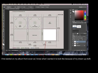
- 1. I first started on my album front cover as I knew what I wanted it to look like because of my drawn up draft.
- 3. Once I edited the photo and got rid of the microphone and background, I decided that a linking theme throughout my products would be the black and white as it means that the products look like they come from the same artist and are advertising the same thing.
- 4. The next thing I did was try and get an effect that made the album cover more aesthetically pleasing and look more like an album cover. To do this I searched ‘sun effect on camera’ on google images as there was a few shots from my music video that had the sun shining which I thought looked good, so I decided I wanted to have that effect on my album cover. once I chose the picture to give the effect I wanted I had to place it over the image that I already had and then I turned the opacity up in order for the picture of my artist to appear through.
- 5. I then did the same for my album back cover as I wanted them to look the same.
- 6. d this by making it a lot more simple that the front cover as I thought it would balance out the look, I then decided to put a picture on it to make it more interesting
- 7. To get the back cover I just used my ready made track list and made it the same font as my front cover. I then made a border and added a barcode and the Epitaph logo to make it more realistic.
- 8. To get the effect of the blurred picture I had to duplicate the layer two times. I then changed the opacity of both the first duplicate and the second duplicate so that you could see all layers underneath. I then changed the positions of all of the duplicates so that they’re not all in line which gave the blurred effect.
- 9. enjoyed using the most was changing the transparency of the pictures as I feel it allows you to use