
Recommandé
Contenu connexe
Tendances
Tendances (20)
En vedette
Similaire à Presentation1
Similaire à Presentation1 (20)
Plus de enamulmiah95
Plus de enamulmiah95 (20)
Dernier
Dernier (20)
Presentation1
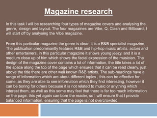
- 1. Magazine research In this task I will be researching four types of magazine covers and analysing the genre, design and layout. The four magazines are Vibe, Q, Clash and Billboard, I will start off by analysing the Vibe magazine. From this particular magazine the genre is clear, it is a R&B specialist magazine, The publication predominantly features R&B and hip-hop music artists, actors and other entertainers, in this particular magazine it shows young jeezy, and it is a medium close up of him which shows the facial expression of the musician. The design of the magazine cover contains a lot of information, the title takes a lot of the space along the top of the page which ensures that it can be read clearly, just above the title there are other well known R&B artists. The sub-headings have a range of information which are about different topics , this can be effective for some, as they are able to see information which they find interesting, however it can be boring for others because it is not related to music or anything which interest them, as well as this some may feel that there is far too much information on the page, this yet again can bore the reader, so I will ensure that I provide balanced information, ensuring that the page is not overcrowded
- 2. From the magazine you The title of the can see the image takes magazine is up a lot of the space, written in big, bold this is very effective letters, this is because the viewers because the main attention should viewer can identify be on the musician the name of the himself magazine clearly, The barcode is it also makes it portrait, this is very look professional unusual and adds a unique touch to the magazine
- 3. The colours used in this magazine are plain and boring, they are black, red and white. The colours have not been combined well to attract customers , although the main focus is the artist himself, the colours do not help attracting an audience, this can be off-putting for some users as there are no unique selling points apart from the actual artist. The colour red symbolizes blood and danger and love, black represent power, these colour may have deeper meanings, however in this case they have not been combined appropriately. I will ensure that I use right colours which are combined well to ensure that I attract my target audience. The layout of the magazine follows the standard conventions of existing magazines where they have located the title at the top and the sub-heading to the left and right hand side of the main image as and barcode and date to the left which is portrait, this is usually landscape, but I believe it works well and gives it a neat finish, in terms of layout I believe it is successful as it is presented clearly and concisely.
- 4. I will now analyse my second cover which is the Q magazine, the first thing which stands out from the page is the main image which is a close up of “Michael Jackson”, this allows the viewer see the facial expressions more clearly . The genre is very clear, this is because Michael Jackson is also known as the “king of pop” so this shows that the magazine is pop genre, the image takes up much of the room within the cover as this is the main focus and is the main attraction which I believe is successful because the viewer will find the image interesting straightaway and want to know more about why he is the main focus. In terms of design the Q magazine follows the same structure for the other existing magazines, the Q logo is always situated in that place as well as the writing across the top. The information on the page is mostly to the right of the image so there are space remaining on the left hand side, this is a negative as the information looks overcrowded on one side, and is hard to read, this is no good to the reader- which means that they will not be keen on buying this particular magazine, the information should distributed appropriately where it can be read easily and clearly. Moreover some of the information is not related to music, which can be another reason why they magazine is unsuccessful as they have not provided potential customers with the necessary information.
- 5. In this particular magazine they have combined colours really well and made the front cover look attractive, the main colours are red, black and white, the colour red symbolizes love and passion, black represents power and white represents purity, they all have deeper meanings which add extra interests, these colours are all common colours used in all there existing magazines which gives it a consistent look and ensures that they keep this colour theme continuous in all there new releases, I will take this into consideration when creating my own magazine. The design of this magazine is clear and concise as there are nothing scattered or uneven which may effect the overall look of the magazine.
- 7. I will now analyse my third magazine cover which is Clash, the genre of this particular magazine can be identified straightaway, it is R&B, this is because of the artist who is Jayz and is most associated to this genre. The layout of this magazine is pretty basic and minimal, there is hardly information on the page which can affect the number of people wanting to buy it, it looks plain and boring as there is nothing which interests them in any way, however the clash magazine may have purposely done this so that the main image is the focus and the customer will see this R&B rapper and make them want to purchase the magazine, I would definitely avoid doing this because there is no particular information which interests me. The colours used in this magazine are grey, black, white and gold, these colours once combined look very well together and make the page standout, the background colour works well with font colours . The layout follows the standard conventions of existing magazine covers as the title is at the top alongside a border at the top and the information at the bottom and the right hand side of the page, the barcode is situated in the wrong place I believe, this is because it is far too up the page and looks out of place, it is something which I will avoid when creating my own as it affects the overall look of the magazine.
- 8. The title is aligned to the left and should be The contrasting colours more central as this is are combined well and one of the main selling enhance the look of the points, it has an odd magazine design which does not look effective. There is minimal The barcode and date information on the are portrait and is far magazine which too up the page which makes it look boring again does not look and unappealing effective
- 9. I will now analyse the fourth magazine, this is the Billboard magazine. By looking at the magazine I am able to tell what the genre of this magazine cover is, it is R&B, this is because of the artist who is Beyonce and is most associated to this genre. The layout of this particular magazine follows the standard conventions of existing magazines, it has the main image which takes up much of the room, this is a unique selling point which is purposely done to make customers buy the magazine, I believe this is successful as it is eye-catching and attracts instant attention. The sub-articles can be found on the left and right hand side of the main image, they have used the space appropriately ensuring that every part of the page is used. The magazine is dedicated to beyonce, so most of the sub articles are about her, I would say that the magazine can be both male and female magazine, this is because they may like the music produced by the artist, however on the magazine it states “women’s music” this may refer to female, but I believe it would be suitable for both genders. The colours used in this magazine are black, white and blue, these colours once combined work effectively, the black colour of the background contrasts well with the white dress worn by Beyonce, this looks really effective and looks professional as its main aim is to stand out from the page. The font colour is also white this works effectively as it stands out from the page.
- 10. The design and structure of the magazine is another element which I like as it stands out and looks really effective, the magazine have located each item appropriately which gives the magazine cover a professional and neat finish, the magazine includes shades of blue which looks as though it is gradually fading, this is very effective and gives the magazine a unique look.
- 11. The title is spread The main image takes out evenly across up much of the room the top of the page which is main focus and cover a lot of and I believe it works space, this is really effectively as it stands effective as its duty out from the page is to stand out and ensure it can be read easily. The space around the page is used effectively which makes the reader want to read on.