Beginners Guide to TikTok for Search - Rachel Pearson - We are Tilt __ Bright...
Music Magazine Cover Analysis Alternative Press
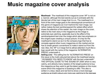
1. Music magazine cover analysis Masthead- The masthead of this magazine cover ‘AP’ is not on a banner, although the text stands out as it contrasts with the blonde hair of the main image that it is on. The masthead is in front of the main image goes is the stereotypical conventions of this genre of magazine as it isn’t behind the main image, but rather makes the text semitransparent for added effect which draws the attention of the reader.the main image on the cover, refers to the main story in the magazine as the image is extremely eye catching, especially due to the effect of the semitransparent text over the image which also has emphasis on the singers eyes creating a unique picture. It is key for the masthead to stand out as it is the company logo that has to compete against other music magazines on the market and so has to break generic conventions to make it stand out from the rest. Also, the ‘AP’ is in large font to attract attention much like a logo would with the name of the magazine ‘ALTERNATIVE PRESS’ underneath it. Selling Line- The selling line for ‘ALTERNATIVE PRESS’ on this issue is the multi coloured text above the masthead saying ‘100 BANDS YOU NEED TO KNOW’ with the text underneath ‘ THE OFFICIAL GUIDE TO THE SOUND OF 2008’ which is very catchy, and attracts many readers of the target audience to buy the magazine as they want to get the latest updates on the music scene which this magazine is boasting to offer. This also is written in a blue, black and redfont to show a more teenage audience as bright colours are more eye catching to the teenage eye.
2. Music magazine cover analysis Main Image- The main image is of only the singer of the band ‘The Rocket Summer’ As this shows ‘Bryce Avary’ placed right in the centre of the magazine showing his importance. The shot used for the photo is a Close Up , which goes against the generic type for a magazine, but emphasizes the importance of ‘Bryce Avery’ to the band. Other Images- There are no other images on this magazine cover which is very unusual, as it is a device used to attract the target audience for the magazine. However, the sheer Lack of images emphasizes the importance of the one and only main image on the cover.
3. Music magazine cover analysis Colour Scheme- The colour scheme of the magazine is Blue, Black, Red, Yellow, Orange & White. The cover uses manudifferent colours instead of the usual 3 to attract more attention to the magazine due to the lack of images on the page, to catch the eye of readers. The colours in the main parts of the magazine contrast the main image which makes them stand out and be eyecatching, whilst the less important text on the front cover use colours that harmonize better with the pictures to give the magazine a smoother feel. Button- There is one button on the front cover; which is the ‘ALTERNATIVE PRESS TOUR 2008’ button at the top left of the magazine, and is placed here as we read left to right, it shall be the first part of the magazine we see which will attract the attention of fans of live music.
4. Music magazine cover analysis Selling Line- In this front cover, the selling lines are mainly names of artists that are being featured in the magazine. The Cover line is the name of the magazines main feature, ‘THE ROCKET SUMMER’. The font of it is largest out of all other selling lines as it is important for the main story to attract the reader into the main story of the magazine. Explanatory- There are no examples of explanatory text on this front cover, as ‘ALTERNATIVE PRESS’ try to make their cover very simplistic to emphasize the effect of the main image, also the simplistic aspect of the cover helps to keep a very relaxed simple vibe to the magazine much like the music that this magazine features. Font- On this front cover, there are 3 types of font which is the stereotypical convention of a front cover keeping a simple yet professional and neat look.