
Recommandé
Contenu connexe
Tendances
Tendances (20)
En vedette
Similaire à NME Dizzee Mag ppt
Similaire à NME Dizzee Mag ppt (20)
Plus de gracepeutherer
Dernier
Dernier (8)
NME Dizzee Mag ppt
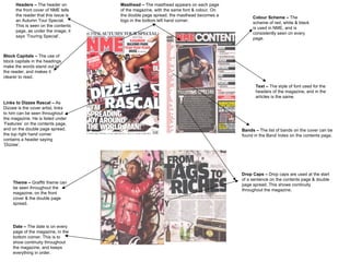
- 1. Theme – Graffiti theme can be seen throughout the magazine, on the front cover & the double page spread. Text – The style of font used for the headers of the magazine, and in the articles is the same. Masthead – The masthead appears on each page of the magazine, with the same font & colour. On the double page spread, the masthead becomes a logo in the bottom left hand corner. Drop Caps – Drop caps are used at the start of a sentence on the contents page & double page spread. This shows continuity throughout the magazine. Colour Scheme – The scheme of red, white & black is used in NME, and is consistently seen on every page. Date – The date is on every page of the magazine, in the bottom corner. This is to show continuity throughout the magazine, and keeps everything in order. Links to Dizzee Rascal – As Dizzee is the cover artist, links to him can be seen throughout the magazine. He is listed under ‘Features’ on the contents page, and on the double page spread, the top right hand corner contains a header saying ‘Dizzee’. Headers – The header on the front cover of NME tells the reader that this issue is an Autumn Tour Special. This is seen on the contents page, as under the image, it says ‘Touring Special’. Bands – The list of bands on the cover can be found in the Band Index on the contents page. Block Capitals – The use of block capitals in the headings make the words stand out to the reader, and makes it clearer to read.