1. Afet Koraltay
Media Essay
2. How effective is the combination of your main product and ancillary texts?
We effectively established apparent links with our music video and our ancillary
texts. The two ancillary texts were marketing products in promoting the artist and her
album. Therefore it was important to ensure that our target audience were familiar
with the genre. The front cover of my digipak is simplistic and focuses on the natural
aspect of the artist. I chose a picture of Hannah that explores the calm and care free
nature of her character which is very identifiable in our video ‘Mexico’. This image
was taken in our photo shoot of our artist when we were
filming the main product and isn’t present in the video
itself. I thought it would be a better idea to present the
audience with a range of pictures which demonstrate
her own star persona and not just the ones we see in the
production. I altered the image by making it black and
white because I thought it was appropriate to create a
neutral look for the cover of the CD. Whilst I was
looking at other artists I noticed that the colour scheme
wasn’t vibrant at all, the colours used were dark in
comparison to the pop genre.
Whilst editing our music video we made decisions in order to portray an
individualistic and feminine artist performing in her element of peacefulness. Her
costume for example, was appropriate for the type of song and showed a variety in her
character. The floral prints on her dresses in the video were similar to those I placed
on the album cover to enable the audience to recognise and identify the relationship
between the two texts. According to Carol Vernallis ‘continuity editing seeks to
preserve the flow of time and the coherence of space’ and I have demonstrated this
through the use of the 180degree shot at the beginning of the production. This camera
angle is effective for the start of the video filmed after she has got off the train and
arrived in Mexico where her journey of discovery and identity officially begins. This
camera angle adds variety to the production and allows the viewers of the video to see
Hannah in a circular anticlockwise direction. Furthermore the transitions effects we
chose to use consistently throughout the video were the same and very subtle to
intertwine with the peaceful notion of the song and lyrics. We used these transitions
when there was a clear change in direction or location but there isn’t many throughout
as we wanted to portray a realistic atmosphere and too much editing effects would
destroy that.
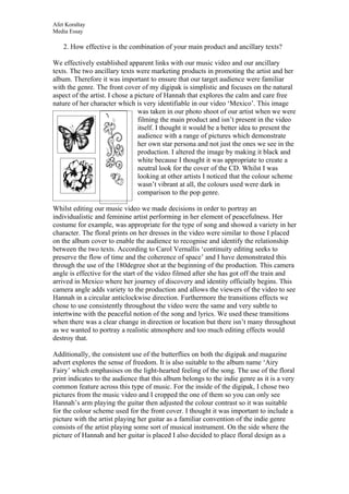
Additionally, the consistent use of the butterflies on both the digipak and magazine
advert explores the sense of freedom. It is also suitable to the album name ‘Airy
Fairy’ which emphasises on the light-hearted feeling of the song. The use of the floral
print indicates to the audience that this album belongs to the indie genre as it is a very
common feature across this type of music. For the inside of the digipak, I chose two
pictures from the music video and I cropped the one of them so you can only see
Hannah’s arm playing the guitar then adjusted the colour contrast so it was suitable
for the colour scheme used for the front cover. I thought it was important to include a
picture with the artist playing her guitar as a familiar convention of the indie genre
consists of the artist playing some sort of musical instrument. On the side where the
picture of Hannah and her guitar is placed I also decided to place floral design as a
2. Afet Koraltay
Media Essay
border to reinforce the genre even more. For example, flowers and leaf shapes are
usually associated and familiar with the Indie music field.
The artist depicts happiness through her body language and her gestures in all three of
the photographs I used for the ancillary text similarly in ‘Mexico’ where we are able
to identify with her happiness. This creates a friendly and approachable appearance of
Hannah and enables the audience to predict the overall tone of the songs on this
album. However, in comparison to the digipak I chose to use a long shot of the artist
standing up in comparison to the pictures on the CD cover where the close up of her
face is given greater importance. Overall the colour scheme and the design as a whole
follow the same principle on both the ancillary texts. I felt as though using key
conventions of the indie genre for example, the colour scheme and designs would best
portray her character and our music video. I think the audience are successfully able
to identify the genre of the song and the artist as there are many indications in terms
of design and costume. Both the advert and the album cover enable the audience to be
aware of the key concepts of the music video itself and promote the artist as a down to
earth individual.