
Recommandé
Contenu connexe
Tendances
Tendances (15)
Similaire à Commander magazine overview
Similaire à Commander magazine overview (20)
Commander magazine overview
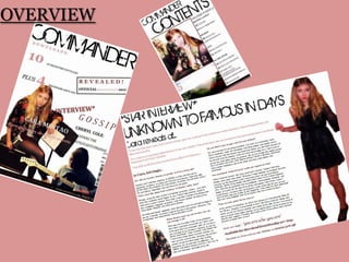
- 1. OVERVIEW
- 2. The Front Cover I have created a pop magazine, primarily aimed at teenage girls aged 14-17. It informs and updates readers of the latest and up to date news within the music industry in a clear, fun layout. Focusing on the music they are interested in. The title of my magazine is Commander I chose this as I feel that it relates well to the genre of my magazine. I feel that my music magazine includes the key conventions seen in mainstream, popular music magazines that are currently available in shops. I have tried to make my finished product as professional looking as possible; mainly through trial and improvement and also including asking my target audience what there views were, using constructive criticism in order to improve my work to the highest standard possible. By including conventions such as bar codes, issue numbers, dates, prices, mastheads and sub-headings on the cover of my magazine I was able to make my magazine look professional and as real as possible; similar to ones that would be found on shop selves.
- 3. MastheadBannerHeadlineCover LinesSecondary LeadFeature Article PhotoMenu StripCover MountDirect AddressStrap LinePuffs
- 4. 1 - In what ways does your media product use, develop or challenge forms and conventions of real media products? – Front Cover AUDIENCE: The audience of my magazine is teenage girls between the ages of 14 and 17. By putting large images of teenage girls on the cover, it relates to the audience; therefore making them more likely to look at the magazine and purchase it. MASTHEAD: There to identify the genre of the magazine, it attracts the audience. The title also conveys a message to the reader about the magazine. Always at the top of the front cover in music magazines, with a strong font. It is short which will enable it to catch the readers attention. COVER LINES: Informing the reader of what is inside the magazine, often used to draw their attention and helps persuade them to buy the magazine. A well known artist is often used to attract the specific audience. I included several cover lines on the front cover, Such as the Reading line-up, star interviews , top downloads and gossip from Cheryl Cole. LANGUAGE: Suitable for the target audience, the language that is suitable for my target audience (teenage girls aged 14-17) is informal but structured. Using words such as ‘gossip’ and ‘revealed’ these are all common words used amongst the readers that they would be familiar and comfortable with. They are short and straight to the point; informing them quickly. COLOUR SCHEME: Subconsciously makes readers aware of the genre of the magazine. The use of colours also indicates what gender and age the magazine is aimed at. Such as uses soft pastel colours would indicate a typical ‘girly’ magazine. Where as using sharp, heavy colours implies a magazine that is a rock genre and aimed at both boys and girls; again dependent on the colours used. SECONDARY LEAD: Another story which will be included in the magazine and is featured on the cover. Secondary lead on my cover is gossip with Cheryl Cole, as the interview with Cara Mintao is the main primary lead. MAIN FEATURE IMAGE: Also known as a feature article photo. The dominant image on the cover; with information about the article that follows with it. ASSOCATION: A popular advertising technique where the product relates to the target audiences lifestyle. I included this by researching what type of singers/bands my target audience are interested in. Rihanna was a extremely popular choice so I included a competition on the cover for the readers. UNIQUE SELLING POINT: COMPETITION: Placed in a noticeable area to ensure that readers can easily see it and will want to buy the magazine for their chance to get something back and win. The reader should be able to notice the feature; but it shouldn’t distract them from the main topics of the cover.
- 5. 1 - In what ways does your media product use, develop or challenge forms and conventions of real media products? – Contents Page MASTHEAD: I have used ‘Commander’ again as it is the title of the magazine and I need to emphasize this. I’ve kept it the same font and colour as on the front page to make it as consistent and professional as possible. FONT: By using the same font throughout the magazine this makes it consistent and clear. The font used could be seen as girly and informal due to its layout and the way it is shown. It is easy to read, yet informal as you wouldn’t see this font in a newspaper because it is too formal. I chose the font as it relates well to my readers and is simple yet interesting. COLOUR SCHEME: I have used the same colour scheme as the front cover, which again, makes it consistent and clear. This makes the product look more professional and finished. IMAGES: I have used images that connect with what is included in the magazine, such as images of Reading and featured artist Cara Mintao. The images used will also be included in the articles within the magazine. FEATURES SECTION: I have included a features section as this is what all music magazines include. It is a good layout to have and clear. By using this it relates back to the features of a music magazine and the main conventions. I chose to lay it out in four sections as it is clear and divides the magazine; making it easier for the reader. The main purpose of a contents page is informing the reader, they don’t want to spend a lot of time locating features and pages on a contents page so I tried to make it as clear as possible. It is popular in music magazines such as ‘NME’ to make the page numbers as clear as possible for the reader. I done this by placing the page number on the left of the text with the information on each page. I then emphasised the size further and made it bold to create a clear and neat, professional look. PAGE REFERNCES: I have included references to featured images in a clear font with the page numbers in the corners as you can see. I have also included featured articles in the section ‘on the cover’ the reason I done this was so that it is clear for the readers to locate what they were interested in on the cover. ADVERTISING: By putting advertisements on the contents page, this is likely to attract a lot of attention from the reader as they will all look definitely look at the contents page. Many music magazine advertise their subscriptions, I felt that this was a good idea and so I decided to include it in my magazine; it also makes it look more professional and finished.
- 6. 1 - In what ways does your media product use, develop or challenge forms and conventions of real media products? – Double Page Spread COLOURSCHEME: Throughout the magazine I have maintained the same colourscheme, in the double page spread I have chosen to have a plain white background as I feel this makes the page look neat and professional. I didn’t want to have a ‘busy’ background that takes away the attention from the article or featured images. I also noticed that in music magazines they don’t have blocked areas – as this looks unfinished. After taking this into consideration I chose to have a plain background and feel that this worked well; complimenting the rest of the page. IMAGES: One of the images included is a feature image on the front cover of my magazine; relating back to the reader. This makes it easier for them to differentiate and also it looks professional. I chose to have a large photo of the featured artist on the left hand side as this draws attention to the image, yet doesn’t take over the page. MASTHEAD: By using the same font and colour throughout the magazine it makes it look professional. It automatically draws the readers attention as it is capital letters and large at the top of the page. LAYOUT: Double page spread layout in music magazine are always A3 size, and usually landscape. I followed this and chose to do the layout in a formal style. By including an interview I had to structure the page carefully as I didn’t want it to look overwhelming and crowded with too much text, which would not interest my reader. I sectioned the interview into small paragraphs making it clear and easy to read, I also included the same font that I have been using throughout the magazine. I inserted a briefing underneath the title in a different colour to the majority of the text as this highlights it to the reader and draws their attention to it, yet is still quite subtle.
- 7. 2 - How does your media product represent particular social groups? The artists featured in my magazine are female teenagers, this represents the positive stereotypical views of them. They would be people who enjoy live music, gigs and new upcoming bands as this is their main interest. My music magazine represents teenage girls, shadowing away from the negative stereotype of teenage girls that is put upon every teenage girl in todays society. By using Cara Mintao and her story of coming from a background with nothing to becoming famous this gives girls hope that they too could be like this, if they are determined and motivated enough. However, it doesn’t make out to be all perfect and flawless, as in the interview Cara clearly states about trust being broken and being hurt which is extremely common amongst teenage girls; so would relate back to them and reassure/help them. GENDER: Mainly females, as the features of my magazine is dominantly what teenage girls are interested in. AGE: 14-17 year olds. They are commonly interested in the main features of my magazine; hence why I put it on the front cover. In todays world many teenagers are interested in celebrities, latest music, festivals, live music, and gossip. I have incorporated this and included as much as possible in my magazine. SOCIAL CLASS: A - Higher ManagementB - Middle ManagementC1 - Supervisors/Clerical/Junior ManagementC2 - Skilled ManualD - Semi-skilled/unskilled manualE - Very low income/pensioners/unemployed I feel that the social class connected with my readers would be from B-D due to the language and images used. I wouldn’t expect adults to read my magazine as a first choice, as it doesn’t include their interests or appeal to them. DEMOGRAPHICS:
- 8. 3 - What kind of media institution might distribute your media product and why? I would want my magazine to be within easy access of my consumers, so in all local shops in towns and villages. Shops that have chains throughout the country such as Tesco, McColl’s, Sainsbury's, WHSmith and Waterstones just to name a few examples. I’d like my magazine to be published in well known high street stores such as the examples shown. I feel these would connect best with my target audience as they would most likely shop in these stores. Ideally I would want IPC to publish my magazine as it is a well known, branded company – publishing over 60 media brands of magazines. Including best selling music magazines NME and KERRANG! On their website figures prove that 2/3 of UK women read their magazine – ass female teenagers are my primary target audience this would be the perfect publisher for my magazine to use. On the website www.bauemedia.co.uk the company publishes NME, KERRANG!, and other well known websites worldwide.
- 9. 4 - Who would be the audience for your media product? The target audience for my media magazine would be teenage girls aged 14-17 years old. I feel that the content within the magazine matches well with the genre; such as including topics they are interested in; popular artists and gossip sections within the magazine. The main audience of my magazine will be young, female teenagers who enjoy being ‘unique’ yet fashionable and currently doing GCSEs or AS levels. They would ideally enjoy going to see live music, new upcoming young artists, attending music festivals such as Reading/Leeds, and V festival. However, I accept that not all of my audience may not have had the opportunity to go to music festivals, so I have kept this in consideration.
- 10. 5 - How did you attract/address your audience? MASTHEAD: The masthead of the magazine is key to drawing the readers attention, therefore I needed it to be bold and appealing. By using the name ‘COMMANDER’ this relates with my readers – as it also implies attitude and individuality. It is short and straight to the point. FONT: Again, by using a informal font this helped to relate to the readers as it is interesting, yet still easy to read. It could be said that this font would be used for ‘young people’ as the older generations may not enjoy reading it – font like the one featured in my magazine (‘Georgia’) isn’t used in magazines such as Q which is aimed at a different and older target audience. LANGUAGE: As my magazine is aimed at teenagers, it is informal yet not patronising in how simple it is. By using appropriate slang and abbreviations this conveyed the tone of the magazine to the readers. It would of made the magazine easier for the readers to relate to and easy to read. This would expand my audience – as you would not have to be well educated to read and understand it, yet you wouldn’t feel as if it was written in a extremely basic formality. CONTENT: The content of my magazine includes issues that relate to teenage girls – such as the gossip section, interviews with celebrities about how tough life can be and other features that would interest and relate to them. I also included the Reading festival line up as I know they are interested in live music and festivals. By doing this it attracts their attention, makes my magazine look more professional and would increase sales. By adding in competitions and ‘chance to meet’ features this attracts the readers attention further as they can gain something and it is popular amongst successful music magazines such as NME and KERRANG! COLOURSCHEME: By using a continuous colourscheme through ought my magazine, it not only makes it recognisable but gives a professional look. The colours used related to my genre as they were soft and stereotypically related to girls. If I had used sharp colours, for example – colours related with the rock genre, then I feel this may have gave the wrong impression genre of my magazine or made it confusing for my readers to differentiate who the magazine is aimed at. IMAGES: I added images that would attract and interest my reader due to their interests and style. By using teenagers on the cover this automatically relates tot them. If I had put a 50 year old woman on the cover then my magazine would not have the same appeal to my readers and would create a whole different look/style.
- 11. 6 - What have you learnt about technologies from the process of constructing this product? BEFORE BEFORE AFTER AFTER
- 12. 6 - What have you learnt about technologies from the process of constructing this product? I have learnt a lot from this process, as at the beginning my first front cover was sectioned in blocked colours, looking back I can see this looked unprofessional and messy. I am glad I was pulled up on this and corrected it as I feel I have really improved and can now see my magazine being sold at a shop or online. The reasons that my first front cover, content page and double page spread were of a poor quality I feel was contributed because I was not used to using the technology and editing. By messing around with it and analysing the ways in which best selling music magazines have their layout I was able to produce a magazine successfully and of high quality. From the start to finish of creating my magazine I feel that I have learnt a lot and improved my skill with using technology. I have been able to expand my knowledge and skill using various software such as Microsoft word, paint, photo editing websites and blogging websites. I hadn’t blogged before, so using websites such as www.blogger.com was a new process for me to go through – after a while I found it easy to use and beneficial to creating my product as it was easy to access and keep up to date. It was a good place to store all my research, and I can easily see how my work has created and improved from start to finish. I used Microsoft word as the base for my magazine – creating it on here. As I used word 2010 it had a lot of editing items that were beneficial to me. I also included paint in the programmes that I used as I spent a lot of time on here removing the background of my photographs to make them look more professional for my magazine. I discovered a really good photo editing website that was free – www.picnik.com his was helpful as I could enhance my photographs, crop, edit and continue to improve them on here. I used all of the above in order to make my magazine successful and as professional as possible. By using computers and software for the vast majority of my magazine production I have discovered that technology is not always reliable, due to factors such as internet connection problems, computers crashing , loosing unsaved work and various other elements that didn’t help with the progress of my magazine.
- 13. 6 - What have you learnt about technologies from the process of constructing this product? Microsoft Word To the left are print screen images of my work using Microsoft Word. I found it particularly beneficial as it is extremely versatile and easy to use, giving a professional look overall. I was able to create my front cover, contents page, double page spread and also edit my images that I wanted to use. A particular useful tool I came across was ‘remove background’ which ; as it states simply removes the background of the photograph. This saved me a lot of time but wasn’t successful for all images – with the ones that I wasn’t able to remove the background on word I edited the background on paint.
- 14. 6 - What have you learnt about technologies from the process of constructing this product? Paint Above is an example of an image I manipulated on the programme ‘paint.’ This took a lot of time and I found that it was not always successful as the image sometimes appeared to look unprofessional and messy due to uneven and jagged sides. I only had to use ‘paint’ for a few of my images and found that when I did, it helped improve the look of them; even though it was incredibly time consuming.
- 15. PHOTO EDITING: www.picnik.com To the left hand side is an example of how I used picnik to edit and enhance the photograph – making it look more professional and finished. It increases the colours and makes the picture ever more clear. BEFORE AFTER
- 16. Examples of editing and improvement of photographs using picnik BEFORE AFTER BEFORE AFTER
- 18. Use of different font rather than standard font – www.dafont.com
- 19. Understanding of presentation of the genre of the magazine I am creating
- 20. Improvements due to mistakes I had made during the preliminary taskMAIN PRELIMINARY