

Recommandé
Recommandé
Contenu connexe
Similaire à Design for TEDx events
Similaire à Design for TEDx events (10)
Dernier
Dernier (20)
Design for TEDx events
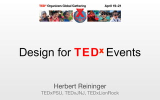
- 1. Herbert Reininger TEDxPSU, TEDxJNJ, TEDxLionRock xDesign for TED Events
- 2. Contrast CRAP: contrast, repetition, alignment, proximity Intangible design principles
- 6. Repetition / consistency CRAP: contrast, repetition, alignment, proximity Intangible design principles
- 8. Alignment / grid CRAP: contrast, repetition, alignment, proximity Intangible design principles
- 12. Proximity CRAP: contrast, repetition, alignment, proximity Intangible design principles
- 14. Size / shape Elements of design Size, type, pictures, logo, color, white space
- 21. Typography Size, type, pictures, logo, color, white space Elements of design
- 25. small
- 26. Pictures Size, type, pictures, logo, color, white space Elements of design
- 31. Logo Size, type, pictures, logo, color, white space Elements of design
- 33. Color Size, type, pictures, logo, color, white space Elements of design
- 34. TED Red Pantone 485 CMYK 0 100 100 0 RGB 255 43 6 Web ff 2b 06 TED Black Pantone Black CMYK 0 0 0 100 RGB 0 0 0 Web 00 00 00
- 35. White space Size, type, pictures, logo, color, white space Elements of design
- 38. Web design Types of design Web, event, print, presentation
- 44. Event design Web, event, print, presentation Types of design
- 49. Presentation design Web, event, print, presentation Types of design
- 51. Let’s talk
Notes de l'éditeur
- "Focus on user experience", "Story telling", "Remove everything that doesn't belong"
- Contrast (adds visual interest through making two similar items VERY different, "make it BIG, or make it very small") It brings out dominant elements and creates dynamism
- Works with typography
- Blue and orange are opposite colors on Goethe ’ s color wheel
- A classic example of contrast in an ad
- Repetition (adds visual interest, creates unity, example: background color or pattern)
- Stay consistent
- Alignment (create order, visually connects elements) Grid (makes aligning much easier)
- Examples
- Examples
- 1 : 1.61803398875 – also called the golden section (Latin: sectio aurea ) or golden mean Fibonacci sequence : 0, 1, 1, 2, 3, 5, 8, 13, 21, 34, 55, 89, 144, ...
- Proximity (group related elements, separate unrelated ones) (use just the right images, no more) Gestalt "People often don't look at every detail, but experience a page/spread as a 'unified whole' (Gestalt psychology, Germany 1920s)
- “ Things that are seen together seem to belong together. ”
- First decide on a physical dimension: standard / non-standard, portrait (vertical) / landscape (horizontal), square, round, etc. Size matters and communicates. If it ’ s a brochure, how is it going to be bound? Spiral, traditional, or simply a large piece folded into small?
- Examples
- Examples
- Examples
- Examples
- Examples
- Examples
- Helvetica only! Hierarchy is important, “ what to look first at? ” , using styles Clear discernible headlines Text as a design element should be easy to scan with the eye Balanced relationship between body text, line spacing and white space
- Hierarchy of importance
- Examples
- Examples
- Examples
- “ A picture says more than a 1000 words ” How much? Full page w. a headline, balanced btw. text and pictures, just one picture per page? Consistency in image style, decide on art direction: focus on people / illustration / metaphors / abstract Resist using built-in clip art
- A picture says more than a 1000 words
- Or focus on people
- Or using illustrations –
- Or a combination of pictures, illustration, etc.
- We all should know by now that the TEDx logo is fixed in shape, color, font and the size relationship of all it ’ s elements
- It ’ s very easy: there are only 3 colors in TEDx design, red, black and white (mostly background)
- Mostly in web and print design, but as a style element it should be used consistently across all platforms
- Example
- Example
- User experience, usability principles
- User experience, usability principles
- Horizontal is better Two holes to hang is better First name needs to be VERY large
- User experience, usability principles
- Nancy Duarte: Slide:ology, Garr Reynolds: Presentation Zen “ Remove what doesn ’ t belong ” Big supporting images, little to no text NO bullet points!