SlideShare une entreprise Scribd logo
1  sur  4
Télécharger pour lire hors ligne
The masthead has been used effectively due to the type of font and
colour that has been used. By it being all in lower case makes the
magazine come across as informal and different, reflecting its genre
and the block colour of white makes the masthead as a whole stand
out against the foreground picture.
Underneath the
masthead, is the
production information
containing the issue
number, date and price
creating the
conventional look of a
magazine. Moreover
the use of a different
typeface, signifies its
importance to the
reader as the sans serif
font comes across
much more formal as
the characters are in
upper and lower case.
The use of a pug on
the upper right hand
corner is effective as it
is one of the first
things that the reader
will see. The use of a
transparent
background around it,
highlights it further as
it signifies to the
reader its importance:
they’re getting
something for free.
The image, a wide angle
shot, has been used for
the entire background of
the magazine. By
blurring the foreground,
the integration of the text
comes across very
natural and fluid, not
blocked. Making the
magazine look
professional.
Furthermore, focus of
the image is on the
teenage girl which is
effective as it is
reflecting the magazines
target audience and in
turn making it known to
them that this magazine
is directly aimed at them
and that the magazine is
for a mass audience.
The headline within the bottom third of the magazine is eye
catching due to the use of two different typefaces and colours.
The first line is in a fairly formal sans-serif white font whereas
the topic area of the article is about, is in a natural bright yellow
sans-serif font, reflecting how large and powerful teenage
stress is for the target audience. Making the mode of address of
the magazine personal as the topics talked of directly effect the
target audience, hence making the target audience feel as
though the magazine is directly aimed at them. Signifying that
the target audience is mainly of an age of 15 to 17 possibly 18.
The cover lines/teasers
along the right third of
the page are effective as
they give brief insights
into the content of the
magazine through the
use of buzz phrases
which entice the reader
to buying the magazine.
Furthermore the use of
the same typeface
throughout aides in
presenting and
grounding the magazines
house style and the use
of white against the grey
background creates a
great contrast, drawing
the readers attention to
this. Moreover, the cover
lines cover a range of
topics, encoring a wider
target audience and
increasing the circulation
of the magazine.
The use of the banner
within the bottom third is
effective as it gives
credibility to the magazine
and validates it. Making
the reader more likely to
buy the magazine and
again increasing
circulation as more people
will feel the ned to buy it.
The overall colour
scheme is effective as it
uses complimentary
colours throughout,
making the colours
easily flow into one
another. Moreover, it is
suitable for its genre, as
it reflects the schools
emblem shown on the
teenagers tie, a range of
colours from green to
blue, reinforcing the
institutions branding and
house style.
The overall layout is effective as within each third there is an appropriate amount of
content. Meaning that the design comes across clean and clear, not cluttered,
making it easy to read just at a glance.
Within the skyline is a unique selling point, highlighting the fact that,
“Student Weekly” is “the number one student magazine”. Although
the colour of the font, a block black, contrasts greatly against the
white background, the characters of the sans-serif font are very
close together, making the phrase seem crushed together and in
turn making it harder to read.
The masthead is effective
due to its colour because
again, it creates a
contrast to the
background of the
magazine. However, due
to the fact that it’s in the
same sans-serif font as
the skyline and the rest of
the cover lines and tag
lines within the magazine,
its prominence on the
front page isn’t as great
as it should be. The
masthead almost merges
into the rest of the
magazine. Making the
house style of the
magazine not
recognisable to the
reader. Perhaps next
time, the designer could
use a different font to
ensure that this is not the
created effect.
The use of teasers and
cover lines within the
left third is effective as
it meets the
conventions of a
magazine, bringing
familiarity to the reader.
Furthermore, the use of
the language within he
buzz phrases is also
effective because it
reflects their target
audience: teenagers.
Hence why the phrases
“boring” and “nerves in
test” appropriate.
Therefore, making it
clear that the magazine
is geared towards a
mass market audience
as it targeting
teenagers from the
ages of 15 to almost
18, both male and
female.
Underneath the
masthead is the
product information.
Although this does fit
the conventions of a
magazine to an
extent it is lacking
the feature of the
issue number and
usually the barcode
and price are much
closer to it. Making
the design look
slightly disorganised
and make their
target audience not
want to buy the
magazine,
decreasing their
circulation.
Although the image
used is placed
conventionally on the
right third of the
magazine, a medium
shot and of good
quality, the woman
used does not reflect
the target audience
the magazine is trying
to appeal to. The
woman used, is in no
way relatable due to
her age and makes
the reader question
whether this
magazine is really
aimed at them.
However, the way that
the woman is smiling
and giving direct eye
contact does make
the mode of address
seem warm and
friendly, combating
the pervious issue.
Magazine
conventions are met
by including price
and barcode, though
these would be
preferably closer to
the date at the top.
The overall colour scheme is not as effective as it could be. This
being because, although the white background does create a brilliant
contrast to text laid upon it, the contents use of red and black, plus
variations of these colours within the image used except for the
notebook, the overall design looks bland. The colours are not vibrant
enough in order to draw in their target audience of teenagers who are
usually drawn to brightly coloured vibrant magazines. Although the
constant use of red and black does aide in its brand identity.
Therefore, next time the designer should include more variations of
colour to make it more appealing.
Within the skyline of the magazine is the date of publication. Although effective as
the colour black stands out against the cream background, it breaks convention of
a typical magazine as the date, issue number and price are usually all within the
strap line, usually located underneath the masthead.
The typeface used for
the masthead, comic
sans, is effective as it
is recognisable and
emulates the genre of
the magazine: school/
college magazine. This
being because comic
sans is the typical font
used within all schools
and has become
almost stereotypical.
Moreover, the dark red
used for the colour of
the masthead is also
effective as it creates a
great contrast against
the cream background,
meaning it stands out
and draws the readers
attention.
The use of teasers
and cover lines down
the right hand third of
the magazine is
effective as the overall
positioning of all cover
lines are equally
spaced, making the
design look clear and
easy to read; not
crowed. However, the
title used for the first
cover line “cover
story” is not effective
as although the blue
draws the readers
initial attention to the
article, the title itself
does not include any
buzz phrases which
would actually keep
the reader interested.
Making them skim
over it. However, the
use of pictures and
the range of shots
displayed, medium
long shot and two
shot, immediately
draw the readers
attention and does
keep them interested,
making up for the lack
of content above.
Additionally, the last
cover line suits the
target audience’s
interests perfectly, as
this is topic which
affects their own lives
heavily. Yet, the stand
first comes across as
informal, making the
mode of address
friendly and therefore
more inviting;
increasing the
circulation of the
magazine.
The use of the main image being placed within the
left third of the magazine is effective as the image
itself is inviting, the teenager is looking directly at
the reader. Making the target audience, young,
mostly female teenagers, know, just at a glance,
that this magazine is aimed at them. However, if
taken again, the teenager should have either worn
a different top or the designer should change the
colour of the background as the teenager does
blend into the background to a degree.
The overall colour
scheme of the
magazine is effective
as all text within it and
images, to an extent,
do stand out as the
cream colour sets of
the other colours
perfectly. Furthermore,
the themes of the dark
red runs throughout the
magazine, not just
through the cover lines
but also within the
central and secondary
pictures. The teenager
within the central
image has a bag which
has variations on the
colour and a girl in the
prom photos has a
dress in a similar
colour. The constant
use of the colours then
creates a recognisable
house style.
The overall
layout is
effective as its
clear design
and use of
graphics are
eye catching
and draw in
the viewer.
Within the skyline the designer has placed the date of publication and the price of the magazine,
suggesting that they’ve moved their strap line above the masthead, which is effective as it makes
not only the date and price stand out more, but the slogan, just underneath it. Furthermore, the
different types of font used for the date and price is also effective as the “FREE” draws the readers
attention first even though they would naturally read left to right, hence, immediately drawing the
readers attention to the most important pice of information in the top third.
The typeface used for
the masthead, a type
of serif in italics, is
effective as it reflects
the genre of the
magazine and appeals
to the target audience.
This being because the
font connotes that the
institution behind the
publication is
professional and
sophisticated because
it uses traditional
typography, This in
turn appeals to its
target audience,
young, most likely
female teenagers, as
their main desire is to
be older than they truly
are. Hence, by looking
at the masthead they
may immediately want
to buy the magazine as
this will aide them in
making them look older
and sophisticated.
The slogan
underneath the
masthead is
effective as it
further reinforces
the branding of
the genre: a
school magazine.
The teasers and cover
lines alongside the right
hand third and left hand
third are effective as
they do draw the
readers attention and
hit the variations within
their target audience.
Meaning that there is
something for
everyone, from sport to
social gossip this
magazine has got it.
Moreover, the colours
used with the coverlids
are effective, especially
for the core line of
“Battle of the house”
which quite literally
represents article and
entices the reader.
However, it would more
effective if the
foreground of the
central image was
blurred.
The overall colour
scheme is effective as
the light blue
compliments the white
and black text.
However, the image
behind it, due to its
background being such
a bright green, does
make it hard to
differentiate between
the text and image.
Therefore, the designer,
should have outlined all
the text in either a black
or even yellow colour,
just like they have done
for the cover line of
“House Music Results
Are In!”
Although the use of the banner is eye catching,
due to the blocked colour around it, the actual
content within is not very positive, making readers
pull away from the magazine. Perhaps if the
designer had used more buzz phrases and
portrayed it more as a scandal, the readers would
d instead be drawn to it. Additionally, the block
colour behind, ruins the design as it breaks it up,
perhaps they could have used a transparent colour
instead to make the design more fluid and to fly.
The image overall is
effective as it reflects
the genre of the
magazine. However,
due to it being a long
shot there is need to
blur the foreground or
crop the image, in
order to make the
design come across
less busy and easier to
read as the cover lines
would stand out more
in a blurred or block
colour background.
Type to enter text
Overall, if the
background
were to be
blurred and the
colour scheme
altered, the
magazine would
look very
sophisticated.

Contenu connexe

En vedette

En vedette (11)

Céline
CélineCéline
Céline
 
Energy work and placebo
Energy work and placeboEnergy work and placebo
Energy work and placebo
 
Presentation1
Presentation1Presentation1
Presentation1
 
JEM Juglone
JEM JugloneJEM Juglone
JEM Juglone
 
Mock up designs for school magazine
Mock up designs for school magazineMock up designs for school magazine
Mock up designs for school magazine
 
JM ‘n JB
JM ‘n JBJM ‘n JB
JM ‘n JB
 
Age ratings according to the bbfc ratings
Age ratings according to the bbfc ratingsAge ratings according to the bbfc ratings
Age ratings according to the bbfc ratings
 
powerpoint presentation
powerpoint presentationpowerpoint presentation
powerpoint presentation
 
Ksd
KsdKsd
Ksd
 
Screenshots
ScreenshotsScreenshots
Screenshots
 
Employment_Resume_Mechanical_Engineer
Employment_Resume_Mechanical_EngineerEmployment_Resume_Mechanical_Engineer
Employment_Resume_Mechanical_Engineer
 

Dernier

Influencing policy (training slides from Fast Track Impact)
Influencing policy (training slides from Fast Track Impact)Influencing policy (training slides from Fast Track Impact)
Influencing policy (training slides from Fast Track Impact)Mark Reed
 
Grade 9 Quarter 4 Dll Grade 9 Quarter 4 DLL.pdf
Grade 9 Quarter 4 Dll Grade 9 Quarter 4 DLL.pdfGrade 9 Quarter 4 Dll Grade 9 Quarter 4 DLL.pdf
Grade 9 Quarter 4 Dll Grade 9 Quarter 4 DLL.pdfJemuel Francisco
 
ENGLISH 7_Q4_LESSON 2_ Employing a Variety of Strategies for Effective Interp...
ENGLISH 7_Q4_LESSON 2_ Employing a Variety of Strategies for Effective Interp...ENGLISH 7_Q4_LESSON 2_ Employing a Variety of Strategies for Effective Interp...
ENGLISH 7_Q4_LESSON 2_ Employing a Variety of Strategies for Effective Interp...JhezDiaz1
 
ANG SEKTOR NG agrikultura.pptx QUARTER 4
ANG SEKTOR NG agrikultura.pptx QUARTER 4ANG SEKTOR NG agrikultura.pptx QUARTER 4
ANG SEKTOR NG agrikultura.pptx QUARTER 4MiaBumagat1
 
ACC 2024 Chronicles. Cardiology. Exam.pdf
ACC 2024 Chronicles. Cardiology. Exam.pdfACC 2024 Chronicles. Cardiology. Exam.pdf
ACC 2024 Chronicles. Cardiology. Exam.pdfSpandanaRallapalli
 
INTRODUCTION TO CATHOLIC CHRISTOLOGY.pptx
INTRODUCTION TO CATHOLIC CHRISTOLOGY.pptxINTRODUCTION TO CATHOLIC CHRISTOLOGY.pptx
INTRODUCTION TO CATHOLIC CHRISTOLOGY.pptxHumphrey A Beña
 
Field Attribute Index Feature in Odoo 17
Field Attribute Index Feature in Odoo 17Field Attribute Index Feature in Odoo 17
Field Attribute Index Feature in Odoo 17Celine George
 
Difference Between Search & Browse Methods in Odoo 17
Difference Between Search & Browse Methods in Odoo 17Difference Between Search & Browse Methods in Odoo 17
Difference Between Search & Browse Methods in Odoo 17Celine George
 
Procuring digital preservation CAN be quick and painless with our new dynamic...
Procuring digital preservation CAN be quick and painless with our new dynamic...Procuring digital preservation CAN be quick and painless with our new dynamic...
Procuring digital preservation CAN be quick and painless with our new dynamic...Jisc
 
ENGLISH6-Q4-W3.pptxqurter our high choom
ENGLISH6-Q4-W3.pptxqurter our high choomENGLISH6-Q4-W3.pptxqurter our high choom
ENGLISH6-Q4-W3.pptxqurter our high choomnelietumpap1
 
THEORIES OF ORGANIZATION-PUBLIC ADMINISTRATION
THEORIES OF ORGANIZATION-PUBLIC ADMINISTRATIONTHEORIES OF ORGANIZATION-PUBLIC ADMINISTRATION
THEORIES OF ORGANIZATION-PUBLIC ADMINISTRATIONHumphrey A Beña
 
GRADE 4 - SUMMATIVE TEST QUARTER 4 ALL SUBJECTS
GRADE 4 - SUMMATIVE TEST QUARTER 4 ALL SUBJECTSGRADE 4 - SUMMATIVE TEST QUARTER 4 ALL SUBJECTS
GRADE 4 - SUMMATIVE TEST QUARTER 4 ALL SUBJECTSJoshuaGantuangco2
 
Culture Uniformity or Diversity IN SOCIOLOGY.pptx
Culture Uniformity or Diversity IN SOCIOLOGY.pptxCulture Uniformity or Diversity IN SOCIOLOGY.pptx
Culture Uniformity or Diversity IN SOCIOLOGY.pptxPoojaSen20
 
AMERICAN LANGUAGE HUB_Level2_Student'sBook_Answerkey.pdf
AMERICAN LANGUAGE HUB_Level2_Student'sBook_Answerkey.pdfAMERICAN LANGUAGE HUB_Level2_Student'sBook_Answerkey.pdf
AMERICAN LANGUAGE HUB_Level2_Student'sBook_Answerkey.pdfphamnguyenenglishnb
 
Visit to a blind student's school🧑‍🦯🧑‍🦯(community medicine)
Visit to a blind student's school🧑‍🦯🧑‍🦯(community medicine)Visit to a blind student's school🧑‍🦯🧑‍🦯(community medicine)
Visit to a blind student's school🧑‍🦯🧑‍🦯(community medicine)lakshayb543
 
Judging the Relevance and worth of ideas part 2.pptx
Judging the Relevance  and worth of ideas part 2.pptxJudging the Relevance  and worth of ideas part 2.pptx
Judging the Relevance and worth of ideas part 2.pptxSherlyMaeNeri
 
Transaction Management in Database Management System
Transaction Management in Database Management SystemTransaction Management in Database Management System
Transaction Management in Database Management SystemChristalin Nelson
 
Karra SKD Conference Presentation Revised.pptx
Karra SKD Conference Presentation Revised.pptxKarra SKD Conference Presentation Revised.pptx
Karra SKD Conference Presentation Revised.pptxAshokKarra1
 

Dernier (20)

Influencing policy (training slides from Fast Track Impact)
Influencing policy (training slides from Fast Track Impact)Influencing policy (training slides from Fast Track Impact)
Influencing policy (training slides from Fast Track Impact)
 
Grade 9 Quarter 4 Dll Grade 9 Quarter 4 DLL.pdf
Grade 9 Quarter 4 Dll Grade 9 Quarter 4 DLL.pdfGrade 9 Quarter 4 Dll Grade 9 Quarter 4 DLL.pdf
Grade 9 Quarter 4 Dll Grade 9 Quarter 4 DLL.pdf
 
ENGLISH 7_Q4_LESSON 2_ Employing a Variety of Strategies for Effective Interp...
ENGLISH 7_Q4_LESSON 2_ Employing a Variety of Strategies for Effective Interp...ENGLISH 7_Q4_LESSON 2_ Employing a Variety of Strategies for Effective Interp...
ENGLISH 7_Q4_LESSON 2_ Employing a Variety of Strategies for Effective Interp...
 
ANG SEKTOR NG agrikultura.pptx QUARTER 4
ANG SEKTOR NG agrikultura.pptx QUARTER 4ANG SEKTOR NG agrikultura.pptx QUARTER 4
ANG SEKTOR NG agrikultura.pptx QUARTER 4
 
YOUVE_GOT_EMAIL_PRELIMS_EL_DORADO_2024.pptx
YOUVE_GOT_EMAIL_PRELIMS_EL_DORADO_2024.pptxYOUVE_GOT_EMAIL_PRELIMS_EL_DORADO_2024.pptx
YOUVE_GOT_EMAIL_PRELIMS_EL_DORADO_2024.pptx
 
Raw materials used in Herbal Cosmetics.pptx
Raw materials used in Herbal Cosmetics.pptxRaw materials used in Herbal Cosmetics.pptx
Raw materials used in Herbal Cosmetics.pptx
 
ACC 2024 Chronicles. Cardiology. Exam.pdf
ACC 2024 Chronicles. Cardiology. Exam.pdfACC 2024 Chronicles. Cardiology. Exam.pdf
ACC 2024 Chronicles. Cardiology. Exam.pdf
 
INTRODUCTION TO CATHOLIC CHRISTOLOGY.pptx
INTRODUCTION TO CATHOLIC CHRISTOLOGY.pptxINTRODUCTION TO CATHOLIC CHRISTOLOGY.pptx
INTRODUCTION TO CATHOLIC CHRISTOLOGY.pptx
 
Field Attribute Index Feature in Odoo 17
Field Attribute Index Feature in Odoo 17Field Attribute Index Feature in Odoo 17
Field Attribute Index Feature in Odoo 17
 
Difference Between Search & Browse Methods in Odoo 17
Difference Between Search & Browse Methods in Odoo 17Difference Between Search & Browse Methods in Odoo 17
Difference Between Search & Browse Methods in Odoo 17
 
Procuring digital preservation CAN be quick and painless with our new dynamic...
Procuring digital preservation CAN be quick and painless with our new dynamic...Procuring digital preservation CAN be quick and painless with our new dynamic...
Procuring digital preservation CAN be quick and painless with our new dynamic...
 
ENGLISH6-Q4-W3.pptxqurter our high choom
ENGLISH6-Q4-W3.pptxqurter our high choomENGLISH6-Q4-W3.pptxqurter our high choom
ENGLISH6-Q4-W3.pptxqurter our high choom
 
THEORIES OF ORGANIZATION-PUBLIC ADMINISTRATION
THEORIES OF ORGANIZATION-PUBLIC ADMINISTRATIONTHEORIES OF ORGANIZATION-PUBLIC ADMINISTRATION
THEORIES OF ORGANIZATION-PUBLIC ADMINISTRATION
 
GRADE 4 - SUMMATIVE TEST QUARTER 4 ALL SUBJECTS
GRADE 4 - SUMMATIVE TEST QUARTER 4 ALL SUBJECTSGRADE 4 - SUMMATIVE TEST QUARTER 4 ALL SUBJECTS
GRADE 4 - SUMMATIVE TEST QUARTER 4 ALL SUBJECTS
 
Culture Uniformity or Diversity IN SOCIOLOGY.pptx
Culture Uniformity or Diversity IN SOCIOLOGY.pptxCulture Uniformity or Diversity IN SOCIOLOGY.pptx
Culture Uniformity or Diversity IN SOCIOLOGY.pptx
 
AMERICAN LANGUAGE HUB_Level2_Student'sBook_Answerkey.pdf
AMERICAN LANGUAGE HUB_Level2_Student'sBook_Answerkey.pdfAMERICAN LANGUAGE HUB_Level2_Student'sBook_Answerkey.pdf
AMERICAN LANGUAGE HUB_Level2_Student'sBook_Answerkey.pdf
 
Visit to a blind student's school🧑‍🦯🧑‍🦯(community medicine)
Visit to a blind student's school🧑‍🦯🧑‍🦯(community medicine)Visit to a blind student's school🧑‍🦯🧑‍🦯(community medicine)
Visit to a blind student's school🧑‍🦯🧑‍🦯(community medicine)
 
Judging the Relevance and worth of ideas part 2.pptx
Judging the Relevance  and worth of ideas part 2.pptxJudging the Relevance  and worth of ideas part 2.pptx
Judging the Relevance and worth of ideas part 2.pptx
 
Transaction Management in Database Management System
Transaction Management in Database Management SystemTransaction Management in Database Management System
Transaction Management in Database Management System
 
Karra SKD Conference Presentation Revised.pptx
Karra SKD Conference Presentation Revised.pptxKarra SKD Conference Presentation Revised.pptx
Karra SKD Conference Presentation Revised.pptx
 

Annotations of Magazine Front Covers

  • 1. The masthead has been used effectively due to the type of font and colour that has been used. By it being all in lower case makes the magazine come across as informal and different, reflecting its genre and the block colour of white makes the masthead as a whole stand out against the foreground picture. Underneath the masthead, is the production information containing the issue number, date and price creating the conventional look of a magazine. Moreover the use of a different typeface, signifies its importance to the reader as the sans serif font comes across much more formal as the characters are in upper and lower case. The use of a pug on the upper right hand corner is effective as it is one of the first things that the reader will see. The use of a transparent background around it, highlights it further as it signifies to the reader its importance: they’re getting something for free. The image, a wide angle shot, has been used for the entire background of the magazine. By blurring the foreground, the integration of the text comes across very natural and fluid, not blocked. Making the magazine look professional. Furthermore, focus of the image is on the teenage girl which is effective as it is reflecting the magazines target audience and in turn making it known to them that this magazine is directly aimed at them and that the magazine is for a mass audience. The headline within the bottom third of the magazine is eye catching due to the use of two different typefaces and colours. The first line is in a fairly formal sans-serif white font whereas the topic area of the article is about, is in a natural bright yellow sans-serif font, reflecting how large and powerful teenage stress is for the target audience. Making the mode of address of the magazine personal as the topics talked of directly effect the target audience, hence making the target audience feel as though the magazine is directly aimed at them. Signifying that the target audience is mainly of an age of 15 to 17 possibly 18. The cover lines/teasers along the right third of the page are effective as they give brief insights into the content of the magazine through the use of buzz phrases which entice the reader to buying the magazine. Furthermore the use of the same typeface throughout aides in presenting and grounding the magazines house style and the use of white against the grey background creates a great contrast, drawing the readers attention to this. Moreover, the cover lines cover a range of topics, encoring a wider target audience and increasing the circulation of the magazine. The use of the banner within the bottom third is effective as it gives credibility to the magazine and validates it. Making the reader more likely to buy the magazine and again increasing circulation as more people will feel the ned to buy it. The overall colour scheme is effective as it uses complimentary colours throughout, making the colours easily flow into one another. Moreover, it is suitable for its genre, as it reflects the schools emblem shown on the teenagers tie, a range of colours from green to blue, reinforcing the institutions branding and house style. The overall layout is effective as within each third there is an appropriate amount of content. Meaning that the design comes across clean and clear, not cluttered, making it easy to read just at a glance.
  • 2. Within the skyline is a unique selling point, highlighting the fact that, “Student Weekly” is “the number one student magazine”. Although the colour of the font, a block black, contrasts greatly against the white background, the characters of the sans-serif font are very close together, making the phrase seem crushed together and in turn making it harder to read. The masthead is effective due to its colour because again, it creates a contrast to the background of the magazine. However, due to the fact that it’s in the same sans-serif font as the skyline and the rest of the cover lines and tag lines within the magazine, its prominence on the front page isn’t as great as it should be. The masthead almost merges into the rest of the magazine. Making the house style of the magazine not recognisable to the reader. Perhaps next time, the designer could use a different font to ensure that this is not the created effect. The use of teasers and cover lines within the left third is effective as it meets the conventions of a magazine, bringing familiarity to the reader. Furthermore, the use of the language within he buzz phrases is also effective because it reflects their target audience: teenagers. Hence why the phrases “boring” and “nerves in test” appropriate. Therefore, making it clear that the magazine is geared towards a mass market audience as it targeting teenagers from the ages of 15 to almost 18, both male and female. Underneath the masthead is the product information. Although this does fit the conventions of a magazine to an extent it is lacking the feature of the issue number and usually the barcode and price are much closer to it. Making the design look slightly disorganised and make their target audience not want to buy the magazine, decreasing their circulation. Although the image used is placed conventionally on the right third of the magazine, a medium shot and of good quality, the woman used does not reflect the target audience the magazine is trying to appeal to. The woman used, is in no way relatable due to her age and makes the reader question whether this magazine is really aimed at them. However, the way that the woman is smiling and giving direct eye contact does make the mode of address seem warm and friendly, combating the pervious issue. Magazine conventions are met by including price and barcode, though these would be preferably closer to the date at the top. The overall colour scheme is not as effective as it could be. This being because, although the white background does create a brilliant contrast to text laid upon it, the contents use of red and black, plus variations of these colours within the image used except for the notebook, the overall design looks bland. The colours are not vibrant enough in order to draw in their target audience of teenagers who are usually drawn to brightly coloured vibrant magazines. Although the constant use of red and black does aide in its brand identity. Therefore, next time the designer should include more variations of colour to make it more appealing.
  • 3. Within the skyline of the magazine is the date of publication. Although effective as the colour black stands out against the cream background, it breaks convention of a typical magazine as the date, issue number and price are usually all within the strap line, usually located underneath the masthead. The typeface used for the masthead, comic sans, is effective as it is recognisable and emulates the genre of the magazine: school/ college magazine. This being because comic sans is the typical font used within all schools and has become almost stereotypical. Moreover, the dark red used for the colour of the masthead is also effective as it creates a great contrast against the cream background, meaning it stands out and draws the readers attention. The use of teasers and cover lines down the right hand third of the magazine is effective as the overall positioning of all cover lines are equally spaced, making the design look clear and easy to read; not crowed. However, the title used for the first cover line “cover story” is not effective as although the blue draws the readers initial attention to the article, the title itself does not include any buzz phrases which would actually keep the reader interested. Making them skim over it. However, the use of pictures and the range of shots displayed, medium long shot and two shot, immediately draw the readers attention and does keep them interested, making up for the lack of content above. Additionally, the last cover line suits the target audience’s interests perfectly, as this is topic which affects their own lives heavily. Yet, the stand first comes across as informal, making the mode of address friendly and therefore more inviting; increasing the circulation of the magazine. The use of the main image being placed within the left third of the magazine is effective as the image itself is inviting, the teenager is looking directly at the reader. Making the target audience, young, mostly female teenagers, know, just at a glance, that this magazine is aimed at them. However, if taken again, the teenager should have either worn a different top or the designer should change the colour of the background as the teenager does blend into the background to a degree. The overall colour scheme of the magazine is effective as all text within it and images, to an extent, do stand out as the cream colour sets of the other colours perfectly. Furthermore, the themes of the dark red runs throughout the magazine, not just through the cover lines but also within the central and secondary pictures. The teenager within the central image has a bag which has variations on the colour and a girl in the prom photos has a dress in a similar colour. The constant use of the colours then creates a recognisable house style. The overall layout is effective as its clear design and use of graphics are eye catching and draw in the viewer.
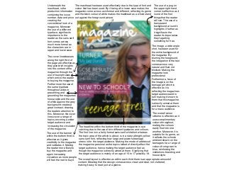
  • 4. Within the skyline the designer has placed the date of publication and the price of the magazine, suggesting that they’ve moved their strap line above the masthead, which is effective as it makes not only the date and price stand out more, but the slogan, just underneath it. Furthermore, the different types of font used for the date and price is also effective as the “FREE” draws the readers attention first even though they would naturally read left to right, hence, immediately drawing the readers attention to the most important pice of information in the top third. The typeface used for the masthead, a type of serif in italics, is effective as it reflects the genre of the magazine and appeals to the target audience. This being because the font connotes that the institution behind the publication is professional and sophisticated because it uses traditional typography, This in turn appeals to its target audience, young, most likely female teenagers, as their main desire is to be older than they truly are. Hence, by looking at the masthead they may immediately want to buy the magazine as this will aide them in making them look older and sophisticated. The slogan underneath the masthead is effective as it further reinforces the branding of the genre: a school magazine. The teasers and cover lines alongside the right hand third and left hand third are effective as they do draw the readers attention and hit the variations within their target audience. Meaning that there is something for everyone, from sport to social gossip this magazine has got it. Moreover, the colours used with the coverlids are effective, especially for the core line of “Battle of the house” which quite literally represents article and entices the reader. However, it would more effective if the foreground of the central image was blurred. The overall colour scheme is effective as the light blue compliments the white and black text. However, the image behind it, due to its background being such a bright green, does make it hard to differentiate between the text and image. Therefore, the designer, should have outlined all the text in either a black or even yellow colour, just like they have done for the cover line of “House Music Results Are In!” Although the use of the banner is eye catching, due to the blocked colour around it, the actual content within is not very positive, making readers pull away from the magazine. Perhaps if the designer had used more buzz phrases and portrayed it more as a scandal, the readers would d instead be drawn to it. Additionally, the block colour behind, ruins the design as it breaks it up, perhaps they could have used a transparent colour instead to make the design more fluid and to fly. The image overall is effective as it reflects the genre of the magazine. However, due to it being a long shot there is need to blur the foreground or crop the image, in order to make the design come across less busy and easier to read as the cover lines would stand out more in a blurred or block colour background. Type to enter text Overall, if the background were to be blurred and the colour scheme altered, the magazine would look very sophisticated.