SlideShare une entreprise Scribd logo
1  sur  7
Télécharger pour lire hors ligne
Issue 1 Winter 2015
The Bassett Weekly
“I know why our year is a SHAMBLES”
-An exclusive from Dhanisha Patel
“You did what in drama?
-Rumours galore. Read it here first!
StreSsed about PPe’S? read
our advice Page NoW!
£1.50
Who’sbeingkissingunderthe
mistletoe?
TBW
By having the masthead of the magazine be
stereotypically traditional, ‘The Bassett Weekly’
immediately brings familiarity to the reader attracting
them to the magazine, as they know from simply
reading the magazine what to expect from it. Thus,
keeping to the conventions of a magazine, as the
name reflects the genre of the magazine and is fairly
conventional of what you would expect for one.
Furthermore, the typeface used for the masthead,
Oriya MN, further keeps to a media convention and
thus attracts the reader due to the fact that the type
face is a type of sans serif. Connoting to the
audience how this magazine reflects their
generation, it is modern and fresh, not traditional
and boring, like a newspaper. Thus attracting the
reader as it signifies to them that this product is
directly for them.
Issue 1 Winter 2015
The Bassett Weekly
“I know why our year is a SHAMBLES”
-An exclusive from Dhanisha Patel
“You did what in drama?
-Rumours galore. Read it here first!
StreSsed about PPe’S? read
our advice Page NoW!
£1.50
Who’sbeingkissingunderthe
mistletoe?
TBW
Yet, by placing the masthead on a dark
background, breaks the conventions of a
magazine, as usually the masthead is simply
placed on top of the picture. Thus, by having the
background there, further draws in the audience to
the magazine as the background colour is truly
eye-catching.
By having the masthead of the magazine be
stereotypically traditional, ‘The Bassett Weekly’
immediately brings familiarity to the reader attracting
them to the magazine, as they know from simply
reading the magazine what to expect from it. Thus,
keeping to the conventions of a magazine, as the
name reflects the genre of the magazine and is fairly
conventional of what you would expect for one.
Furthermore, the typeface used for the masthead,
Oriya MN, further keeps to a media convention and
thus attracts the reader due to the fact that the type
face is a type of sans serif. Connoting to the
audience how this magazine reflects their
generation, it is modern and fresh, not traditional
and boring, like a newspaper. Thus attracting the
reader as it signifies to them that this product is
directly for them.
Issue 1 Winter 2015
The Bassett Weekly
“I know why our year is a SHAMBLES”
-An exclusive from Dhanisha Patel
“You did what in drama?
-Rumours galore. Read it here first!
StreSsed about PPe’S? read
our advice Page NoW!
£1.50
Who’sbeingkissingunderthe
mistletoe?
TBW
By placing a teaser 90 degrees anti-clockwise
challenges a magazine convention, as usually all
teasers and cover lines aren’t placed at an angle to
aid in easy reading. Yet, by challenging this, I
believe the teasers becomes more interesting to the
reader and thus draws their attention to it as it
almost connotes how the article is so scandalous
that for the teaser to be placed at not at an angle
would cause too much controversy as too many
people would notice what its content contains. This
is interest is then retained by the use of font, a type
of serif font titled ‘Winter’. By using a season themed
font, further reinforces the issue of magazine, the
Winter Edition, and creates more interest in the
subject matter it is reflecting.
By having the masthead of the magazine be
stereotypically traditional, ‘The Bassett Weekly’
immediately brings familiarity to the reader attracting
them to the magazine, as they know from simply
reading the magazine what to expect from it. Thus,
keeping to the conventions of a magazine, as the
name reflects the genre of the magazine and is fairly
conventional of what you would expect for one.
Furthermore, the typeface used for the masthead,
Oriya MN, further keeps to a media convention and
thus attracts the reader due to the fact that the type
face is a type of sans serif. Connoting to the
audience how this magazine reflects their
generation, it is modern and fresh, not traditional
and boring, like a newspaper. Thus attracting the
reader as it signifies to them that this product is
directly for them.
Yet, by placing the masthead on a dark
background, breaks the conventions of a
magazine, as usually the masthead is simply
placed on top of the picture. Thus, by having the
background there, further draws in the audience to
the magazine as the background colour is truly
eye-catching.
Issue 1 Winter 2015
The Bassett Weekly
“I know why our year is a SHAMBLES”
-An exclusive from Dhanisha Patel
“You did what in drama?
-Rumours galore. Read it here first!
StreSsed about PPe’S? read
our advice Page NoW!
£1.50
Who’sbeingkissingunderthe
mistletoe?
TBW
By having the masthead of the magazine be
stereotypically traditional, ‘The Bassett Weekly’
immediately brings familiarity to the reader attracting
them to the magazine, as they know from simply
reading the magazine what to expect from it. Thus,
keeping to the conventions of a magazine, as the
name reflects the genre of the magazine and is fairly
conventional of what you would expect for one.
Furthermore, the typeface used for the masthead,
Oriya MN, further keeps to a media convention and
thus attracts the reader due to the fact that the type
face is a type of sans serif. Connoting to the
audience how this magazine reflects their
generation, it is modern and fresh, not traditional
and boring, like a newspaper. Thus attracting the
reader as it signifies to them that this product is
directly for them.
Yet, by placing the masthead on a dark
background, breaks the conventions of a
magazine, as usually the masthead is simply
placed on top of the picture. Thus, by having the
background there, further draws in the audience to
the magazine as the background colour is truly
eye-catching.
By placing a teaser 90 degrees anti-clockwise
challenges a magazine convention, as usually all
teasers and cover lines aren’t placed at an angle to
aid in easy reading. Yet, by challenging this, I
believe the teasers becomes more interesting to the
reader and thus draws their attention to it as it
almost connotes how the article is so scandalous
that for the teaser to be placed at not at an angle
would cause too much controversy as too many
people would notice what its content contains. This
is interest is then retained by the use of font, a type
of serif font titled ‘Winter’. By using a season themed
font, further reinforces the issue of magazine, the
Winter Edition, and creates more interest in the
subject matter it is reflecting.
The use of cover lines keeps to the conventions
of a magazine due to the variety of them, from
scandalous to studious based articles, the cover
lines appeal to all main interests of 16-18 year
olds of this generation. Thus, appealing to the
entirety of my target audience, no one is
excluded. Moreover by using a different sans
serif typeface for the cover lines further develops
the conventions of magazines as usually most
designers keep to the same font from the
masthead for the cover lines, to induced brand
identity, yet some magazines do not, which I
discovered from my secondary research. Thus, I
decided to use different typefaces as personally,
this type of design worked better in drawing the
attention of the reader as it gave more variety to
the design. To draw further interest in the
coverlids as well, I placed a transparent text box
behind them in order for them to stand out, yet, I
did not make them block fill as from my prior
secondary research I found that blocked text
boxes within the design could break up the
fluidity of the design, thus, developing a
convention of magazine design. In addition to
this, I included a picture corresponding to the
article “I know why our year is a SHAMBLES” in
order to again develop a magazine convention,
as some magazines do include corresponding
pictures where as others don’t. Yet, I decided to
in order to make use of the blank space within
the top left third of the picture. By including a
mid/close shot of Dhanisha, it filled that blank
space and gave more variety to my front cover.
The image used challenges media convention due to
the fact that it is a two, mid shot, which is
unconventional to find on a magazine front cover, as
usually the main image focuses just on one subject.
However, I decided to have two subjects in order to
make it evident to the audience that the magazine is
aimed at both male and females, something which
again is uncommon in most magazines. Thus, the
image itself draws in the readers interest. Moreover,
the background of the image, white enhanced
through Photoshop, connotes how these two pupils,
represent the ideal students of RWBA Sixth Form,. Im
addition to this their clothing also represents this as
although slightly relaxed, it sill demonstrates this
fact.
By having the product information at the bottom
challenges the conventions of a magazine as usually
this information is contained in the skyline or just
bellow the masthead, yet, I believe it is effective as it
is the last thing the reader sees, meaning the
interested generated by the previous should then
validate to them, the price.
By having the headline, running diagonally
across the two students in the picture,
challenged the conventions of magazine design
due to the fact that it obstructed the centre of the
image. However, I believe that this is effective as
it signifies to the reader its importance and
makes them want to investigate to exactly what
the headline is describing as, in their eyes in
must be something important, in order for it to
obstruct the main image.

Contenu connexe

En vedette

The textual analysis using ‘Art of the Title'
The textual analysis using ‘Art of the Title'The textual analysis using ‘Art of the Title'
The textual analysis using ‘Art of the Title'emilyflaxman
 
INNOVATION SHOWCASE A5 BOOKLET v6 (2) A
INNOVATION SHOWCASE A5 BOOKLET v6 (2) AINNOVATION SHOWCASE A5 BOOKLET v6 (2) A
INNOVATION SHOWCASE A5 BOOKLET v6 (2) AGary atkinson-hope
 
Presentasjon Holmestrand Skitunnel
Presentasjon Holmestrand SkitunnelPresentasjon Holmestrand Skitunnel
Presentasjon Holmestrand Skitunnelholmestrandskitunnel
 
Contents page photoshoot plan
Contents page photoshoot planContents page photoshoot plan
Contents page photoshoot plansamipayling1
 
Jewellery design
Jewellery designJewellery design
Jewellery designmisshivi_xo
 
File types pro forma-Libby Wright
File types pro forma-Libby WrightFile types pro forma-Libby Wright
File types pro forma-Libby WrightLibby-Wright1
 
Programa para alumno comunicación visual
Programa para alumno comunicación visualPrograma para alumno comunicación visual
Programa para alumno comunicación visualPatricia GH
 
CONTRACT.docx fuel oil 1394
CONTRACT.docx fuel oil 1394CONTRACT.docx fuel oil 1394
CONTRACT.docx fuel oil 1394meysam jahangiri
 

En vedette (13)

Audience research
Audience researchAudience research
Audience research
 
The textual analysis using ‘Art of the Title'
The textual analysis using ‘Art of the Title'The textual analysis using ‘Art of the Title'
The textual analysis using ‘Art of the Title'
 
INNOVATION SHOWCASE A5 BOOKLET v6 (2) A
INNOVATION SHOWCASE A5 BOOKLET v6 (2) AINNOVATION SHOWCASE A5 BOOKLET v6 (2) A
INNOVATION SHOWCASE A5 BOOKLET v6 (2) A
 
Presentasjon Holmestrand Skitunnel
Presentasjon Holmestrand SkitunnelPresentasjon Holmestrand Skitunnel
Presentasjon Holmestrand Skitunnel
 
Durham county
Durham countyDurham county
Durham county
 
Evaluation Q6 (1)
Evaluation Q6 (1)Evaluation Q6 (1)
Evaluation Q6 (1)
 
Innovative Teaching Mannual
Innovative Teaching MannualInnovative Teaching Mannual
Innovative Teaching Mannual
 
Contents page photoshoot plan
Contents page photoshoot planContents page photoshoot plan
Contents page photoshoot plan
 
Jewellery design
Jewellery designJewellery design
Jewellery design
 
MohitBilakhia
MohitBilakhiaMohitBilakhia
MohitBilakhia
 
File types pro forma-Libby Wright
File types pro forma-Libby WrightFile types pro forma-Libby Wright
File types pro forma-Libby Wright
 
Programa para alumno comunicación visual
Programa para alumno comunicación visualPrograma para alumno comunicación visual
Programa para alumno comunicación visual
 
CONTRACT.docx fuel oil 1394
CONTRACT.docx fuel oil 1394CONTRACT.docx fuel oil 1394
CONTRACT.docx fuel oil 1394
 

Dernier

Unraveling Hypertext_ Analyzing Postmodern Elements in Literature.pptx
Unraveling Hypertext_ Analyzing  Postmodern Elements in  Literature.pptxUnraveling Hypertext_ Analyzing  Postmodern Elements in  Literature.pptx
Unraveling Hypertext_ Analyzing Postmodern Elements in Literature.pptxDhatriParmar
 
Scientific Writing :Research Discourse
Scientific  Writing :Research  DiscourseScientific  Writing :Research  Discourse
Scientific Writing :Research DiscourseAnita GoswamiGiri
 
Q-Factor HISPOL Quiz-6th April 2024, Quiz Club NITW
Q-Factor HISPOL Quiz-6th April 2024, Quiz Club NITWQ-Factor HISPOL Quiz-6th April 2024, Quiz Club NITW
Q-Factor HISPOL Quiz-6th April 2024, Quiz Club NITWQuiz Club NITW
 
Blowin' in the Wind of Caste_ Bob Dylan's Song as a Catalyst for Social Justi...
Blowin' in the Wind of Caste_ Bob Dylan's Song as a Catalyst for Social Justi...Blowin' in the Wind of Caste_ Bob Dylan's Song as a Catalyst for Social Justi...
Blowin' in the Wind of Caste_ Bob Dylan's Song as a Catalyst for Social Justi...DhatriParmar
 
CHEST Proprioceptive neuromuscular facilitation.pptx
CHEST Proprioceptive neuromuscular facilitation.pptxCHEST Proprioceptive neuromuscular facilitation.pptx
CHEST Proprioceptive neuromuscular facilitation.pptxAneriPatwari
 
Grade 9 Quarter 4 Dll Grade 9 Quarter 4 DLL.pdf
Grade 9 Quarter 4 Dll Grade 9 Quarter 4 DLL.pdfGrade 9 Quarter 4 Dll Grade 9 Quarter 4 DLL.pdf
Grade 9 Quarter 4 Dll Grade 9 Quarter 4 DLL.pdfJemuel Francisco
 
Team Lead Succeed – Helping you and your team achieve high-performance teamwo...
Team Lead Succeed – Helping you and your team achieve high-performance teamwo...Team Lead Succeed – Helping you and your team achieve high-performance teamwo...
Team Lead Succeed – Helping you and your team achieve high-performance teamwo...Association for Project Management
 
Using Grammatical Signals Suitable to Patterns of Idea Development
Using Grammatical Signals Suitable to Patterns of Idea DevelopmentUsing Grammatical Signals Suitable to Patterns of Idea Development
Using Grammatical Signals Suitable to Patterns of Idea Developmentchesterberbo7
 
Active Learning Strategies (in short ALS).pdf
Active Learning Strategies (in short ALS).pdfActive Learning Strategies (in short ALS).pdf
Active Learning Strategies (in short ALS).pdfPatidar M
 
Textual Evidence in Reading and Writing of SHS
Textual Evidence in Reading and Writing of SHSTextual Evidence in Reading and Writing of SHS
Textual Evidence in Reading and Writing of SHSMae Pangan
 
4.16.24 21st Century Movements for Black Lives.pptx
4.16.24 21st Century Movements for Black Lives.pptx4.16.24 21st Century Movements for Black Lives.pptx
4.16.24 21st Century Movements for Black Lives.pptxmary850239
 
Mythology Quiz-4th April 2024, Quiz Club NITW
Mythology Quiz-4th April 2024, Quiz Club NITWMythology Quiz-4th April 2024, Quiz Club NITW
Mythology Quiz-4th April 2024, Quiz Club NITWQuiz Club NITW
 
CLASSIFICATION OF ANTI - CANCER DRUGS.pptx
CLASSIFICATION OF ANTI - CANCER DRUGS.pptxCLASSIFICATION OF ANTI - CANCER DRUGS.pptx
CLASSIFICATION OF ANTI - CANCER DRUGS.pptxAnupam32727
 
How to Manage Buy 3 Get 1 Free in Odoo 17
How to Manage Buy 3 Get 1 Free in Odoo 17How to Manage Buy 3 Get 1 Free in Odoo 17
How to Manage Buy 3 Get 1 Free in Odoo 17Celine George
 
DIFFERENT BASKETRY IN THE PHILIPPINES PPT.pptx
DIFFERENT BASKETRY IN THE PHILIPPINES PPT.pptxDIFFERENT BASKETRY IN THE PHILIPPINES PPT.pptx
DIFFERENT BASKETRY IN THE PHILIPPINES PPT.pptxMichelleTuguinay1
 
4.9.24 School Desegregation in Boston.pptx
4.9.24 School Desegregation in Boston.pptx4.9.24 School Desegregation in Boston.pptx
4.9.24 School Desegregation in Boston.pptxmary850239
 
Indexing Structures in Database Management system.pdf
Indexing Structures in Database Management system.pdfIndexing Structures in Database Management system.pdf
Indexing Structures in Database Management system.pdfChristalin Nelson
 
4.11.24 Mass Incarceration and the New Jim Crow.pptx
4.11.24 Mass Incarceration and the New Jim Crow.pptx4.11.24 Mass Incarceration and the New Jim Crow.pptx
4.11.24 Mass Incarceration and the New Jim Crow.pptxmary850239
 
Tree View Decoration Attribute in the Odoo 17
Tree View Decoration Attribute in the Odoo 17Tree View Decoration Attribute in the Odoo 17
Tree View Decoration Attribute in the Odoo 17Celine George
 

Dernier (20)

prashanth updated resume 2024 for Teaching Profession
prashanth updated resume 2024 for Teaching Professionprashanth updated resume 2024 for Teaching Profession
prashanth updated resume 2024 for Teaching Profession
 
Unraveling Hypertext_ Analyzing Postmodern Elements in Literature.pptx
Unraveling Hypertext_ Analyzing  Postmodern Elements in  Literature.pptxUnraveling Hypertext_ Analyzing  Postmodern Elements in  Literature.pptx
Unraveling Hypertext_ Analyzing Postmodern Elements in Literature.pptx
 
Scientific Writing :Research Discourse
Scientific  Writing :Research  DiscourseScientific  Writing :Research  Discourse
Scientific Writing :Research Discourse
 
Q-Factor HISPOL Quiz-6th April 2024, Quiz Club NITW
Q-Factor HISPOL Quiz-6th April 2024, Quiz Club NITWQ-Factor HISPOL Quiz-6th April 2024, Quiz Club NITW
Q-Factor HISPOL Quiz-6th April 2024, Quiz Club NITW
 
Blowin' in the Wind of Caste_ Bob Dylan's Song as a Catalyst for Social Justi...
Blowin' in the Wind of Caste_ Bob Dylan's Song as a Catalyst for Social Justi...Blowin' in the Wind of Caste_ Bob Dylan's Song as a Catalyst for Social Justi...
Blowin' in the Wind of Caste_ Bob Dylan's Song as a Catalyst for Social Justi...
 
CHEST Proprioceptive neuromuscular facilitation.pptx
CHEST Proprioceptive neuromuscular facilitation.pptxCHEST Proprioceptive neuromuscular facilitation.pptx
CHEST Proprioceptive neuromuscular facilitation.pptx
 
Grade 9 Quarter 4 Dll Grade 9 Quarter 4 DLL.pdf
Grade 9 Quarter 4 Dll Grade 9 Quarter 4 DLL.pdfGrade 9 Quarter 4 Dll Grade 9 Quarter 4 DLL.pdf
Grade 9 Quarter 4 Dll Grade 9 Quarter 4 DLL.pdf
 
Team Lead Succeed – Helping you and your team achieve high-performance teamwo...
Team Lead Succeed – Helping you and your team achieve high-performance teamwo...Team Lead Succeed – Helping you and your team achieve high-performance teamwo...
Team Lead Succeed – Helping you and your team achieve high-performance teamwo...
 
Using Grammatical Signals Suitable to Patterns of Idea Development
Using Grammatical Signals Suitable to Patterns of Idea DevelopmentUsing Grammatical Signals Suitable to Patterns of Idea Development
Using Grammatical Signals Suitable to Patterns of Idea Development
 
Active Learning Strategies (in short ALS).pdf
Active Learning Strategies (in short ALS).pdfActive Learning Strategies (in short ALS).pdf
Active Learning Strategies (in short ALS).pdf
 
Textual Evidence in Reading and Writing of SHS
Textual Evidence in Reading and Writing of SHSTextual Evidence in Reading and Writing of SHS
Textual Evidence in Reading and Writing of SHS
 
4.16.24 21st Century Movements for Black Lives.pptx
4.16.24 21st Century Movements for Black Lives.pptx4.16.24 21st Century Movements for Black Lives.pptx
4.16.24 21st Century Movements for Black Lives.pptx
 
Mythology Quiz-4th April 2024, Quiz Club NITW
Mythology Quiz-4th April 2024, Quiz Club NITWMythology Quiz-4th April 2024, Quiz Club NITW
Mythology Quiz-4th April 2024, Quiz Club NITW
 
CLASSIFICATION OF ANTI - CANCER DRUGS.pptx
CLASSIFICATION OF ANTI - CANCER DRUGS.pptxCLASSIFICATION OF ANTI - CANCER DRUGS.pptx
CLASSIFICATION OF ANTI - CANCER DRUGS.pptx
 
How to Manage Buy 3 Get 1 Free in Odoo 17
How to Manage Buy 3 Get 1 Free in Odoo 17How to Manage Buy 3 Get 1 Free in Odoo 17
How to Manage Buy 3 Get 1 Free in Odoo 17
 
DIFFERENT BASKETRY IN THE PHILIPPINES PPT.pptx
DIFFERENT BASKETRY IN THE PHILIPPINES PPT.pptxDIFFERENT BASKETRY IN THE PHILIPPINES PPT.pptx
DIFFERENT BASKETRY IN THE PHILIPPINES PPT.pptx
 
4.9.24 School Desegregation in Boston.pptx
4.9.24 School Desegregation in Boston.pptx4.9.24 School Desegregation in Boston.pptx
4.9.24 School Desegregation in Boston.pptx
 
Indexing Structures in Database Management system.pdf
Indexing Structures in Database Management system.pdfIndexing Structures in Database Management system.pdf
Indexing Structures in Database Management system.pdf
 
4.11.24 Mass Incarceration and the New Jim Crow.pptx
4.11.24 Mass Incarceration and the New Jim Crow.pptx4.11.24 Mass Incarceration and the New Jim Crow.pptx
4.11.24 Mass Incarceration and the New Jim Crow.pptx
 
Tree View Decoration Attribute in the Odoo 17
Tree View Decoration Attribute in the Odoo 17Tree View Decoration Attribute in the Odoo 17
Tree View Decoration Attribute in the Odoo 17
 

Codes/Conventions of Magazine and how they attract audience

  • 1. Issue 1 Winter 2015
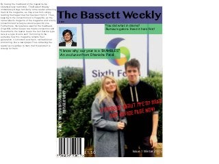
 The Bassett Weekly “I know why our year is a SHAMBLES” -An exclusive from Dhanisha Patel “You did what in drama? -Rumours galore. Read it here first! StreSsed about PPe’S? read our advice Page NoW! £1.50 Who’sbeingkissingunderthe mistletoe? TBW By having the masthead of the magazine be stereotypically traditional, ‘The Bassett Weekly’ immediately brings familiarity to the reader attracting them to the magazine, as they know from simply reading the magazine what to expect from it. Thus, keeping to the conventions of a magazine, as the name reflects the genre of the magazine and is fairly conventional of what you would expect for one. Furthermore, the typeface used for the masthead, Oriya MN, further keeps to a media convention and thus attracts the reader due to the fact that the type face is a type of sans serif. Connoting to the audience how this magazine reflects their generation, it is modern and fresh, not traditional and boring, like a newspaper. Thus attracting the reader as it signifies to them that this product is directly for them.
  • 2. Issue 1 Winter 2015 The Bassett Weekly “I know why our year is a SHAMBLES” -An exclusive from Dhanisha Patel “You did what in drama? -Rumours galore. Read it here first! StreSsed about PPe’S? read our advice Page NoW! £1.50 Who’sbeingkissingunderthe mistletoe? TBW Yet, by placing the masthead on a dark background, breaks the conventions of a magazine, as usually the masthead is simply placed on top of the picture. Thus, by having the background there, further draws in the audience to the magazine as the background colour is truly eye-catching. By having the masthead of the magazine be stereotypically traditional, ‘The Bassett Weekly’ immediately brings familiarity to the reader attracting them to the magazine, as they know from simply reading the magazine what to expect from it. Thus, keeping to the conventions of a magazine, as the name reflects the genre of the magazine and is fairly conventional of what you would expect for one. Furthermore, the typeface used for the masthead, Oriya MN, further keeps to a media convention and thus attracts the reader due to the fact that the type face is a type of sans serif. Connoting to the audience how this magazine reflects their generation, it is modern and fresh, not traditional and boring, like a newspaper. Thus attracting the reader as it signifies to them that this product is directly for them.
  • 3. Issue 1 Winter 2015 The Bassett Weekly “I know why our year is a SHAMBLES” -An exclusive from Dhanisha Patel “You did what in drama? -Rumours galore. Read it here first! StreSsed about PPe’S? read our advice Page NoW! £1.50 Who’sbeingkissingunderthe mistletoe? TBW By placing a teaser 90 degrees anti-clockwise challenges a magazine convention, as usually all teasers and cover lines aren’t placed at an angle to aid in easy reading. Yet, by challenging this, I believe the teasers becomes more interesting to the reader and thus draws their attention to it as it almost connotes how the article is so scandalous that for the teaser to be placed at not at an angle would cause too much controversy as too many people would notice what its content contains. This is interest is then retained by the use of font, a type of serif font titled ‘Winter’. By using a season themed font, further reinforces the issue of magazine, the Winter Edition, and creates more interest in the subject matter it is reflecting. By having the masthead of the magazine be stereotypically traditional, ‘The Bassett Weekly’ immediately brings familiarity to the reader attracting them to the magazine, as they know from simply reading the magazine what to expect from it. Thus, keeping to the conventions of a magazine, as the name reflects the genre of the magazine and is fairly conventional of what you would expect for one. Furthermore, the typeface used for the masthead, Oriya MN, further keeps to a media convention and thus attracts the reader due to the fact that the type face is a type of sans serif. Connoting to the audience how this magazine reflects their generation, it is modern and fresh, not traditional and boring, like a newspaper. Thus attracting the reader as it signifies to them that this product is directly for them. Yet, by placing the masthead on a dark background, breaks the conventions of a magazine, as usually the masthead is simply placed on top of the picture. Thus, by having the background there, further draws in the audience to the magazine as the background colour is truly eye-catching.
  • 4. Issue 1 Winter 2015 The Bassett Weekly “I know why our year is a SHAMBLES” -An exclusive from Dhanisha Patel “You did what in drama? -Rumours galore. Read it here first! StreSsed about PPe’S? read our advice Page NoW! £1.50 Who’sbeingkissingunderthe mistletoe? TBW By having the masthead of the magazine be stereotypically traditional, ‘The Bassett Weekly’ immediately brings familiarity to the reader attracting them to the magazine, as they know from simply reading the magazine what to expect from it. Thus, keeping to the conventions of a magazine, as the name reflects the genre of the magazine and is fairly conventional of what you would expect for one. Furthermore, the typeface used for the masthead, Oriya MN, further keeps to a media convention and thus attracts the reader due to the fact that the type face is a type of sans serif. Connoting to the audience how this magazine reflects their generation, it is modern and fresh, not traditional and boring, like a newspaper. Thus attracting the reader as it signifies to them that this product is directly for them. Yet, by placing the masthead on a dark background, breaks the conventions of a magazine, as usually the masthead is simply placed on top of the picture. Thus, by having the background there, further draws in the audience to the magazine as the background colour is truly eye-catching. By placing a teaser 90 degrees anti-clockwise challenges a magazine convention, as usually all teasers and cover lines aren’t placed at an angle to aid in easy reading. Yet, by challenging this, I believe the teasers becomes more interesting to the reader and thus draws their attention to it as it almost connotes how the article is so scandalous that for the teaser to be placed at not at an angle would cause too much controversy as too many people would notice what its content contains. This is interest is then retained by the use of font, a type of serif font titled ‘Winter’. By using a season themed font, further reinforces the issue of magazine, the Winter Edition, and creates more interest in the subject matter it is reflecting. The use of cover lines keeps to the conventions of a magazine due to the variety of them, from scandalous to studious based articles, the cover lines appeal to all main interests of 16-18 year olds of this generation. Thus, appealing to the entirety of my target audience, no one is excluded. Moreover by using a different sans serif typeface for the cover lines further develops the conventions of magazines as usually most designers keep to the same font from the masthead for the cover lines, to induced brand identity, yet some magazines do not, which I discovered from my secondary research. Thus, I decided to use different typefaces as personally, this type of design worked better in drawing the attention of the reader as it gave more variety to the design. To draw further interest in the coverlids as well, I placed a transparent text box behind them in order for them to stand out, yet, I did not make them block fill as from my prior secondary research I found that blocked text boxes within the design could break up the fluidity of the design, thus, developing a convention of magazine design. In addition to this, I included a picture corresponding to the article “I know why our year is a SHAMBLES” in order to again develop a magazine convention, as some magazines do include corresponding pictures where as others don’t. Yet, I decided to in order to make use of the blank space within the top left third of the picture. By including a mid/close shot of Dhanisha, it filled that blank space and gave more variety to my front cover.
  • 5. Issue 1 Winter 2015 The Bassett Weekly “I know why our year is a SHAMBLES” -An exclusive from Dhanisha Patel “You did what in drama? -Rumours galore. Read it here first! StreSsed about PPe’S? read our advice Page NoW! £1.50 Who’sbeingkissingunderthe mistletoe? TBW By having the masthead of the magazine be stereotypically traditional, ‘The Bassett Weekly’ immediately brings familiarity to the reader attracting them to the magazine, as they know from simply reading the magazine what to expect from it. Thus, keeping to the conventions of a magazine, as the name reflects the genre of the magazine and is fairly conventional of what you would expect for one. Furthermore, the typeface used for the masthead, Oriya MN, further keeps to a media convention and thus attracts the reader due to the fact that the type face is a type of sans serif. Connoting to the audience how this magazine reflects their generation, it is modern and fresh, not traditional and boring, like a newspaper. Thus attracting the reader as it signifies to them that this product is directly for them. Yet, by placing the masthead on a dark background, breaks the conventions of a magazine, as usually the masthead is simply placed on top of the picture. Thus, by having the background there, further draws in the audience to the magazine as the background colour is truly eye-catching. By placing a teaser 90 degrees anti-clockwise challenges a magazine convention, as usually all teasers and cover lines aren’t placed at an angle to aid in easy reading. Yet, by challenging this, I believe the teasers becomes more interesting to the reader and thus draws their attention to it as it almost connotes how the article is so scandalous that for the teaser to be placed at not at an angle would cause too much controversy as too many people would notice what its content contains. This is interest is then retained by the use of font, a type of serif font titled ‘Winter’. By using a season themed font, further reinforces the issue of magazine, the Winter Edition, and creates more interest in the subject matter it is reflecting. The use of cover lines keeps to the conventions of a magazine due to the variety of them, from scandalous to studious based articles, the cover lines appeal to all main interests of 16-18 year olds of this generation. Thus, appealing to the entirety of my target audience, no one is excluded. Moreover by using a different sans serif typeface for the cover lines further develops the conventions of magazines as usually most designers keep to the same font from the masthead for the cover lines, to induced brand identity, yet some magazines do not, which I discovered from my secondary research. Thus, I decided to use different typefaces as personally, this type of design worked better in drawing the attention of the reader as it gave more variety to the design. To draw further interest in the coverlids as well, I placed a transparent text box behind them in order for them to stand out, yet, I did not make them block fill as from my prior secondary research I found that blocked text boxes within the design could break up the fluidity of the design, thus, developing a convention of magazine design. In addition to this, I included a picture corresponding to the article “I know why our year is a SHAMBLES” in order to again develop a magazine convention, as some magazines do include corresponding pictures where as others don’t. Yet, I decided to in order to make use of the blank space within the top left third of the picture. By including a mid/close shot of Dhanisha, it filled that blank space and gave more variety to my front cover. The image used challenges media convention due to the fact that it is a two, mid shot, which is unconventional to find on a magazine front cover, as usually the main image focuses just on one subject. However, I decided to have two subjects in order to make it evident to the audience that the magazine is aimed at both male and females, something which again is uncommon in most magazines. Thus, the image itself draws in the readers interest. Moreover, the background of the image, white enhanced through Photoshop, connotes how these two pupils, represent the ideal students of RWBA Sixth Form,. Im addition to this their clothing also represents this as although slightly relaxed, it sill demonstrates this fact.
  • 6. Issue 1 Winter 2015 The Bassett Weekly “I know why our year is a SHAMBLES” -An exclusive from Dhanisha Patel “You did what in drama? -Rumours galore. Read it here first! StreSsed about PPe’S? read our advice Page NoW! £1.50 Who’sbeingkissingunderthe mistletoe? TBW By having the masthead of the magazine be stereotypically traditional, ‘The Bassett Weekly’ immediately brings familiarity to the reader attracting them to the magazine, as they know from simply reading the magazine what to expect from it. Thus, keeping to the conventions of a magazine, as the name reflects the genre of the magazine and is fairly conventional of what you would expect for one. Furthermore, the typeface used for the masthead, Oriya MN, further keeps to a media convention and thus attracts the reader due to the fact that the type face is a type of sans serif. Connoting to the audience how this magazine reflects their generation, it is modern and fresh, not traditional and boring, like a newspaper. Thus attracting the reader as it signifies to them that this product is directly for them. Yet, by placing the masthead on a dark background, breaks the conventions of a magazine, as usually the masthead is simply placed on top of the picture. Thus, by having the background there, further draws in the audience to the magazine as the background colour is truly eye-catching. By placing a teaser 90 degrees anti-clockwise challenges a magazine convention, as usually all teasers and cover lines aren’t placed at an angle to aid in easy reading. Yet, by challenging this, I believe the teasers becomes more interesting to the reader and thus draws their attention to it as it almost connotes how the article is so scandalous that for the teaser to be placed at not at an angle would cause too much controversy as too many people would notice what its content contains. This is interest is then retained by the use of font, a type of serif font titled ‘Winter’. By using a season themed font, further reinforces the issue of magazine, the Winter Edition, and creates more interest in the subject matter it is reflecting. The use of cover lines keeps to the conventions of a magazine due to the variety of them, from scandalous to studious based articles, the cover lines appeal to all main interests of 16-18 year olds of this generation. Thus, appealing to the entirety of my target audience, no one is excluded. Moreover by using a different sans serif typeface for the cover lines further develops the conventions of magazines as usually most designers keep to the same font from the masthead for the cover lines, to induced brand identity, yet some magazines do not, which I discovered from my secondary research. Thus, I decided to use different typefaces as personally, this type of design worked better in drawing the attention of the reader as it gave more variety to the design. To draw further interest in the coverlids as well, I placed a transparent text box behind them in order for them to stand out, yet, I did not make them block fill as from my prior secondary research I found that blocked text boxes within the design could break up the fluidity of the design, thus, developing a convention of magazine design. In addition to this, I included a picture corresponding to the article “I know why our year is a SHAMBLES” in order to again develop a magazine convention, as some magazines do include corresponding pictures where as others don’t. Yet, I decided to in order to make use of the blank space within the top left third of the picture. By including a mid/close shot of Dhanisha, it filled that blank space and gave more variety to my front cover. The image used challenges media convention due to the fact that it is a two, mid shot, which is unconventional to find on a magazine front cover, as usually the main image focuses just on one subject. However, I decided to have two subjects in order to make it evident to the audience that the magazine is aimed at both male and females, something which again is uncommon in most magazines. Thus, the image itself draws in the readers interest. Moreover, the background of the image, white enhanced through Photoshop, connotes how these two pupils, represent the ideal students of RWBA Sixth Form,. Im addition to this their clothing also represents this as although slightly relaxed, it sill demonstrates this fact. By having the product information at the bottom challenges the conventions of a magazine as usually this information is contained in the skyline or just bellow the masthead, yet, I believe it is effective as it is the last thing the reader sees, meaning the interested generated by the previous should then validate to them, the price.
  • 7. Issue 1 Winter 2015 The Bassett Weekly “I know why our year is a SHAMBLES” -An exclusive from Dhanisha Patel “You did what in drama? -Rumours galore. Read it here first! StreSsed about PPe’S? read our advice Page NoW! £1.50 Who’sbeingkissingunderthe mistletoe? TBW By having the masthead of the magazine be stereotypically traditional, ‘The Bassett Weekly’ immediately brings familiarity to the reader attracting them to the magazine, as they know from simply reading the magazine what to expect from it. Thus, keeping to the conventions of a magazine, as the name reflects the genre of the magazine and is fairly conventional of what you would expect for one. Furthermore, the typeface used for the masthead, Oriya MN, further keeps to a media convention and thus attracts the reader due to the fact that the type face is a type of sans serif. Connoting to the audience how this magazine reflects their generation, it is modern and fresh, not traditional and boring, like a newspaper. Thus attracting the reader as it signifies to them that this product is directly for them. Yet, by placing the masthead on a dark background, breaks the conventions of a magazine, as usually the masthead is simply placed on top of the picture. Thus, by having the background there, further draws in the audience to the magazine as the background colour is truly eye-catching. By placing a teaser 90 degrees anti-clockwise challenges a magazine convention, as usually all teasers and cover lines aren’t placed at an angle to aid in easy reading. Yet, by challenging this, I believe the teasers becomes more interesting to the reader and thus draws their attention to it as it almost connotes how the article is so scandalous that for the teaser to be placed at not at an angle would cause too much controversy as too many people would notice what its content contains. This is interest is then retained by the use of font, a type of serif font titled ‘Winter’. By using a season themed font, further reinforces the issue of magazine, the Winter Edition, and creates more interest in the subject matter it is reflecting. The use of cover lines keeps to the conventions of a magazine due to the variety of them, from scandalous to studious based articles, the cover lines appeal to all main interests of 16-18 year olds of this generation. Thus, appealing to the entirety of my target audience, no one is excluded. Moreover by using a different sans serif typeface for the cover lines further develops the conventions of magazines as usually most designers keep to the same font from the masthead for the cover lines, to induced brand identity, yet some magazines do not, which I discovered from my secondary research. Thus, I decided to use different typefaces as personally, this type of design worked better in drawing the attention of the reader as it gave more variety to the design. To draw further interest in the coverlids as well, I placed a transparent text box behind them in order for them to stand out, yet, I did not make them block fill as from my prior secondary research I found that blocked text boxes within the design could break up the fluidity of the design, thus, developing a convention of magazine design. In addition to this, I included a picture corresponding to the article “I know why our year is a SHAMBLES” in order to again develop a magazine convention, as some magazines do include corresponding pictures where as others don’t. Yet, I decided to in order to make use of the blank space within the top left third of the picture. By including a mid/close shot of Dhanisha, it filled that blank space and gave more variety to my front cover. The image used challenges media convention due to the fact that it is a two, mid shot, which is unconventional to find on a magazine front cover, as usually the main image focuses just on one subject. However, I decided to have two subjects in order to make it evident to the audience that the magazine is aimed at both male and females, something which again is uncommon in most magazines. Thus, the image itself draws in the readers interest. Moreover, the background of the image, white enhanced through Photoshop, connotes how these two pupils, represent the ideal students of RWBA Sixth Form,. Im addition to this their clothing also represents this as although slightly relaxed, it sill demonstrates this fact. By having the product information at the bottom challenges the conventions of a magazine as usually this information is contained in the skyline or just bellow the masthead, yet, I believe it is effective as it is the last thing the reader sees, meaning the interested generated by the previous should then validate to them, the price. By having the headline, running diagonally across the two students in the picture, challenged the conventions of magazine design due to the fact that it obstructed the centre of the image. However, I believe that this is effective as it signifies to the reader its importance and makes them want to investigate to exactly what the headline is describing as, in their eyes in must be something important, in order for it to obstruct the main image.