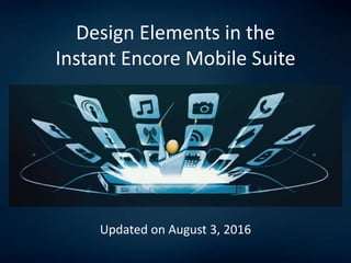
Design Elements in the Instant Encore Mobile Suite
•
1 like•1,318 views

Updated in August 2016. This slide presentation discusses all of the graphic and image-based elements needed to create your mobile app with InstantEncore's mobile service for the performing arts.

Recommended
Recommended
More Related Content
Similar to Design Elements in the Instant Encore Mobile Suite
Similar to Design Elements in the Instant Encore Mobile Suite (20)
Design Elements in the Instant Encore Mobile Suite
- 1. Design Elements in the Instant Encore Mobile Suite Updated on August 3, 2016
- 2. Design Notes on the Mobile Suite • The InstantEncore mobile suite uses set templates for its mobile apps and websites. • There are particular areas within the mobile suite where you may customize the look and feel. • When possible, use PNG image files. They will load faster on mobile devices.
- 3. Settings Items: App Store and Device Icons Splash Screen or Loading Screen Found in the Mobile>>Basic Settings area of the control panel.
- 4. App Store and Device Icons In the Mobile>>Basic Settings area of the control panel under Permanent Settings, you will need to upload a 1024px X 1024px icon for your mobile app. This is the icon that will appear in Apple’s app store and Android’s marketplace. Do not round the corners for your image. The app store will do that for you. InstantEncore will automatically resize this image to 75px X 75px. The resulting icon is the image that will appear on the end user’s mobile device. It is important to bear this in mind when designing the original app store image, particularly if you plan to include text.
- 5. Splash Screen or Loading Screen A customized welcome screen displayed as the Apple or Android app loads. This is a simple image upload in the Mobile>>App Settings area of the control panel. The image is 1800px X 2800px, which works great for tablet computers and will auto-scale to fit smartphones.
- 6. Splash Screen or Loading Screen Tips for Your Mobile App’s Splash Screen – from InstantEncore’s blog 5 Awesome Mobile App Splash Screens (and Why) – from InstantEncore on Slideshare
- 7. Style Items: Highlight Color Background Image Light or Dark Theme Custom CSS Found in the Mobile>>Style area of the control panel.
- 8. Highlight Color Highlight Color The Highlight Color may be selected using our color palette or by entering the hex code for the desired color in the Mobile>>Style area of the control panel. Highlight Color
- 9. The Background Image Background Image The Background Image is uploaded in the Mobile>>Style area of the control panel. The recommended image size is 640px X 960px. Smaller images (e.g. 320px X 480px) will load more quickly, but may not look as sharp on higher resolution devices. Larger images (e.g. 1240px X 1920px) will look sharper on tablet devices, but will take longer to load initially. Tips for Customizing Your Mobile App’s Background Image – from the InstantEncore blog 9 Great Examples of Custom Background Images for Mobile Apps – from InstantEncore on Slideshare
- 10. Light or Dark Theme Light Theme There are two Theme options for the mobile suite which may be selected in the Mobile>>Style area. 1. The Light Theme works well with light colored background images by overlaying black text for the content. 2. The Dark Theme overlays white text, so it works well with darker background images. Dark Theme
- 11. The Custom CSS tool allows you to set style and formatting preferences within your mobile app. The CSS Tool is an advanced area of the control panel and should only be edited by someone with previous CSS and HTML experience. If you do not have this previous experience, then please consult a web designer before making any changes to this area. Custom CSS
- 12. Tabs Area Items: Home Screen Options Slideshow Cards Icons What’s New Group Member Bios Custom Tabs Found in the Mobile>>Tabs area of the control panel.
- 13. Slideshow Cards Home Screen Options
- 14. Icons What’s New Home Screen Options
- 15. Slideshow Image Each slide associated with the Slideshow home screen option has its own image. It is a simple image uploaded in the Mobile>>Tabs>>Featured area of the control panel. Slideshow Images • Upload an image large enough for tablet-sized devices (approx 1024 px X 768px) • Keep the main content of the image near the center as the edges may be cropped depending on the viewing device’s dimensions
- 16. Cards Header Image For the Cards Home screen, you can set a header image at the top by going to Mobile>>Tabs>>Cards. You can also set an image at the top of your custom Cards. For both the header and custom card images, we recommend using an image with a 3:1 width- to-height ratio that is at least 900px wide. Custom Card Image
- 17. Icons Icons Home Screen You have icons associated with each tab listed in the Mobile>>Tabs area of the control panel. You may select one of the icons from our library by going to the Manage link for the desired tab. You may also upload your own custom icons in the same area of the control panel. These images should be 60px X 60px. Icons Menu
- 18. What’s New Image The What’s New Image is associated with the welcome message area at the top of the What’s New home screen option. It is a simple image upload in the Mobile>>Tabs>>What’s New area of the control panel. The recommended size is 1024px X 1024px. The image will automatically be scaled and cropped to the appropriate size. What’s New Image The other images on the What’s New tab are pulled from various areas of the control panel and will be discussed later.
- 19. The Artists tab allows you to create and group bios for individuals involved in work. To begin, go to Mobile>>Tabs and select Manage next to the Artists tab listing. Group Image: You may choose an icon from our library to represent the group, or you may upload a 72px X 72px image. This could be a performance image, the poster image for a play (see left), etc. Artist Image: Once you create the group, you will begin adding bios and an image for each artist in the group. This image is 1024px X 1024px. This image will appear in the list of group members and on the individual’s profile. Group Member Bios Group Image Artist Image
- 20. You have the ability to create your own tabs for your mobile app in the Mobile>>Tabs area of the control panel. At the bottom of the page is an area labeled Add a Custom Tab. You may add a custom tab by connecting to an external URL (preferably, a mobile- optimized one) or by using our HTML editor. The HTML editor has both a Design view and an HTML view. Using this editor, you may create tabs with tables, inserted images, ordered lists, scripts from third party sites, and more. Make Your App Unique With Custom Tabs Custom Tabs
- 21. Best Practices for Adding Images in Custom Tabs 28 Things Performing Arts Organizations Highlight with Custom Tabs in Their Mobile Apps Get URL - A Tool for Enhancing Navigation Inside (and Outside) Your App Adding Phone Number Links to Tabs in Your Mobile App Custom Tabs
- 22. Content Items: Event Images Music Images Buzz Images Found in each content area in the sidebar menu of the control panel.
- 23. Event Images Events List Event Details The image associated with an event in the Events List and the Event Details tabs comes from one of two places: 1. For standard InstantEncore apps, this 1024px X 1024px image is uploaded in the Events area of the control panel when the individual event is created. 2. For Tessitura-integrated apps, this image is pulled from the Small Image URL content field in the Mobile>>Tessitura>>Settings area of the control panel. The values on the Tessitura side actually point to external URLs where the images reside.
- 24. Music Images In the Music area of the control panel, you may upload audio tracks to stream through your mobile app. Audio tracks are grouped together in albums, and each album has an image associated with it. This image is a simple 1024px X 1024px upload, which is automatically scaled as appropriate. Music List Music Details
- 25. The Buzz area of the control panel synchronizes with content feeds from your blog, podcast, news sources, and social media accounts. When you add an RSS or ATOM feed to the Buzz area, you may upload a custom image to associate with the feed by going to Edit Image. Whenever content from that feed appears in the Buzz tab (or on the What’s New screen,) it will have this image associated with it. The custom image for the feed should be 1024px X 1024px, which will scale as appropriate. Buzz Images Buzz List Buzz Details
- 26. At The Venue Items: Landing Screen Info Screen Images Things to Know Offers Found in the Mobile>>At the Venue area of the control panel.
- 27. The landing screen contains a central image for the event (like the mobile suite’s Slideshow home screen option.) • Recommended size is 1024 tall x 768 wide. This is large enough to look good on tablets, but should still load quickly. • Keep the main content of the image near the center as the edges may be cropped depending the viewing devices dimensions. Landing Screen
- 28. This image appears directly beneath the ATE menu bar. A square 1024px X 1024px image is recommended. Info Screen Image
- 29. The Things to Know screen enables you to highlight specific items for your audience: important elements of the work, trivia about the artists, logistical information, reminder of a Q&A or reception after the show, etc. • You control the number of items to feature, the image to feature, and the text for each item. • This system will overlay the appropriate number over each item’s image. • 500px X 250px rectangular images are recommended. • While there is no limit on the amount of text associated with an item, we do recommend keeping the text to 200 characters or less. Things to Know
- 30. The Offers screen features a scrollable series of images with a text overlay to feature both internal offers (tickets to future shows, concessions, parking, etc.) as well as offers with external partners – restaurants, hotels, and more. • You can feature as many offers as you like • Each offer on this screen has an image associated with it. • If you only have a single offer featured, a 600px X 800px image is recommended. • If you have multiple offers featured, we recommend using 500px x 250px images. Offers
- 31. Got questions? Contact us at support@instantencore.com