SlideShare une entreprise Scribd logo
1  sur  12
Colour scheme: The colour scheme on this cover is black, red and white, although a variety of colours have been used. The colours represent the magazine’s individuality and originality. The contrasting colours make the words pop out and the red colour highlights what they are trying to say.  The use of these colours are typical for a rock audience which leads us to believe that the magazine is rock-oriented. These colours allow the audience to feel at home with the colour scheme, and draws the reading in. The colours are also eye-catching so this shows that they have picked out colours that will make a potential reader look at the magazine.  Writing style: As this is a cover, we don’t have any other writing except for the title and cover lines, but the language seems to be fairly informal and open. There isn’t use of slang, as you would expect to see in rock magazines, which can both mean that the audience is more intellectual or less exciting. Uses of words like ‘Exclusive!’ and ‘Special Issue!’ grabs the reader’s attention but can also cheapen a magazine.  There are technical codes that are unfamiliar to most people(‘avid HD Omni’) which again shows that the reader should be interested in this area and should have some background knowledge in it. Photography: As this is a different type of music magazine – focused on studio equipment, the images are also expected to be different. These photos are of recording studio equipment, some of which is recognizable for us – a software controller, a controller keyboard, etc. However, these are not all that familiar to us, which means that the reader of the magazine is expected to have some knowledge in this area (maybe work in this business, or being a musician).
Text/picture ratio: As for the cover we have much bigger ratio of picutres than text, which is normal for every cover of a magazine, as the pictures draw the reader in more easily and quickly. However, unlike other magazines this one doesn’t have one particular image for the cover, which could be reflective of the audience and how much they want to find out about the magazine from the cover. Another thing about this type of magazine is that if there was only one image on the cover it wouldn’t look exciting, and possibly wouldn’t draw as many readers in.  Overall look: The cover looks like a scrap book at places as there are a number of images put together in the centre of the page. This breaks the wall between the magazine and the audience and makes it more intimate and personal.  The use of aggressive and contrasting colours is eye-catching and reveals a more ‘rebellious’ side of the reader. These colours appeal more to men than women, as they create its’ casual mannish look. Just by looking at the cover, it is pretty clear that the audience must be familiar with this type of technology beforehand as this is what the magazine is about. Fonts: On this cover there are two main fonts – one for the title and one for the cover lines, as one of them is in italic and the other one is emboldened, but both simple enough to read. The italic font used for the title suggests a more sophisticated and classy audience, also people who are prepared to pay more for a better quality. The cover lines are usually consisted of two lines, where the upper one is emboldened and the bottom one isn’t, which is a good technique of drawing a person’s attention to the whole title of the article.
Colour scheme:  The DPS uses white background for the text and black background for the photo of the gig playing live. There is a use of contrasting colours which makes them both stand out, and allows the reader to focus on each one separately. White represents innocence and purity, which can represent the good side of the band, where as the black shows its’ rebellious and dark side. These are colours that are associated to rock and metal bands so they are linked with the type of music they represent Photography: The picture of the band playing at a live concert. There is only one shot that sums up the whole concert, of a retro band, as the costumes of the musicians look quite old fashioned. In the centre of the DPS there are drums, which take a big part of the picture, which links to the theme of the magazine.  The image shows that the band is quite relaxed, playing retro/jazz music and it doesn’t look as intense or dramatic as rock music.  Writing style: The article is about the recording of one of the famous songs of the band ‘talking heads’. The style writing is relaxed, simple and fairly informal. This kind of language has been purposely chosen to create a picture of the band without having to necessarily know of it beforehand. As expected, the article is more about recording music, a particular song called ‘Road To Nowhere’ that was popular in 1985. The magazine takes us back to the 1980s, which shows us that it focuses on all aspects of music at all ages.
Text/picture ratio: In this DPS the text is definitely more dominant than the picture- it takes up a page and a half. This shows that the magazine is relying on the written word more than anything – which is an indication that their audience is prepared to spend more time on reading than anything else. Again this can be a sign of a well-educated audience that likes reading. A short quote, followed by a sub-heading has been used to focus the audience's attention and give an insight of the story.  Overall look: The overall look of this article is quite neat and ordered – text and picture clearly separated by contrasting colours. The side bar on the right hand side of the article makes it more fun and exciting as there is a picture and red font used. The use of distressed fonts makes it look well organised and tidy. Fonts:  Two main fonts have been used in this double spreadsheet. The first one is larger and simple, with quite a big distance between each word (introduction) but the larger amount of the article has been written in a very small shrift which would be harder for older people to read – this shows that the audience of this magazine are mainly young people, around 25, who can read small fonts. In emboldened font we have titles of the different paragraphs, which is used to section them, to make it easier for the reader to get into.
Colour scheme: The colour scheme on this contents page is white, black and red. Of course, other colours are featured but these are definetely the most dominant ones, as the white one is chosen for background and the red and black are for pictures and features mainly. This is the typical style for these magazine and it adds to that rock vibe that we are used to seeing in the magazine Photography:  For the contents page there are a number of pictures which show the various contents of the magazine. There are pictures spread all over the DPS which creates a messier and more exciting look. Also in the middle of  the DPS there are two pictures of SOS magazine covers which suggests that these are the next few months’ issues. This has been done to draw attention and make the reader look forward to it.   Writing style:  On the contents page there are mainly outlined features of the magazine and a few interesting stuff in the sidebar. The bullet points add to the more formal language style of the page. The writing is very organised as there are sub-headings to help you find what you are looking for more easily, which contrasts with the not-so-well organised pictures.
Text/picture ratio: The DPS relies heavily on text for this contents page. Even though there aren’t any long articles there is a lot more writing (in the form of bullet points) than there are pictures. This tells us that their audience is well-educated adults, who look at the content page and like to know where everything is. This is another reason why headings and subheadings are used to divide different sectionds. Fonts: there are a number of fonts used in this page and this is because of the fact that there is quite a lot of writing in it. The two main fonts used are standard for this magazine and we have seen them before in the DPS. The titles of the features in the magazine are emboldened so that they stand out easily, whereas the following sentence is in normal shrift which means that you don’t have to read both lines. Overall: By looking at the page at first it seems as if it is well-messy and disorganised and it is hard to find where things are because of the amount of writing. However, on second glance you can tell that everything has been organised well to make it simple for the reader to get into. Overall I would say that this page has been done well, by professionals who considered people’s opinions and how long they’d look at it.
Photography:  For the cover of this magazine we have a large picture of a male celebrity, who we reckon is a musician. This person is wearing a black suit in this picture which has possibly been done to match the black background. His face is in colour, where the rest of the page is in black and white which makes it stand out. The picture isn’t too artistic or dramatic which is probably linked to their audience’s taste, who may prefer less staged pictures. The picture is in the centre of the page, surrounded by cover lines which creates a visual frame, and it is easier for the reader to read. Colour scheme: Once again, the main colours used here are black and white with hints of red that pop out. This follows a pattern for music magazines, as SOS also uses these colour schemes. From my audience research I also found out that my these are the colours that my audience prefers to see in music magazines. In difference to SOS, Mojo uses very little red and just black and white for its’ cover. This makes it look quite professional, plain and helps things stand out. Writing style: the writing style is relaxed and plain, using lots of exclamation marks and quotes. This drags the reader’s attention to a particular cover line and shows that the story is meant to be interesting/exciting. It is distant from the audience as the use of bullet points and short titles doesn’t allow the magazine to break the invisible wall between the audience and the writing.
Fonts:  there are two main fonts used for this cover – one of them is always used in capitals. Both of these fonts are used for the cover lines of the page, where one in capitals is used for the first line and the normal one is used for the second one. This is a technique that many magazines use to draw attention to the line without making it look tacky.  Overall:  The cover looks professional and sophisticated. The title is covered by the main picture which shows that the magazine is already well known and familiar to the audience. It draws the readers attention by using cover lines written in capitals and big works saying ‘THE BEATLES’. Another thing about this magazine is that there are more than one pictures on the cover but they don’t distract the readers attention from the main focus and don’t make it look cheap or flashy. Text/picture ratio: The ratio between pictures and text is disproportional as the picture is much bigger than the amount of text on the cover. This is done to make the magazine look more interesting and to draw the reader’s attention to the magazine quickly without having to read so many cover lines.
Colour scheme: A number of colours have been used for this DPS. The main ones are our familiar red, black and white, but yellow has also been used for a background and in pictures. The 3 standard colours have been used to add to the fact that it is a rock magazine and that it needs to be a bit more edgier and messier. The colours in the pictures vary from blue to green but there isn’t one main colour for them. The various colours make the article look more dramatic and conspicuous. Photography: There is one main photo spread on over half of the DPS. It is of a band playing live concert. This picture makes the atmosphere quite relaxed and informal. This brings the audience closer to the article and shows that they prefer live photos than studio ones. This tells us that their audience is very down-to-earth, doesn’t like formalities and prefers real photos.  Writing style: the writing style is informal but quite stylish, no use of swear or harsh words , which adds to the classy feel of the magazine, and clearly establishes the type of audience for it.
Fonts:  As in most magazines, there are only two main fonts in this DPS. One of them is the title which is much larger and the other one is the main one for the text. Both of those fonts look clean and simple which adds to the style of the magazine. The use of fonts has clearly been considered to suit the audience and the genre. The use of few fonts makes the magazine look more stylish, rather than dodgy.  Text/picture ratio:  the amount of writing in the article is little, on the left side as the picture is covering the bigger part of the page. On the left side the articles involve more writing but always supported with pictures, which shows that the audience of the magazine is not prepared to spend too much time reading, especially if there are no image involved. Overall:  overall the DPS looks like there is a lot in it, but if you look closely it really doesn’t. This effect is created by the large number of small articles, side bars and colours which make it look more attractive as well as more crowded.
Colour scheme:  The colour scheme of this contents page is quite different from the rest of the magazine. There are only three colours which have been used and they are yellow, black and red, where the white is used for a background colour. This simple design is eye-catching and interesting looking.  What surprised me was the use of yellow that has almost never been used in ‘Mojo’ so far. The colours are engaging for all the right reasons and the page looks nice, simple and clear. Photography:  the use of one image for the whole page is a new and interesting idea and I think it is definetely working for this magazine.  The image is of one person looking up to the camera, who is dressed in a red suit. This colour is a contrast to the white background and is making him stand out.  His face is looking right at the camera lens which makes him look more confident and it is quite intimidating as you get the feeling that he is looking straight at you.  The photo is quite artistic and quite looks like the person has modern views is quite dramatic and interesting. This could be a presentation of the reader of the magazine, or the other way around. It might be the opposite of the reader, so that it makes it more interesting for them. Writing style:  Use of complex sentences is quite untraditional for this type of magazine, especially for the contents page but we can find quite a few examples of them on this page. The sentences are well-structured and interesting, and make the whole article stand out.
Fonts:  Use of three fonts in this page – two of them are emboldened which makes the titles of the articles stand out and look more appealing. The simple font is used to add to the titles as description. Although one more font is added the page looks really clean and polished, and it hasn’t affected the look of it. The three fonts are quite similar too each other, nothing too unusual has been used, they are relying  more on the larger font and the bold words.  Text/picture ratio:  the picture and the text are taking up approximately the same amount of space on the page. They are quite parallel – where the text finished the picture finishes. This has been purposely done to make the reader focus on the photo as well as the text. There is a difference between the DPS and the contents page, as the DPS had more pictures than text, where as here the composition is different. Overall look:  Overall the page looks relatively simple but eye-drawing at the same time. What I like about it is the use of simple fonts and colours which makes it look really stylish and professional, and makes you want to spend more time on it.

Contenu connexe

Tendances

Evaluation presentation
Evaluation presentationEvaluation presentation
Evaluation presentationEmily Brown
 
Evaluation 1- In what ways does your media product use, develop or challenge ...
Evaluation 1- In what ways does your media product use, develop or challenge ...Evaluation 1- In what ways does your media product use, develop or challenge ...
Evaluation 1- In what ways does your media product use, develop or challenge ...Daisy Birchall
 
NME analysis
NME analysisNME analysis
NME analysisbeckyt95
 
Compare and contrast of two music magazines
Compare and contrast of two music magazinesCompare and contrast of two music magazines
Compare and contrast of two music magazinesleomatcham
 
Task 2- magazine cover, contents & double page spread
Task 2- magazine cover, contents & double page spreadTask 2- magazine cover, contents & double page spread
Task 2- magazine cover, contents & double page spreadasmediab15
 
Textual analysis - Contents pages.
Textual analysis - Contents pages.Textual analysis - Contents pages.
Textual analysis - Contents pages.Nicoline Granheim
 
Analysis of Music Magazines
Analysis of Music MagazinesAnalysis of Music Magazines
Analysis of Music MagazinesBeniboy39
 
Codes and convention
Codes and conventionCodes and convention
Codes and conventionstephanie983
 
Comparing magazine front covers
Comparing magazine front coversComparing magazine front covers
Comparing magazine front coversajeetrs
 
Codes and convention
Codes and conventionCodes and convention
Codes and conventionstephanie983
 
Contents page music magazine deconstruction
Contents page music magazine deconstructionContents page music magazine deconstruction
Contents page music magazine deconstructionRebecca Black
 
Similarities And Differences Between Different Magazines
Similarities And Differences Between Different MagazinesSimilarities And Differences Between Different Magazines
Similarities And Differences Between Different MagazinesMaaZe
 
Overall media analysis
Overall media analysisOverall media analysis
Overall media analysisobehiejele
 
Magazine Textual Analysis
Magazine Textual AnalysisMagazine Textual Analysis
Magazine Textual AnalysisJwbread
 
Textual analysis
Textual analysisTextual analysis
Textual analysisJwbread
 

Tendances (20)

Evaluation presentation
Evaluation presentationEvaluation presentation
Evaluation presentation
 
Evaluation 1- In what ways does your media product use, develop or challenge ...
Evaluation 1- In what ways does your media product use, develop or challenge ...Evaluation 1- In what ways does your media product use, develop or challenge ...
Evaluation 1- In what ways does your media product use, develop or challenge ...
 
NME analysis
NME analysisNME analysis
NME analysis
 
Compare and contrast of two music magazines
Compare and contrast of two music magazinesCompare and contrast of two music magazines
Compare and contrast of two music magazines
 
Task 2- magazine cover, contents & double page spread
Task 2- magazine cover, contents & double page spreadTask 2- magazine cover, contents & double page spread
Task 2- magazine cover, contents & double page spread
 
Textual analysis - Contents pages.
Textual analysis - Contents pages.Textual analysis - Contents pages.
Textual analysis - Contents pages.
 
Analysis of Music Magazines
Analysis of Music MagazinesAnalysis of Music Magazines
Analysis of Music Magazines
 
Codes and convention
Codes and conventionCodes and convention
Codes and convention
 
Comparing magazine front covers
Comparing magazine front coversComparing magazine front covers
Comparing magazine front covers
 
Codes and convention
Codes and conventionCodes and convention
Codes and convention
 
Contents page music magazine deconstruction
Contents page music magazine deconstructionContents page music magazine deconstruction
Contents page music magazine deconstruction
 
As 21
As 21As 21
As 21
 
Similarities And Differences Between Different Magazines
Similarities And Differences Between Different MagazinesSimilarities And Differences Between Different Magazines
Similarities And Differences Between Different Magazines
 
Overall media analysis
Overall media analysisOverall media analysis
Overall media analysis
 
Magazine covers
Magazine coversMagazine covers
Magazine covers
 
Magazine analysis
Magazine analysisMagazine analysis
Magazine analysis
 
Magazine Textual Analysis
Magazine Textual AnalysisMagazine Textual Analysis
Magazine Textual Analysis
 
Textual analysis
Textual analysisTextual analysis
Textual analysis
 
Magazine analysis
Magazine analysisMagazine analysis
Magazine analysis
 
As 21
As 21As 21
As 21
 

En vedette (7)

buy cheap laptop battery
buy cheap laptop batterybuy cheap laptop battery
buy cheap laptop battery
 
The Internet business_Success stories business models etc_A talk at IIM Ahme...
The Internet business_Success stories business models etc_A  talk at IIM Ahme...The Internet business_Success stories business models etc_A  talk at IIM Ahme...
The Internet business_Success stories business models etc_A talk at IIM Ahme...
 
300
300300
300
 
Mundo maravilhoso!
Mundo maravilhoso!Mundo maravilhoso!
Mundo maravilhoso!
 
HKBU POLS 3620 Contemporary Europe and Asia 2010 Gambling in China and France
HKBU POLS 3620 Contemporary Europe and Asia 2010 Gambling in China and FranceHKBU POLS 3620 Contemporary Europe and Asia 2010 Gambling in China and France
HKBU POLS 3620 Contemporary Europe and Asia 2010 Gambling in China and France
 
Winner или Loser
Winner или LoserWinner или Loser
Winner или Loser
 
Flat plans
Flat plansFlat plans
Flat plans
 

Similaire à Market Research

Similaire à Market Research (20)

Market research
Market researchMarket research
Market research
 
My magazine research
My magazine researchMy magazine research
My magazine research
 
My magazine research
My magazine research My magazine research
My magazine research
 
Q
QQ
Q
 
My magazine research
My magazine research My magazine research
My magazine research
 
Task one and two
Task one and twoTask one and two
Task one and two
 
Media research 2
Media research 2Media research 2
Media research 2
 
Media research 2
Media research 2Media research 2
Media research 2
 
Kerrang!
Kerrang!Kerrang!
Kerrang!
 
Kerrang!
Kerrang!Kerrang!
Kerrang!
 
DPS analysis
DPS analysisDPS analysis
DPS analysis
 
DPS analysis
DPS analysisDPS analysis
DPS analysis
 
Media research 2
Media research 2Media research 2
Media research 2
 
Analysing music magazine front covers kerrang
Analysing music magazine front covers   kerrangAnalysing music magazine front covers   kerrang
Analysing music magazine front covers kerrang
 
Media contents and dps analysis
Media contents and dps analysis Media contents and dps analysis
Media contents and dps analysis
 
Task 5
Task 5Task 5
Task 5
 
Mojo
MojoMojo
Mojo
 
Task2
Task2Task2
Task2
 
Contents pages
Contents pagesContents pages
Contents pages
 
Textual analysis
Textual analysisTextual analysis
Textual analysis
 

Plus de ivelinaemilova

Plus de ivelinaemilova (20)

Media music magazine
Media music magazineMedia music magazine
Media music magazine
 
Evaluation progress
Evaluation progressEvaluation progress
Evaluation progress
 
Evaluation progress
Evaluation progressEvaluation progress
Evaluation progress
 
Evaluation progress
Evaluation progressEvaluation progress
Evaluation progress
 
Evaluation progress
Evaluation progressEvaluation progress
Evaluation progress
 
Evaluation progress
Evaluation progressEvaluation progress
Evaluation progress
 
Evaluation progress
Evaluation progressEvaluation progress
Evaluation progress
 
Evaluation progress
Evaluation progressEvaluation progress
Evaluation progress
 
Technology
TechnologyTechnology
Technology
 
Attract and adress
Attract and adressAttract and adress
Attract and adress
 
Technology
TechnologyTechnology
Technology
 
Technology
TechnologyTechnology
Technology
 
Technology
TechnologyTechnology
Technology
 
Media evaluation
Media evaluationMedia evaluation
Media evaluation
 
Media evaluation
Media evaluationMedia evaluation
Media evaluation
 
Presentation1
Presentation1Presentation1
Presentation1
 
Media design style presentation
Media design style presentationMedia design style presentation
Media design style presentation
 
Media design style presentation
Media design style presentationMedia design style presentation
Media design style presentation
 
Media design style presentation
Media design style presentationMedia design style presentation
Media design style presentation
 
Media Design Style Presentation
Media Design Style PresentationMedia Design Style Presentation
Media Design Style Presentation
 

Dernier

Beyond the EU: DORA and NIS 2 Directive's Global Impact
Beyond the EU: DORA and NIS 2 Directive's Global ImpactBeyond the EU: DORA and NIS 2 Directive's Global Impact
Beyond the EU: DORA and NIS 2 Directive's Global ImpactPECB
 
Activity 01 - Artificial Culture (1).pdf
Activity 01 - Artificial Culture (1).pdfActivity 01 - Artificial Culture (1).pdf
Activity 01 - Artificial Culture (1).pdfciinovamais
 
Presentation by Andreas Schleicher Tackling the School Absenteeism Crisis 30 ...
Presentation by Andreas Schleicher Tackling the School Absenteeism Crisis 30 ...Presentation by Andreas Schleicher Tackling the School Absenteeism Crisis 30 ...
Presentation by Andreas Schleicher Tackling the School Absenteeism Crisis 30 ...EduSkills OECD
 
Hybridoma Technology ( Production , Purification , and Application )
Hybridoma Technology  ( Production , Purification , and Application  ) Hybridoma Technology  ( Production , Purification , and Application  )
Hybridoma Technology ( Production , Purification , and Application ) Sakshi Ghasle
 
SOCIAL AND HISTORICAL CONTEXT - LFTVD.pptx
SOCIAL AND HISTORICAL CONTEXT - LFTVD.pptxSOCIAL AND HISTORICAL CONTEXT - LFTVD.pptx
SOCIAL AND HISTORICAL CONTEXT - LFTVD.pptxiammrhaywood
 
Z Score,T Score, Percential Rank and Box Plot Graph
Z Score,T Score, Percential Rank and Box Plot GraphZ Score,T Score, Percential Rank and Box Plot Graph
Z Score,T Score, Percential Rank and Box Plot GraphThiyagu K
 
Employee wellbeing at the workplace.pptx
Employee wellbeing at the workplace.pptxEmployee wellbeing at the workplace.pptx
Employee wellbeing at the workplace.pptxNirmalaLoungPoorunde1
 
Accessible design: Minimum effort, maximum impact
Accessible design: Minimum effort, maximum impactAccessible design: Minimum effort, maximum impact
Accessible design: Minimum effort, maximum impactdawncurless
 
Student login on Anyboli platform.helpin
Student login on Anyboli platform.helpinStudent login on Anyboli platform.helpin
Student login on Anyboli platform.helpinRaunakKeshri1
 
Grant Readiness 101 TechSoup and Remy Consulting
Grant Readiness 101 TechSoup and Remy ConsultingGrant Readiness 101 TechSoup and Remy Consulting
Grant Readiness 101 TechSoup and Remy ConsultingTechSoup
 
18-04-UA_REPORT_MEDIALITERAСY_INDEX-DM_23-1-final-eng.pdf
18-04-UA_REPORT_MEDIALITERAСY_INDEX-DM_23-1-final-eng.pdf18-04-UA_REPORT_MEDIALITERAСY_INDEX-DM_23-1-final-eng.pdf
18-04-UA_REPORT_MEDIALITERAСY_INDEX-DM_23-1-final-eng.pdfssuser54595a
 
A Critique of the Proposed National Education Policy Reform
A Critique of the Proposed National Education Policy ReformA Critique of the Proposed National Education Policy Reform
A Critique of the Proposed National Education Policy ReformChameera Dedduwage
 
Kisan Call Centre - To harness potential of ICT in Agriculture by answer farm...
Kisan Call Centre - To harness potential of ICT in Agriculture by answer farm...Kisan Call Centre - To harness potential of ICT in Agriculture by answer farm...
Kisan Call Centre - To harness potential of ICT in Agriculture by answer farm...Krashi Coaching
 
Contemporary philippine arts from the regions_PPT_Module_12 [Autosaved] (1).pptx
Contemporary philippine arts from the regions_PPT_Module_12 [Autosaved] (1).pptxContemporary philippine arts from the regions_PPT_Module_12 [Autosaved] (1).pptx
Contemporary philippine arts from the regions_PPT_Module_12 [Autosaved] (1).pptxRoyAbrique
 
Industrial Policy - 1948, 1956, 1973, 1977, 1980, 1991
Industrial Policy - 1948, 1956, 1973, 1977, 1980, 1991Industrial Policy - 1948, 1956, 1973, 1977, 1980, 1991
Industrial Policy - 1948, 1956, 1973, 1977, 1980, 1991RKavithamani
 
Interactive Powerpoint_How to Master effective communication
Interactive Powerpoint_How to Master effective communicationInteractive Powerpoint_How to Master effective communication
Interactive Powerpoint_How to Master effective communicationnomboosow
 
mini mental status format.docx
mini    mental       status     format.docxmini    mental       status     format.docx
mini mental status format.docxPoojaSen20
 
The basics of sentences session 2pptx copy.pptx
The basics of sentences session 2pptx copy.pptxThe basics of sentences session 2pptx copy.pptx
The basics of sentences session 2pptx copy.pptxheathfieldcps1
 
Sanyam Choudhary Chemistry practical.pdf
Sanyam Choudhary Chemistry practical.pdfSanyam Choudhary Chemistry practical.pdf
Sanyam Choudhary Chemistry practical.pdfsanyamsingh5019
 

Dernier (20)

Beyond the EU: DORA and NIS 2 Directive's Global Impact
Beyond the EU: DORA and NIS 2 Directive's Global ImpactBeyond the EU: DORA and NIS 2 Directive's Global Impact
Beyond the EU: DORA and NIS 2 Directive's Global Impact
 
Activity 01 - Artificial Culture (1).pdf
Activity 01 - Artificial Culture (1).pdfActivity 01 - Artificial Culture (1).pdf
Activity 01 - Artificial Culture (1).pdf
 
Presentation by Andreas Schleicher Tackling the School Absenteeism Crisis 30 ...
Presentation by Andreas Schleicher Tackling the School Absenteeism Crisis 30 ...Presentation by Andreas Schleicher Tackling the School Absenteeism Crisis 30 ...
Presentation by Andreas Schleicher Tackling the School Absenteeism Crisis 30 ...
 
Mattingly "AI & Prompt Design: Structured Data, Assistants, & RAG"
Mattingly "AI & Prompt Design: Structured Data, Assistants, & RAG"Mattingly "AI & Prompt Design: Structured Data, Assistants, & RAG"
Mattingly "AI & Prompt Design: Structured Data, Assistants, & RAG"
 
Hybridoma Technology ( Production , Purification , and Application )
Hybridoma Technology  ( Production , Purification , and Application  ) Hybridoma Technology  ( Production , Purification , and Application  )
Hybridoma Technology ( Production , Purification , and Application )
 
SOCIAL AND HISTORICAL CONTEXT - LFTVD.pptx
SOCIAL AND HISTORICAL CONTEXT - LFTVD.pptxSOCIAL AND HISTORICAL CONTEXT - LFTVD.pptx
SOCIAL AND HISTORICAL CONTEXT - LFTVD.pptx
 
Z Score,T Score, Percential Rank and Box Plot Graph
Z Score,T Score, Percential Rank and Box Plot GraphZ Score,T Score, Percential Rank and Box Plot Graph
Z Score,T Score, Percential Rank and Box Plot Graph
 
Employee wellbeing at the workplace.pptx
Employee wellbeing at the workplace.pptxEmployee wellbeing at the workplace.pptx
Employee wellbeing at the workplace.pptx
 
Accessible design: Minimum effort, maximum impact
Accessible design: Minimum effort, maximum impactAccessible design: Minimum effort, maximum impact
Accessible design: Minimum effort, maximum impact
 
Student login on Anyboli platform.helpin
Student login on Anyboli platform.helpinStudent login on Anyboli platform.helpin
Student login on Anyboli platform.helpin
 
Grant Readiness 101 TechSoup and Remy Consulting
Grant Readiness 101 TechSoup and Remy ConsultingGrant Readiness 101 TechSoup and Remy Consulting
Grant Readiness 101 TechSoup and Remy Consulting
 
18-04-UA_REPORT_MEDIALITERAСY_INDEX-DM_23-1-final-eng.pdf
18-04-UA_REPORT_MEDIALITERAСY_INDEX-DM_23-1-final-eng.pdf18-04-UA_REPORT_MEDIALITERAСY_INDEX-DM_23-1-final-eng.pdf
18-04-UA_REPORT_MEDIALITERAСY_INDEX-DM_23-1-final-eng.pdf
 
A Critique of the Proposed National Education Policy Reform
A Critique of the Proposed National Education Policy ReformA Critique of the Proposed National Education Policy Reform
A Critique of the Proposed National Education Policy Reform
 
Kisan Call Centre - To harness potential of ICT in Agriculture by answer farm...
Kisan Call Centre - To harness potential of ICT in Agriculture by answer farm...Kisan Call Centre - To harness potential of ICT in Agriculture by answer farm...
Kisan Call Centre - To harness potential of ICT in Agriculture by answer farm...
 
Contemporary philippine arts from the regions_PPT_Module_12 [Autosaved] (1).pptx
Contemporary philippine arts from the regions_PPT_Module_12 [Autosaved] (1).pptxContemporary philippine arts from the regions_PPT_Module_12 [Autosaved] (1).pptx
Contemporary philippine arts from the regions_PPT_Module_12 [Autosaved] (1).pptx
 
Industrial Policy - 1948, 1956, 1973, 1977, 1980, 1991
Industrial Policy - 1948, 1956, 1973, 1977, 1980, 1991Industrial Policy - 1948, 1956, 1973, 1977, 1980, 1991
Industrial Policy - 1948, 1956, 1973, 1977, 1980, 1991
 
Interactive Powerpoint_How to Master effective communication
Interactive Powerpoint_How to Master effective communicationInteractive Powerpoint_How to Master effective communication
Interactive Powerpoint_How to Master effective communication
 
mini mental status format.docx
mini    mental       status     format.docxmini    mental       status     format.docx
mini mental status format.docx
 
The basics of sentences session 2pptx copy.pptx
The basics of sentences session 2pptx copy.pptxThe basics of sentences session 2pptx copy.pptx
The basics of sentences session 2pptx copy.pptx
 
Sanyam Choudhary Chemistry practical.pdf
Sanyam Choudhary Chemistry practical.pdfSanyam Choudhary Chemistry practical.pdf
Sanyam Choudhary Chemistry practical.pdf
 

Market Research

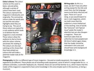
  • 1. Colour scheme: The colour scheme on this cover is black, red and white, although a variety of colours have been used. The colours represent the magazine’s individuality and originality. The contrasting colours make the words pop out and the red colour highlights what they are trying to say. The use of these colours are typical for a rock audience which leads us to believe that the magazine is rock-oriented. These colours allow the audience to feel at home with the colour scheme, and draws the reading in. The colours are also eye-catching so this shows that they have picked out colours that will make a potential reader look at the magazine. Writing style: As this is a cover, we don’t have any other writing except for the title and cover lines, but the language seems to be fairly informal and open. There isn’t use of slang, as you would expect to see in rock magazines, which can both mean that the audience is more intellectual or less exciting. Uses of words like ‘Exclusive!’ and ‘Special Issue!’ grabs the reader’s attention but can also cheapen a magazine. There are technical codes that are unfamiliar to most people(‘avid HD Omni’) which again shows that the reader should be interested in this area and should have some background knowledge in it. Photography: As this is a different type of music magazine – focused on studio equipment, the images are also expected to be different. These photos are of recording studio equipment, some of which is recognizable for us – a software controller, a controller keyboard, etc. However, these are not all that familiar to us, which means that the reader of the magazine is expected to have some knowledge in this area (maybe work in this business, or being a musician).
  • 2. Text/picture ratio: As for the cover we have much bigger ratio of picutres than text, which is normal for every cover of a magazine, as the pictures draw the reader in more easily and quickly. However, unlike other magazines this one doesn’t have one particular image for the cover, which could be reflective of the audience and how much they want to find out about the magazine from the cover. Another thing about this type of magazine is that if there was only one image on the cover it wouldn’t look exciting, and possibly wouldn’t draw as many readers in. Overall look: The cover looks like a scrap book at places as there are a number of images put together in the centre of the page. This breaks the wall between the magazine and the audience and makes it more intimate and personal. The use of aggressive and contrasting colours is eye-catching and reveals a more ‘rebellious’ side of the reader. These colours appeal more to men than women, as they create its’ casual mannish look. Just by looking at the cover, it is pretty clear that the audience must be familiar with this type of technology beforehand as this is what the magazine is about. Fonts: On this cover there are two main fonts – one for the title and one for the cover lines, as one of them is in italic and the other one is emboldened, but both simple enough to read. The italic font used for the title suggests a more sophisticated and classy audience, also people who are prepared to pay more for a better quality. The cover lines are usually consisted of two lines, where the upper one is emboldened and the bottom one isn’t, which is a good technique of drawing a person’s attention to the whole title of the article.
  • 3. Colour scheme: The DPS uses white background for the text and black background for the photo of the gig playing live. There is a use of contrasting colours which makes them both stand out, and allows the reader to focus on each one separately. White represents innocence and purity, which can represent the good side of the band, where as the black shows its’ rebellious and dark side. These are colours that are associated to rock and metal bands so they are linked with the type of music they represent Photography: The picture of the band playing at a live concert. There is only one shot that sums up the whole concert, of a retro band, as the costumes of the musicians look quite old fashioned. In the centre of the DPS there are drums, which take a big part of the picture, which links to the theme of the magazine. The image shows that the band is quite relaxed, playing retro/jazz music and it doesn’t look as intense or dramatic as rock music. Writing style: The article is about the recording of one of the famous songs of the band ‘talking heads’. The style writing is relaxed, simple and fairly informal. This kind of language has been purposely chosen to create a picture of the band without having to necessarily know of it beforehand. As expected, the article is more about recording music, a particular song called ‘Road To Nowhere’ that was popular in 1985. The magazine takes us back to the 1980s, which shows us that it focuses on all aspects of music at all ages.
  • 4. Text/picture ratio: In this DPS the text is definitely more dominant than the picture- it takes up a page and a half. This shows that the magazine is relying on the written word more than anything – which is an indication that their audience is prepared to spend more time on reading than anything else. Again this can be a sign of a well-educated audience that likes reading. A short quote, followed by a sub-heading has been used to focus the audience's attention and give an insight of the story. Overall look: The overall look of this article is quite neat and ordered – text and picture clearly separated by contrasting colours. The side bar on the right hand side of the article makes it more fun and exciting as there is a picture and red font used. The use of distressed fonts makes it look well organised and tidy. Fonts: Two main fonts have been used in this double spreadsheet. The first one is larger and simple, with quite a big distance between each word (introduction) but the larger amount of the article has been written in a very small shrift which would be harder for older people to read – this shows that the audience of this magazine are mainly young people, around 25, who can read small fonts. In emboldened font we have titles of the different paragraphs, which is used to section them, to make it easier for the reader to get into.
  • 5. Colour scheme: The colour scheme on this contents page is white, black and red. Of course, other colours are featured but these are definetely the most dominant ones, as the white one is chosen for background and the red and black are for pictures and features mainly. This is the typical style for these magazine and it adds to that rock vibe that we are used to seeing in the magazine Photography: For the contents page there are a number of pictures which show the various contents of the magazine. There are pictures spread all over the DPS which creates a messier and more exciting look. Also in the middle of the DPS there are two pictures of SOS magazine covers which suggests that these are the next few months’ issues. This has been done to draw attention and make the reader look forward to it. Writing style: On the contents page there are mainly outlined features of the magazine and a few interesting stuff in the sidebar. The bullet points add to the more formal language style of the page. The writing is very organised as there are sub-headings to help you find what you are looking for more easily, which contrasts with the not-so-well organised pictures.
  • 6. Text/picture ratio: The DPS relies heavily on text for this contents page. Even though there aren’t any long articles there is a lot more writing (in the form of bullet points) than there are pictures. This tells us that their audience is well-educated adults, who look at the content page and like to know where everything is. This is another reason why headings and subheadings are used to divide different sectionds. Fonts: there are a number of fonts used in this page and this is because of the fact that there is quite a lot of writing in it. The two main fonts used are standard for this magazine and we have seen them before in the DPS. The titles of the features in the magazine are emboldened so that they stand out easily, whereas the following sentence is in normal shrift which means that you don’t have to read both lines. Overall: By looking at the page at first it seems as if it is well-messy and disorganised and it is hard to find where things are because of the amount of writing. However, on second glance you can tell that everything has been organised well to make it simple for the reader to get into. Overall I would say that this page has been done well, by professionals who considered people’s opinions and how long they’d look at it.
  • 7. Photography: For the cover of this magazine we have a large picture of a male celebrity, who we reckon is a musician. This person is wearing a black suit in this picture which has possibly been done to match the black background. His face is in colour, where the rest of the page is in black and white which makes it stand out. The picture isn’t too artistic or dramatic which is probably linked to their audience’s taste, who may prefer less staged pictures. The picture is in the centre of the page, surrounded by cover lines which creates a visual frame, and it is easier for the reader to read. Colour scheme: Once again, the main colours used here are black and white with hints of red that pop out. This follows a pattern for music magazines, as SOS also uses these colour schemes. From my audience research I also found out that my these are the colours that my audience prefers to see in music magazines. In difference to SOS, Mojo uses very little red and just black and white for its’ cover. This makes it look quite professional, plain and helps things stand out. Writing style: the writing style is relaxed and plain, using lots of exclamation marks and quotes. This drags the reader’s attention to a particular cover line and shows that the story is meant to be interesting/exciting. It is distant from the audience as the use of bullet points and short titles doesn’t allow the magazine to break the invisible wall between the audience and the writing.
  • 8. Fonts: there are two main fonts used for this cover – one of them is always used in capitals. Both of these fonts are used for the cover lines of the page, where one in capitals is used for the first line and the normal one is used for the second one. This is a technique that many magazines use to draw attention to the line without making it look tacky. Overall: The cover looks professional and sophisticated. The title is covered by the main picture which shows that the magazine is already well known and familiar to the audience. It draws the readers attention by using cover lines written in capitals and big works saying ‘THE BEATLES’. Another thing about this magazine is that there are more than one pictures on the cover but they don’t distract the readers attention from the main focus and don’t make it look cheap or flashy. Text/picture ratio: The ratio between pictures and text is disproportional as the picture is much bigger than the amount of text on the cover. This is done to make the magazine look more interesting and to draw the reader’s attention to the magazine quickly without having to read so many cover lines.
  • 9. Colour scheme: A number of colours have been used for this DPS. The main ones are our familiar red, black and white, but yellow has also been used for a background and in pictures. The 3 standard colours have been used to add to the fact that it is a rock magazine and that it needs to be a bit more edgier and messier. The colours in the pictures vary from blue to green but there isn’t one main colour for them. The various colours make the article look more dramatic and conspicuous. Photography: There is one main photo spread on over half of the DPS. It is of a band playing live concert. This picture makes the atmosphere quite relaxed and informal. This brings the audience closer to the article and shows that they prefer live photos than studio ones. This tells us that their audience is very down-to-earth, doesn’t like formalities and prefers real photos. Writing style: the writing style is informal but quite stylish, no use of swear or harsh words , which adds to the classy feel of the magazine, and clearly establishes the type of audience for it.
  • 10. Fonts: As in most magazines, there are only two main fonts in this DPS. One of them is the title which is much larger and the other one is the main one for the text. Both of those fonts look clean and simple which adds to the style of the magazine. The use of fonts has clearly been considered to suit the audience and the genre. The use of few fonts makes the magazine look more stylish, rather than dodgy. Text/picture ratio: the amount of writing in the article is little, on the left side as the picture is covering the bigger part of the page. On the left side the articles involve more writing but always supported with pictures, which shows that the audience of the magazine is not prepared to spend too much time reading, especially if there are no image involved. Overall: overall the DPS looks like there is a lot in it, but if you look closely it really doesn’t. This effect is created by the large number of small articles, side bars and colours which make it look more attractive as well as more crowded.
  • 11. Colour scheme: The colour scheme of this contents page is quite different from the rest of the magazine. There are only three colours which have been used and they are yellow, black and red, where the white is used for a background colour. This simple design is eye-catching and interesting looking. What surprised me was the use of yellow that has almost never been used in ‘Mojo’ so far. The colours are engaging for all the right reasons and the page looks nice, simple and clear. Photography: the use of one image for the whole page is a new and interesting idea and I think it is definetely working for this magazine. The image is of one person looking up to the camera, who is dressed in a red suit. This colour is a contrast to the white background and is making him stand out. His face is looking right at the camera lens which makes him look more confident and it is quite intimidating as you get the feeling that he is looking straight at you. The photo is quite artistic and quite looks like the person has modern views is quite dramatic and interesting. This could be a presentation of the reader of the magazine, or the other way around. It might be the opposite of the reader, so that it makes it more interesting for them. Writing style: Use of complex sentences is quite untraditional for this type of magazine, especially for the contents page but we can find quite a few examples of them on this page. The sentences are well-structured and interesting, and make the whole article stand out.
  • 12. Fonts: Use of three fonts in this page – two of them are emboldened which makes the titles of the articles stand out and look more appealing. The simple font is used to add to the titles as description. Although one more font is added the page looks really clean and polished, and it hasn’t affected the look of it. The three fonts are quite similar too each other, nothing too unusual has been used, they are relying more on the larger font and the bold words. Text/picture ratio: the picture and the text are taking up approximately the same amount of space on the page. They are quite parallel – where the text finished the picture finishes. This has been purposely done to make the reader focus on the photo as well as the text. There is a difference between the DPS and the contents page, as the DPS had more pictures than text, where as here the composition is different. Overall look: Overall the page looks relatively simple but eye-drawing at the same time. What I like about it is the use of simple fonts and colours which makes it look really stylish and professional, and makes you want to spend more time on it.