Desarrollo de aplicaciones móviles
•Télécharger en tant que KEY, PDF•
4 j'aime•2,220 vues

Alternativas al desarrollo de apps nativas: jQuery Mobile e introducción a responsive/adaptive design. Keynote de iZenius.com para Congreso Web Zaragoza 2012

Recommandé
Contenu connexe
En vedette
En vedette (20)
Similaire à Desarrollo de aplicaciones móviles
Similaire à Desarrollo de aplicaciones móviles (20)
Dernier
Dernier (20)
Desarrollo de aplicaciones móviles
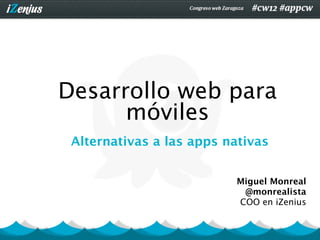
- 1. Desarrollo web para móviles Alternativas a las apps nativas Miguel Monreal @monrealista COO en iZenius
- 2. Sobre
- 3. Antes de empezar ... ¿Por qué alternativas a las apps nativas?
- 4. Razón 1: Pereza Nuestros usuarios NO instalarán nuestra app si no están fidelizados o tienen una ventaja muy grandeCongreso web Zaragoza 2012
- 5. Razón 2: Precio Desarrollar un solución para cada plataforma es caro Congreso web Zaragoza 2012
- 6. Podríamos pensar... Mi web se ve bien, sólo tienen que hacer zoom
- 7. ¡NO! Es necesario contextualizar ¡Diferente navegación! Buscamos otra información
- 10. Tenemos que ofrecer a nuestro usuario la mejor experiencia de usuario
- 11. La forma de conseguir esta experiencia de usuario ha generado debate
- 15. There is no Mobile Web. There is only The Web, which we view in different ways. There is also no Desktop Web. Or Tablet Web. Thank you Stephen Hay. There is not mobile web
- 16. The primary design principle underlying the Web's usefulness and growth is universality Tim Berners-Lee
- 17. 90% of all websites are too simple to justify the time and money it takes to develop a separate mobile version. Common Sense Thinker
- 18. Y mientras tanto ...
- 19. Varias filosofías - Versión móvil separada - Adaptar la web
- 20. Creando una versión móvil por separado con
- 21. ¿Qué NO es jQuery • Una framework para trabajar con JS • Un compilador de apps • Una solución que sirva para todo.
- 22. Qué SÍ es jQuery Mobile Un framework UI (interfaz de usuario) multiplataforma que permite crear webapps para móviles y tablets táctiles.
- 23. Características • Etiquetas HTML 5 (no intrusivo) y CSS 3 • OpenSource • Ligero (31 Kb) • Soporte para accesibilidad
- 24. Y más! • Construido sobre JQuery • Mejora progresiva • Personalizable • API JS disponible • Buena documentación (jquerymobile.com)
- 25. Requisitos Inicialmente, no necesitarás saber: • HTML 5 / CSS 3 • JS • JQuery
- 26. Compatibilidad Compatibilidad A/B/C en http://jquerymobile.com/gbs/
- 27. ¿Qué incluye jQuery • Un fichero JS • Una hoja de estilos CSS • Imágenes
- 28. ¡Ejercicios! Ejercicios de descargables en: http://www.izenius.com/events/cw12/mobile/jqm.zip
- 29. Adaptando la web Responsive Web Design
- 30. El contenido manda! http://mediaqueri.es/pal/
- 31. Responsive web design A flexible grid (with flexible images) that incorporate media queries to create a responsive,adaptive layout. Ethan Marcotte
- 32. Flexible layout http://www.slideshare.net/livefront/responsive-design-7877412
- 33. ¿Como se construye un layout Utilizar uno hecho -> http://cssgrid.net/ Construirlo nosotros mismos.
- 34. Sitio de ejemplo .container (940 px) .sidebar .main (305 px) ( 590 px)
- 35. .container Se le suele poner un max-width alto o un width porcentual. .container { .container { max-width: 1300px; width: 90%; } }
- 36. Fórmula target / context = result target width sizearent width size p
- 37. .sidebar .sidebar { width: 305px; }
- 38. .sidebar .sidebar { target / context = result width: 305px; } 305 / 940 = 0.32446809 tamaño del tamaño sidebar padre
- 39. .sidebar .sidebar { target / context = result width: 305px; } 305 / 940 = 0.32446809 tamaño del tamaño sidebar padre .sidebar { width: 32.446809%; /* 305px/940px */ }
- 40. Sitio de ejemplo .container (940 px) .sidebar .main (305 px) ( 590 px)
- 41. .main .main { width: 590px; }
- 42. .main .main { target / context = result width: 590px; 590 / 940 = 0.62765957 } tamaño del tamaño mainpadre
- 43. .main .main { target / context = result width: 590px; 590 / 940 = 0.62765957 } tamaño del tamaño mainpadre .main { width: 62.765957%; /* 590px/940px */ }
- 44. Sitio de ejemplo .container (940 px) .sidebar .main (305 px) margin-left: 325 px
- 45. Conversión When setting flexible margins on an element, your context is the width of the element’s container. Ethan Marcotte (Responsive Web Design, 35)
- 46. Margin .main { margin-left:325px; width: 62.765957%; /* 590px/940px */ }
- 47. Margin .main { target / context = result margin-left:325px; width: 62.765957%; 325 / 940 = 0,34574468085106 /* 590px/940px */ } tamaño del margen main padre
- 48. Margin .main { target / context = result margin-left:325px; width: 62.765957%; 325 / 940 = 0,34574468085106 /* 590px/940px */ } tamaño del margen main padre .main { width: 62.765957%; /* 590px/940px */ margin-left: 34.574468%; /* 325px/940px */ }
- 49. Sitio de ejemplo .container (940 px) .sidebar .main (305 px) padding: 20px
- 50. Conversión Padding When setting flexible padding on an element, your context is the width of the element itself. Ethan Marcotte (Responsive Web Design, 35)
- 51. Padding .main { padding:20px; width: 62.765957%; /* 590px/940px */ }
- 52. Padding .main { target / context = result padding:20px; width: 62.765957%; 20 / 590 = .03389830 /* 590px/940px */ } tamaño padding main propio
- 53. Padding .main { target / context = result padding:20px; width: 62.765957%; 20 / 590 = .03389830 /* 590px/940px */ } tamaño padding main propio .main { width: 62.765957%; /* 590px/940px */ padding: 3.389830%; /* 20px/590px */ }
- 54. Flex your fonts! No olvidemos convertir la fuentes de PX a EM
- 55. Un pequeño truco html { font-size: 16px; /* base */ } body { font-family: Georgia, serif; font-size: 62.5%; /* 1em = 10px */ }
- 56. La fórmula! target / context = result font size of target font size containing element 10px / 16px = 0.625 -> 62,5%
- 57. Sitio de ejemplo .container .sidebar .main h1 { font-size:30px}
- 58. Fuente .main h1 { target / context = result font-size:30px; } 30 / 10 = 3 tamaño fuente h1 defecto .main h1{ font-size: 3em; /* 30px/10px */ }
- 59. Sitio de ejemplo .container .sidebar .main h1 { font-size:30px} a {font-size: 24px}
- 60. Fuente .main h1 a { target / context = result font-size:24px; } 24 / 30 = 0.8em fuente atamaño h1 .main h1 a{ font-size: 0.8em; /* 24px/30px */ }
- 61. Break points Son lugares donde en función del ancho/alto del viewport, el diseño se “rompe”.
- 62. Típicos breakpoints http://www.slideshare.net/livefront/responsive-design-7877412
- 63. Media Queries @media screen and (max-width: 320px) { body { font-size: 100%; } } <= 320 px
- 64. Media Queries @media screen and (min-width: 1024px) { body { font-size: 100% } } >= 1024 px
- 65. Advanced Media Tipo @media screen, print { ... } Orientación @media (orientation:portrait) { ... } Color @media (color) { /* Screen in color */ } http://css-tricks.com/css-media-queries/
- 66. Compatibilidad http://www.slideshare.net/livefront/responsive-design-7877412
- 67. Compatibilidad Wouter van Der Graaf nos solucionó la papeleta: http://code.google.com/p/css3-mediaqueries-js/ http://www.slideshare.net/livefront/responsive-design-7877412
- 68. Adaptive / Responsive design ¿Es lo mismo adaptive que responsive? Adaptive: Nosotros definimos los break points Responsive: El contenido define los break points
- 69. Adaptive design Diseñar para un contexto específico: • Dispositivo (iphone, ipad ...) • Tamaño de pantalla (1024x768, 320x480...) • Resolución (retina display ...)
- 70. Responsive design Responsive designs provide continuity between contexts Responsive designs are portable and accessible. Ethan Marcotte
- 71. Flex your media Modern browsers FU.. IE 6 img, video, object { img, video, object { max-width: 100%; width: 100%; } }
- 72. ¡Ejercicios! Ejercicios de descargables en: http://www.izenius.com/events/cw12/mobile/responsive.zip
- 73. Muchas gracias! ¿Preguntas? Miguel Monreal @monrealista mmonreal@izenius.co m
Notes de l'éditeur
- \n
- \n
- \n
- \n
- \n
- \n
- \n
- \n
- \n
- \n
- \n
- \n
- \n
- \n
- \n
- \n
- \n
- \n
- \n
- \n
- \n
- \n
- \n
- \n
- \n
- \n
- \n
- \n
- \n
- \n
- \n
- \n
- \n
- \n
- \n
- \n
- \n
- \n
- \n
- \n
- \n
- \n
- \n
- \n
- \n
- \n
- \n
- \n
- \n
- \n
- \n
- \n
- \n
- \n
- \n
- \n
- \n
- \n
- \n
- \n
- \n
- \n
- \n
- \n
- \n
- \n
- \n
- \n
- \n
- \n
- \n
- \n
- \n
- \n
- \n
- \n
- \n
- \n
- \n
- \n
- \n
- \n
- \n
- \n
- \n
- \n
- \n
- \n
- \n