
Recommandé
Contenu connexe
Tendances
Tendances (20)
En vedette
En vedette (19)
Similaire à Lucy Mongan Media Evaluation
Similaire à Lucy Mongan Media Evaluation (20)
Plus de jackiemason
Plus de jackiemason (14)
Dernier
Dernier (20)
Lucy Mongan Media Evaluation
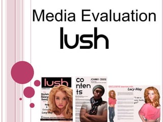
- 2. 1. FRONT COVER Conventional masthead Dominant contrast Website Direct mode of address Selling line Main image Main feature Colour coded Barcode Features
- 3. CONTENTS Bold font to stand out Model credit Direct mode of address Features Sub text with page numbers Main image Dressed to suit the genre Colour coded
- 4. DOUBLE-PAGE SPREAD Bold lettering to stand out Quote from “Lucy-May’s” answers Buzz word Main image Brief introduction Indirect mode of address Main image Dressed to suit the genre Direct mode of address to draw the readers in Body language in a pose Questions and answers with the main feature inside the magazine.
- 5. 2. How does your media product represent particular social groups? For example the glamorous look e.g.- big hair, pink lips and a seductive look. Used by the poses in my magazine The colours throughout the magazine are pink, grey and black. These colours will appeal to both genders and make the magazine more popular.
- 6. 3. What kind of media institution might distribute your media product and why? MOST SUCCESSFUL MUSIC WEBSITE IN THE UK My magazine could be distributed by the Marketforce within the IPC media, as they have brought out extremely popular brands such as the music magazine “NME”, the gossip and fashion magazine “Look” and also the fashion brand “Marie Claire” It has become the most successful music website in the UK, its famous for its industry.
- 8. Bubbly, cheeky, extremely outgoing and confident.This is a typical target who will read my magazine Loves fashion Bold make-up Obviously loves to stand out Glamorous look
- 9. 5. How did you attract and address your target audience? FRONT COVER needs to stand out Direct eye contact, to grab the readers attention, flirtatious and sexy look. The main feature and the selling line, stand out dramatically on the page Feature artists- catches reader Big bold masthead, used dominant contrast to allow the most important thing to stand out on the page, and to be recognisable towards the readers.
- 10. 5. How did you attract and address your target audience? CONTENTS PAGE needs to look attractive as the reader looks through Is themed (the font) the same as the front cover, to show consistency. Main image used direct mode of address and also is dressed to suit the genre. The features to make the reader want to flick through.
- 11. 5. How did you attract and address your target audience? DOUBLE PAGE SPREAD needs to catch our eye as we flick through, and the producer decides what the reader looks at first. First the reader looks at- Main image on the page, to grab them and make them want to read more Third the reader looks at- Pull quotes Second the reader looks at- Name of the main feature needs to stand out
- 12. RnB = most popular So I have chosen to create an RnB magazine. All these artists are very popular, so I have featured them inside my magazine.
- 13. 6. What have you learnt about technologies from the process of constructing this product? Liquify Tools = bloat tool, pucker tool, burn tool , forward warp tool
- 14. Looking back at your preliminary task, what do you feel you have learnt in the progression from it to the full product? - Looks much more professional - Gained more skill in photo shop - Higher standard of photography - Kept to a consistent house style - Learnt more creative techniques - Researched into my target audience, learnt what catches their attention
Notes de l'éditeur
- Read out.
- Read out
- Read out.
- My magazine could be distributed by the Marketforce within the IPC media, as they have brought out extremely popular brands such as the music magazine “NME”, the gossip and fashion magazine “Look” and also the fashion brand “Marie Claire” It has become the most successful music website in the UK, its famous for its industry.
- These types of people will read my magazine,
- Main image has to dramatically stand out on the front page of the magazine, features would also catch their eye as the artists i have chosen to be in my magazine are extremely popular and would make the reader want to flick through. The big bold masthead needs to stand out,
- Same font throughout the magazine, which shows consistency, colours are coded, all images except one uses direct mode of address with leers the reader in and grabs their eyes to read the magazine.
- I decide what the public look at first, so it would be the main image, then the name of the artist, any pull quotes and finally the interview.
- Read out.
- I have used the polygonal lasso tool, cropping tool, burn tool, magic wand tool, feather tool,